9 Mistakes that Sabotage Your Ads (And How to Fix Them)

Author: Brad Smith
Last Updated: October 31, 2022 | Facebook Ads, Paid Search Marketing, Social Media
Last Updated: October 31, 2022 | Facebook Ads, Paid Search Marketing, Social Media
People tend to believe that their competition is their greatest threat, especially in zero-sum, auction-based online ad platforms where the price is generally driven up by the amount of competition you face.
But that’s not entirely true.
After all, the competition isn’t responsible for your high cost-per-lead. Your ineffective headline is. And your overly general, clichéd copy, your uninspiring images, and your misuse of calls to action.
Want more leads, for less? Forget about what the competition is doing, and focus first on stopping these self-sabotaging advertising mistakes first.
Why the Competition Is Irrelevant if You’re Making these Common Mistakes
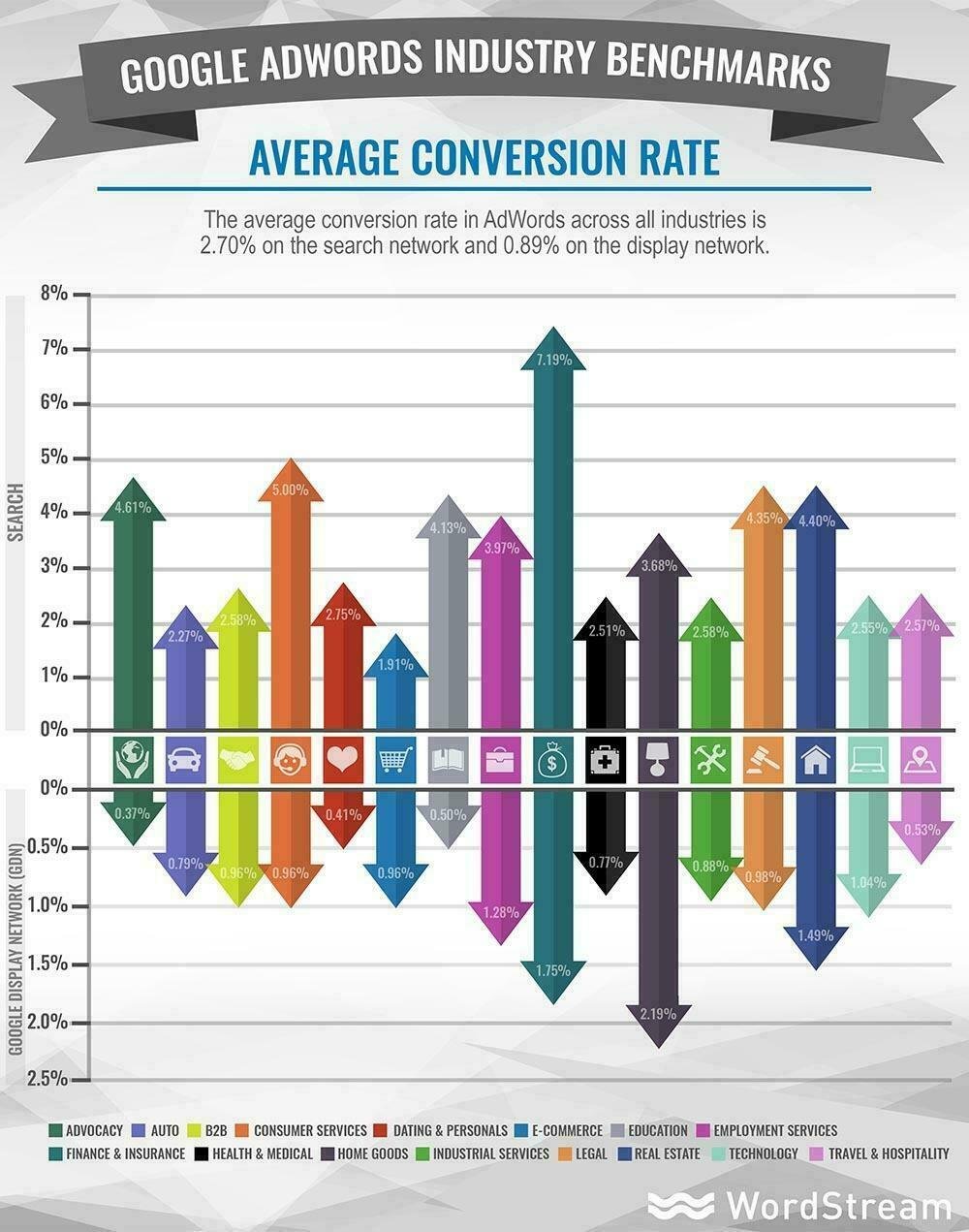
Benchmarking is helpful. Knowing your industry’s conversion rate, and how you measure up, is helpful. To a point.
In many cases, however, here’s the truth: The competition isn’t responsible for your advertising success (or lack thereof). You are.
I don’t mean that judgmentally, but practically. The competition doesn’t directly dictate how much you’re currently paying for clicks or leads. Your Quality Score does. Same for your Relevance Score in Facebook.
Those metrics are directly influenced by the keywords or topics you choose, the landing pages you’re sending people to, and the ads you’re creating to get people from point A to point B.
Simple mistakes in these areas are what’s holding you back from getting the results you need (and deserve!).
The unicorns, meanwhile, aren’t looking around at the competition. They’re busy creating and testing. These accounts with the best results typically feature at least 10 different landing pages, with as many as 100 ads to eventually arrive at the best performing combinations.
Better ad performance should equal better scores, which equals lower costs paid to drive more leads, which means mo’ money.
Here are some examples of simple – yet all too common – ad creative mistakes on AdWords, Twitter and Facebook that could sabotage your results (along with a few ideas to fix them).
3 Self-Sabotaging AdWords Mistakes (& What to Do Instead)
AdWords mistakes are surprisingly easy to commit. Especially when margins for error are so small with heavily commercial, transactional queries that typically lead to purchases.
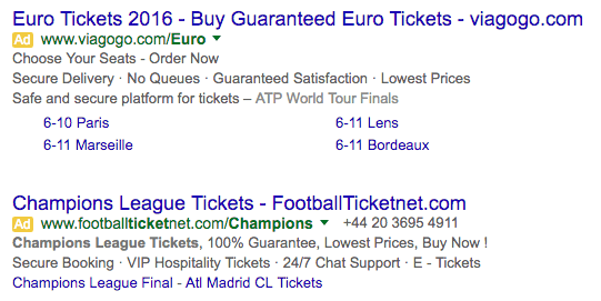
For example, there’s this thing called soccer. Outside of the U.S., where it’s a pretty big deal, they call it football (because you actually play it with, you know, your feet). And the Super Bowl of European club soccer is the Champions League final, which was played a few weeks ago between Real Madrid and Atletico Madrid.
That would be like the Clippers vs. Lakers in the NBA finals (assuming the latter didn’t suck).
As you could imagine, tickets were at a premium. That means the PPC competition was hot too. And that’s why this next ad might have been underperforming in the weeks leading up to the game:

The headline features the search phrase, which is a nice start. However it then starts to get a little too generic. That leads us to Mistake #1: This advertiser didn’t take timing and intent into account.
Think about it: At this point, you already know who’s in the final. So you’re looking for very specific tickets – not “tickets available for all teams.”
Next, the vague ad copy is too generalized to stand out. It could apply to anything.
Compare the previous example with this one:
The above ad contains a sitelink that references the actual teams playing in the Champions League final. THAT level of specificity and relevance catches someone’s eye when searching.
But let’s say that, unfortunately, you’re too busy to fly over to Europe for a game. Like me, you were probably sitting in an office toiling away in front of a computer when the final happened.
The bad news is, sitting is the new smoking. Cue “standing desk” query:

First pass, everything looks great in this ad. The headline contains a brand [Evodesk] + the search term [standing desk].
The first line is benefit-driven, with a low starting price (it’s a decent deal as far as standing desks go). The second line includes a few additional features (although those would be better if they were transformed into benefits or outcomes).
They also throw in a testimonial from Entrepreneur media for good measure.
All that hard work, and then they send you straight to the homepage.
Don’t get me wrong, it’s a very nice homepage. However, driving PPC traffic to the homepage is one of the most common landing page mistakes you can make. That’s Mistake #2: You’re asking the homepage to do too much.
Chances are, it was designed and created for a very specific purpose: highlighting what your company is good at, or showcasing your product range. Whatever the case, targeting a very specific keyword phrase for a transaction-focused visitor was probably not one of them.
The result? Messaging on a page gets diluted when multiple keywords (with different value propositions) compete for attention, resulting in a lower Quality Score.
And as we’ve discussed, lower Quality Score means a higher cost-per-click (and a higher cost-per-lead or sale), even if you show up lower than the competition on search engine result pages (SERPs).
If standing desks are too expensive for you, don’t stress. Because if sitting is truly as bad as smoking, we probably won’t be around long enough to enjoy them anyway.
Instead, we’ll probably see a better ROI through buying life insurance. (Wow, that escalated quickly. Also, worst segue ever.)

This first ad example is “meh,” starting with the confounding headline, which doesn’t align well with the actual search query of “life insurance” used to find this.
Mistake #3: Not employing the specific search query in the headline is a poor relevance signal and can affect your CTR and Quality Score (raising the effective CPC you pay).
But it also ignores the critical importance of message match (thereby lowering your probable conversion rate).
Second, what does “Top 10 Life Ins Companies” even mean? Is this ONE of the top ten life insurance companies, or is clicking this ad just going to take me to a list of the top ten life insurance companies? It doesn’t do a good job of setting expectations. The searcher (who’s using AdWords because they want a fast, specific answer in the first place) is left to somehow piece together a trail of clumsily laid clues.
Searcher’s ain’t got time for no Da Vinci Code.
Now compare that ad with this good example from Amica:

The headline is direct and obvious, straight to the point. The description adds context to the numbers, decoding what it means for you and how much it’ll set you back. And the testimonial on the bottom is a nice example of credibility-boosting risk reversal.
Overall, this Amica one feels both more relevant, and more polished and organized.
3 Mistakes that Will Sabotage Your Twitter Ads (Plus Counter Examples to Learn From)
Twitter is an excellent medium for driving initial brand awareness and even capturing initial leads as well.
It’s also a highly visual medium, where the image quality can result in a significantly higher CTR (18% more clicks to be exact). But only when done properly.
Case in point:

What’s the problem with this ad? Easy: The image is completely irrelevant. It doesn’t tell Twitter users at a glance what they’re going to get if they click the ad. And that’s a problem, considering irrelevant images can actually reduce conversions by distracting readers. On Twitter, people scroll fast, and you need to hook them immediately.
Compare that with this one from SuperImageMarket:
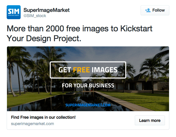
In this ad, the hero image shows you what you’re going to get and uses text to immediately translate the primary benefit of the offer (which is especially helpful for scanners who don’t need to read every single line).
Drilling down a little bit, the best Twitter ads also prioritize clarity over cleverness (similar to the AdWords example earlier). According to HubSpot, “clearly stated offers” outperform “ambiguous copy” by getting:
- 18% more clicks
- 29.8 more retweets
For example:
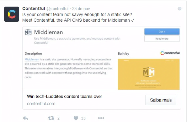
Contentful seems like a great idea. Only problem? What the heck is it? This ad’s big problem is that it’s too complicated.
You probably know what an API is. You probably also know what a CMS is. If you’re tech savvy, you might even know what Middleman is.
But when you’re already struggling to keep up with the firehouse of data, it’s unlikely you’re going to instantly make the neural leaps in logic required to make sense of this ad without seeing some kind of example, interface, or use case.
Let’s see how this ad from HubSpot themselves differs a bit:
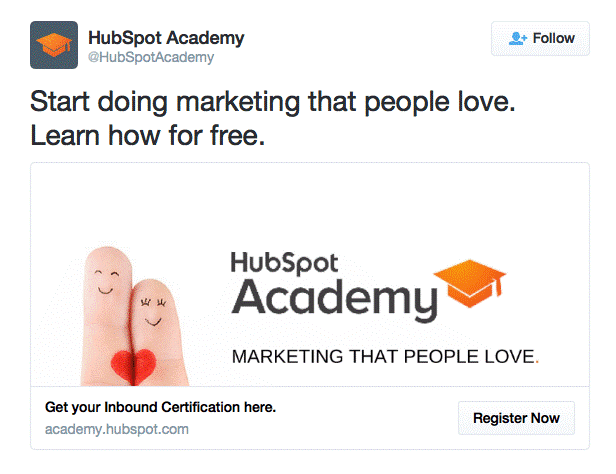
First and foremost, the right half of the image quickly communicates what this ad is, and why it’s important (even if the finger part is borderline irrelevant and distracting).
The description, ‘Get Your Inbound Certification Here’, supports the university cap in the picture to translate what you’re getting, and the CTA helps subtly complete the mental picture.
The end result is an ad that, while not groundbreaking, isinstantly understood.
Unlike this one from LED in Stone:

This entire ad creative here feels a bit off.
There’s no clear headline that delivers a compelling value proposition. The copy gets broken up by truncated text and odd formatting. The haphazard hashtags distract you from the link. And the image, while good quality, doesn’t give you an example of the product in use (so it’s hard to make sense of how it works).
VERY different from this excellent Treehouse example:
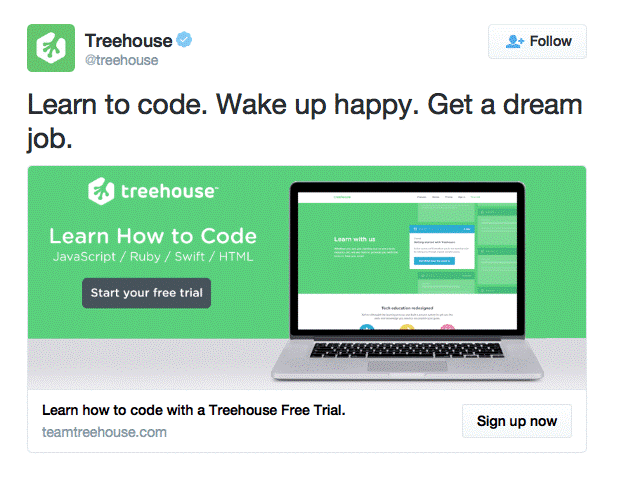
Treehouse teaches people how to code. But that’s not the focal point of this ad per se.
Instead, they highlight the primary outcome their customers get (i.e. better jobs and a happier life). They’re selling a transformation, which helps them avoid competing on features (or price).
This Treehouse example (and the HubSpot one from earlier) are also textbook examples of concision (the most important ad copywriting tip you’ve never heard of).
Beyond the stylistic benefits of concision, data backs up its performance results, too. Editing down your headline or title to eight words can result in a 21% CTR lift.
Next, we’ll see how this same principle can help you boost Facebook ad performance too.
3 Facebook Ad Mistakes to Avoid (& Best Practices to Follow)
Google AdWords excels at commercial transactions, while Twitter ads are perfect for initial brand awareness at the top of the funnel.
Similarly, Facebook ads have their own unique funnel with peerless targeting options (in other words, you can focus your ad budget on very specific types of people).
But you’ll notice that the creative mechanics are largely the same. The audience targeting and specific settings are a bit different, however a pattern emerges when looking at (a) what constitutes a good ad and (b) what common mistakes are being made – regardless of platform or use case.
Here are the basic principles of a good Facebook ad:
- Headlines: Concisely summarize the compelling value proposition of your offer.
- Copy: Focus on the specific benefits and outcome people can expect from redeeming your offer.
- Images: Instantly communicate what the offer will deliver or look like in use.
- Call To Action: Clearly explain what they should do, and what they stand to gain.
When done correctly, it looks effortless. It’s easy to miss the importance and weight of each step.
So instead, let’s see how OptionPundit completely misses the mark to learn from their mistakes:
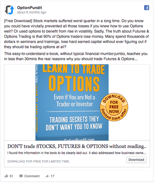
This could be a good ad. The raw potential is there. However, the execution is way off, starting with the ridiculously long copy to begin with, that also neglects basic punctuation along with mismatching the title case.
The headline suffers from the same issues, while the supporting copy underneath gets truncated entirely (so you have no idea what it’s trying to say). Your Facebook ads need to communicate value at a glance!
Secondly: The image could be decent, showing people a concrete example of what they’re going to download. But the sizing is all off, so you can’t see the whole book, coming across amateurish while detracting from the overall credibility of the ad and its claims, rather than supporting them. You need to take care to optimize your ad images for the platform they’re going to be running on.
Next up, IQ Options gets closer to the finish line:
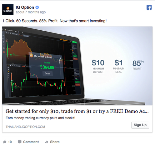
Right off the bat, you’ll notice that this ad is concise and the image is visually arresting (in a good way).
Another clever trick they use is a ‘tripwire’, or irresistibly low offer to reduce your risk of getting started. The $10 minimum deposit with $1 trade makes signing up easy and pain-free for most would-be traders.
However, the headline is too long, so it gets truncated before it can fully explain itself. Ideally, your Facebook ad headline should only be around 5 words (according to a study of over 37,259 Facebook ads).
One trick to keeping headlines concise is to use one of the 5 “most persuasive words in the English Language” to summarize the primary benefit:
- New
- You
- Free
- Because
- Instantly
Now let’s see if we can get everything together in one ad. All of the important elements, working cohesively to get readers to take action.
Here’s one of the best recent examples I’ve seen, from none other than…

Probably didn’t expect this, did you? Regardless of your political affiliation or your belief in those hyperbolic claims, it’s hard to argue with the execution of this ad.
The lead-in content is specific, using powerfully persuasive (and emotionally charged) words like “secretly,” “sneak” and “shocking.” The image supports this notion, using a widely understood Trojan Horse metaphor to drive home the point (with a helpfully designed button to boot).
The headline contains a simple, direct call to action (that alludes to a secret you NEED to know about, creating urgency), while the short copy underneath continues to heap blame on a third-party, which successfully unifies the rallying target market of this ad.
Keep Your Eyes on the Prize
Online, your #1 priority is to compete for attention. That means you’re competing against other businesses for a few seconds of your prospects’ attention.
However, the emphasis of that competition can get overblown, knocking you off course when things within your control go neglected.
Sure, general advertising cost ranges are driven by market competition. However, what you’re actually paying (and getting in return) has more to do with your own execution of common creative elements – things like a powerfully persuasive headline. Benefit-laden copy. A compelling hero image. And a clear call to action.
THESE things dictate your click-through rates, Quality or Relevance Scores. So make sure you master them!
Meet The Author
Brad Smith
Brad Smith is the founder of Codeless, long-form content creators for SaaS companies. Their work has been featured in The New York Times, Business Insider, TheNextWeb, Shopify, Moz, Unbounce, HubSpot, Search Engine Journal, and more.


Comments
Please read our Comment Policy before commenting.