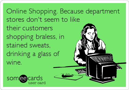
Does anyone else have online shopping ADD? Maybe it’s just me, but I have no problem abandoning a shopping cart if something goes even the slightest bit astray. The other day I was contemplating purchasing a dress from Free People, but my shoulders tensed up at the thought of it not fitting properly. Who wants to pay for shipping just to have to repackage and return the darn thing? The convenience of online shopping can quickly turn into an inconvenient, time-wasting, and frustrating experience, which is probably why most of us have no problem abandoning potential purchases.
Yes, e-commerce can be a joyfully profitable industry to be in. Sales cycles are instant, unlike B2B industries where marketers have to nurture leads down a long sales funnel. On the other hand, shoppers have no problem turning to another brand if their products are positioned in a more convenient, glamorous, or financially friendly manner. Why should I order a vacuum cleaner from you if your competitor offers essentially the same product, but with free shipping and a 30-day money back guarantee?
Moral of the story, product pages can make or break an e-commerce transaction. If the shopper has the slightest doubt in their mind, you’ve lost them.
I recently chatted with HubSpot’s e-commerce marketing consultant and Sales Engineer, Steve Haase, who’s consulted with hundreds of e-commerce businesses for the past 3+ years, and has an impressive and diverse background from founding his own startup software company, being a full-time musician, to serving in the military. Haase enlightened me to some best practices that can really make or break an e-commerce product page and help you increase online sales.
#1: Put Your Shopper at Ease
Your product page needs to address any potential concerns or hesitations your potential buyer might have. Will these pants fit? How long is the battery life? Can I return this product? Are sizes accurate? These questions all need to be answered. “For example, if your product has to do with clothing, how can you put people at ease that it’s going to fit?” says Haase. “Is there a sizing chart or guide? The thing that will make people shop elsewhere is uncertainty.”

Brainstorm ways you can put your shopper at ease, by providing clear copy, visual guides, and instructions if a product needs assembly. Haase explains the thought process the typical online shopper has: “I need a Large, but do Larges run big? I don’t want a muscle T, but I don’t want it too baggy. Ahh, I don’t know, I’ll just go somewhere else.” We’ve all had this internal dialogue when shopping online.
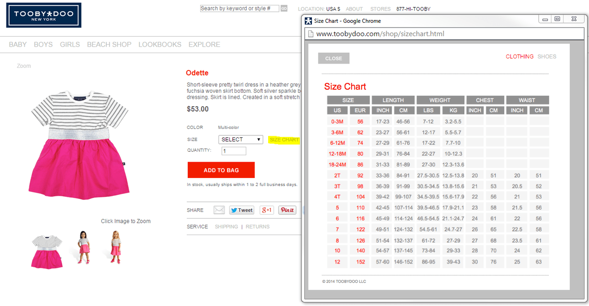
Take a look at the example below from the children’s clothing site, Tooby Doo. It allows the shopper to select the “size chart” button, which then provides a pop-up sizing guide for those in doubt. The pop-up is nice since is doesn’t direct to a new page, but provides a compact and easy-to-read and understand sizing chart to put the shopper at ease.
#2: Customer Reviews are ABSOLUTELY CRITICAL
88% of consumers trust online reviews as much as personal recommendations, according to BrightLocal.
That’s right, we trust complete strangers as much as we trust our mothers.
Also, 70% of people consult reviews and ratings before purchasing, according to BusinessWeek.
Alright, we all know customer reviews are necessary so why don’t you have them on your product pages? Or perhaps you do, but are they impactful? This tip ties in nicely with the one above because it’s all about putting the consumer at ease. When it comes to e-commerce product pages, having reviews on each page should be a no-brainer.
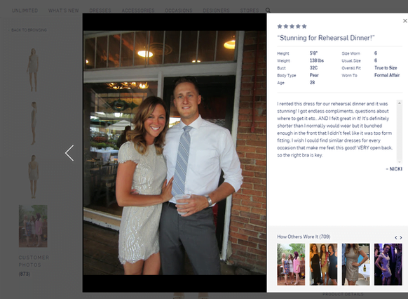
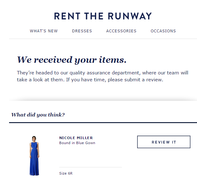
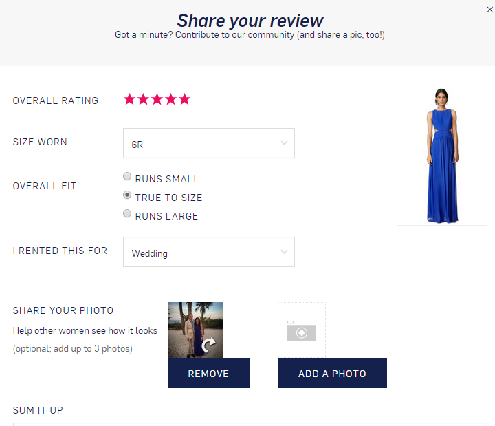
Rent The Runway kills it when it comes to reviews. Almost all of their dresses have 30+ reviews, with pictures that include a granular level of detail from the shopper’s height, weight, size worn, usual size, overall fit, affair, body type, etc., to ensure the rental is the perfect fit for the occasion before reserving. I’m a loyal customer (yes, I even have a PRO account), largely due to this reason.
What if you’re having trouble getting your customers to review your products? Well, you need to remind them that their feedback is important to you through emails…
And subtle site reminders…
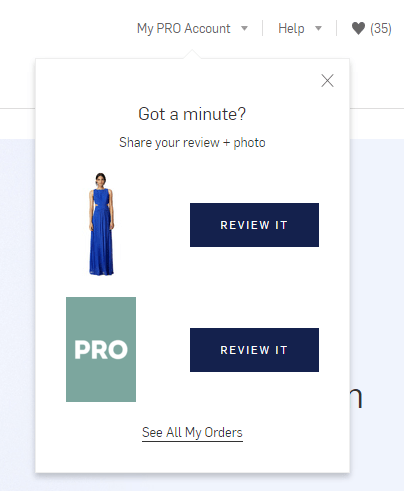
Alright, alright, I’ll review it.
#3: Craft Creative Copy
Strong on-page copy seems obvious, but you’d be surprised by the massive amount of product pages that have snooze-worthy copy. It’s not enough simply to include your e-commerce keywords on the page. Perhaps, the company is more concerned with imagery then creative copy. Yes, gripping visual content like images and videos are crucial product page elements, but if the copy is crap, this can be a huge detriment to building excitement about a product. “How are you actually convincing someone to buy the thing?” says Haase. “If your copy is crap then your page is crap. Not providing insight into why they should be excited, and why they should believe in you, is a huge mistake.” Take a look at this copy for instance:
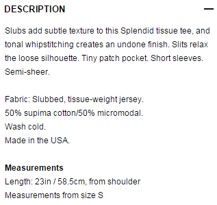
Slubs? Silhouette? Whipstiching? What does “whipstitching” even mean? Avoid the over-complicated language, and make your copy more fun and relatable. E-commerce is an industry where it’s easy to be creative, and not take yourself too seriously.
The e-commerce clothing store So Worth Loving provides some creative and compelling copy on every product page. Check out the one below:
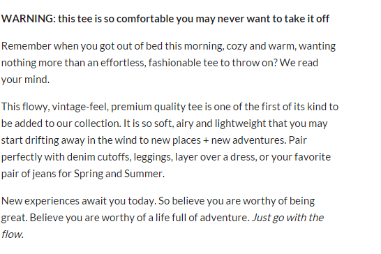
“WARNING: this tee is so comfortable you may never want to take it off.” You had me at comfortable, SOLD!
#4: Create a Strong Sense of Urgency
The fastest way to get e-commerce conversions? SCARE TACTICS. You want to make every visitor nervous that if they don’t buy now they might miss out! I know, it sounds manipulative, and perhaps it is, but it works. “You just paid for the click so you need to convince them they don’t need to look anywhere else,” says Haase. “Investigate the elements of urgency and scarcity that you have on your checkout page. Are you running a special sale for a limited amount of time? What about availability?” Haase recommends implementing an inventory management system if you don’t have one already. This will allow you to provide inventory on the page so you can show when stock is low in turn giving the shopper more incentive to buy before it runs out.
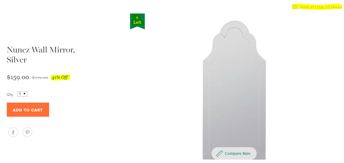
Check out the example below from the e-commerce furniture store One Kings Lane, where their product page for a silver wall mirror emphasizes several urgency factors such as the 41% discount, the inventory 2 days left bookmark, and the small clock icon informing the shopper that the sale is about to end. Seriously, this is well done!
#5: Provide All Necessary Context
Find creative ways to provide as much information as possible to properly inform the shopper without overwhelming them with unorganized copy. “Any kind of instructional information needs to be included,” says Haase. “What’s the care? Is it dry clean only? I hate that, but you didn’t tell me so I’m going to go somewhere else.”
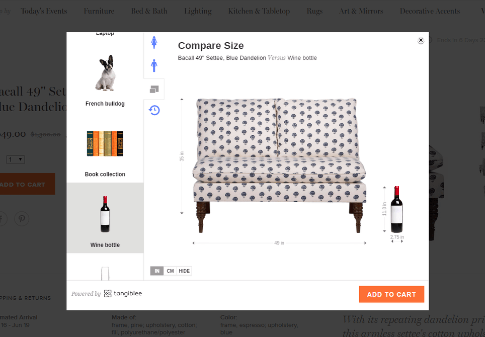
For example, if you’re selling a do-it-yourself (DIY) product there needs to be some sort of kit on assembly instructions. Perhaps an engaging time-lapse video. “Provide reinforcement for any of the objections that the person might have as they reach that page,” says Haase. One King’s Lane also does a great job at providing context. Just take a look at the example below. Each one of their product pages allows you to compare the piece of furniture to real-life objects, from anything from a French bulldog, to a wine bottle, to a standard door. This helps shoppers get a true idea of the size and dimensions of the furniture without leading them to doubt that buying online is the right choice.
#6: Experiment with Exit Intent Popovers
What are exit intent popovers? They’re those popups that appear before you leave a site, saying something like, “Are you leaving us already?” If you’re rolling your eyes and thinking ‘those are annoying,’ yes, I actually agree, but we use them at WordStream because we’ve found that they actually work.
“The worst investment of your dollar (from a paid click) is a 10 second brand impression,” says Haase. “If they’re not going to get the sale at least get the email. If they’re not ready to buy you can provide a pre-transactional offer, for example ‘Oh, I see you’re interested in weaving, get our free e-book to learn some new tactics.’”
#7: Leverage Social Sharing
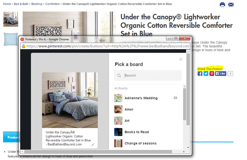
Every product page should leverage the power of social media. Yes, your website should be promoting your brand’s social channels, but on product pages there should be social buttons allowing the shopper to share the product on platforms like Twitter and Facebook. For example, let’s say you’re shopping around for a new pair of boots during the holiday season, but you realize that the pair you want isn’t in your price range. An easy fix, tweet the product to a loved one with a subtle hint – “@mom, add this to the Christmas list J.” This makes it so that even if your shopper doesn’t go through with the transaction, there’s a chance they’ll promote it to their followers and perhaps convince others to buy from you.
Haase recommends using product hashtags to get people chatting about your products. “Social media helps put your products out there, and can drastically expand your reach,” he says.
Check out the example from Bed, Bath, and Beyond below.
#8: Ensure Your Product Pages are Mobile-Friendly
Yup! We get it. Mobile is important, we’ve all been hearing this for years now, but have you ever actually taken the time to search for your product pages on your iPhone? You might be unpleasantly surprised by the shopping experience. Well, mobile isn’t going aware. According to Google, there was a 175% growth in shopping searches on mobile in the first five months of the year. So people are searching for products on their phones, clicking on your ads or organic listing and being delivered to your site while on the way to work or while watching TV at night. This isn’t that surprising, right? You likely do this more then you even realize.
Need I say more? Mobile is big. We all know this. So stop living in denial and get your mobile act together already!
#9: Turn One-Time Shoppers into Loyal Customers
Lastly, conversions only go so far in e-commerce. Lots of products are affordable so in order to gain ROI from your marketing efforts there needs to be a large sum of transactions which occur on a regular basis. All e-commerce marketers should be thinking of ways to make their customers come back time and time again.
Haase told me about one his largest e-commerce clients, “The number one thing they spend their time on is tactics to make people come back. This is their job,” says Haase. “How can I get someone to buy more stuff? You need to answer that question, which comes down to your own creativity and strength of your business.” Haase recommends trying to build a relationship with each and every customer to through new, interesting, and fun experiences.
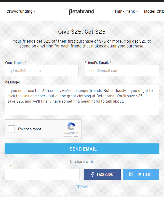
One company that Haase recommends learning from is BetaBrand: “They’re always coming up with new campaigns. They also know their persona and know what they’re looking for. Unless that’s happening, none of your marketing is going to do anything.”
Even just visiting BetaBrand’s site for the first time it’s clear that they do a lot of marketing to not only engage with their current customers, but also gain new customers through creative tactics. See the example below where they’re giving customers a $25 credit for each friend they refer, as well as the new customer $25 off on their first purchase.
Going along with this point, Haase also recommends implementing a marketing automation software to re-engage with past shoppers. “If you’re selling pet food, how long does it take to go through the container? Send an email a week before, follow up the week after.”
So there you have it. Implement these strategies to drastically grow your e-commerce transactions through better product pages. “Do the standard things, but in terms of what’s the next thing, ask what will help people? What is it that people are worried about? What do they like to do?”
Are you wasting money in Google Ads?

Meet The Author
Margot Whitney
Margot is a content marketing specialist at WordStream and nutrition graduate student at Framingham State. She loves all things digital, learning about nutrition, running, traveling, and cooking.
Recommended for you