You’d think all the social media platforms out there might get together and make a one-size-fits-all approach to creative content, but unfortunately, that’s not the case. However, it’s important you get your social media sizes right on every platform to ensure your image or videos are correctly conveyed to your audience. Following social media size guidelines stops your social content from appearing blurry, cut off, or otherwise unviewable.
Table of contents
- Social media image sizes for:
- Social media image sizing tools
- Social media image size templates
- More tips for your social media image sizes
Social media image sizes and video specs for 2026
Wondering what the right social media sizes are for your business’s most successful social platforms? You’ve come to the right place!
Facebook image and video sizes
Meta has tons of image sizing options as well as ways to incorporate various video formats into your organic and paid posts. So, we broke it down a bit:
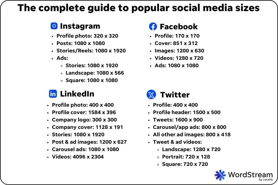
Facebook profile picture size, cover photos, video, and image post specs
- Facebook profile picture size: 170 x 170 px
- Facebook Business Page cover photo size: 851 x 315 px
- Post with landscape image: 1200 x 630 px
- Post with portrait image: 630 x 1200 px
- Post with square image: 1200 x 1200 px
- Video posts: 1280 x 720 px
- Facebook Story size: 1080 x 1920 px
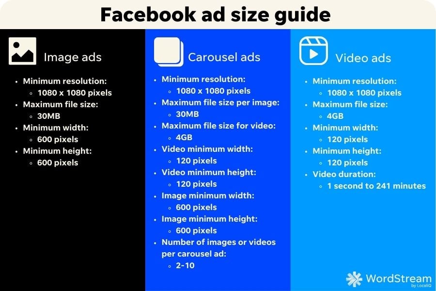
Facebook ad sizes
- Facebook image ads: 1080 x 1080 px
- Facebook carousel ads: 1080 x 1080 px
- Facebook video ads: 1080 x 1080 px
Facebook image size tips
Here are some helpful tips for your Facebook image sizing.
- Be mindful of images that contain links. The Meta platform has different sizing best practices for linked images. For example, if you’re posting an image with a link on Facebook Marketplace, the recommended image size is 1200 x 1200 px. Meanwhile, Meta Audience Network native, banner, and interstitial ad placements all have the same recommended image size of 398 x 208 px if they do not contain a link. For Meta Audience Network ad images with a link, the recommended size is 1200 x 628 px.
- Your Facebook ad file sizes matter. You’ll need to ensure your image and carousel ad file sizes are under the 30 MB maximum per image. Facebook video ads can be up to 4GB and anywhere from 1 minute to 241 minutes long.
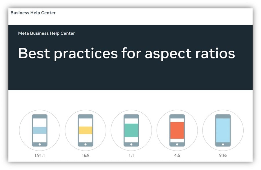
- Consider where your image or video will be showing when determining your aspect ratios. Most Facebook image size aspect ratios are 1:1, but this may change depending on whether the placement is horizontal or vertical.
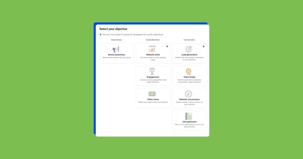
🔏Unlock the secrets to the most effective strategies in Facebook ads here!
Instagram image and video sizes
Here are the recommended image sizes for Instagram.
Sizes for Instagram Stories, Reels, and posts
- Instagram profile photo: 320 x 320 px
- Instagram square image posts: 1080 x 1080 px
- Instagram landscape image posts: 1080 x 566 px
- Instagram portrait image posts: 1080 x 1350 px
- Instagram Stories and Reels: 1080 x 1920 px
- Instagram Reel cover image size: 420 x 654 px
Instagram ad sizes
- Story ads: 1080 x 1920 px
- Landscape image ads: 1080 x 566 px
- Square image ads: 1080 x 1080 px
Instagram image size tips
Here are some quick Instagram image and video sizing tips to keep in mind.
- Your business’s Instagram profile aesthetic is important. Remember that anything you post on Instagram, you’ll want to look good on your page and feel cohesive with your other posts. The Instagram thumbnail size is 161 x 161 px. So if you want to plan out your profile tiles, try testing out how your images might look in the 161 x 161 px thumbnail size.
- There is flexibility in some of the Instagram sizes. Technically, the Instagram profile picture minimum size is 110 x 110 px, so you could get away with a smaller size than the recommended 320 x 320 px if needed.
- For carousel posts and ads, try to stick to the same size for all the images. Whichever image you choose as the first photo in a carousel post, the rest will have to be cropped to match. So, it may be easier to pre-plan and resize your selection of photos beforehand.
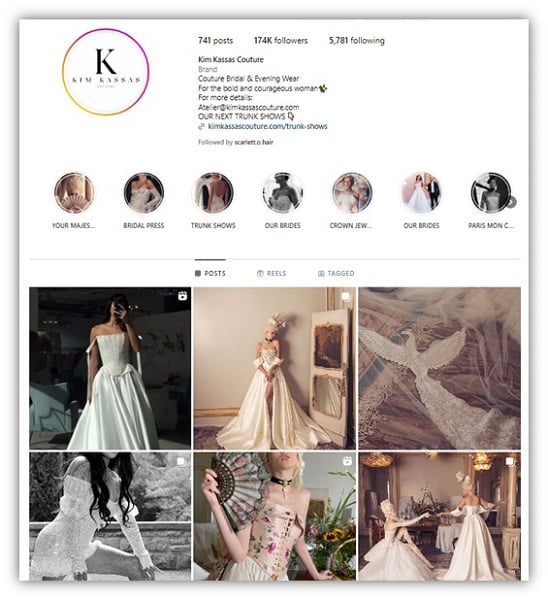
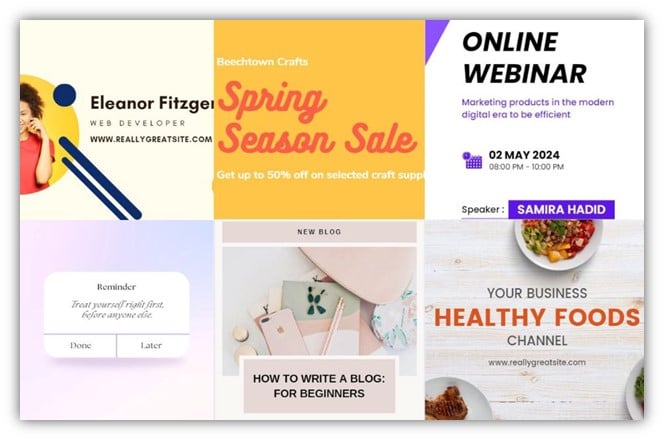
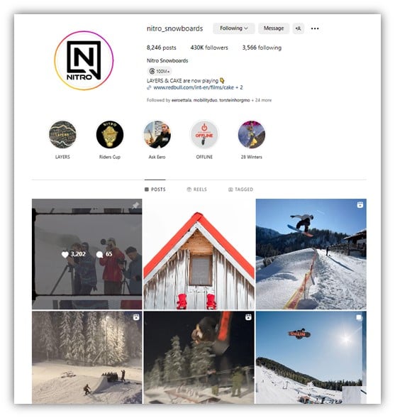
This brand posts Instagram images that all have similar themes and aesthetics to make its thumbnails look cohesive.
TikTok video sizes
Stick with these TikTok video and image sizes to optimize your TikTok marketing strategy.
- Landscape TikTok videos: 1920 x 1080 px
- Portrait TikTok videos: 1080 x 1920 px
- Square TikTok videos: 1080 x 1080 px
- TikTok Story and Live size: 1080 x 1920 px
- TikTok profile photo size: 200 x 200 px
- TikTok carousel image size: 1080 x 1920 px
Tips for your TikTok video sizes
Follow these TikTok tips when considering your social media image size strategy.
- Aim for the highest resolution possible. For example, the minimum size to upload a TikTok profile photo 20 x 20 px, but it’s recommended for a higher pixel, higher quality photo to avoid having to change it later as your visibility grows.
- The preferred aspect ratio for TikTok videos is 9:16. This means that all your TikTok videos should align with this ratio to provide a consistent, high-quality experience to your viewers.
Snapchat image and video sizes
Snapchat image and video sizes are consistent across the app, so there are only a few social media sizing specifications you need to know for this platform.
- Snapchat snap and ad size: 1080 x 1920 px
- Snapchat Geofilter image sizes: 1080 x 1080 px (minimum), 1080 x 2340 px (recommended)
Snapchat image size tips
- Double-check your Snapchat image file specifications. For example, it’s okay to use either JPEG or PNG for a Snapchat image or video, but you’ll need to ensure it stays under the maximum file size of 5 MB.
- Remember, Snaps take up the user’s whole screen. As you’re planning out your image or custom Geofilter, try to keep in mind what would be most visually appealing across a phone screen.

If you decide to create a Snapchat Geofilter to promote your business, consider how it will look over a full-screen image like this.
LinkedIn image and video sizes
When you’re looking to market your business on LinkedIn, follow these LinkedIn image sizes.
- LinkedIn profile image size / LinkedIn company logo: 300 x 300 px (400 x 400 px recommended)
- LinkedIn profile cover image: 1584 x 396 px
- LinkedIn company page cover image: 1128 x 191 px
- LinkedIn Stories: 1080 x 1920 px
- LinkedIn landscape image posts and ads: 1200 x 627 px
- LinkedIn portrait image posts and ads: 1200 x 627 px
- LinkedIn video posts and ads: 4096 x 2304 px
- LinkedIn carousel ads: 1080 x 1080 px
LinkedIn image and video size tips
Remember these LinkedIn optimization strategies when working out your image sizes.
- Going with a LinkedIn company logo image smaller than 400 x 400 px may impact how it appears. LinkedIn company logo sizes smaller than 400 x 400 px work, but the smaller file size can cause it to end up cropped or pixelated.
- Your LinkedIn image file specifications matter. You’ll also want to stick to a JPEG or PNG and under 3 MB in size for all your LinkedIn image files.
X (Twitter) image and video sizes
X (formerly known as Twitter) requires businesses to adhere to the following social media image size guidelines.
- Twitter profile image: 400 x 400 px, minimum 200 x 200 px
- Twitter profile header image: 1500 x 500 px
- Twitter image posts: 1600 x 900 minimum 600 x 335 px
Twitter video posts and ads sizes
- Maximum video length: 140 seconds (or up to three hours for premium subscribers)
- Landscape: 1280 x 720 px
- Portrait: 720 x 128 px
- Square: 720 x 720 px
Tips for image sizes on X
Check out these tips for sizing out your Twitter images and videos.
- All X images should adhere to a certain aspect ratio and file format. Ideally, your X image aspect ratio is 1:1. And, while X supports GiF, JPG, and PNG files, they should all be around 2 MB.
- If you want to show on both X’s desktop and mobile views, keep your image or gif file size small. The maximum image and gif file size is 5 MB to be displayed on mobile.
- Your business’s X profile header image will change depending on the viewer’s device. Profile header images are responsive based on screen size and cropped to an aspect ratio of 3:1.
Pinterest image sizes
Find all the necessary image sizes for Pinterest marketing success here.
- Pinterest profile picture: 165 x 165 px
- Pinterest business profile cover photo: 800 x 450 px (minimum)
- Square Pinterest pins: 1000 x 1000 px
- Pinterest Story pins: 9:16 aspect ratio, 1080 x 1920 px, 20 MB
- Pinterest collection pins or ads (mobile only): 1000 x 1000 px or 1000 x 1500 px, 1:1 or 2:3 aspect ratio, 10 MB
Pinterest image size tips
When promoting your business on Pinterest, be mindful of these tips below.
- Keep your Pinterest cover photo to a set ratio. 16:9 is the recommended Pinterest cover photo ratio.
- Square pins may get cut off if they’re a smaller size. While square Pinterest pins must be at minimum 1000 x 1000 px, try to adjust your square pins to be 1000 x 1500 px with a 2:3 aspect ratio to help your audience see all image details within the Pinterest feed.
- Consider your Pin thumbnails. Pins are displayed with a fixed width of 236 px on the feed.
- Pins have slightly more file flexibility than other platforms. Unlike some of the platforms above, a 20 MB maximum file that’s PNG or JPEG is fine for Pinterest.
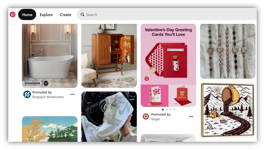
An example of how Pin thumbnails may vary.
YouTube image and video sizes
Your business’s YouTube Channel image and video sizes should align with the following specs.
- YouTube profile image size: 800 x 800 px
- YouTube channel banner size: 2048 x 1152 px (minimum)
- YouTube video size: 1280 x 720 px (minimum)
- YouTube thumbnail size: 1280 x 720 px
YouTube video and image size tips
Here are some helpful YouTube sizing tips.
- YouTube profile images display at 98 x 98 px. While you’ll want to upload your YouTube profile image size at 800 x 800 px, try testing to see what it will look like sized down to 98 x 98 px.
- Your YouTube Channel banner images could be automatically cropped. Text and logos cut off on YouTube Channel banner images at 1235 x 338 px. Also, the maximum file size is 6 MB.
- YouTube videos intended for sale or rental should have a higher pixel count. You’ll want these YouTube videos to be sized at 1920 x 1080, rather than the typical YouTube video size of 1280 x 720 px. However, If you want your video to qualify for YouTube HD standards, YouTube videos must be at least 1280 x 720 px with a 16:9 aspect ratio size.
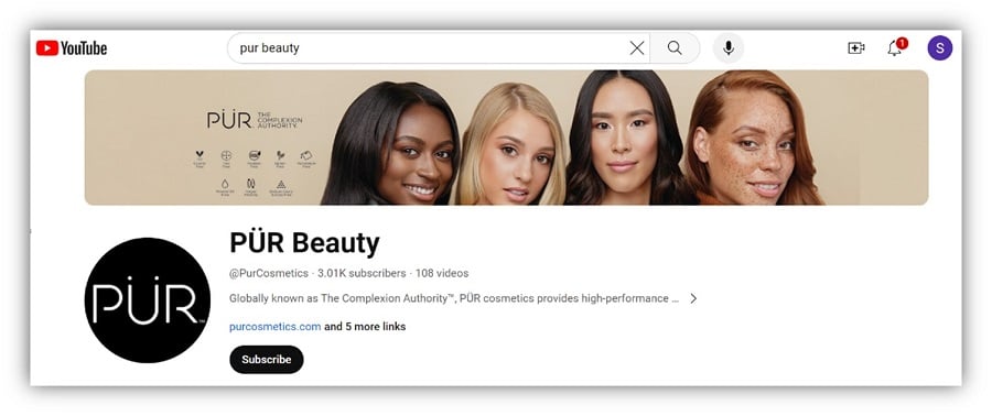
This YouTube channel banner example could probably be resized to align with the auto-crop that was applied.
Tools to help with social media image sizes
To help you with your editing, check out some of these top social media image and video tools.
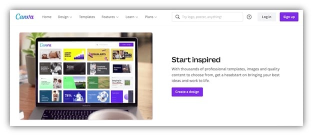
Canva
When it comes to social media image sizing, Canva can be an excellent resource. Canva is free to use, or you can pay for a Canva Pro subscription too. Both come with options for social media templates, free-to-use graphics and photos, as well as plenty of easy-to-navigate editing and cropping tools.
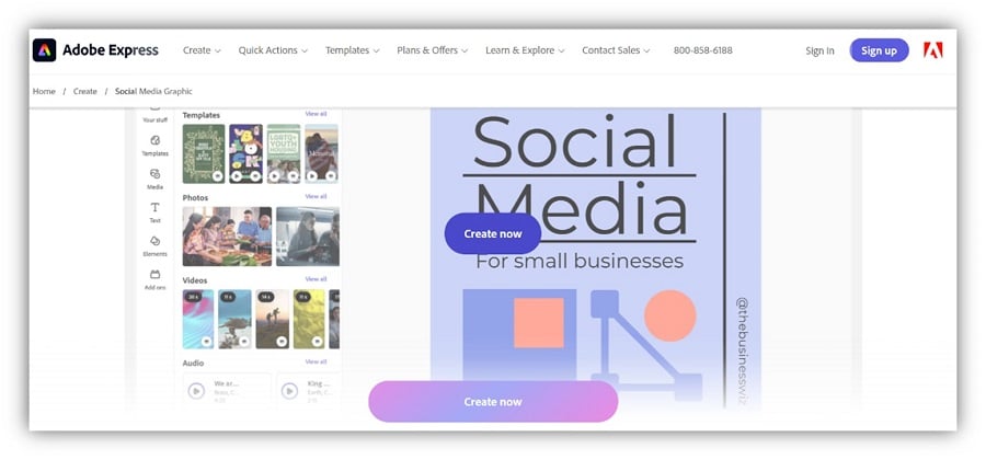
Adobe Express
Similar to the above, Adobe Express is a free tool that helps you quickly generate and edit social media graphics complete with templates and stock content.
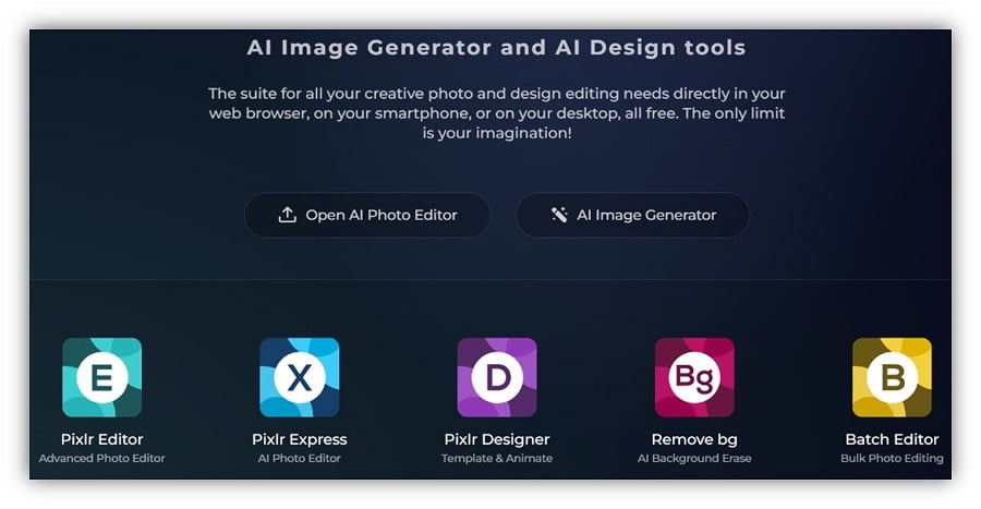
Pixlr
Pixlr is an AI-powered social media image editing tool. It uses artificial intelligence (AI) to either fully create an image for your business, or you can also edit your own images using AI design tools.
🤖 Find more ways to use AI in social media content and beyond with our free guide to AI in marketing!
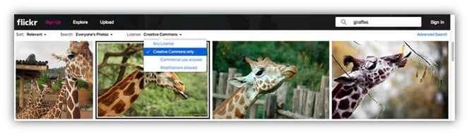
Flickr
Flickr makes it easy to find TONS of CC-licensed materials by modifying Flickr search parameters.
Pixabay
Pixabay is a great source for free photos and free vector illustrations. The best thing about it? You can use these images and illustrations without attribution, even for commercial purposes. Just be sure to steer clear of the Shutterstock ad photos that show up within the results for free photos—those come with a cost.
Free images
Free Images has lots of free high-quality stock photos and graphics to choose from. Avoid the “premium” photos on the top line of searches which are not free.
Open Clipart
Open Clipart offers free and easy clip art to use with other photos to create a new, customized piece of content. Open Clipart is a gigantic resource of free clip art, with unlimited commercial use.

This clip art and more could be yours!
Social media image size templates
Use these handy, pre-fitted social media image size templates to jumpstart your own social media image creation.
Get the templates: [Facebok/Instagram image posts] [Snapchat Geofilters] [LinkedIn image posts] [Twitter image posts] [Pinterest Square pins] [YouTube channel banners]
5 more social media image sizing tips
As you start on your journey to finding the right social media images for your business, here are a few final quick tips.
💡 Want even more marketing tips and tricks? We’ve got you covered with our free list of over 130 of the best online marketing tips for more traffic, leads, and sales.
1. Remember your profile pictures and logos will likely default to a circle icon
While you may upload a square image as your primary logo or profile picture across platforms, know that some social media sites display these in a circle by default. Try to keep the most important creative elements at the center of your image.
The right social media image size strategy can help you avoid off-center images like these!
2. Simplicity is key
The social media image size list above shows that, on some platforms, your content will inevitably be cropped automatically. While it can be tempting to create images and videos that are jam-packed with promotional assets, it’s best to keep your social content as simple and clear as possible so that it can be easily viewed on any device at any size.
3. Balance your social media image quality and quantity
When it comes to social media image sizing, it’s better to put out a few high-quality images on each of your marketing channels rather than overload with lower-quality images for the sake of having extra content. Upholding your business’s online reputation with clean and consistent social media posts and ads should be the focus.
This business is selective with its posting schedule, only posting the highest-quality videos of its products in use.
4. Keep your branding consistent
Brand consistency can be a common small business challenge when dealing with social media image sizing. This is understandable, as you’re trying to balance content that fits in your desired placements while also maintaining your brand messaging. Using a style guide and social media policy can be a good starting point to ensure all your images and videos follow a common theme.
5. Use AI… with caution
AI in digital marketing will continue to trend in the coming years. In fact, AI statistics show that AI is expected to see an annual growth rate of 37% from 2024 to 2030. There are tons of AI-powered tools popping up that can make your life a lot easier when it comes time to resize a social media image.
However, it’s critical to edit your AI-generated images every step of the way. Generative AI can be you get through the initial mock-up phase of a social media image or video, but you know your business best, and you’ll want you and your team to be manually evaluating the quality of your AI-edited content before it goes live.

This AI infographic proves the importance of generative AI tools in the small business content creation process.
Use this social media size guide year-round
When you’re in a pinch (pun intended) and feel your social strategy is stretched thin (again, pun intended), these social media image size guidelines can be a huge help. Just be sure to always prioritize your business’s social media goals and brand messaging as you adjust image or video sizes to ensure your content is of the highest quality. If you’re ready to kick your social media content strategy up a notch, see how our solutions can help you run with these sizing guidelines to bring your campaigns to life!

Meet The Author
Susie Marino
Susie is the Senior Content Marketing Specialist for WordStream and LocaliQ, where she uses her experience as a PPC consultant to share tips, tactics, and best practices in the ever-evolving marketing and advertising space. Susie’s work has been featured in publications such as Search Engine Land, MediaPost, Social Media Today, and others. Outside of work, Susie loves to get outside for some snowboarding or (once the cold weather melts away) hiking!