If you’re writing marketing copy and want it to convert better, this is for you. After 15 years of writing, it’s become clear to me that the biggest conversion lifts actually come from a few tiny copy tweaks. No massive rewrites. No new voice-and-tone workshop. Just small, human-centric decisions that make the content feel easier to read and invite more trust. And this is not a gut feeling. Good copy has twice the impact on conversion rates compared to design. Meaning: your words matter more than people think.
But, as we’ve seen with the rise of AI, words alone are not the answer. LLMs still can’t replace good judgment—knowing which sentence to keep, which one to cut, and where a reader is likely to hesitate. Conversions don’t happen because text exists. They happen when the right sentence meets the right reader at the right moment—with the right amount of clarity, confidence, and “okay, I get it.”
These 15 tiny tweaks keep performing. I return to them daily because they keep working regardless of tools. They rely on pattern recognition from thousands of real-world pages and data points. Think of them as your “last mile” work—the part where a page stops sounding like copy and starts feeling more like something a real person would say, believe, and ultimately act on.
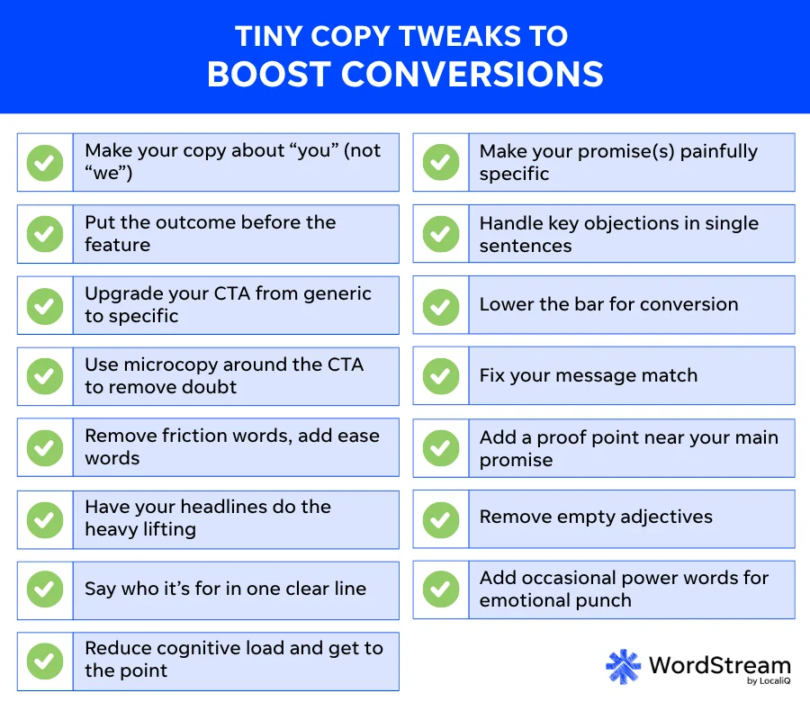
Contents
- Copy tweaks to boost conversions
- Make your copy about “you” (not “we”)
- Put the outcome before the feature
- Upgrade your CTA from generic to specific
- Use microcopy around the CTA to remove doubt
- Remove friction words, add ease words
- Have your headlines do the heavy lifting
- Say who it’s for in one clear line
- Reduce cognitive load and get to the point
- Make your promise(s) painfully specific
- Handle key objections in single sentences
- Lower the bar for conversion
- Fix your message match
- Add a proof point near your main promise
- Remove empty adjectives
- Add occasional power words for emotional punch
- Why these tiny tweaks keep working
The tiny copy fixes that boost conversions
You can apply most of these to landing pages, ads, emails, product pages, articles, reports, and even “boring” things like forms and confirmation screens. Sure, you won’t always need all 15 for a single piece of content, but it can act as a decent checklist. Try it out, and see what sticks.
1. Make your copy about “you” (not “we”)
Most websites sound like companies talking to themselves. When copy is based around “we,” readers have to translate that into their own reality. That extra mental step costs attention and momentum. “You”-first copy removes that friction and has been shown to make people feel personally responsible for the problem being described, increasing the likelihood that they’ll act.
| The tiny tweak | Rewrite company-centric hero sections, intros, and bullets to speak directly to the reader instead. |
| Example | Don’t: We help startups optimize their onboarding. Do: You get smoother onboarding, turning trial users into customers. |
| Why it works | Relevance is the first conversion filter. When readers immediately see themselves in the copy, they’re more likely to keep reading. |
🧠 Want copywriting psychology insights? Download our free guide >> 25+ Brilliant Ways to Use Psychology in Your Copywriting
2. Put the outcome before the feature
Features don’t convert on their own. Outcomes do. When value is buried behind explanations, readers lose interest before they understand why they should care.
| The tiny tweak | Lead with the result the reader gets, then describe the feature behind it. |
| Example | Don’t: Our platform has automated reporting. Do: See what’s working, in seconds, through automated reporting. |
| Why it works | People scan for value first. Clear outcomes give them a reason to stay long enough to understand the “how.” |

3. Upgrade your CTA from generic to specific
People skim everything—even buttons. If someone reads nothing but your headline and your CTAs, they should still understand what happens next.
| The tiny tweak | Replace vague CTAs with action + outcome. |
| Example | Don’t: Learn more Do: Get the free landing page checklist |
| Why it works | Specific CTAs act as micro-promises. The click feels safer because the outcome is clear. |
📚 Free guide download >> The 42 Best Call to Action Phrases Ever (& Why They Work)
4. Use microcopy around the CTA to remove doubt
Hesitation peaks right before a click. Tiny clarifications at that moment can quietly save conversions.
| The tiny tweak | Add short copy that addresses time, risk, effort, what happens next, or privacy. |
| Example |
|
| Why it works | Microcopy answers unspoken questions and reduces anxiety at the exact moment it matters. |
5. Remove friction words, add ease words
Some words feel heavier than others. They add emotional resistance to already fragile decisions—and research into plain language consistently shows that simpler, more familiar wording helps people understand and complete tasks more easily.
| The tiny tweak | Replace friction-heavy verbs like submit, process, or complete with lighter alternatives. |
| Example | Don’t: Fill out the form Do: Tell us where to send it |
| Why it works | Reducing friction by even a small amount can noticeably improve completion rates. |

6. Have your headlines do the heavy lifting
Headlines aren’t decoration. They’re the clarity layer of the page. If they’re vague, the whole page feels vague.
| The tiny tweak | Write headlines that communicate value or proof. Avoid abstract section titles. |
| Example | Don’t: Our solution Do: Get clarity on which campaigns to fix first |
| Why it works | Many readers skim headlines only. Strong headlines let them understand the page without reading paragraphs. |
Get headline formulas to help you get unstuck here.
7. Say who it’s for in one clear line
Most visitors spend the first few seconds deciding whether a page is relevant to them.
| The tiny tweak | Add one explicit “This is for…” line near the top of the page. |
| Example | “For small marketing teams who don’t have time to manage ads full-time.” |
| Why it works | Clear audience targeting makes the right people feel seen and filters out the wrong ones. |
8. Reduce cognitive load and get to the point
Extra thinking kills conversions. Overexplaining, long sentences, and throat-clearing intros slow people down.
| The tiny tweak | Cut warm-up sentences, shorten long lines, remove nested clauses, and make every sentence do one job. |
| Example | Don’t: In today’s fast-paced digital landscape (iykyk)… Do: Here’s how to fix your landing page without rewriting it. |
| Why it works | People convert when the path feels easy. Less mental effort means fewer drop-off points. |
9. Make your promise(s) painfully specific
Vague promises feel cheap. Specific promises feel credible, even when the numbers are small.
| The tiny tweak | Replace general claims with concrete outcomes, ideally with numbers or ranges. |
| Example | Don’t: Improve conversions Do: Increase demo requests by 20–30%. |
| Why it works | Specifics build trust and make benefits easier to imagine. |
10. Handle key objections in single sentences
Every offer triggers a default objection. Ignoring it doesn’t make it go away.
| The tiny tweak | Add one short line that disarms the most common concern. |
| Example |
|
| Why it works | Acknowledging objections builds credibility and reduces silent resistance. |
11. Lower the bar for conversion
Not everyone is ready for a sales call. High-commitment CTAs push away early-stage or cautious visitors. Adding smaller, safer steps in addition to your preferred CTA helps you capture people who would otherwise leave without taking any action at all.
| The tiny tweak | Offer multiple CTAs with different levels of commitment that support each other as well as different users’ maturity stages. |
| Example |
|
| Why it works | More entry points capture more intent without forcing a decision too early. Now, instead of losing two-thirds of your traffic, you’re capturing the ready-to-buy, the curious-but-not-sold, and the just-browsing crowd. |

12. Fix your message match
If the promise that brought someone to the page isn’t reflected on the page itself, something feels off—even if the copy is good.
| The tiny tweak | Echo the click-triggering promise in the hero or opening line. |
| Example | Ad: Free website audit in 24 hours. Hero: Get a free audit of your website in 24 hours—so you know exactly what to fix. |
| Why it works | Message match reassures visitors they’re in the right place. |
13. Add a proof point near your main promise
Trust accelerates conversions—especially when people can see clear social proof, which research consistently shows is one of the strongest signals behind a purchase decision.
| The tiny tweak | Add a short credibility anchor near the hero or main CTA. |
| Example |
|
| Why it works | Even small proof signals dramatically increase perceived reliability. |
14. Remove empty adjectives
Buzzwords don’t persuade. They dilute the meaning and make your copy sound generic. If you can delete an adjective without changing the meaning of the sentence, it’s probably filler.
| The tiny tweak | Delete empty adjectives or replace them with outcomes or specifics. |
| Example | Don’t: Cutting-edge automation Do: Automation that reduces reporting time by 80% |
| Why it works | Clear, concrete language feels more honest and believable. |
15. Add occasional power words for emotional punch
Some words exist to add personality, honesty, and edge. Like this. And this. But probably not this. I don’t see these as fillers, but “lifters.” Used once in a while, they humanize your copy. They’re often referred to as “power words” because they trigger emotional responses even when they don’t add informational value.
| The tiny tweak | Use brand-aligned power words when emphasis or attitude adds value. |
| Example |
|
| Why it works | Power words don’t improve clarity. They improve voice, memorability, and emotional connection. If you’re speaking to your audience, the way your audience is speaking, you’ll build trust. |
💪 Want a jumpstart on the best power words to use in your marketing copy? Free download: 135 of the Best Words & Phrases for Marketing with Emotion
Why these tiny tweaks keep working
These small improvements compound because they’re grounded in how people actually read, hesitate, and decide—not in templates or best-practice checklists. They focus on clarity, relevance, and the subtle trust gaps that determine whether someone clicks, scrolls, or leaves.
And let’s be honest: no one applies every one of these perfectly every time. But after editing thousands of landing pages, onboarding flows, emails, ads, and articles, certain patterns become hard to ignore. You start to see where people reliably get bored, where they get confused, where they hesitate—and which small changes consistently move them forward. These tweaks aren’t rules; they’re a reliable baseline for you to explore.
Boost conversions through human-driven decisions
If you take one thing away from this article, let it be this: You don’t need a redesign or a full rewrite to improve conversions. Most of the time, the biggest gains come from making a handful of small things better—clearer headlines, more specific promises, easier next steps, and fewer words that make people stop and think.
Fix one page, then the next. Over time, the difference between copy that looks good and copy that actually works becomes very obvious. Not because of big changes, but because the small ones add up where it counts.

Meet The Author
Oskar Duberg
Oskar is a Swiss-based Swede—a freelance writer, content marketer, and brand consultant who helps B2B tech, agencies, and creative companies communicate with clarity and personality. He’s spent over a decade turning complex ideas into content that connects, creating strategies, stories, and brand identities for global players and respected publications. Above all, he loves writing and believes that every great brand starts with words that sound human.