Google has just released a nifty new addition to Google Labs. Today we welcome Google Correlate.
Google Correlate – The Opposite of Trends
While Google Trends and Google Insights allow you to enter a search term and see the search trends, Google notes that:
Researchers told us they want to enter the trend of some real world activity and see which search terms best match that trend. In other words, they wanted a system that was like Google Trends but in reverse.
Google Correlate is the response, allowing you to upload your own data series and get back a list of search terms that correspond with the real world trend.
Taking Google Correlate for a Test Drive
Upon first learning about Google Correlate, I was a little more than confused; science has never been my strong suit. But the Google Correlate Tutorial is very helpful in explaining the details of how Google Correlate works in (mostly) layman’s terms.
Excited to experiment with Google’s latest plaything, I was at first put off to find that you are prompted to input your own time data series. Being quite allergic to anything more scientific than Bill Nye the Science Guy, naturally I don’t just have time data lying around.
No worries, Google thought of that.
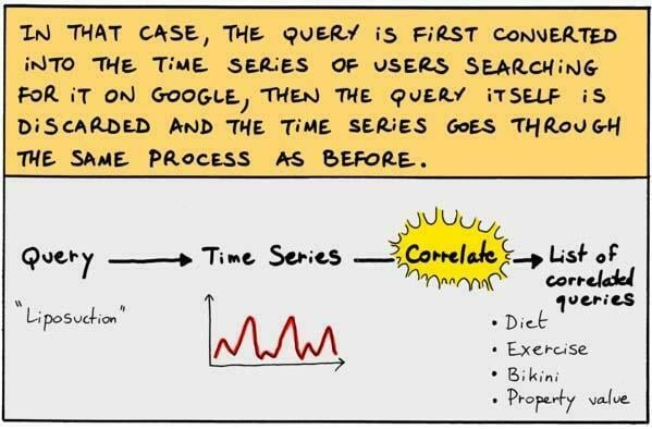
What you can do instead is put in your own search query, and then Google Correlate creates time series data based off of the query. Google has a nifty little comic book form to explain:
Correlating with “Sunflower”
Testing this process out, I used the term “sunflower.” Google Correlate converts my query into a time series and pops back a list of queries that correlate when “sunflower” is searched.
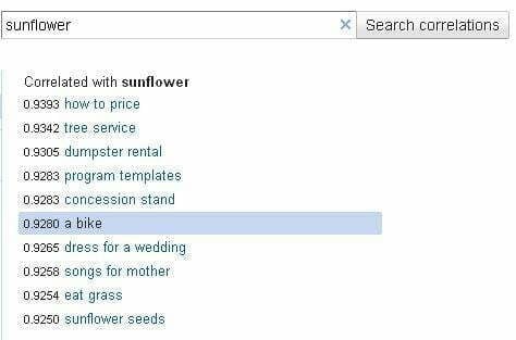
It seems appropriate that terms like “dress for a wedding” and “a bike” correlate with “sunflower,” all reminders of spring time.
When highlighting the term “a bike” Google Correlate shows me a line chart below. Not only do I get to see how the two terms correlate, I also get to see how searching for these terms has generally increased quite a bit over the years as people go to Google more often to answer their questions.

Correlations by US State
Google Correlate also has the option to look at queries whose popularity correlates with a data set across space instead of time, using US states.
Google uses the example of creating a data set which is 1 for the New England states and 0 for all other states.
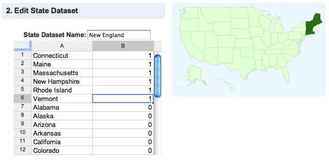
Using this data set, you are shown queries that correlate with New England. Google had the New England data all ready for me, so I used that and found that, unsurprisingly, “lobster cooking time” was a popular search query.
Selecting that query, Google Correlate gives a map on which you can scroll over and see which states are most connected with this query.
Known for their lobster paraphernalia, Maine was the New England state with the most “lobster cooking time” queries.

In addition, I can view that same data in a scatter plot if I choose.
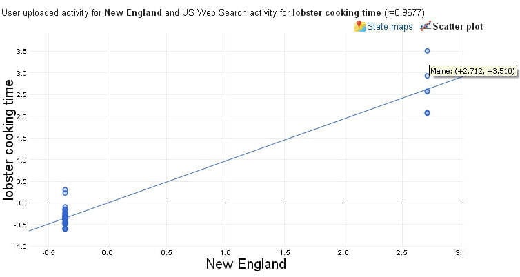
Google Correlate will be a big help for researchers, and could be a handy tool for some marketing strategies as well.
Are there certain times of the year people are more likely to search for your product?
What queries are being searched alongside yours?

