Getting prospective customers to do what you want them to do can be like herding cats. They abandon shopping carts before checking out, they don’t sign up for your beautifully written newsletter, and they don’t even have the common courtesy to read your blog posts all the way to the end.

However, there is hope. In today’s post, I’m going to show you 11 creative and effective call to action examples, and explain why they work so well. So grab a coffee, a pen and paper, and get ready for the deluge of conversions you’re about to experience.
Call to action examples
To get your prospects to do what you want, all you have to do is include a compelling call to action on your website and in your marketing campaigns. Simple, right? Well, actually, call to action marketing is harder than it sounds. Fortunately, there are many companies who have already done the hard work of A/B testing their call to action buttons, so you don’t have to. Let’s take a look.
1. Crazy Egg – ‘Show Me My Heatmap’
We’re big fans of Crazy Egg here at WordStream, and not just because they offer a cool product. Crazy Egg’s messaging is also right on the money, as demonstrated by this compelling CTA:
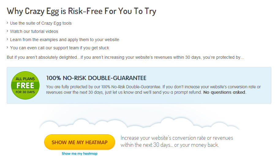
CrazyEgg’s call-to-action: compelling, bold, irresistible
Why this call to action works
This call to action hits several major marks. First, it establishes why trying out Crazy Egg is risk-free, using simple language that reinforces the safety of trying out their service.
It lists several reasons why you’d want to do this, using simple verbs. Finally, the CTA button itself (“Show Me My Heatmap”) taps into the power of using the voice of the customer, making it irresistible.
2. Manpacks – ‘Build a Manpack’
Speak your prospective customers’ language and you can get them to do pretty much whatever you want. Case in point, this call to action example from men’s grooming product site Manpacks.
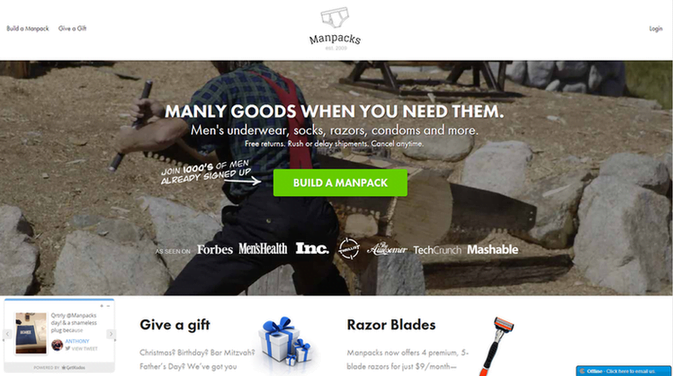
Man, reading Manpack’s call-to-action: “Now you’re speaking my language”
Why this call to action works
On their own, underwear, razors, and condoms might not be terribly exciting, but appeal to men’s desire to build something and you’re onto a winning strategy.
By combining imagery that might otherwise be stereotypical (a man in a plaid shirt sawing timber) with strong phrasing (“Build a Manpack”), this company makes putting a male grooming gift box together sound as exciting as building a house – or a log cabin in the woods.
3. GiftRocket – ‘Send a GiftRocket’
Let’s face it – gift certificates and off-the-shelf greetings cards are pretty much the laziest ways to show someone you care. However, GiftRocket manages to combine the two into a surprisingly compelling package that can actually result in a decent gift for the people you love.
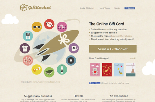
GiftRocket’s call-to-action: “Send a GiftRocket”
Why this call to action works
This CTA is so effective because it doesn’t ask you to “Sign Up Now” or “Get Yours Free,” but allows you to “Send a GiftRocket,” a much more interesting and exciting way to send a gift.
This landing page features simple yet striking imagery combined with short sentences and active verbs, resulting in a compelling experience. Why send a gift card when you can Send a GiftRocket?
4. Contently – ‘Talk to Us’
It’s no secret that Contently puts out some of the best content around, but their landing pages also incorporate some great calls to action.
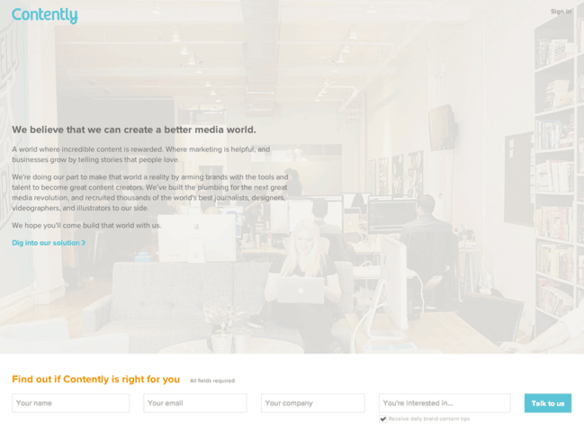
Contently’s call-to-action is as inviting as its logo
The design of this landing page is a little unorthodox. Personally, I think they could get away with scrapping the “You’re interested in…” field, but the CTA itself – “Talk to us” – is brilliant.
It could have said something bland and generic like “Submit” (which would have been borderline criminal), but instead uses friendly, approachable language that reinforces the importance of relationships to Contently’s operation. It also hints at what prospects can expect from Contently, which is dialogue – not being sold to.
5. Less Accounting – ‘Let’s Do It!’
Getting prospects to take an action that might be perceived as risky – even if it will ultimately benefit their business – is really hard. This is especially true for SaaS companies, and even more so for firms offering financial software. This is why our fifth kick-ass call to action example, from Less Accounting, really shines.
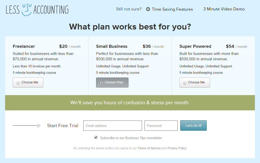
Less Accounting benefits from muted colors and an upbeat, “in it together” CTA
Why this call to action works
This landing page makes use of a muted color palette to evoke calming emotions, but the CTA is what sets this example apart.
Yes, they’re asking the prospect to sign up a free trial of their accounting software, but the way they’ve asked – “Let’s Do It!” – is particularly compelling. Firstly, the CTA itself implies a partnership; they’re not just trying to get their hands on the prospect’s personal data. Secondly, the use of an exclamation mark conveys excitement about the product itself, which is quite an accomplishment, given the nature of the product. Overall, a great example of a kick-ass call to action.
6. Square – ‘Get Free Card Reader’
Offering something your prospects really want is a great way to increase conversions. If you can manage this, your CTA doesn’t have to be particularly innovative or exciting, as demonstrated by this landing page by Square.
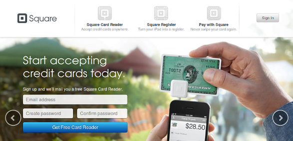
The word “get” stands out in Square’s call-to-action
Why this call to action works
This landing page itself appeals to small-business owners by highlighting the benefits of using their product, namely being able to accept credit cards for transactions – something that was previously out of reach for many merchants before Square came along.
The CTA itself uses simple language that can be successful for many types of business, as the inclusion of the word “get” is often highly motivating. The fact that Square doesn’t charge for its product is likely to be genuinely surprising to many prospects, which reinforces the value proposition of the offer and makes it more tempting.
Between the minimal form (just three fields), the strong indicator of potential benefit (“Start accepting credit cards today”) and the great offer (the free Square card reader), this landing page/CTA combo is a winner.
7. Basecamp – ‘Give Basecamp a Try’
Everything about project management software platform Basecamp is designed with ease in mind. From the style and tone of its website copy to its minimal, approachable design, Basecamp intends to simplify life for project managers everywhere.
Basecamp’s call to action is another variation of a tried-and-true CTA – the free trial – but features some subtle, and effective, differences:
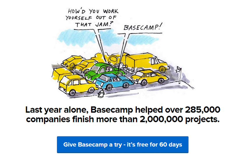
“What do you have to lose?” asks Basecamp’s call-to-action
Why this call to action works
Basecamp’s CTA is effective because it simultaneously reinforces the risk-free nature of the free trial while using casually persuasive language. “Give Basecamp a try” is a lot less intimidating than something more direct such as “Start Free Trial Now.”
In fact, the CTA’s diction almost suggests a blasé attitude – sort of like, “What’s the worst that could happen?” This is precisely what Basecamp is trying to achieve, as they’re so confident that users will try (and subsequently love) the product, they don’t need to make an aggressive pitch with a potentially confrontational CTA. Very clever.
8. My Perfect Resume – ‘Create My Resume’
Writing a resume from scratch can be a pain in the ass, a fact that My Perfect Resume capitalizes on excellently with its service.
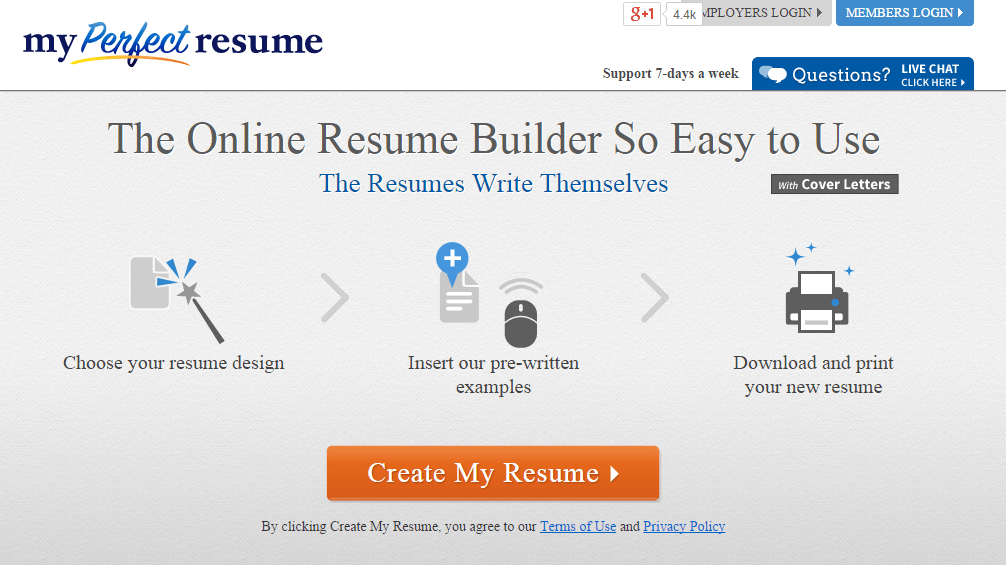
My Perfect Resume’s call-to-action benefits from the tedium typically associated with resume building
Why It Works
This call to action example, by itself, is very simple. However, its positioning alongside the step-by-step graphics above it make it extraordinarily clickable.
The one-two-three progression flow suggests that My Perfect Resume does the lion’s share of the work for you, making the “Create My Resume” button a very tempting proposition for people who lack the time or inclination to write their resume themselves. A great example of how a simple CTA, combined with graphical elements, can be very compelling.
9. Point Blank SEO – ‘Be Awesome’
Newsletter sign-up CTAs can be tough. Yes, you want prospects to “Sign Up,” but asking them to sign up is, well, boring. If you’re struggling to boost the readership of your newsletter, take a page out of Point Blank SEO’s book:
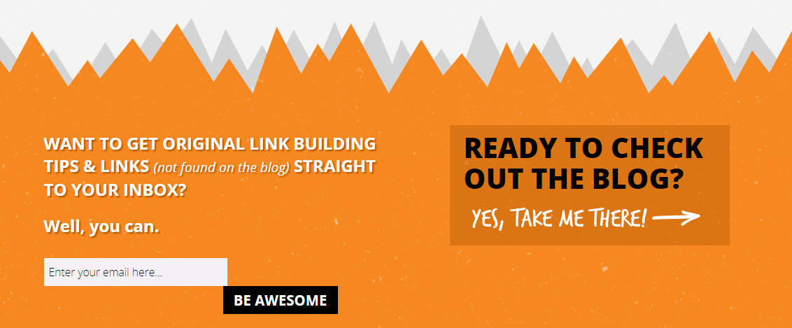
Point Blank SEO’s CTA doesn’t take itself too seriously
Why It Works
This CTA is highly effective for several reasons. Firstly, rather than ask you to click a boring “Sign Up,” or worse, “Submit” button, Point Blank SEO make signing up for their newsletter fun and even somewhat comical – after all, who doesn’t want to “Be Awesome”?
Secondly, it creates a sense of urgency and immediacy by using a direct call to action in an interesting way. This is reinforced by the navigational link to the Point Blank SEO blog to the right, which uses an exclamation mark to create excitement about a simple navigational element. Finally, the color scheme – bold orange and black – is visually striking, which further enhances the CTA and navigational cue to the blog.
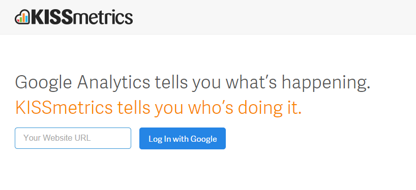
10. KISSmetrics – ‘Log In With Google’
No blog post about calls to action would be complete without mentioning KISSmetrics. Arguably one of the simplest of these examples, this CTA from the KISSmetrics homepage is also one of the most persuasive:
KISSmetrics’ CTA piggybacks off Google’s credibility
Why It Works
Rather than launch into a detailed breakdown of KISSmetrics’ bells and whistles, the homepage simply explains what the platform does.
However, what makes this CTA so compelling is that it requires as little input and effort from the user as possible – just a URL. The “Log In with Google” button tells users exactly what they can expect, and makes it ridiculously easy for them to get started. The phrasing of the explanatory text also serves to pique users’ curiosity, and the mention of Google reinforces the prospects’ need for security – no mention of OAuth or any other verification technology necessary.
11. Quick Sprout – ‘I Want To…’
Our final kick-ass call to action example comes from Neil Patel’s Quick Sprout.
Similarly to newsletter sign-ups, encouraging users to engage with educational content can be challenging, particularly as this traffic might not necessarily be considered a qualified lead right off the bat. That doesn’t make these visitors any less valuable, but it does require a different approach.
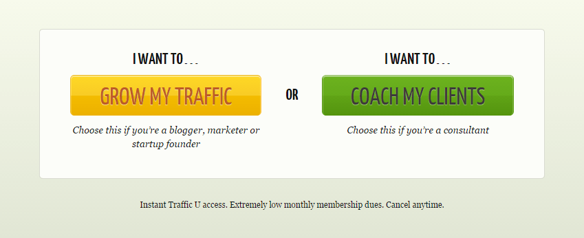
QuickSprout’s CTA says, “What do you want? We can give it to you.”
Why It Works
To drive traffic to Quick Sprout’s educational content, the site utilizes two simple, yet highly compelling, CTAs – both of which manipulate prospects’ desire to solve a problem.
The first appeals to the more “selfish” goal of driving traffic to the prospect’s own website. Helpfully, this CTA button offers a suggestion based on the type of user, which makes it even easier to choose one of the two options (and reduces the likelihood that the prospect will bounce away without taking any action).
The second CTA reinforces the value that Quick Sprout’s educational content can offer to agencies and consultants by creating a deeper connection with the content itself by highlighting the payoff of learning. It suggests that, by reading (or downloading) Quick Sprout’s content, users can make themselves more useful (and, by extension, essential) to their clients, which strengthens the desire to become more effective at their job and capitalizes on their desire for greater job security or a bigger paycheck. Again, very clever.
Be Awesome
The best call to action phrases are clear but specific and create urgency that drives the user to action. If you have a truly irresistible offer, your call to action should sell its value.
We hope these examples gave you some food for thought for your own CTAs!
Ready for more call to action examples?

Meet The Author
Dan Shewan
Originally from the U.K., Dan Shewan is a journalist and web content specialist who now lives and writes in New England. Dan’s work has appeared in a wide range of publications in print and online, including The Guardian, The Daily Beast, Pacific Standard magazine, The Independent, McSweeney’s Internet Tendency, and many other outlets.
Recommended for you

![Search Advertising Benchmarks for Your Industry [Report]](https://www.wordstream.com/wp-content/uploads/2024/04/RecRead-Guide-Google-Benchmarks.webp)