Call-to-action (CTA) buttons are the buttons you use in your website and on your landing pages to guide users towards your goal conversion. It’s the part of the landing page that the user needs to click in order to take the action you want them to take. CTA buttons can vary in style and size depending on your goal conversion and website style. Some common examples of call-to-action buttons are:
- Add to cart buttons
- Free trial sign-up buttons
- Download buttons
CTA buttons have a very specific goal: to get your web visitor clicking and completing a conversion.
Today we’ll be discussing 17 call-to-action button best practices to help you get a higher CTR and more conversions out of your beautiful buttons.
Call-to-Action Button Best Practices to Get the Click
Use these tips and best practices to get all the clicks! And when you’re done, check out these 36 Best Call to Action Phrases…Ever!
1. Use Action-Packed Text
Call to action buttons should feature striking, action-oriented text. Substitute boring words like “submit” and “enter” for more action packed words like “get,” “reserve,” and “try.” Your action words should go along with specific text relating to your offer like:
- Try Our Free Trial
- Reserve Your Seat
- Download Whitepaper
Udemy’s “Take This Course” button text gives a a great offer-related action.

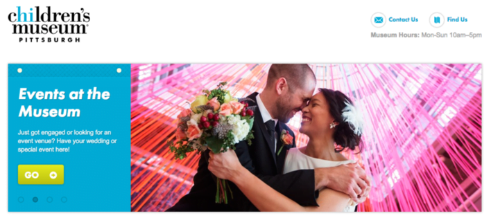
The Children’s Museum of Pittsburgh has a nice site design, but their button text could be better. Instead of boring “Go,” why not try “Book An Event” ?
2. The Colors Duke, The Colors.
#ThingsOnly90sKidsWillUnderstand. Your button color matters. It matter a lot. In fact, if you’re going to take only one tiny single piece of advice from this post, it should be to give careful consideration to your button colors.
Generally speaking, green and orange buttons are reported to perform best. Ultimately though it will depend on your site design, as contrasting colors work best to make striking buttons that stand out. You wouldn’t want a green CTA button on a green background.
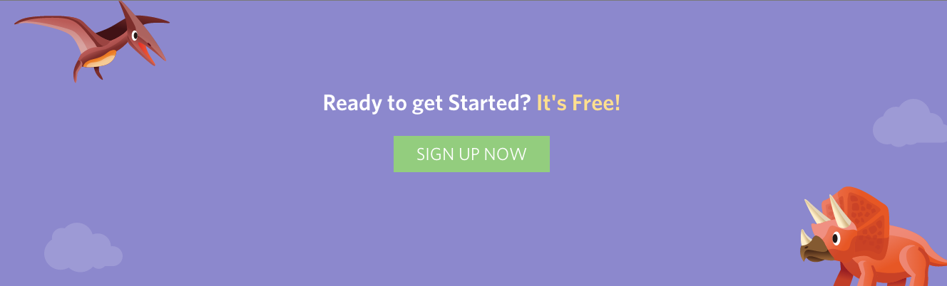
Green and purple are contrasting colors – plus those dinos are adorable
If you’re not sure what looks best, run the super sophisticated squint test and see what comes off most appealing. However, if you really want to know what color CTA button will work best on your page, testing is the only way to go!
Check out our guide on color psychology—it’s pretty interesting how different colors inspire different emotions!
3. Snazzy Button Shapes
Button shape can also play a big role when attempting to craft the perfect CTA button. You’ll need to consider whether you want to go with a more rounded button shape or a button with square edges. Hard to say what works better here as both style are common and both can perform well in different settings. Ultimately you’ll have to test shapes and see what works best for your biz!
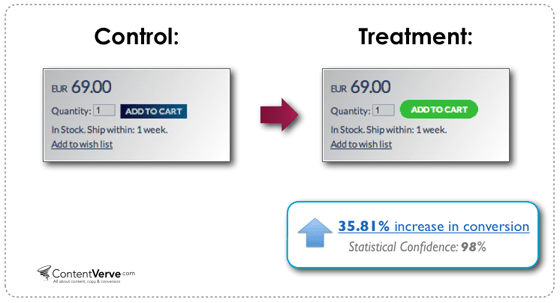
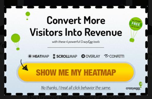
In ContentVerve’s test, a rounded green button did better than a blue rectangle
4. Large and Legible Text.
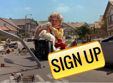
Your button text should be large enough to read easily, but not so large that it looks obnoxious or intimidating. You want to avoid a “Honey, I Blew Up the Kid” situation.
While it may seem absurd to imply that large text makes people feel anxious or uncomfortable, many users do experience subconscious distaste for threateningly large lettering. Your button text should be big enough to draw attention, but not so big that it completely overwhelms the rest of the content.
5. Button Text Shouldn’t Go On and On and On
We discussed earlier how it’s good to use specific action-oriented button text. Considering that, it may be tempting to stretch out your button text, but that’d be a bad move. Ideally you’ll want to keep that button text to two or five words.
This CTA button is probably OK, but it’s nearing the red zone
📣 Free download >> The 36 Best Call to Action Phrases Ever (Real Examples +Tips!)
6. Go With First Person Speech
Michael Aagard of Content Verve shared a study in which he discovered that changing button text from second person (“get your free template”) to the first person (“get my free template”) resulted in a 90% increase in clicks! See how changing your CTA button to 1st person (putting yourself in your customer’s shoes) affects your CTRs.
7. Create a Sense Of Urgency
Constructing a sense of urgency in your call to action buttons can yield some impressive click-through rates. For example, you could use button text like:
- Sign Up and Get 50% Off Today Only!
- Download the Build Apps E-Course for $30 $10!
Even just adding “now” builds a subtly sense of urgency for users:
- Register For The Ultimate PPC Webinar Now!
The example below does a nice job of creating a sense of urgency. My only issue with it is the red X marks – they are there to denote points of information, but to me it looks like they are sold out or cancelled events. That’s a dangerous misinterpretation!
8. Keep it Above the Fold
You always want to keep your call to action button above the fold so that users never miss it. As noted in an earlier post about landing page best practices, the important vital information should always be kept above the fold. The additional extra info should stay below the fold, where it remains assessable but not distracting.
9. Natural Hierarchy
Sometimes you’ll have other buttons on your web page that are not your main call-to-action conversion buttons. Those buttons should be less attention-grabbing than your main CTA button. For your non-CTA buttons, try using gray scale buttons or monochromatic colors. Your main call-to-action button should always be the biggest and brightest.
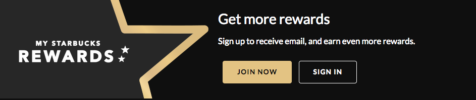
Starbucks does a nice job of clarifying their main CTA button while keeping within their color scheme
10. Use Button Copy for Value Proposition
You may notice that many buttons include the word “free,” as in, “Get My Free Ebook.” “Free” is an enticing word, and using that word in button copy emphasizes your offer’s value proposition. Consider your offer’s value proposition and how it might best be displayed in your call-to-action button.
11. Get Fancy With Button Graphics
In some cases, small arrows or graphics on your CTA button can positively affect click-through-rates. If you’re going to use graphics, make sure that your icons clarify rather than confuse the offer for users. For example, you would want to avoid using a disk download icon for a user who is registering for a webinar.
12. Bonus Button Text. There are some situations in call-to-action marketing where you may want to consider adding an extra line of information within your button text.
This practice is common with free trial buttons. For example, a free trial button might say “30 day trial, no credit card” in smaller text beneath the main “Start Your Free Trial” button text. This is valuable info that will encourage users to click through to begin their trial.
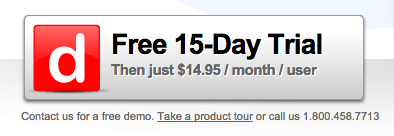
Example from Dashboard
This won’t always be necessary with all buttons, but when it fits, this extra information can help CTRs a lot.
Alternatively, you can put that extra information underneath or beside a button. Copyblogger refers to these elements as “click triggers.” Some examples of click triggers include:
- Testimonials
- Anxiety-Suppressing Info (e.g. No credit card required)
- Key Benefits
- Data Points (e.g. users see a 40% increase in shares when using X)
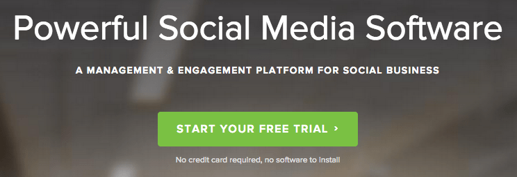
Example from Social Sprout
13. Cart Calls to Action
E-commerce sites will want to spend the most time A/B testing their cart/purchase buttons. Even small adjustments in cart buttons can dramatically affect conversion rates. Be sure to offer buttons for other payment options like PayPal.
Having a PayPal button can be a huge incentive – there have been MANY times ordering food where I’ve been too lazy to fish out a credit card and only move forward by the grace of PayPal.
14. Less is More When it Comes to Choices
Us humans tend to suffer from the choice paradox – we enjoy choosing between an apple or an orange, but present us with apples, oranges, dragon fruit, grapes, pomegranates, bananas, clementine, and mangos and our heads may nearly explode with indecision.
In one study by Mark Lepper of Columbia University, participants who were asked to choose one chocolate from a box of six were happier with their selection than participants who selected one chocolate from a box of 30. Keep your users happy by giving them fewer buttons to choose from!
If you do want to include multiple button choices, give weight to once choice over others to help funnel users towards a specific path. It doesn’t even matter what path really – users just wanted to be guided!
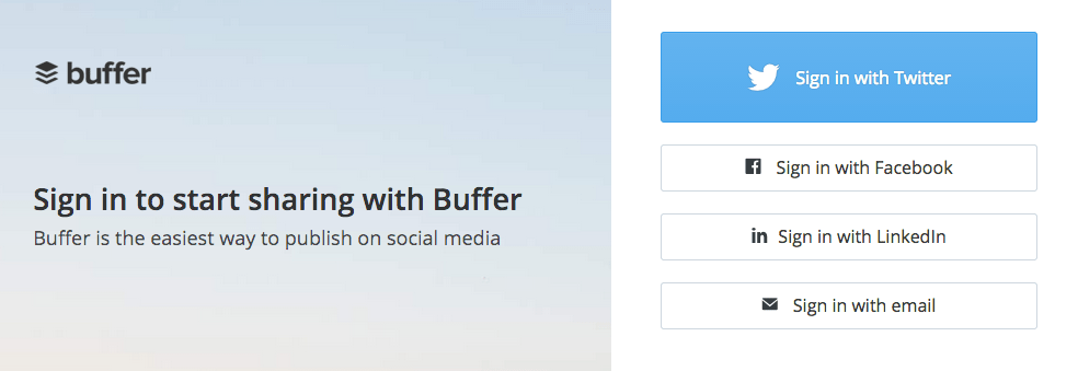
Buffer offers several sign-in options, but emphasizes one over the others
15. Follow the Natural User Flow
In Western culture, we read top to down and left to right. Keeping this natural reading flow in mind can help influence smart button placement. Call-to-action buttons placed towards the bottom or to the right of content often outperforms alternative placements.
Most importantly, never force users to backtrack in order to click a button – CTA buttons should appear in appropriate places that align with a user’s experience. For example, you would want to put a “sign up now” button in a spot where a user would find it after reading about your offer or product, not before, as it would make no sense for a user to sign up for an offer they know nothing about!
RELATED: 24 Unusual AND Effective Call to Action Examples You Can Copy
16. Widen That White Space
Your CTA buttons should always have a healthy chunk of white space surrounding them. White space helps call the users’ attention to your button and helps it stand out.
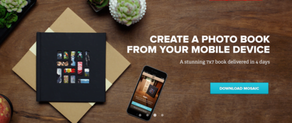
This CTA button from Mixbook has plenty of white space
17. Test Buttons Like Your Life Depends On It
Testing with CTA buttons is absolutely vital! If you haven’t done much A/B testing before (tsk tsk), the call-to-action buttons are a great place to start as even small, easy-to-make changes can have dramatic effects. Test placement, color, style, text – if you can think of it, you should test it!

Meet The Author
Megan Marrs
Megan Marrs is a veteran content marketer who harbors a love for writing, watercolors, oxford commas, and dogs of all shapes and sizes. When she’s not typing out blog posts or crafting killer social media campaigns, you can find her lounging in a hammock with an epic fantasy novel.
Recommended for you

![Search Advertising Benchmarks for Your Industry [Report]](https://www.wordstream.com/wp-content/uploads/2024/04/RecRead-Guide-Google-Benchmarks.webp)