The colors you use in your marketing and branding are foundational. You’ll use these to create your logo, your website, your ads, and so much more—which means you shouldn’t make these choices lightly. Instead, you should choose the colors you’re going to use in your branding and marketing strategically. How? The key is understanding color psychology and using the theory to your advantage.
Let’s get to it.
Table of contents
In this guide to understanding color psychology and using it to improve your marketing materials, we’ll cover:
- What is color psychology?
- Why does color psychology matter in marketing?
- How to use color psychology to improve your marketing.
What is color psychology?
Color psychology is the theory that certain colors elicit a physical or emotional reaction and, in doing so, shape human behavior. This isn’t quite as simple as seeing red and getting angry or seeing blue and feeling at ease—but almost. Medical studies suggest that the color red correlates to an increase in blood pressure, and the color blue corresponds with a decrease.
Because of this impact on behavior, color can play a big role in creating a mood. According to Architectural Digest, this makes choosing the right paint colors crucial for setting the tone of your home. Warm colors tend to energize, while cool colors tend to calm.
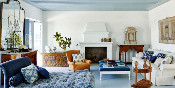
I don’t know about you, but I’m feeling calmer looking at AD’s aspirational blue living room.
The psychology of colors has a similar impact when it comes to your brand and your marketing strategies, and this leads us to the next section.
🚨 Speaking of psychology in marketing… Free guide download >> The 36 Best Call to Action Phrases Ever (& Why They Work)
Why does the psychology of color in marketing matter?
Color can play a big role in marketing—whether you’re paying attention to it or not. The colors that you use in your branding, including your logo, and your other marketing collateral evokes an emotional response in your audience, whether they realize it or not.
And as noted in our marketing psychology guide, we make decisions based on emotion, not logic.
Bottom line: You need to consider color psychology when you’re building your brand and creating your campaigns.
How to use color psychology to improve your marketing
Now that we’re clear on what the psychology of color is and how influential using the right or wrong colors can be in your marketing, here’s how to use color psychology to make your marketing even more effective.
1. Learn color psychology essentials
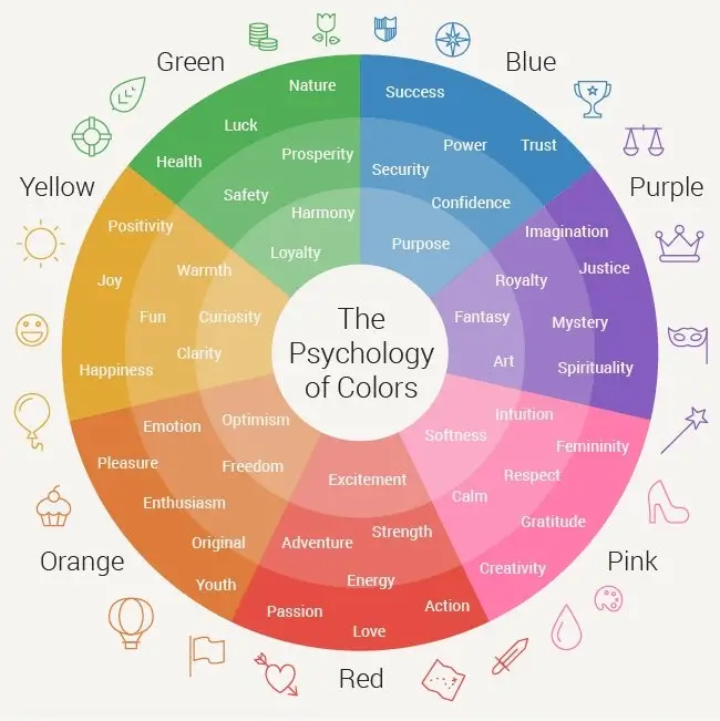
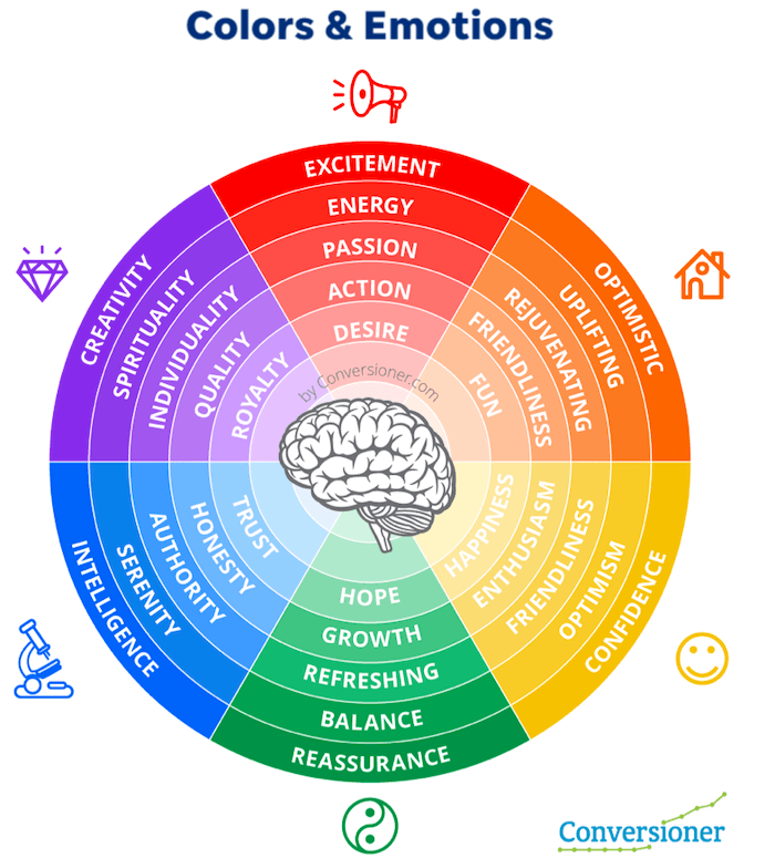
Familiarizing yourself with the basics can go a long way toward employing color psychology in your marketing. We covered earlier how red can evoke heightened alertness or anxiety, while blue can have an adverse calming effect. Here are some more fundamental color associations to consider with your emotional ads:
- Red: excitement, passion, anger, danger, action, anxiety, power.
- Orange: playfulness, friendliness, creativity, warmth, enthusiasm.
- Yellow: happiness, optimism, warning, joy, originality, enthusiasm.
- Green: Youth, vibrancy, vigor, nature, growth, stability.
- Blue: Calm, stability, depth, peacefulness, trust.
- Purple: Royalty, luxury, romance, introspection, calm.
Notice how there are some overlaps. You’re not limited to only one color—or one tone of that color—per emotion.
2. Start with emotion first
Whether you’re rethinking your brand colors or deciding on a palette for new ads, you need to start with the emotion you want your audience to have. Should they respond with fear? Curiosity? Confidence? Use these emotional ad copy examples for inspiration.
Once you know the desired outcome, make sure to choose the right color.
Take this example ad from a Lego campaign with the tagline “Make your own story.”
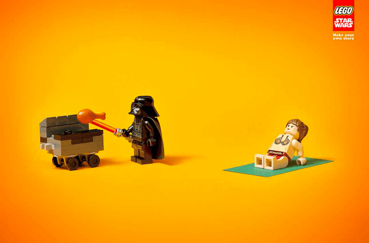
The ad shows a Lego Darth Vader grilling with Leia sitting in the sun hanging out nearby. It’s a playful scene with these Star Wars figures, dropping them into a casual, fun atmosphere to make a new story. It’s no wonder that the background is orange—an open, inviting color that inspires creativity.
📚 Free guide download >> 135 of the Best Words & Phrases for Marketing with Emotion
3. Get inspired by other brands
The best way to get better at using the psychology of color is to pay attention to ads, websites, and branding and how the colors make you feel. Check out the website for Bloomscape, an ecommerce plant website targeting Millennial and Gen-Z consumers.
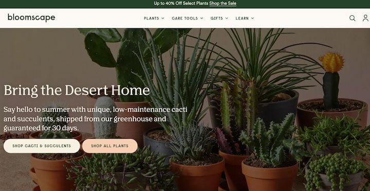
The forest green font and bar at the top toes the line between earthy and trendy. The cream is a homey natural accent that pairs well with the light peach, a warm, creative revision of Millennial pink. The variety of greens is offset with warm terracotta pots, as well as the red and orange accents on the plants. The effect makes me want to water and nurture my own plants, and maybe even buy a succulent or two.
4. Keep it consistent with your branding
When SEO company Reboot ran a study on logo recognition, 78% of participants were able to recall the primary color of the logo while only 43% were able to remember the company name.
If your audience remembers your brand by its color, then you want to make sure it’s the same and it’s everywhere. That’s why keeping your colors consistent with your branding is paramount, and the most successful brands recognize this. Remember the Dunkin Donuts rebrand to Dunkin a few years ago? All those image changes, same old but iconic color choices.
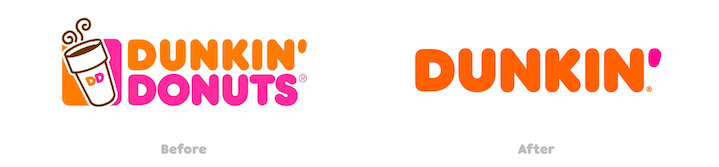
Dunkin’ is a good example because its branding is all over everything—with orange, pink, brown, as well as variations on these colors. It’s the multiple colors and variations that (in most cases) keep your branding from becoming flat or two-dimensional. This leads us to the next tip—giving yourself the right palette to work with.
5. Create a brand color palette
You want to keep the colors in your marketing consistent, but you don’t want to be forgettably one-note. Worse, this could look spammy. The solution is to have a color scheme to work with that allows for some variety but sets some standards.
So if you don’t already have a brand color palette, it’s time to make one.
Here are a few common types of color palettes:
- Analogous: Colors next to each other on the color wheel.
- Complementary: Opposite colors that create high contrast.
- Monochromatic: Different shades or tones of the same primary color.
If you’re looking for some help coming up with the palette or some inspiration, check out the free design tool Coolors. It contains example pallets and can automatically generate your own based on a starting color or even a photograph.
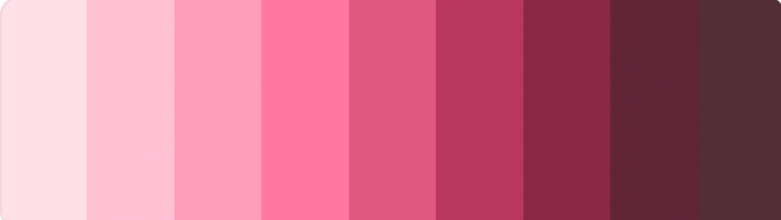
A monochromatic color palette from Coolors.
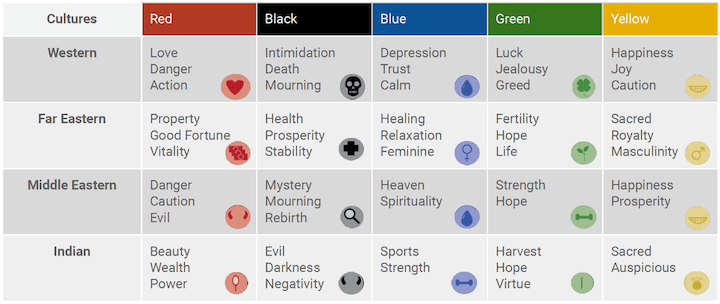
6. Keep cultural context in mind
Perception of color isn’t universal. In fact, MIT researchers found that the words that we have and use to talk about color varies by language. Some communities have three color categories, while others have up to 12—a significant range in categories, before even getting into individual colors.
It follows that psychology of color isn’t universal then, either. That’s why it’s important to keep cultural context in mind for your branding and marketing. Here’s an excellent cheat sheet visualization to use as a starting point:
7. Try to add some blue
If you’ve gotten to this point and you’re thinking that keeping track of cultural context, sticking with a palette, and relying on the color psychology basics is overwhelming and impossible, don’t worry. Getting versed in the basics and incorporating color psychology into your marketing workflow is going to take some time and some practice.
But in the meantime, here’s a quick rule of thumb: When in doubt, add some blue.
It turns out that blue is the most popular favorite color across the world. That might be one of the reasons that some of the world’s most successful brands have blue in their logos. Facebook, Twitter, Vimeo, American Express, IBM—the list goes on and on.
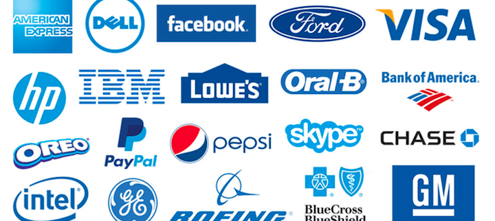
So if you’re looking for a shortcut or a sure thing, blue’s a safe bet.
8. Run color tests with your audience
Now, this might sound like I’m going against everything before. But the reality is that you can’t always predict how your audience will respond to a certain color—let alone certain shades, tones, or tints in your color palette. That’s where A/B testing comes in. Try testing two different color backgrounds in your ads or buttons on your website and see which your audience prefers.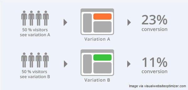
Then use that information. That’s the best way to leverage color psychology to improve your marketing. Test—and keep testing.
🧠 Want more copywriting psychology insights? Download our free guide >> 25+ Brilliant Ways to Use Psychology in Your Copywriting
Make color psychology work for you
It’s important to remember that color psychology will affect your marketing, period. Your audience will make judgments about how well your brand colors suit your business. They will react to a red or green or blue button more quickly. This will happen whether you’re paying attention to the psychology of color during your branding or marketing design.
Better to use it to your advantage. Here’s a quick recap of the tactics you can use to make color psychology work for you and your marketing goals:
- Learn color psychology essentials
- Start with emotion first
- Get inspired by other brands
- Create a brand color palette
- Keep cultural context in mind
- Try to add some blue
- Stay consistent with your branding
- Run color tests with your audience
Good luck!

Meet The Author
Céillie Clark-Keane
Céillie is Head of Marketing for Building Ventures, a VC firm focused on funding and mentoring early-stage startups in the built environment space. Previously, Ceillie led content strategy for Unstack and managed the award-winning blog at WordStream.


")