Calls to action are the keys to conversion, but they don’t exist in a vacuum. For any quality piece of content you see online, you’ll never just see a CTA button on an island with no context. Either the button or link itself has clear copy, or the content around it gives the proper context.

See for yourself…that a CTA without surrounding phrases is useless.
And the best part is, marketers are getting more and more creative with their calls to action each year. So, what makes a good call to action phrase? Today we’re going to share with you the best CTA phrases in seven categories:
- Blunt call to action phrases
- Relatable call to action phrases
- Powerful call to action phrases
- Subtle but smart call to action phrases
- Reverse psychology call to action phrases
- Funny call to action phrases
- Different call to action phrases
I’ll be providing screenshots and takeaways for each category, but if you want to skip to the full, text-only list of CTA phrases, I’ll understand.
NOTE: I’m abandoning proper grammar and doing away with hyphens altogether in this post and I don’t care who knows it.
Some key takeaways from these call to action phrases & examples
Before you get wrapped up in the fun, here are some of the key takeaways to pay attention to in the list.
- Experiment with parentheses to make a particular word stand out or to sound relatable.
- Write like you or your audience would speak.
- Try being super blunt or so obviously rude in a way that makes it playful.
- Check out puns, rhymes, or plays on words (there’s a way to do it without being cheesy!).
- Use the call to no action to encourage the yes or to reinforce the value of the offer.
- Make your “boring” calls to action super-specific—they’ll be more compelling than you’d think.
- Call readers to take a small step rather than a big leap.
- Try out speedy words like “grab.”
So let’s take a look at these truly effective call to action phrases that we can learn from and laugh at.
👀 Looking for more ways to drive people to your site? Free guide >> 25 Ways to Increase Traffic to Your Website
Blunt call to action phrase examples
In the name of being forthright, let’s start with the blunt examples.
1. No nonsense. Just really good marketing insights
Brafton’s approach here is plain and simple. No fancy words, super easy to read. This popup for no nonsense content uses no nonsense copy. Success.

What better way to prove you’ll provide no-nonsense info than with a no-nonsense CTA?
2. If you want my team to just do your marketing for you, click here.
Another no-nonsense approach. And very transparent.

Simple, transparent, true. Good stuff.
Relatable call to action phrases
Sometimes, reliability is all you need for compelling copywriting. Try out using call to action phrases that take the words right out of your readers’ heads (or mouths).
3. No, I get enough unwanted parenting advice
First off, this popup has that blunt approach:
“Our newsletters are basically parenting cheat sheets, delivered to your inbox four times a week.”
I also like the button copy of “Yes! It takes a village.”
But the “no” copy here is what makes you want to click on the CTA button above it:
“No, I get enough unwanted parenting advice.”
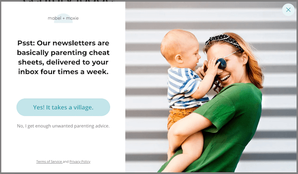
I’m not even a parent but I appreciate the “no” copy enough to want to click yes.
4. (takes 5 seconds)
In this example, GrowthLab is promoting its email copywriting guide. It reads:
“Don’t have time to read the whole guide right now? No worries. Let me send you a copy so you can read it when it’s convenient for you. Just let me know where to send it (takes 5 seconds).”
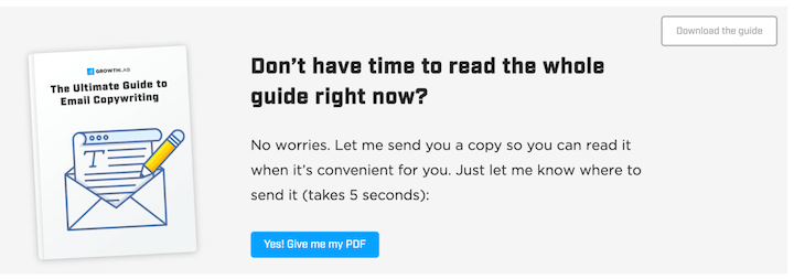
“Takes five seconds”…I can hear a person saying it.
The “takes 5 seconds” helps reassure the reader this is a friction-free ask, and the parentheses and casual speak makes it feel like someone’s talking to you.
📚 Free guide download >> The 36 Best Call to Action Phrases Ever (& Why They Work)
5. I have a few questions first!
Here, Optinmonster is trying to get you to get started with their software. The “yes” call to action button reads “Get Started with OptinMonster,” but the “no” button isn’t “no thanks.” Instead, it says “I have a few questions first!” which takes you to a contact page.
It’s generally a rule of thumb to only have one CTA, but it all depends on how important the offer is and where it’s being shown.
If your conversion rates are low, your offer might be too bottom-funnel for the audience of this piece of content. You may want to change the offer to something of a lower commitment. Or try adding an alternative option with a second, less prominent but “safer” call to action phrase like OptinMonster does.
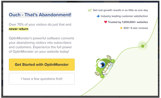
Don’t rush me! I have a few questions first!
OptinMonster uses this approach elsewhere on their site, such as in the example below with a “Get Started” and a “See All Features” call to action placed next to one another.
![]()
6. The struggle is over
I mean, who hasn’t said “struggle is real”? It’s wildly overused and yet it somehow is still funny to me when someone says it (most of the time—depends on the person).
Anyway, “struggle” is such a relatable term and “The struggle is over” is a great call to action phrase for that pain point marketing.
Another option would be to have the call to action button say “End the struggle now.”

The struggle is [not real]. It’s over.
7. Unlock (not provided)
Sometimes when Google Analytics can’t (or doesn’t want to…) give you data on a keyword, you’ll see “(not provided)”. It’s v. frustrating. Keyword Hero uses jargon in their call to action phrase, which will attract only its qualified users would understand.
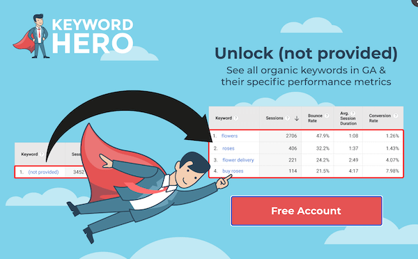
All in all, it’s a creative headline, but “Free Account” could use some more action and specificity to make this a conversion-boosting pop-up.
8. Got no clue where to start?
This display ad by Fiver is simple.
“Need SEO and got no clue where to start? Hire an expert.”
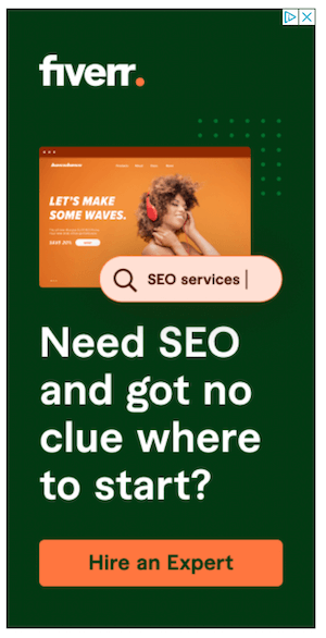
How many times have you said “I have no clue where to start” when seeking help?
Powerful call to action phrase examples
Bold copywriting is a surefire way to market with emotion—just make sure it’s on-brand.
9. Convince people you know what a DSP is
I love this one. If you don’t know what a DSP is, this is precisely why you should sign up for DigiDay’s newsletter.

10. We could have sworn you were someone who…
“Awkward” is right up there with “struggle” in terms of relatable words. But it’s the boldness of this call to action that stands out. In its free trial popup offer, Hootsuite says:
“Well this is awkward.
We could have SWORN you were someone who wanted to blow your competition out of the water on social media. Our bad. We’ll just leave this 60-day free trial here for someone else then…”
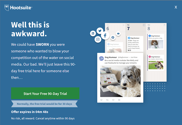
Our bad, we thought you wanted to be good at your job…
Challenging someone’s decision-making or their commitment to their job? Bold.
11. You should know better
This is a clever little play on words, since DueDil (fun name) is an intelligence platform, but this is still a great call to action copywriting tip.
You could leave it at that (You should know better.) or try out a little relief in the end (You should know better…we never charge full price!).
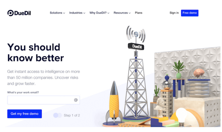
Both a play on words and a bold phrase. I like it!
💡 Guide download >> 135 of the Best Words & Phrases for Marketing with Emotion
12. Prove yourself
Doesn’t get much bolder’nat.
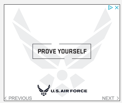
Talk about a motivating call to action.
But you don’t have to be the U.S Air Force to use this call to action phrase.
Maybe your buyer persona is a young professional in a cutthroat industry. Maybe they’re athletes or fitness fanatics. With some visual or textual context, this could be a great call to action button or phrase.
RELATED: 24 Unusual AND Effective Call to Action Examples You Can Copy
13. See for yourself
Nothing revolutionary here. A solid show of confidence with a bold touch.
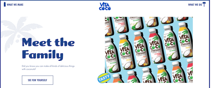
“See for yourself” may not be creative, but it’s classic and effective.
Similar or supplementing phrases might include
- Don’t believe us?
- What do you have to lose?
- Don’t take our word for it…
- See why

14. Escape content marketing hell
The nature of this call to action phrase isn’t really bold, but it’s a bold move to use this copy in your call to action.
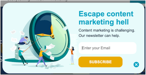
Pain point targeting taken to the next level.
15. Wow, we were sure you’d want this
Another bold approach, this time by Sleeknote.
“Wow, we were sure you’d want this…
Because you look like someone who likes to stay one step ahead of the competition.”
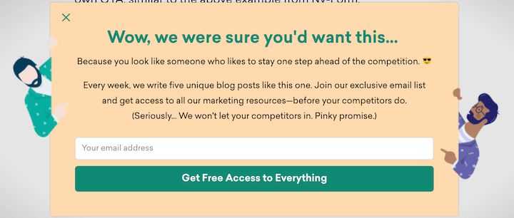
Trivialize something about your reader but make it so completely obvious that it’s playful.
16. You won’t get anywhere else
Providing something that your audience won’t get anywhere else gives the offer added appeal, but be selective with this phrase. Deliver on your promise.
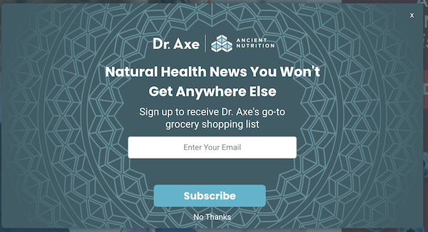
“You won’t get anywhere else” is strong…just deliver on your promise!
Subtle but smart call to action phrase examples
Confession: these call to action phrases aren’t outwardly entertaining, but they’re simple tweaks that stuck out to me and that I think we can learn from.
17. Get your first lesson now
Instead of [potentially] intimidating or scaring users away with CTA button text, make things more simple. In the example below, instead of asking the user to start the entire course, this CTA invites the user to just start with the first lesson, which feels much easier.
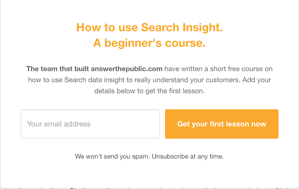
“Take a bite” is a lot more doable than “consume the entire meal,” no matter how delicious.
And this can work for any type of long-form content you are promoting—such as with “Start the first chapter,” or “Watch the first video.”
Also, side note: Head here for plenty more pop-up examples!
18. More info and register here
While “register” wouldn’t be my first pick for words here (I’d go for something a little more friendly like “sign up,” there’s something about this call to action phrase that I appreciate. The “more info” kind of lets me know that I’m not locked into anything. Plus, there’s a slight curiosity factor. What more info is there to know?
Plus, it keeps the popup clean and attractive.

Thank you for not cramming every detail about the webinar into a three inch box.
19. Check availability
In my opinion, I think this is a really smart option when you’re offering any sort of free assessment, consultation, or audit.
There’s nothing wrong with “book now” or “schedule now,” but what does that mean? If you click on it, are you submitting your contact information and then someone will be reaching out to you within 24 hours? Will you be given a number or email address to contact in order to schedule it?
“Check availability” tells me that I can reserve a spot online (convenient), and without actually having to interact with anyone just yet.

“Check availability” gives a lot more information than “book now.”
Note: I think this site means to say “scheduling” instead of setting.
20. Start using Slidebean
You can create a free account on Slideban. Signup is easy, but what I like about this call to action example is that it adds a touch of actionability as well as convenience. Instead of asking me to “Submit,” it’s asking me to “Start using Slidebean,” which could make a difference! It also implies I’ll be able to get started right away.
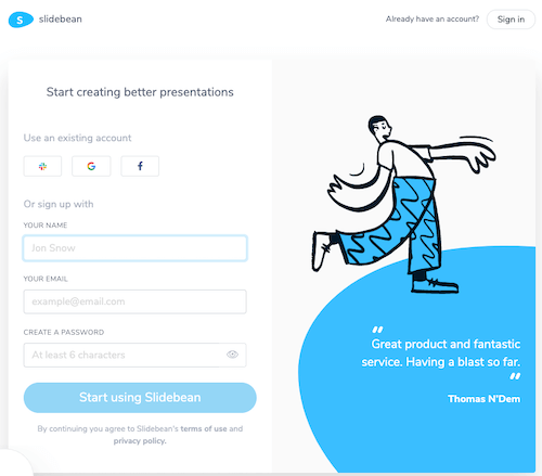
Well don’t just [submit] there, do something.
21. Complete your (free) registration
Sometimes, plastering “FREE” all over your call to action copy sounds loud and pushy. I kind of like how DX summit saves it for the call to action button. Parentheses are powerful in copywriting, and this simple addition makes “Free” pretty front and center if you ask me.
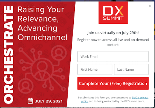
Sometimes, a gentle “(free)” speaks louder than “FREE WEBINAR!” all up in your face.
Reverse psychology call to action phrases
Sometimes it’s the no button that prompts a user to click on the yes button. Or if not, the creativity of the no button at least gives you a memorable impression of that brand. Let’s take a look at some examples
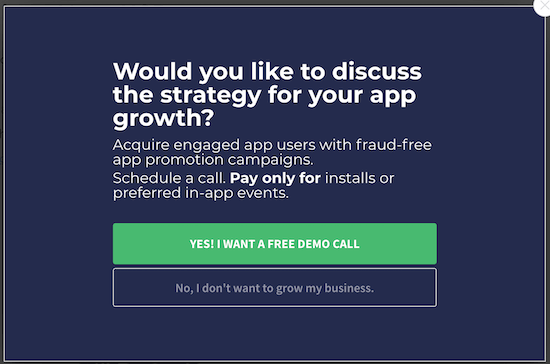
22. No, I don’t want to grow my business
This “no” call to action button is pretty standard. “No, I don’t want to grow my business” is a good way to imply the value of the offer.
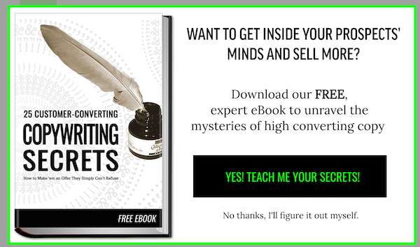
23. No thanks, I’ll figure it out myself.
This call to (no) action phrase is a bit more effective, reminding the reader that they’re putting more work on themselves if they don’t seize this opportunity.
24. No, I don’t want free insights
Another creative call to action example for newsletter signup. The “no” is used to describe the value of the core value (free insights) of the newsletter—and a reminder that you’re a fool to pass up something free.
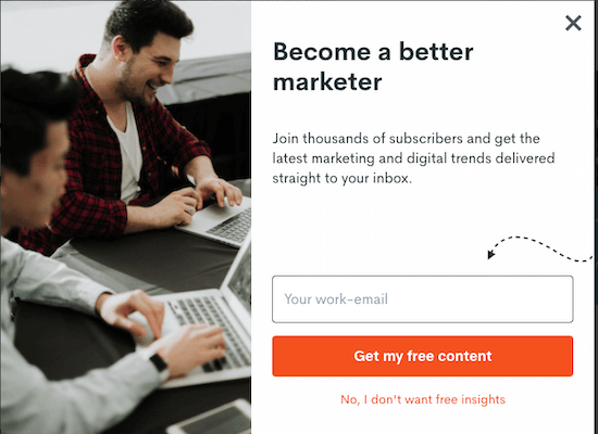
Putting into words that your reader is passing up free insights can have an effect.
25. No thanks, I love being exhausted
I like this one because instead of saying “I don’t want” something, it’s taking it to the opposite extreme, saying that you desire the pain point.
This popup is promoting a 30-day health program for women, promising to improve energy levels. The headline is a question “Hi, want to dramatically increase your energy in just 30 days?”
Then you have a YES button or a “No thanks, I love being exhausted.”
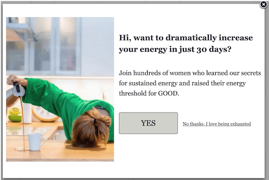
“I love being exhausted” has more tang than “I don’t want to increase my energy.”
Funny call to action phrases
These aren’t necessarily call to action phrases you’ll want to steal, but they can give you inspiration for coming up with your own funny ones.
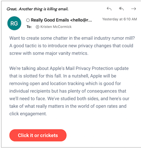
26. Click it or crickets
Really Good Emails sends out a creative newsletter and for their additional reading, their button for “read more” says “click it or crickets.”
It’s fun, rolls off the tongue, but it also kind of has a different feel to it. Like they’re giving me the power to reject them. But they don’t really care if I do.
Take it or leave it. Either way, we rock.
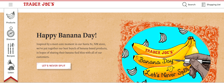
27. Let’s never split
This call to action phrase doesn’t exactly scream conversion rate optimization, but that’s not what Trader Joe’s is going for here. They picked a fun national day to celebrate and then created a call to action button with a punny phrase. Very on-brand.
Note: Banana Day is just one of many national days in April. Get all of them in our April marketing ideas post!
28. Add to diaper bag
“Add to diaper bag” is not the most versatile call to action phrase in the world, but it does spark ideas for fun alternatives to “add to cart.”
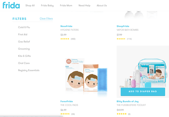
What can you replace diaper bag with? Suitcase? Briefcase? Must-do list?
29. Cat gifs on every page
This popup—for “8 things to know about building a design portfolio”—needs some clarification. I dont know if this is an ebook, webinar, blog post, or what. And “cat GIFs on every page” feels better suited for an “8 reasons” title—unless maybe they’re saying this guide has cat GIFS on every page? But the “1” in the button tells me it’s giving me the first item in the list…
Like I said…needs clarity but I still like the ideas this inspires.

Make your CTA phrase the first (funny, or clearly not true but funny nonetheless) reason to get the offer.
As stated above, the surrounding content should speak more to the button for it to be effective, but the creativity and the fun is there.
Different call to action button phrases
The rest of these call to action phrases and examples aren’t exactly entertaining or super-unique, but still just different enough to be noticeable.
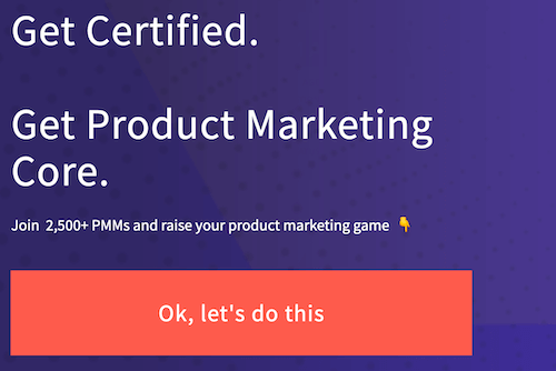
30. Ok, let’s do this
This is for a certification course for product marketing managers. It calls you to “Join 2,500+ PMMs and your product marketing game.” The copy has an authoritative encouraging feel to it, making “Ok, let’s do this,” a fitting CTA button phrase.
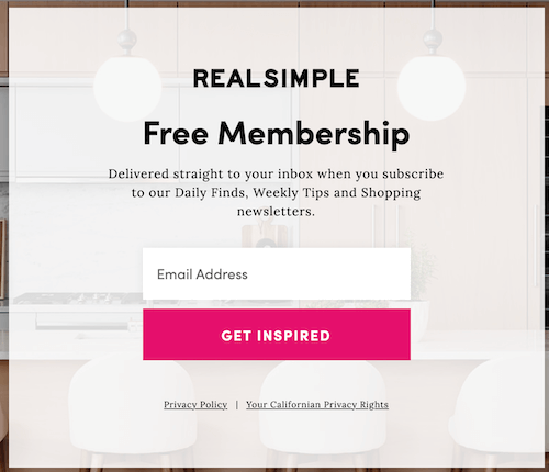
31. Get inspired
There’s a lot going on here in this popup. “Free membership” is referring to their daily, weekly, and other newsletters so that’s confusing. BUT I do like the switch-up to “Get inspired” instead of “Sign up” or “Subscribe.”
32. Improve your writing
Being concise and specific is one of my many tips on how to write copy that sells. “Improve your writing” has more action and conveys more value than “Start now” or “Get started today.”

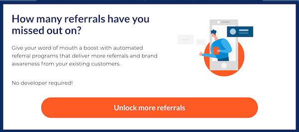
33. Unlock more referrals
Another example of indicating the value of the offer right in the CTA button.
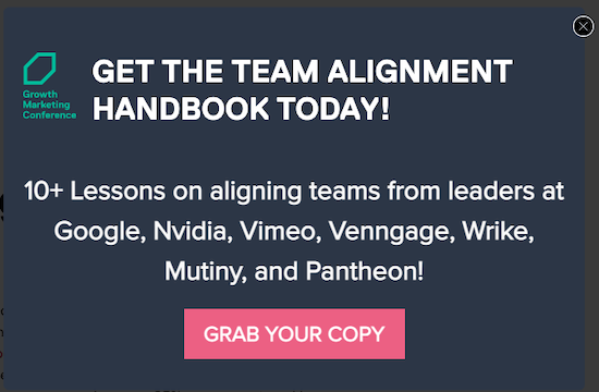
34. Grab your copy
“Grab your copy” feels quicker than “Download the handbook.”
35. Get invite link
This isn’t anything super creative but it’s something that I appreciate. The button could say “refer friend” but instead, it says “get invite link.” Even though the process is outlined clearly above (an excellent use of psychology in copywriting), the button copy at the end reassures them that clicking on it doesn’t send anything to anyone.
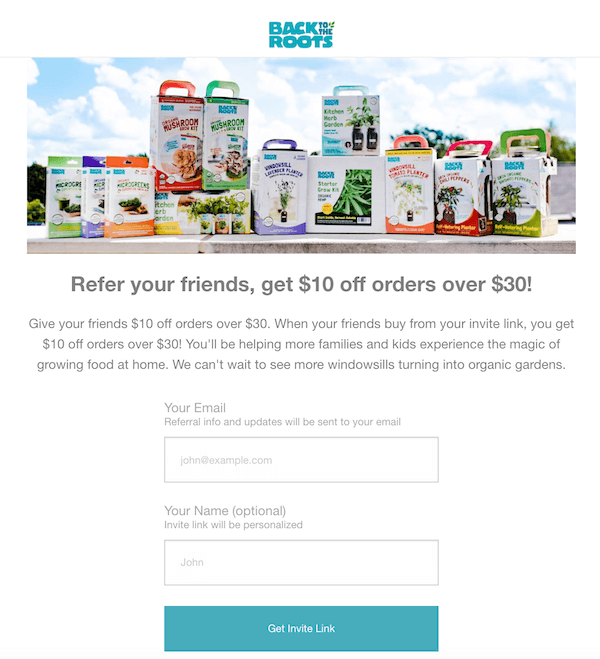
A nice little reminder that clicking this button doesn’t send anything to anyone.
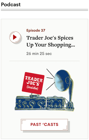
36. Past ‘casts
Just a fun example of a call to action button using rhyming. In this case, the button isn’t conversion-critical, but more of a way to express Trader Joe’s brand voice.
The best call to action phrases to get the click [full list]
To close off, I’m sharing the list of the examples we covered above so you can see them all at once, with a few additional call-to-action phrases to try out.
Subtle but smart call to action phrases
- More info and register here
- Get the deets and sign up
- Check availability
- Schedule your assessement
- Get your first lesson now
- Start the first lesson today
- Complete your (free) registration
- Try the (always free) tool
- I have a few questions first!
Bold call to action phrases
- See for yourself
- Escape content marketing hell
- You should know better
- Prove yourself
- Don’t believe us?
- What do you have to lose?
- Don’t take our word for it
Reverse psychology call to action phrases
- No thanks, I love being exhausted
- No thanks, I’ll figure it out myself
- I don’t want to know the latest trends
- I don’t want to grow my business
Relatable and funny call to action phrases
- The struggle is over
- End the struggle now
- (takes 5 seconds)
- Well this is awkward
- Unlock (not provided)
- Got no clue where to start?
- Funny call to action phrases
- Cat gifs on every page
- Add to diaper bag
- Let’s never split
Blunt call to action phrases
- If you want my team to just do your marketing for you, click here.
- No nonsense. Just really good marketing insights
- No thanks, I get enough unwanted parenting advice.
Different call to action phrases
- Get inspired
- Get invite link
- Grab your copy
- Ok, let’s do this
- Get access

