The great thing about popups: they work. Put the right offers on the right pages and you’ve got yourself a lead-generating machine.
The tough thing about popups? There is so much you can do with them that it’s borderline stressful (okay maybe completely stressful).

That’s why we’re sharing 16 popup examples to help you get ideas and inspiration for your own website and lead generation efforts.
Let’s check’em out!
16 awesome popup examples (& why they work)
Below you’ll find all kinds of popup ads with a variety of use cases, offers, designs, tones, targeting, and more. Whether you’re looking to generate new leads, move existing leads through your funnel, gather insights, or drive sales, there is something in here for everyone.
1. Invesp – Be real
Invesp‘s popup is for a newsletter. It reads:
Overwhelmed by CRO best practices disguised as conversion insights?
Join 365K+ marketers, designers, & optimizers who receive uncomfortable conversion ideas in their inboxes for free. Every Wednesday.
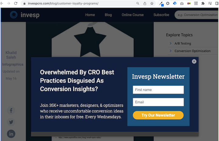
Why it works
- Tells it like it is! Invespro is assuring you that you’ll get what you need in your inbox each week—actual valuable insights and not just flimsy best practice or fluff content.
- Social proof. Join 35K+ others who are already signed up? Talk about FOMO
- Lead qualification. By stating that 35K+ marketers, designers, & optimizers already signed up, this popup is making sure that it gets the right people to sign up and assuring those targeted leads that you have what they want.
What I might change
- No need for title case in the headline. You’re going to see this come up time and time again in this post. Sentence case reads easier! The easier something is to read, the easier the customer perceives it to be! It’s copywriting psychology!
2. Survey Sparrow – Use faces
This popup example by Survey Sparrow has a guy pointing to a headline that reads Build surveys that work.
The description says Beautifully designed conversational surveys. Highly engaging, 40% more responses. Then the CTA says Signup for free.
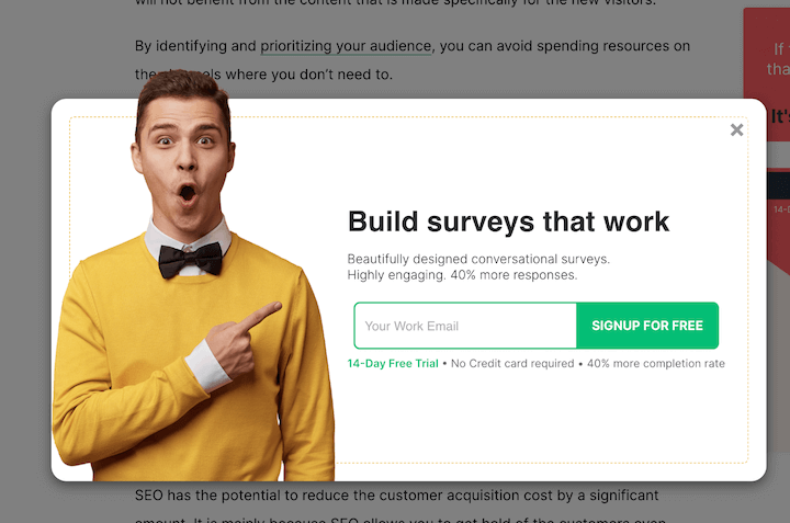
Why it works
- Visually attention-grabbing. Thanks to the guy making an impressed facial expression in a bright yellow sweater, pointing to the headline. Plus, having him pop out from the popup gives it even more of a…well…pop.
- Value proposition. You learn from the description exactly what is in it for you, with the added bonus of a quantifiable 40% more responses.
- Trust. You get the honest truth that it’s free in that it’s a 14-day free trial, but also reassured that there’s no credit card required.
What I might change
- Probably no need to repeat the 40% more completion rate at the bottom.
3. Tully’s Training – Address pain points
The below popup example by Tully’s Training is a unique one. It reads Hi, My name is Mary Tully – Does your dog struggle with any of the following? Then you can choose between four options: Puppy mayhem, destructive behavior, aggressive dogs, and potty training.
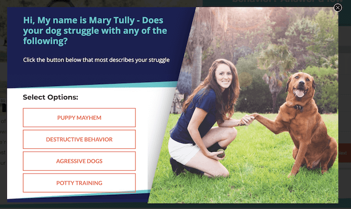
Why it works
- Visually appealing. The high-quality image of Mary with a dog is attractive while also building trust, and the font and design colors are consistent with the hues in the photo.
- It’s very clickable. Instead of the typical Yes/No button or email field, you’re given four options to choose from. If you struggle with any one of those, how can you not click?
What I might change
- There’s some excess copy in there that could be removed to make the design cleaner and engage the reader faster.
4. Pop Chart – Make up a word
This Pop Chart popup is a good example of conversational tone. It reads Our emails are off the chart. Get un-spammy updates from Pop Chart.
Why it works
- Reassures the reader. It speaks to users’ hesitancy to get bombarded by junk email.
- Plain and simple. Just two colors and an icon, and the copy is minimal. You have a headline, subtitle, and one field for you to enter your email.
- Subtlety. It’s narrower than your traditional popup, making it feel a little less disruptive.
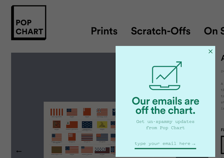
What I might change
- This one’s simple enough, I got nothin!
5. Almond Surfboards – Survey your visitors
This popup example by Almond Surfboards reads:
How long have you been surfing?
Your previous experience will help inform the best equipment for you.
Then you have two options: less than or more than two years.

Why it works
- Personalization. This popup appears upon entering the site and helps to create a personalized experience for the visitor—a a pillar in any buyer’s journey mapping and optimization.
- Clean design. The copy is minimal and the image of the surfer is (clearly) on-brand.
What I might change
- Nothing really, but I would want to test this against other approaches—number of questions asked, offering a coupon vs doing the survey, etc. While it can be a great way to collect insights and personalize the experience, your website visitors may have different expectations upon entering your site.
6. WPMU Dev — Include your ratings
This popup by WPMU Dev reads Our biggest discounts happen over email. And the description says Be the first to know about our newest product releases and sales – including this year’s Black Friday sale which is set to be our biggest yet!
Then there’s a field to enter your email and a CTA button that says “SEND ME DEALS.”
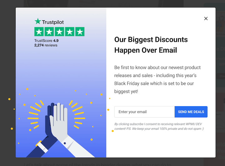
Why it works
- Specificity. It tells the reader what they stand to gain if they subscribe to the newsletter.
- Social proof. The 2,274 Trustpilot reviews and 4.9 average stars score gives you confidence that this is a WordPress plugin you can trust—which is important in the world of websites and plugins.
- Strategic copy. The headline builds excitement about the Black Friday sale—a great way to boost engagement with your marketing campaigns and promotions.
What I might change
- Change to sentence case on the heading.
- I’d probably go with a graphic that’s a little more visually stimulating or illustrative of the offer.
7. Flexxable — Go over the top
Well if this popup isn’t marketing with emotion, then I don’t know what is. It reads HOLD UP! and below it is a man wearing the company swag hoodie and in handcuffs. Then there’s a subtitle and description:
Are you being held hostage by demanding lead gen clients? Escape “Retainer Prison” and end the nasty texts, PMs & emails demanding you DO MORE work for less money.
Then the CTA button says GET MY ESCAPE PLAN.
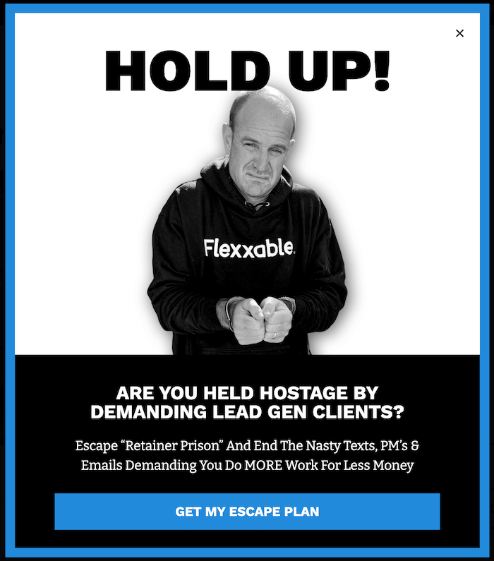
Why it works
- Catches the eye. The HOLD UP! and negatively charged feel of the whole ad grabs your attention right away. It’s a little over the top but that’s precisely why it works.
- Well-targeted copy. It speaks to the pain points of the target audience (agencies with demanding and stingy clients).
- The call to action phrase. Housed by a blue button among a black and white image presents the offer as the perfect solution to alleviate the pain.
What I might change
- Turn the title case into sentence case. This isn’t Google ad copy!
📣 Want more great call to action phrases? 📣
Free guide >> The 36 Best Call to Action Phrases (Ever)
8. Canva – Tell AND show
Canva’s popup example below appears in the web instance and it’s for the app. There’s a visual on the right of what the editor looks like, with images of multiple people working, and then three feature/benefit statements.
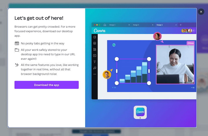
Why it works
- The visual is key. It tells the user what they can expect with the app version and also illustrates the features on the left, like real-time collaboration and no browser tabs.
- Placement. It’s a little heavy on the text, but since this popup is appearing in the web interface, it’s showing up for existing users who will be interested in the app and more likely to read the copy.
- The creative headline and friendly, easy tone (“Let’s get out of here!” “no pesky tabs,” “all that browser background noise,” etc.)
What I might change
- Aside from behind a little heavy on the text, I don’t have any complaints! Good work!
9. Tessemae’s – Use a great slogan
Tessemae’s popup is for 15% off. It reads:
Simplify food, amplify life
Enjoy 15% off!!
Join Tessemae’s email list to receive new recipes, product announcements, sales, and enjoy 15% off your first order!”
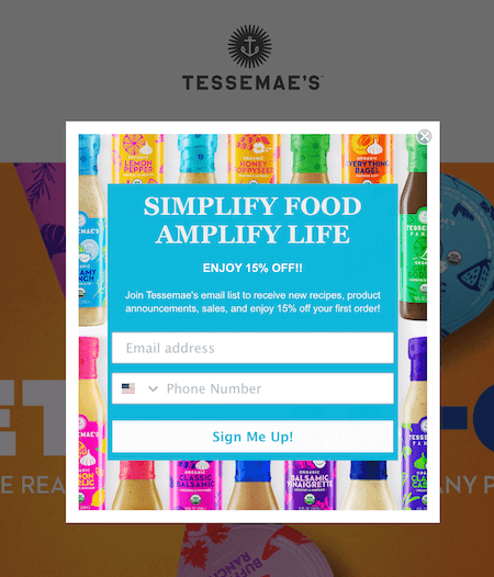
Why it works
- Catchy tagline. A good slogan does not go unnoticed! It can be just the thing that resonates with a website visitor and gets your brand voice to click with them.
- Vibrant colors. The dressings in the background make for a bright visual that is on-brand but not distracting.
- Clarity. You learn exactly what you’re going to get if you sign up for the newsletter. People will be hesitant to provide their information if they don’t know what’s in store. Good copywriting is clear copywriting!
What I might change
- The inconsistency of the capitalization in the form fields and CTA is somewhat distracting, but that could just be because I’m an editor.
10. PCMag – Keep it clean
This popup example from PCMag is for a variety of offers that the user gets if they enter their email. We see the PC mag logo at the top, a headline that reads “Enter your email to unlock” a checklist of what that entails, and then a single email address field.
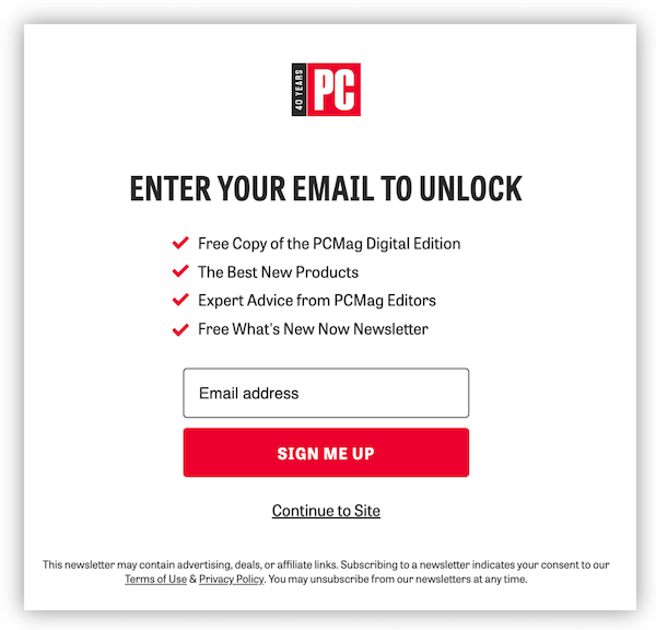
Why it works
- Super clean design. The red CTA button stands out and helps bring out checkmarks and logo since they are also red.
- Clarity. The user gets a clear idea of what they’ll get if they provide their email. Free copy of the digital edition, the best new products, expert advice, and the newsletter.
What I’d change
- A colon after “unlock” would clarify that the checkmarks are a list of features/benefits.
- Sentence case people!!!
11. Getty Stewart – stay friendly and focused
The below popup example is from Gettystewart.com for a downloadable guide. We see a logo and tagline at the top, then:
Guide to Super Soups
FREE 5 day email guide to inspired, flavourful soups
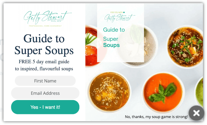
Why it works
- Gated content. Promoting gated content through popups is a great way to generate leads.
- Effective copywriting. Very specific offer, enthusiastic “Yes – I want it!” yes button, and a friendly “No, thanks, my soup game is strong!” no button.
- Attractive visuals. If you’re going to promote a guide to super soups, you better have the visuals to prove it.
What I might change
- The two logos and guide titles is a bit redundant. I’d remove the one on the right and allow more room for the visual to come through.
12. Postable – Be super transparent
Postable‘s popup example will make you chuckle. It reads “Like discounts? Allow us to bribe you with an obscene discount code.” Then the call to action is an enthusiastic “Send me my code!”
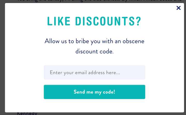
Why it works
- The headline. Asking a question is a great way to grab the attention of your audience.
- The humor. The blatant subtitle reveals the brand’s tone of voice, and who doesn’t like transparency these days?
- The hues. The teal button stands out and pairs nicely with the teal headline color.
What I might change
- Get more specific— how much is the discount?
- Add something a little more visual.
- The placeholder text for the email field could be shortened just to reduce the amount of text that the reader has to parse through.
13. Tiny Organics – Offer personalized recommendations
Tiny Organics‘ popup below reads Unlock 35% off your first order. Then you’re asked to Select an age group for personalized product recommendations.

Why it works
- Appealing offer. Most popups offer 10%, 15%, or at most, 20% but 35% is a hefty discount!
- Personalization. Like the Almond Surfboards popup example, this popup is gathering preferences so the business can make recommendations.
- Imagery. A picture of the products alongside the natural ingredients that comprise them? Great way to enhance perceived value.
What I might change
- It might make sense to put a note under the “continue” button that says “1 of 3” or “one more question!” just so the user doesn’t worry that they have a survey ahead of them.
14. WordStream by LocaliQ – Scare your audience
Here’s an example of one of our best performers. We see the guide thumbnail on the left, and on the right it reads Boring content doesn’t convert. These 120 words and phrases stand out and inspire action. Then the CTA says Get the free guide.
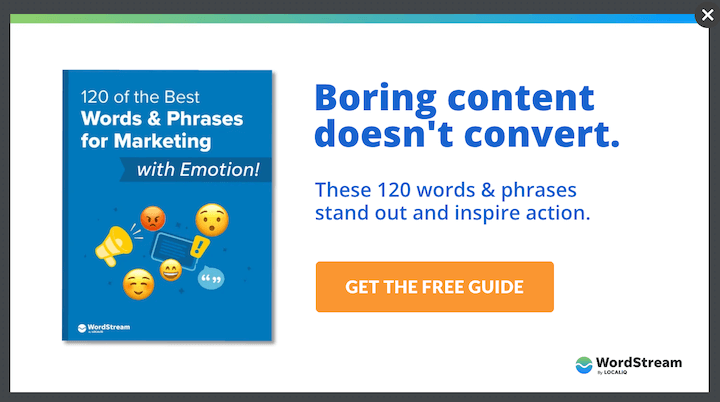
Why it works
- Ominous headline. Yes, we tapped into the fear factor here (used emotional words to promote a list of emotional words—go figure!). This popup appears on blog posts in our copywriting category, so we know that copywriters are our target audience. And what copywriter wants boring content or zero conversions?
- Balancing description. We then follow up the scary statement with our solution: 120 words and phrases that stand out (not boring!) and inspire action (convert!). There are lots of good copywriting formulas that follow this model.
- Right offer. A free guide is something that our blog readers consider to be of high value at this stage in the funnel, as opposed to a free assessment or case study.
What I might change
- Actually, right now we’re testing this version against one that does not contain the description. Perhaps less is more. We’ll find out!
15. Kith – Add a preference box
Kith‘s popup example below is short and sweet. It reads:
Join our list.
Sign up to receive updates on the latest products as well as exclusive early access through the Kith Loyalty Program.
Then you can check off men’s, women, and/or kids and enter your email.
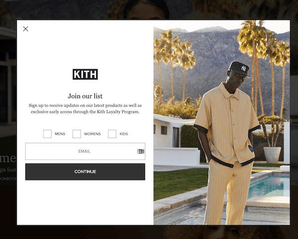
Why it works
- Personalization. Again, we’re seeing another popup that is collecting information so as to personalize the experience. This is a great way to gather first-party data!
- Simplicity. No bells or whistles. Just a plain and simple “Join our list” with two sentences on what that means. This is consistent with the simple black and white branding.
What I might change
- Similar to the Tiny Organics popup example, I’d add some clarifying copy so that the “continue” button doesn’t open up uncertainty.
16. Allbirds—run a giveaway
The Allbirds popup example below reads Win the Ultimate Trip.
A trip for 2 to New Zealand, the source of our Super Natural wool. Sign up to stay connected and a chance to win.

Why it works
- No excess hype. Yes, you can use popups to announce exciting offers with exclamation points, but you can also get visitors excited with the opposite approach. Allbirds brand style is not flashy or loud, so a bold-faced “Win the Ultimate Trip.” with a period at the end does the trick.
- Lead gen. Using a popup to host a giveaway? Good idea! Plus, the destination being the source of their Super Natural wool makes it relevant.
What I might change
- I might potentially use a more stimulating visual of New Zealand.
- While it’s important to include terms and conditions, there are opportunities to remove unnecessary copy in this popup to make it a bit cleaner and more inviting.
Use these popup examples to start your own campaign
Like I said at the start, popups work! It’s easy to get overwhelmed with all of the options available and approaches you can take, but the best thing you can do is just start. Get one or two campaigns up, collect some insights, and let those insights inform your next steps. And now you have plenty of concepts to use as ideas for your initial implementation or for determining new tests to run. Good luck!

Meet The Author
Kristen McCormick
Kristen is the Head of Marketing at Hatch, a customer communication platform for service-based businesses. She was previously the Senior Managing Editor at WordStream. Her cat Arnold has double paws on every paw, and she finds life to be exponentially more delightful on a bicycle.
Recommended for you