You’ve done all the hard work: You pay for traffic. Create compelling headlines to lure people in. Design beautiful landing pages to wring out every last conversion. And yet at the moment of truth, when it’s time to click or buy or join or submit…they bounce.
Your call-to-action button copy should be reinforcing whatever it is someone is about to receive. It should be an afterthought, ideally. A nonissue you don’t have to worry about. But instead, it’s literally scaring people away.
Excuse this totally non-seasonal image, but it is scary, right?
Read on to learn five reasons your call to action text isn’t working, along with five ways to fix it.
Reason #1. Weak, Limpy CTA Words
The most persuasive word in the English language is “You.” (Because people are selfish?)
The second is “Free.” (Because people are cheap?)
These “power words” (as they’re known in the biz) are persuasive because they speak to our old, dumb, lizard brains that have failed to evolve or keep pace with the times. (Kinda like those Birkenstocks that keep popping up everywhere.)
Here’s the problem. Nobody reads anymore. This was confirmed ages ago, in a now-ancient Nielsen Norman Group eye-tracking study, where they noted that “exhaustive (word-for-word) reading is rare” online.
Oh, and there’s another issue. How many browser tabs do you have open right now? Because the average is 3-5 (on the low side). And let’s not even get into the TV being on in the background, or what your mobile’s streaming in the foreground.
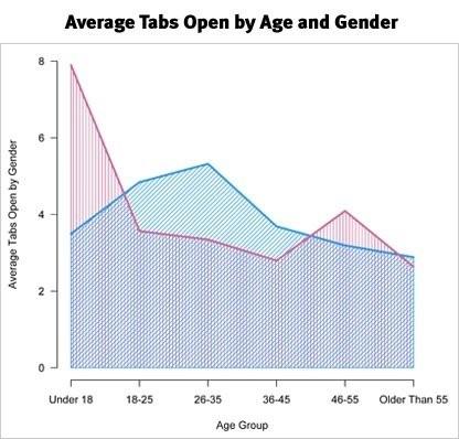
Point is, we’re distracted as hell. Which is “literally altering our brain chemistry” according to research compiled in an excellent Trello article. Despite the fact that it makes you feel productive, they go on to say, “it’s actually making you scatterbrained, thus decreasing your ability to remember any single piece of information.”
So what’s the antidote?
Fear. Greed. Envy. Lust. Those visceral emotions that once helped stone-age humans to avoid getting eaten, fall off cliffs, and reproduce so that we could eventually one day idolize people like Justin Bieber. (Maybe it wasn’t such a good idea after all?)
Power words speak to these long-forgotten feelings. The mere mention of “sabotage”, for example, gets people to sit up and take notice. (Also, 1500+ shares. Thank you kindly.)
Most savvy marketers know that CTA button copy should utilize some action or verb to get people to click. But it turns out that according to multiple tests, any generic “Sign Up” don’t cut it.
Whenever, wherever possible, those actions need to also include the value that someone’s gonna get after they click.
So instead of the generically vague “Click Here”, it should be, “Get Instant Access Now”.

Reinforce the value someone’s about to receive with action-oriented language that speaks to our lizard brains.
Reason #2. Poor Relevance, Message Match, and Priming
“Message match” in advertising is the alignment of key variables, like the keyword someone is searching for, with your ad text and the landing page that they’ll eventually (hopefully) hit.
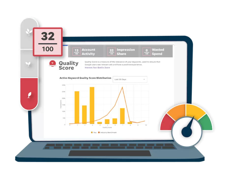
Ad networks like AdWords use Quality Scores to measure the relevance between what you’re advertising and the intent or purpose behind what someone’s searching for. The more relevance there is between what the searcher wants and what you’re offering, the higher your Quality Score.
So an improvement in message match should deliver an increased Quality Score, which will drop your costs by 16% for each point you can raise it.
This happens on Facebook too, where Relevance Score measures the relationship between an audience segment and your advertisements, to ultimately determine who you’re gonna reach and how much you’re gonna pay to reach them.
But there are far more obvious reasons, besides ad spend efficiency, for increasing relevance or message match.
The simple act of choosing, or making a decision, is cognitively stressful. Decision fatigue eventually sets in, rendering your poor, tired, lizard brain unable to make even the simplest choice of where to go to dinner tonight. (Now you have a valid excuse the next time your spouse gets mad at you for saying you “don’t care”.)
📣 Free guide >> The 36 Best Call to Action Phrases (Ever)
Marketers can reduce decision fatigue by “priming” customers. Which, it turns out, is exactly what you’re doing when making your ads and landing pages line-up together. See how visually, this ad and landing page look almost exactly the same, down to the CTA words?
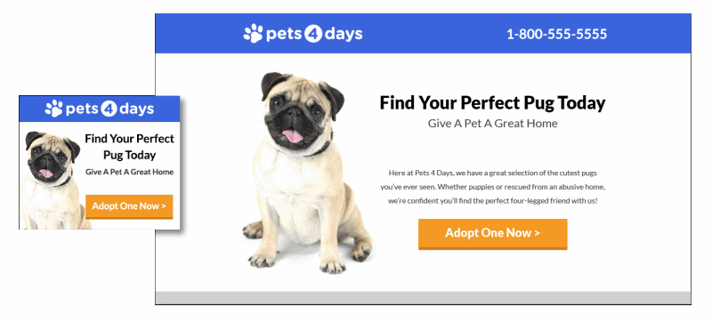
(Pictures of so-ugly-they’re-adorable pugs don’t hurt, either.)
Button copy works the same. By changing it from an emotionless “Download” CTA…
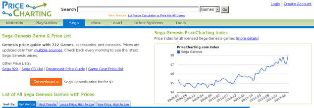
… to better reflect what someone’s going to get (specifically, a “Price Guide”)…
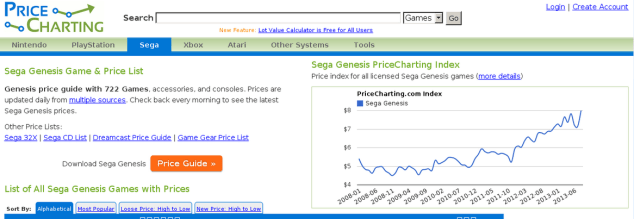
… you can skyrocket clicks by 620.9%.
A simple two-word tweak increases relevance, improves messages match, primes customers to act, and lifts results. All in one fell swoop.
Reason #3. No Compelling Reason Why
“Click Here to Continue Reading” isn’t the most compelling button copy. And now you can already see the problems.
For one, nobody likes to read. So “continue reading” doesn’t exactly inspire. If it did, you would still have a Borders bookstore to go kill time in, flipping through images in magazines.
No, the value – the compelling reason why one should “click here” or “continue” anything – is the end result that “reading” will get you.
Years ago, Laura Roeder ran a promotion with that exact button copy. And the results were predictably lackluster.
So she worked with Visual Website Optimizer to come up with the new CTA button copy, “Make Me Famous!” It resulted in an immediate 8.39% boost in conversions.

The new winning call-to-action copy encapsulates everything we’ve touched on so far. It uses an action-oriented verb that expertly emphasizes the end results, while at the same time, better aligning the message match between the button, the page headline, and the program name (which was called “Creating Fame”). But most importantly, it answers the prospect’s question, “Why should I click?”
Reason #4. Implying Costs & Commitment Instead of Value
The word “submit” makes people uneasy.
There’s anxiety. An apprehension as to what comes next.
It’s too close to “submission,” which means different things to different people. Most of which are negative, especially for commitment-phobes.
“Subscribe” causes similar anxiety, making people think they’re about to pay for something and that it’s going to be a bigger decision than it probably is. And as we’ve already seen, forcing people to think can sink conversions.
Simple, everyday words like these carry their own connotations – pernicious ones to avoid related to cost.
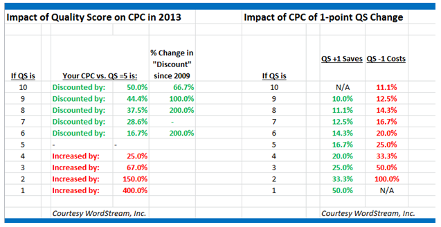
Sales 101 says to trump cost objections with value building. That’s true in this conversion game too, where customers are constantly weighing the discrepancy between these two opposing forces. “Prospects subconsciously subtract perceived cost force from the perceived value force”, according to Flint McGlaughlin, Managing Director of MECLABS (the parent company of MarketingExperiments).
Which – apparently, I’m told – is what this graphic illustrates:
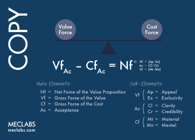
I have no idea what that image says, either. But images, yo! GRAPHS AND CHARTS!
This point was further illustrated by the simple copy test of two seemingly innocuous phrases: “Select Lodging” vs. “See All Rentals”
The first sounds simple enough. But the second crushed it by 427% (along with a few other changes, to be fair).
The theory goes back to negative connotations. “Select Lodging” implies that people will have to do all the work, assuming not just a hard cost to purchase, but also a soft one in the form of mentally-taxing, time-consuming searches that need performing.
The second version of the CTA text is more value-based. It’s asking for less work and commitment in comparison, and instead focuses on the variety of rentals they have to offer. That’s value.
Reason #5. Overusing Clichéd Words like “Free”
What kind of a marketer would I be without completely contradicting myself?
In the first point in this article I said “free” is one of the most persuasive words in the English language.
Most of the time it works. Until it doesn’t.
This first example from WhichTestWon shows a website offering a “Free Consultation”:
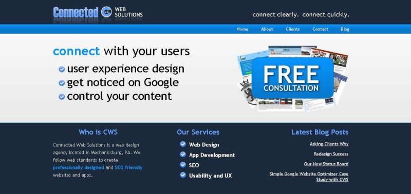
The second variation changes that wording to “Work with Us”:

This second, “free”-less variation got 171% more people to click through to the Contact form.
So…why?
In short: no idea.
On the one hand, it is more concrete. It is more specific about the action someone’s about to take. And it does offer up a tiny little bit more than the generic “Free Consultation” CTA you see on every other competitor’s website.
Not to mention, this isn’t the first time free’s let us down in the past.
Free has failed in email tests, too. For example, HubSpot ran a simple subject line A/B test between two variations: one with “Free Guide” and the other a topic-focused phrase instead (“SEO Guide”).
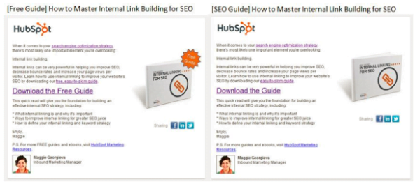
I know what you’re thinking, you smart marketer, you. But the answer is no. The Free version wasn’t trapped in any Spam filters. In fact, it passed seven of eight checks on Return Path. And both emails had the same SpamAssassin Score. So deliverability alone wasn’t the issue (both coming in over 99%).
The real kicker was the click-through rate difference, with the topic-focused “SEO Guide” coming in at a 17% higher CTR. Looking at CTR only for those who opened the email, this second variation still outperformed the first by 5%.
One potential reason? “[Our subscribers] already know that our content is free, and therefore, the word does not add value,” the blogger guessed.
Last but not least, Jeremy Smith provides a nice analysis of the word “free” too, concluding with this simple recommendation based on his similarly mixed findings:
If you want to use the power of “free” without being gimmicky, then do this:
- Use it if your searchers expect it.
- Use it if your users will be drawn in by it.
- Use it if you will provide value.
The lesson? Beware “best practices” and test for yourself. Because even free can become vague and meaningless to your audience. There’s a lot of nuance to a simple word choice.
Bonus Reason: Your Button Copy Blends In with Everything Else
Ok, we can’t end it on that last, slightly inconclusive one. So here’s a freebie.
Great CTAs have one thing in common, an underpinning or foundation that needs to be right before your copy can take hold.
They need to visually stand out. Specifically, they should present people with a clear visual hierarchy, prioritizing their attention for them.
You can use the best button copy in the world – even the word Free – and your CTA will still underperform if it blends in with everything else on the site.
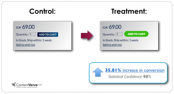
Here’s a perfect example. One European eCommerce site redesigned the color and shape of their CTA button for more contrast, didn’t touch the copy at all, and increased product sales (not just CTR) by 35.81%.
If people are scanning and multitasking, searching for relevance so they don’t have to think, and relying on compelling words to form a mental shortcut for what they should do… you gotta make clickable actions obviously clickable.
In Sum…
The best button copy is a promise.
It hints at what’s to come, and aligns with your subconscious expectations.
So when you get to the last possible point of conversion, there’s no hesitation. Your lizard brain doesn’t panic. No alarm bells ring.
And your opt-in momentum carries you through.
Ready for more? Learn from the best with these 36 best call to action phrases (ever) and these 20 call to action examples for newsletter signups.

Meet The Author
Brad Smith
Brad Smith is the founder of Codeless, long-form content creators for SaaS companies. Their work has been featured in The New York Times, Business Insider, TheNextWeb, Shopify, Moz, Unbounce, HubSpot, Search Engine Journal, and more.

![Search Advertising Benchmarks for Your Industry [Report]](https://www.wordstream.com/wp-content/uploads/2024/04/RecRead-Guide-Google-Benchmarks.webp)