Let’s say you’re hungry and want burritos. You leave your office and take a stroll down the street to find a place to eat a burrito.
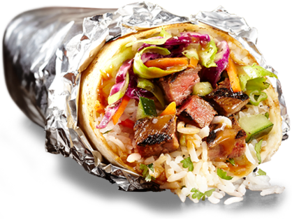
Mmmm, burrito
You find one, but as soon as you step inside, you get a surprise: the odor of alfredo sauce and pizza dough. Turns out the restaurant, advertised as a burrito shop from the outside, is an Italian restaurant inside.
Bummer. Doesn’t make sense, doesn’t it? Disappointed, you leave to go find something else.
In case you’re wondering, yes, this is a post about landing pages. The story above might not make too much sense and you might be confused as to why I wrote it, but the truth is, it’s very similar to a huge, widespread problem I see all the time when it comes to online marketing and landing pages.
In this blog post, you will learn what this big landing page problem is, why it’s ruining your PPC campaigns, and how you can fix it to increase ROI. This post focuses on matching the messaging between your ads and their landing pages. For more on visual continuity, check out this post about Facebook landing pages.
Let’s unwrap.
The problem with the majority of landing pages
In my story, the restaurant advertised itself as one thing, while inside, it was something completely different.
Now let’s look at your online marketing.
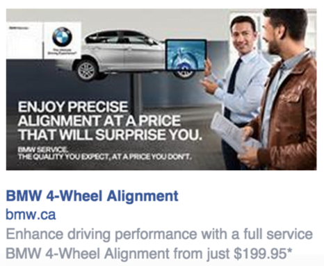
You run Facebook ads, Google AdWords ads and maybe other types of pay-per-click ads too. Your ads will most likely have a headline, to capture attention, text that will dive more into the details of your offer, and then maybe a small image. For example:
Now, what happens when someone clicks your ad? They get redirected to a landing page (if it goes to your home page, know that you’re throwing away money – I’ll explain that later in this post).
And here’s the question you have to ask yourself: Is your landing page consistent with your ad? Your ad has an offer, a certain message that it conveys, so will someone who clicks on your ad find the same content once they land on your landing page? In 90% of the cases I see, nope.
This problem is called the message match problem. It happens when your ad does not exactly match with the end offer on the landing page.
Message match relates to the textual, content and offer parts of the ad. If the text of an e-commerce ad promotes a sales event, but when clicked, you land on a product page that promotes a new product… Where’s the sale? It’s a total mismatch in terms of the message being conveyed. Chances are most people who clicked on the ad did because of the advertised sale, but when they arrived at the destination and saw nothing mentioning the sale, they left.
This campaign from Insightly has a message match problem. The message and wording used on the ad is completely absent from the landing page, and the look and feel doesn’t match either.
The “scent match” problem is very similar, but instead of the messaging being wrong, it’s the visual aspect that’s off. Imagine you see a beautifully designed, clean, modern-looking banner ad, you click on it, and you get redirected to a messy web page with completely different colors that remind you of the 90’s. Hm… chances are you’ll leave.
This is also why you should never redirect clicks from your ads to your home page. The messaging and look are unlikely to be the same, since home pages can’t be personalized and optimized for every specific ad variation you run. Plus, tracking results is harder too, since your homepage URL is always the same.
The message match problem is more frequent, but no matter which one is causing trouble, such mismatches inevitably results in high bounce rates, wasted clicks (don’t forget you’re paying for your ad clicks), high costs of customer acquisition, and of course, a low conversion rate.
In other words, you’re throwing your money out of the window for nothing.
Let’s look at a few examples of bad message match
MINI Facebook Ad
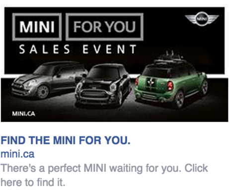
First let’s look at this Facebook ad by MINI. The image, which takes the majority of the ad space, advertises a sales event. Let’s click on it.
Here’s where I’m taken when I click on the ad. Is there a scent match problem? Not really, the image of the ad has the same vibe as the landing page. Good. But is there a message match problem? Big time. Let me explain…
In this ad, they advertise the “MINI for you sales event.” As you can imagine, I was expecting to see something about that sales event. The image above is the top of the landing page, but even when you scroll down, there is nothing on the page mentioning a sale or an event. Believe me, I even searched the page for the term “sale”, and I got 0 results.
Facepalm.
The wording “MINI for you” was also emphasized quite a lot in the ad. Notice that on this page, there’s absolutely nothing related to it either. Yes, you can customize your MINI, and that’s what their landing page is all about, but there is no headline or text anywhere on the page to keep it consistent from the ad. You land on the page, and boom, their product’s name and price. No headline to communicate any value, no call to action except for buttons, and nothing to link the ad to this page. MUCH could be improved here…
Blue Cross Travel Insurance
For this one, I wanted to show you an example of the problem through Google AdWords. Due to so many landing pages not being optimized as they should, I knew it wouldn’t take long to find an example.
In this case, I googled one of the first terms that popped into my mind: “Travel Insurance.” Here’s the first result:
My expectation was that I would be redirected to a landing page where I could learn more about their plan and services, and then click on a button to request a quote. I was wrong.
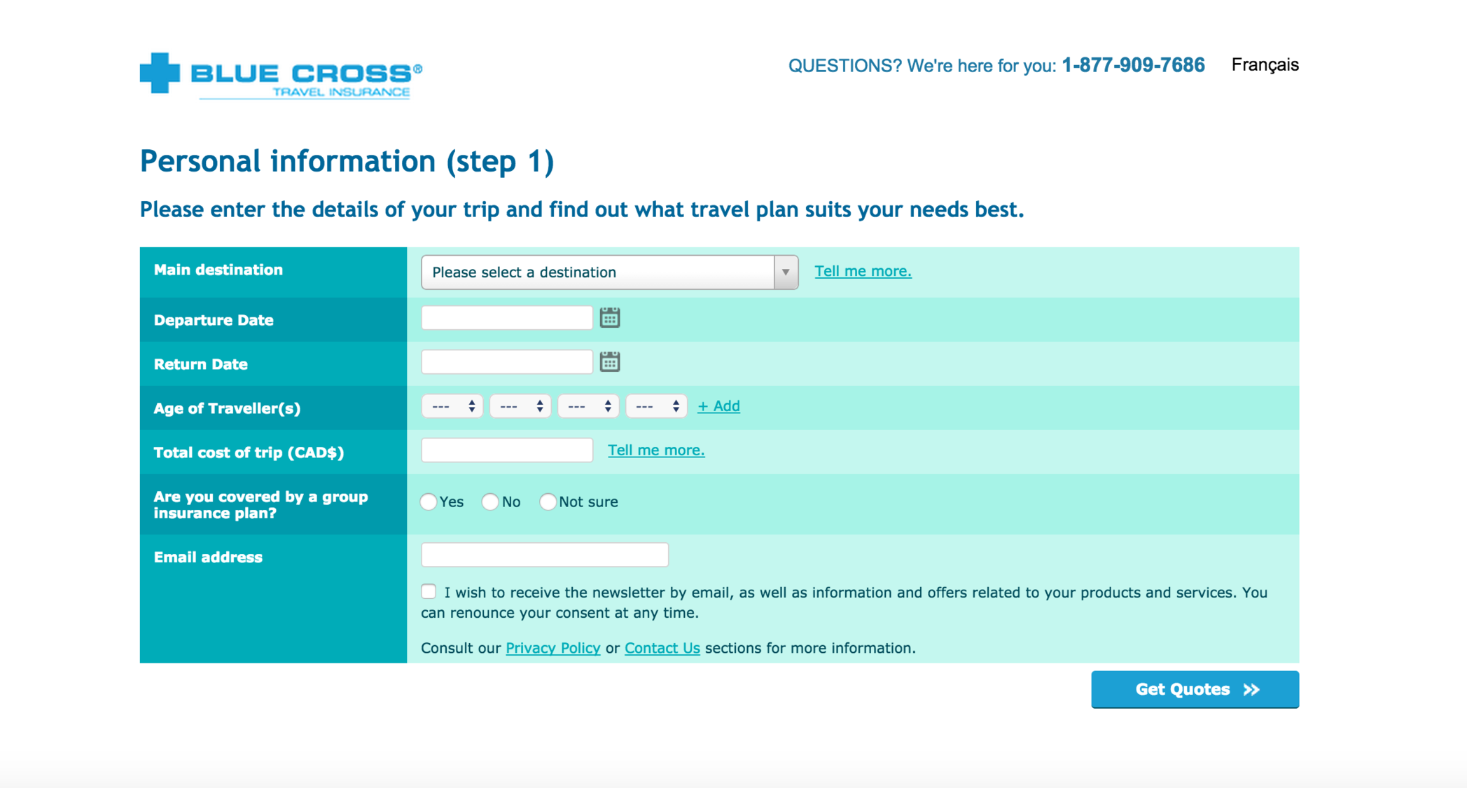
Here is what I got instead:
Now, having this as a landing page is much more than a message match problem. If I’d be in control of this campaign, I’d scrap this page and make a proper landing page full of information where there would be a simple call to action button to get a quote. Then only AFTER I click the call to action button on the landing page would it make sense to see this form. Here, they totally skipped the landing page and dropped me straight to a form. Now, I could write a lot more on what’s wrong with this page, but let’s focus on the message match.
As you probably guessed, this one is a complete failure. The ad is for a travel insurance, but when I get on this page, I barely see anything about their travel insurance plans or that they even offer travel insurance.
First thing I notice is the headline “Personal Information,” which is a problem in itself. Not only is a headline with a clear value proposition and call to action missing, but it’s asking me for my personal information right away? Red flags right here.
Before giving away my personal information and taking the time to fill out this form, I would like to know much more about the company and their offer, but no, I’m asked to give them everything. My response? A click on the back button.
Additionally, the text of their ad doesn’t say much, all I knew was that I could get a quote for travel insurance through their site. Although I can get a quote through their landing page, they skipped a bunch of fundamentals and went to the ask right away (and worst, they’re asking for it in a very weak way). Avoid anything they’ve done.
Samsung Galaxy Tab A
I have to warn you in advance, the landing page in this example does everything you should avoid when building a landing page: No call to action, no message match, no clear goal, nothing – except for a perfect scent match (which is good).
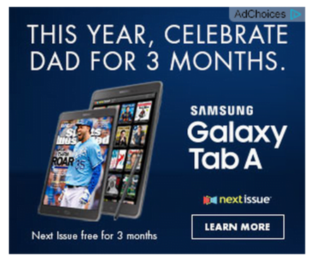
Here’s the banner ad that I clicked on:
The ad is not too bad, from what I see they’re aiming to leverage the upcoming Father’s Day to get sons to buy a Samsung tablet as a gift to their father.
Then when I click on the ad…I get this.
This is the complete landing page, so as you can probably conclude by now, message match is definitely not a notion present on the page.
The main headline is “The Ultimate Family Solution.” The display ad mentioned a 3-month promotion for Next Issue along with the tablet being a perfect gift for Father’s Day, and none of this is addressed on the landing page. It’s just like the burrito store – I thought I would learn more about the promotion and why the tablet is a perfect gift for dads, but this offer is unrelated.
Where’s the info about the promotion? How is this related to Father’s Day? I hit my browser’s back button.
Finally, a good example: Air Canada
Air Canada’s message and scent match game is spot on! Here’s the ad I clicked on:
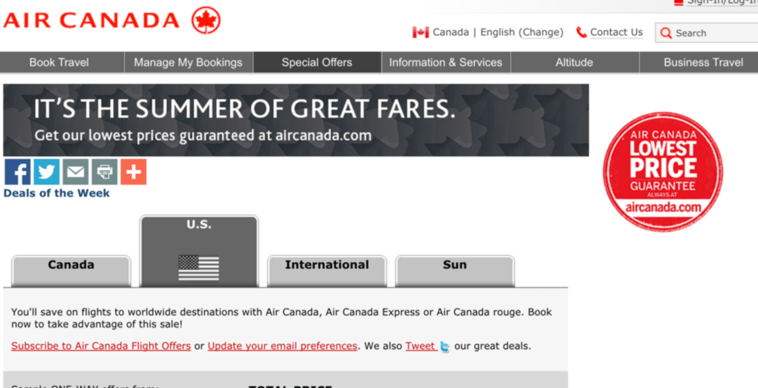
And here’s their landing page:
Look at the headline and the subhead in the ad and on the landing page. It’s a match! Air Canada did a great job here, the kept the ad consistent with their landing page. The offer stays the same and everyone’s happy.
As for look and feel, they got that right too: the same background, colors and formatting have been used both on the ad and on the webpage.
That’s what you want to aim for.
How to avoid scent and message match problems
Message match and scent match problems are easier to avoid that you would think. The concept is pretty basic: Your ad should look and feel like your landing page, and the message and offer should be the same. Voilà. Simple, eh?
Now, the best way to obtain a perfect scent/message match is simply to create a specific landing page for each variation of your ads. Your landing page variations don’t need to be re-created from scratch – duplicating your existing page and just changing the headline and a few lines of text so it matches your ad will suffice in most cases.
If you’re doing your landing pages yourself, it might take you a little more time, and if you’re paying someone else to do it, it might cost more; however, the net result will undoubtedly be a huge increase in conversions.
About the Author
Raphael Paulin-Daigle is serial entrepreneur and conversion rate optimizer. He runs a monthly-recurring website optimization service called Splitbase that helps companies increase sales and grow faster. His mission is to educate entrepreneurs and founders on how to get started with conversion optimization, which he does through his blog. Grab his free mini video course here.


