If you’re not already using Facebook advertising, you probably know you should be – it’s cost-effective, the reach is huge, and the targeting capabilities are phenomenal.
But there’s more to Facebook Ads than just the ads! If your campaigns are going to succeed, you also need great Facebook landing pages. Although creating compelling visual ads for your Facebook campaigns is crucial, it’s only half the battle – your accompanying landing pages need to be just as strong (if not more so) to ensure your visitors go the distance and convert.
P.S. We have a podcast episode on this topic! Check out Goal Talk Podcast Episode 13: The Anatomy of a Money-Making Landing Page.
In this post, we’ll be looking at everything you need to know about Facebook landing pages, from how to ensure continuity of your messaging from ad to landing page, to what elements you need to consider when designing the landing pages themselves. By the end of this post, you’ll be equipped to make your own ass-kicking Facebook landing pages, so let’s get started.
What are Facebook landing pages?
Before we go any further, it’s important that we clarify what we’re actually talking about when we mention Facebook landing pages.
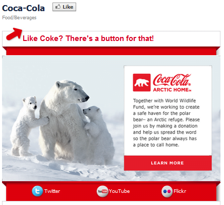
Not so long ago, Facebook landing pages were pages that advertisers could create using third-party platforms to prompt users to complete a desired action. This could be something as simple as “Liking” a page, or a more involved action like completing a web form. The example below is of one such page for Coca-Cola:
This is a great example of what is known as a “Like gate,” a pop-up or page designed to prompt the user to Like a page before allowing them to access the content they’re interested in. There are many variations of this type of “landing page,” such as competitions, special offers, limited-time downloads, and online tie-ins to real-world promotions, such as code redemption offers for digital goods etc.
However, for the purposes of this blog post, we’ll be talking about actual landing pages. Facebook landing pages are pages that a visitor is taken to after clicking on a Facebook ad. You might think there’d be nothing much to distinguish Facebook landing pages from their paid search counterparts, but there are several elements you should consider before launching your campaigns.
Why are Facebook landing pages important?
Considering the immense amount of paid and organic content Facebook users consume while scrolling through their News Feeds and clicking through Stories, catching their attention and enticing them to engage with your business is no easy task.
You work hard to drive clicks—tweaking ad copy, experimenting with different image formats, sharing a video here and there. We’re talking about serious investments of time and money. But if few to none of those clicks convert into revenue for your business, then what’s the point?
That’s why Facebook landing pages are important—because they determine whether you drive any returns from your efforts and ad spend. Even if a Facebook user truly loves your ad, if she doesn’t see anything of interest or substance after clicking through, she has no reason to convert—no matter what action you’re trying to inspire her to take.
There’s a reason marketers talk about the “customer journey” so often: people take multiple steps before becoming paying customers. And if you don’t engage them and deliver legitimate value at every step, they’re going to take their business elsewhere.
4 Tips for Creating Amazing Facebook Landing Pages
Ready to turn clicks on your Facebook ads into revenue for your business like never before? Check out our four best tips for creating amazing Facebook landing pages.
1. Consider user intent on your Facebook landing pages
One of Facebook ads’ greatest strengths is that they’re inherently visual. Given that Facebook restricts advertisers to using just 20% of an ad’s virtual real estate for text, Facebook ads often look great, which makes them easier on the eye and significantly more clickable. They also blend in much more effectively with organic content in users’ news feeds, resulting in a much better experience for the user.
However, this also means more work for advertisers – or, at least, more things to think about. With text ads, you can send visitors to pretty much whatever page you like (as long as it’s relevant to the ad), but with Facebook ads, you have to consider the user experience once they’ve clicked on your ad. Let’s take a look at some examples.
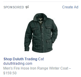
Here is an ad, captured from my Facebook feed, for a winter coat sold by Duluth Trading Co. (a coat I happen to own already and bought online, proving there’s room for improvement, even for Facebook’s powerfully granular targeting options):
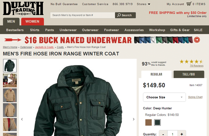
When I click on this ad, I’m taken to this page:
Obviously, this landing page features the exact product that was advertised in my Facebook feed (a solid plus in terms of relevance), but it doesn’t provide me with any incentive to click around if, for whatever reason, I decide I’m not in the market for a new winter coat, or this coat in particular.
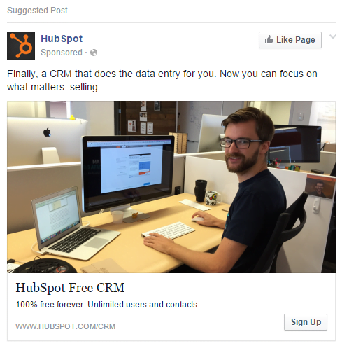
Now let’s look at an example from HubSpot:
This ad is obviously promoting HubSpot’s CRM product. The ad features some compelling copy that emphasizes the product’s benefits, such as “100% free forever” and “Unlimited users and contacts.” It also makes use of the “Sign Up” call-to-action button that lets visitors convert directly from the ad. If I were looking for a CRM solution, this would likely pique my interest, so I click on the ad – only to be taken to this page:
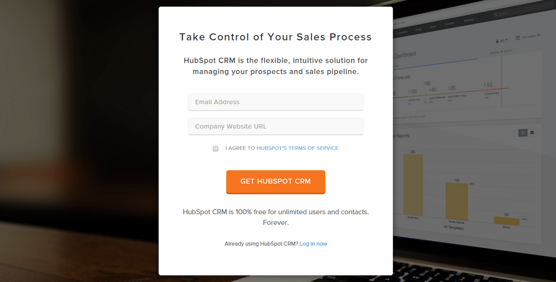
Woah, woah, woah – hang on a minute, HubSpot. I clicked on that ad expecting to learn more about HubSpot’s CRM, not to sign up for anything. Sure, this page tells me that HubSpot’s CRM “is the flexible, intuitive solution for managing your prospects and sales pipeline,” but this copy doesn’t tell me anything substantial. It’s precisely the kind of copy I’d expect from any CRM vendor. Now, for all I know, this landing page has a crazy-high conversion rate, but it’s definitely not what I expected.
Secondly, this landing page immediately presents me with a web form. Sure, it’s not asking for a lot of information – just an email address and a company URL – but it’s still more information than I’m prepared to hand over at this stage, which is precisely none. Remember – I came to this page from a Facebook ad, which means I’m most likely not in a commitment frame of mind. Yes, HubSpot’s CRM is “100% free forever” as the ad informed me, but that still doesn’t mean I’m ready to sign up for anything.
If I perform a search with high commercial intent on Google for desktop, I’m probably much more focused on elements such as functionality, features, and pricing, and more likely receptive to a landing page like this. If I click an ad from Facebook on mobile, I’m almost definitely not going to be interested in an even slightly harder sell like this, particularly for this kind of product.
2. Ensure visual continuity between your ads and your Facebook landing pages
Remember how we said that one of the greatest strengths of Facebook ads are they’re visually rich? Well, this provides both opportunities and challenges for advertisers, as visual continuity between your ads and your landing pages becomes even more important, especially on mobile.
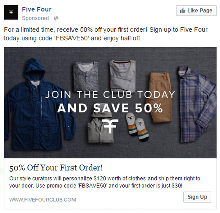
Let’s take a look at another example to see what I mean. Here’s a Facebook ad for clothing retailer Five Four Club:
This ad makes excellent use of text despite Facebook’s 20% rule, and even manages to sneak in some additional branding with the inclusion of the logo. Now that the ad has caught my attention with its promises of stylish clothing at a 50% discount, I click on the ad, which takes me to this page:
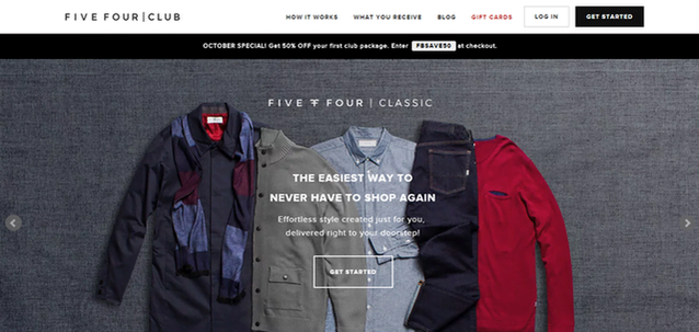
See how closely the ad and the landing page are aligned in terms of aesthetics and overall design? It’s the perfect progression from ad to landing page, and gives me exactly what I expect when I click on that ad. The landing page also follows a number of other best practices, such as reinforcing the benefits of the service, including compelling language with minimal copy, and featuring the coupon code to get the 50% discount promised by the ad.
There’s still room for improvement here, however. This Facebook landing page could have emphasized the discount offer featured in the ad much more strongly – it’s obvious that this page was not created specifically to accompany that Facebook ad, which is why Four Five Club opted for the temporary banner beneath the page’s navigation bar. Still, it’s a great example of how matching visual continuity from ad to landing page can be very effective for Facebook advertisers.
3. Optimize your Facebook landing pages for mobile
Almost half of Facebook’s 1.49 billion monthly active users only access Facebook from a mobile device. Let that sink in for a minute. That means that 655 million people – more than twice the entire population of the United States – NEVER access Facebook from a desktop. This trend is likely to continue, as it has for almost two years now.
Image via VentureBeat
With this kind of data, failing to optimize your Facebook landing pages for mobile could quite literally doom your campaigns to failure. You won’t see any major brands making this mistake, but if you’re a small brand or new to Facebook advertising, the risk of overlooking mobile-friendly landing pages is much higher.
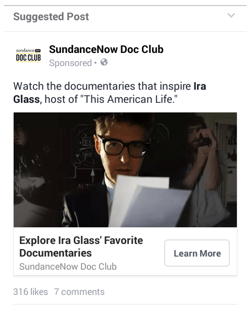
Let’s take a look at an example of a mobile Facebook landing page done right. Here, we have an ad for SundanceNow Doc Club, a streaming video subscription service for new independent documentary films (think of it as Netflix for documentary geeks):
This ad most definitely pertains to my interests, and so I click on the ad, which takes me to this landing page:
Everything about this mobile Facebook landing page adheres to best practices. The design and messaging match the ad, the copy is brief but compelling, it makes the benefits of the service abundantly clear, and the call to action is bold, easily clickable, and well phrased. Despite being pretty image-heavy, this mobile landing page also loaded very quickly, even on an older Android device.
I cannot stress the importance of mobile-friendly landing pages enough when it comes to Facebook advertising. Not only are millions of people only accessing Facebook from a mobile device, but this is the kind of user experience that today’s Internet users have come to expect. If you try forcing them to scroll around a page to fill out a web form on a page that isn’t optimized for mobile, you can forget about ever converting them – and you’ll probably damage your brand while you’re at it.
4. Apply best practices to your Facebook landing pages
Unlike Google, Facebook does not offer advertisers much in the way of best practices to follow with their landing pages.
While there are many similarities between search and social landing pages, the most crucial distinction between the two is that with Facebook, you’re searching for users – they aren’t searching for you. This means you can effectively think of Facebook ads as a component of your landing pages, or the first action in a longer process. Some campaigns may be able to offer users a simple, direct path to conversion directly from Facebook, but other campaigns may necessitate a longer, more indirect conversion path in which a Facebook ad is just the first step.
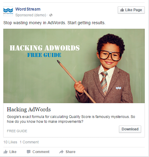
For example, one of our most successful Facebook advertising campaigns was for a content download. Here’s the ad:
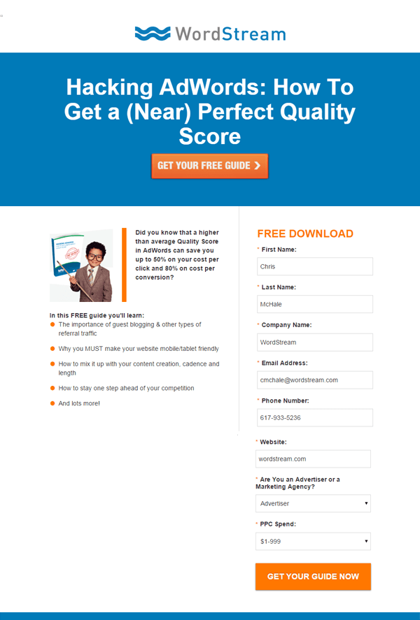
The copy is punchy and focuses on the benefits of reading the guide (and leverages the mystery about AdWords’ Quality Score to create additional interest), and the image proved immensely popular with our audience. Seriously, people love this kid. Here’s the landing page that users were taken to from this ad:
As you can see, we’re asking for quite a lot of information on this landing page. Nevertheless, this campaign performed extraordinarily well for us. Granted, traditional engagement with the ad – likes and comments – was low (as you might expect), but in terms of conversions, this ad/landing page combo is one of our most successful.
The complexity of your landing pages will depend greatly on the desired action you want prospects to take, and their content will depend on the nature of whatever you’re offering. A landing page for a whitepaper download, for example, might include some brief details of what the guide contains, whereas a landing page for a more costly service or product, such as a school or training course, might include more comprehensive information about the school and its programs.
As with any marketing initiative, Facebook advertising campaigns should be designed around the intent of the user. However, following the guidelines above, and landing page best practices in general, will help you increase conversion rates and provide a better experience for users interacting with your brand on Facebook.

