Many moons ago, before I became a WordStreamer, I applied for an entry-level position at a company that required six (yes, SIX) rounds of interviews. I persevered through the process, miraculously nailing the final interview and was informed that the only thing standing between me and my dream job was a single PowerPoint presentation.
To say I flubbed the final task would be a massive understatement. My submission was abominable. The story didn’t flow, the deck had no personality and it featured clip art (!).
Of the seven slides I created, this is the one I was most proud of. Sigh.
It wasn’t that I didn’t give it my all. I spent hours laboring over my slides. I just had no clue how to build a strong presentation.
Let’s fast forward a few years. I’ve now spoken at my fair share of industry events and I’m proud to report that I’ve overcome my PowerPoint handicap! So, for those of you who are still struggling to craft a halfway decent marketing slide deck, here’s my go-to, 13-step formula for a rocking marketing presentation:
#1. Take Your Audience on an Emotional Rollercoaster
The vast majority of business-related presentations are mind-numbingly boring. Make it your mission to stand out from the crowd and craft a memorable presentation that people are talking about for weeks to come!
When you’re presenting on a not-so-sexy topic (ahem, paid search), it’s tough to create a mind-blowing story arch. Alas, it can be done! The key is to take your audience on an emotional rollercoaster. We know that people are more apt to engage with ads that awaken their emotions. Presentations are the same way—they need a “hook” that draws people in on an emotional level. To achieve this, start by painting a picture of the pain points that they’re experiencing. Then, be the hero that shows them how to alleviate the problem.
Oli Gardner, who is famous for his mind-blowing CRO presentations, follows this formula religiously. He presents a few pessimistic, doomsday-style slides and then, once the audience is sufficiently bummed out, he swoops in with good news.
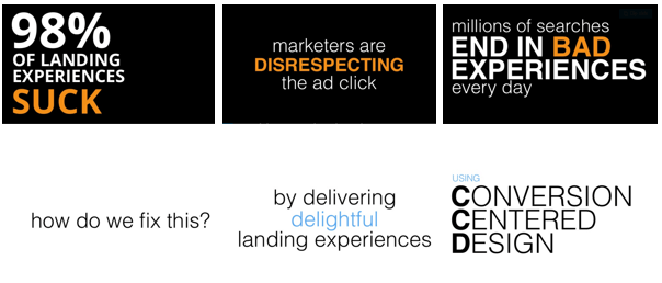
A series of slides from Oli Gardner’s 2014 HeroConf presentation, I Give A Sh!t About Your Conversion Rates.
In fact, Oli once advised me to draw out a “presentation path” for all rough drafts on a white board to identify the weakest sections. Now, when I finish a rough draft, I map out every slide. If it’s presenting positive information, I put it above my baseline. If my final map doesn’t show continues series of low points followed by high points, I know that I have work to do!

Here’s what it looks like when I start building my map!
#2. The More Slides, The Better
Peoples’ attention spans are abysmally short to begin with and in conference settings, they’re even worse. Chances are, attendees have already seen numerous presentations that day, their inboxes are piling up with emails from clients and colleagues who don’t realize they’re out of the office and they’re nursing a nasty hangover from the welcome reception the night before.
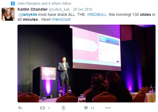
The best way to combat their waning attention spans is to keep your slides moving. Rather than speaking to one slide for several minutes, use multiple images to illustrate what you’re talking about, as you speak. If you can master this, you won’t need to reference the images at all, they’ll seamlessly coincide with your talking points. Larry Kim is the master of this technique—I once witnessed him cover 200 slides in 25 minutes!
#3. Make Your Audience Feel Like They Know You
Your audience is more apt to engage with your presentation if they feel a connection with you, personally. However, going about this without seeming like a narcissist can be tough. Believe me—once I started a presentation with six introduction slides and I’m pretty sure it warranted more than a few eye rolls. Rather than kicking things off with a lengthy introduction, try weaving personal stories into your slides.
My colleague, Mark Irvine, executed this strategy flawlessly this year at SMX West. He presented on advanced audience targeting and opened the conversation by explaining that identifying the perfect paid search audience was a lot like finding the right life partner.

In the beginning of the presentation he revealed that he just recently got engaged (congrats, Mark!!) and, as he walked through various targeting options, he equated each to a different stage in the dating game.
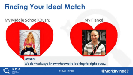
As Mark went through the presentation, the audience didn’t miss a beat. They related to his dating analogies, which made the sophisticated targeting strategies much easier to understand, and were captivated as they watched his love life progress.
#4. Be Funny – But Don’t Force It
The rough draft for my first conference-level marketing presentation was a disaster. Not only was it poorly organized, it was also miserably boring. So, I turned to WordStream’s resident conference vet, Larry Kim, for help. His recommendation was to make it 20 times funnier and he emailed me a handful of silly memes and gifs to add to the deck. There was just one problem—almost all of the images were references to movies that I’d never seen (The Matrix, Star Wars, Star Trek…you get the picture). I’m sure they were hilarious, but the humor went way over my head.

Regardless, I plastered them all over my slides, hoping the audience would love the humor, even if it went over my head.
Obviously, this was a terrible idea. After reviewing my new draft with a co-worker, he sat me down and advised me to ditch the nerd humor and replace it with content that I actually thought was funny. 20 minutes later, I had a deck riddled with photos of reality TV stars. It was so funny that, as I practiced my speech, I couldn’t look at the slides themselves because I’d be doubled over in laughter.
In the end, the presentation was a hit. Sure, most of the conference attendees were not devotees of Keeping up with the Kardashians, but because I was enthusiastic and the pictures were entertaining, they laughed anyway. The bottom line is, to nail the comedic delivery of your marketing presentation, you have to be 100% confident and excited about the content.
#5. Use High-Quality Images
Looking at blurry images on your desktop is annoying. Blow them up on a screen that’s 100x bigger and the crappy images are downright unbearable. Take the time to scout out visually stimulating, high-quality images for your marketing presentation. Personally, I spend hours scouring Unsplash and Gratisography, both of which offer unique, free, high-resolution pictures that serve as awesome backgrounds for PowerPoint presentations. (Use these images in your content marketing too!)
I’m also a huge fan of memes. Unfortunately, most of the memes floating around on the internet feature the exact same pictures, many of which are low-quality. Take matters into your own hands by creating memes yourself. I’m a big fan of MemeCreator, which allows you to upload your own image and overlay meme-style text.
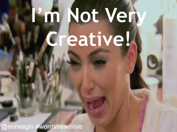
#6. Use Gifs Only for Reaction Slides
If you want an easy laugh, gifs are the way to go. The key is, never use a gif on a slide where you are sharing something profound like a graph, shocking data point or major takeaway. The repetitive motion will catch viewers’ attention and distract them from your mind-blowing content. Instead, use gifs on slides immediately after these points to reiterate them.
Select a gif that demonstrates the emotion your data should elicit from viewers. In a way, your gif will tell them how they should be responding. For example, when I shared graphs highlighting poor conversion rates for mobile devices, compared to desktops, I followed it with a gif of Dawson Leary, of Dawson’s Creek, sobbing profusely.

When I presented data showing that many advertisers were boosting CPCs to increase ad rank, but their conversion rates were still terrible in high positions, I followed it with a gif of Leonardo DiCaprio showing money into a trashcan. This reiterated my point that this was an expensive, overly wasteful tactic.

Giphy has an enormous library of gifs and excellent search functionality, so you’ll be able to find all the gifs you need there.

As you can see, I used animation to highlight the numerical component of this ad.
It’s also critical that you resist the temptation to overuse animation in your deck. It should solely be leveraged to highlight important sections of your images and graphs or show contrasting pictures side-by-side.
Oftentimes, when presenters share text in a bullet-point format, they use animation to show each point consecutively to prevent searchers from reading ahead. If you must share big chunks of text, just show one point per slide—it’ll be way easier for attendees to read!
#7. Share Real-Life Data
Hate to break it to you, but unless you’re a super-inspirational thought leader, most people aren’t attending your session because they want to know how you, personally, feel about the topic. Instead, they want to hear what you’ve concluded based on hard facts and data that you’ve collected. Share case studies and examples to back up all of your points. Ultimately, hard marketing data is way more powerful than simple generalizations.
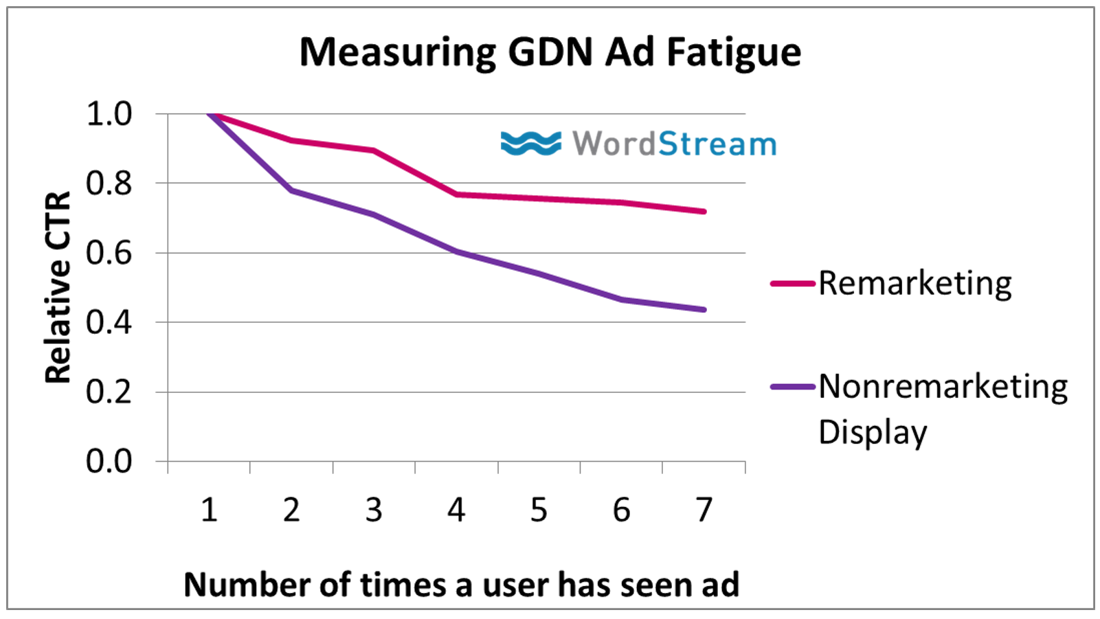
For example, rather than simply saying “in my experience, ad fatigue isn’t really a big issue for remarketers,” share a graph to demonstrate that remarketing ads fatigue at half the rate of non-remarketing ads. Having data to back up bold statements makes them far more credible!
#8. Provide *Actionable* Takeaways
There’s no sense in learning new, fascinating data if you can’t figure out how to use it to your advantage. Great presentations highlight problems, then provide clear instruction on how to fix them.
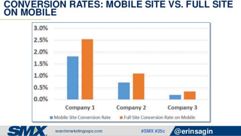
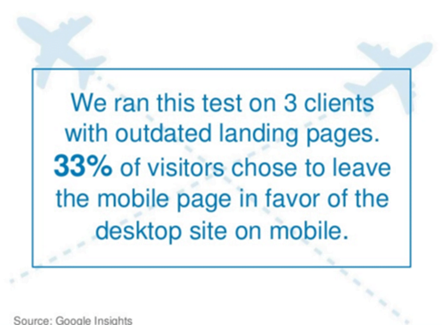
Check out the example above. As you can see, it’s some pretty crazy data showing that more people convert on mobile phones using a desktop-specific site than on mobile phones using a mobile-specific site. For mobile advertisers, this is huge. It shows that there is a major issue with many of their mobile landing pages…but what’s the sense in bumming everyone out if I can’t offer a solution? So, the follow-up slide was…
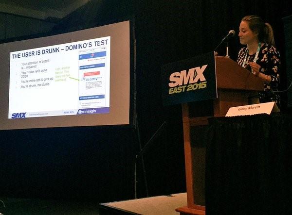
…you guessed it—a solution to the mobile landing page disaster! I walked them through a series of actionable, easy-to-implement changes (including the drunk test featured above) to repair their broken landing pages. Great public speakers make sure you don’t leave without writing something down.
#9. Your Twitter Details Should Appear on Every Slide
Gone are the days where presenters expect undivided attention during their sessions. As a speaker, you encourage your audience to pull out their phones and computers to engage with social media as you present.
There’s two major reasons you want to encourage tweeting during your presentation. Firstly, it will show conference organizers that you’re sharing exciting content that people deem worth of sharing with their networks. Secondly, with multi-track shows, it shows people who didn’t attend your session that they missed out on something special. As a result, they’re more likely to download your slides after the event or attend your session the next time around.
In the beginning of every presentation, I take the time to encourage viewers to tweet questions and comments my way. I also include my twitter handle and the event hashtag on every slide. This reminds them to share my content during the presentation and ensures they include both me and the event in their tweets, making them easy to track afterwards!
#10. Make Your Tweetable Moments “POP”

Piggybacking on my last point, one of the best ways to boost your Twitter mentions is to spoon-feed the audience exactly what you want them to share. Follow up each section of your presentation with a super-quotable catchphrase—bonus points if it’s less than 140 characters, so they can tweet it verbatim! As you can see in the example above, my goal for my Pubcon SFIMA session was to convince advertisers to spend more time creating more eye-catching, memorable ad copy. I nailed this point home with the catch phrase, “Your ads don’t have to suck!”

To make these “tweetable moments” really stand out, take a page from Margot da Cunha’s book, and feature the text on a dark background so it really pops. Works like a charm!
#11. Ask Someone Else to Proofread Your Deck
There’s nothing more mortifying than standing on stage alongside a deck riddled with grammatical errors. Not only is this vastly unprofessional, it’s also incredibly distracting to your audience (and maybe even yourself, if you catch it while you’re presenting).
The worst part is, these errors will continue to haunt you long after your in-person marketing presentation is complete. Oftentimes conference organizers make decks or recordings available through SlideShare, so attendees can access them long after the event itself. Even worse, your audience may take pictures as you present and post them to Twitter or in blogposts. God forbid a slide with an obvious error makes it online!
The best way to avoid this mishap is to ask others’ to review your presentation with a fine-toothed comb. Proofreading it on your own is a great start, but you’re more likely to overlook simple errors because you know what you want it to say.
# 12. Listen to Feedback, Damnit

When I’m deep in the throes of creating a presentation, I think about it non-stop. Once I went so far as to send a slew of texts to my own phone because I had some genius ideas (or so I thought) when I was out at a bar! You get the picture – by the time I have a rough draft ready for review, I’ve already expended a considerable amount of brain power on the project and love it like a first-born child.
When I finally share “my baby” with others, it can be painful to hear negative feedback on it. However, it’s crucial to take this criticism seriously and be open to making adjustments to your deck. When others review it, they’ll give you valuable insight into what makes sense, what’s distracting and where your story falls flat. Take the time to understand their viewpoints and make the necessary adjustments before you get on stage.
#13. Get the Most Out of Your Work by Repurposing Your Deck
The first thought that crosses my mind after presenting at a conference is, “geez, I can’t believe I spent weeks slaving over this deck and the whole presentation is over after 20 minutes!” So, I’ve made it my mission to glean as much traction as I can out of each and every marketing deck. To extend a presentation’s visibility to people who didn’t attend it, I upload my deck to SlideShare and share the link through all my social media channels.

Next, I create a long-form blogpost covering my presentation content, which is loosely based off of the script I wrote for the event itself. If it was a lengthy presentation, sometimes I can even turn it into a series of posts.
Finally, I partner with our marketing team to create webinars based on the original deck. The more blogposts, guides and webinars I can get out of a presentation, the easier it is to justify spending a ton of time crafting it.
Are you wasting money in Google Ads?

Meet The Author
Erin Sagin
Erin Sagin worked at WordStream for five years with roles in Customer Success and Marketing. She lives in California.