
What is the best button color for boosting conversions?
Red? Orange? Green? Blue?
According to HubSpot, red beats green:
This study on CTA button color is easily one of the most authoritative out there. The study tracked conversions to see if there was any difference in performance of the two button colors based on a sample of 2,000 visitors to the landing page. Contrary to the study author’s expectations, the red CTA button outperformed the green one by a whopping 21%. So is that the final answer? Are red buttons the key to effective web design?
As far as Unbounce is concerned, the future of web design and optimization is BOB: That stands for Big Orange Button. A Wider Funnel test corroborated this stance with a study that showed a Big Orange Button resulted in a 32.5% increase in conversions. As Unbounce notes, “According to Wikipedia, Orange represents energy, enthusiasm, and a ‘get-it-done’ attitude. Sounds like a call to action to me.”
I mean, what CTA button color converts better than one that asks you to just “get it done,” right?
Really Good Emails took an entirely different approach: it analyzed every email sent to it in a particular year to see what is unique about them, as well as what they all have in common. Really Good Emails concluded that blue is the clear winner and CTA button color of choice.
According to Dmix? Red wins!
And Monetate? Blue beats orange!
I could go on and on, but I’m sure you’ve gotten the gist by now. Some CRO experts are certain your button should be a certain color. As for me, rather than focusing on button color alone, I believe the context of the button (i.e., your web design) is what’s important.
Here are five critical web design mistakes that cost you conversions – regardless of your CTA button color.
1. Using CTA colors that blend in
The very first web design mistake you can make when it comes to your landing pages is that of using a CTA button color that blends in.
For a moment, let’s take a look at the HubSpot study again:
When you carefully analyze that image, something becomes instantly clear: the green button blends in with the site’s design. The site’s color scheme and background is green. After black, green is the most used color on that page. Naturally, users are already used to seeing the color green and are as a result more likely to ignore it.
Now, when you take a look at the CTA button on this page comparing VPS services, however, the bright orange color stands out in stark contrast to the site’s blue color scheme – and that is all that matters.
This makes sense and goes in line with a principle of psychology called sensory adaptation. While this doesn’t talk about color psychology exactly, it does talk about stimuli and how we respond to them. According to this principle, repeated exposure to any stimulus prompts us to gradually tune it out until we fail to notice it.
Take a minute to think about what happens when you wear your clothes or your shoes. You feel it for a while, and then it feels as if it is part of your body. Okay, how about when you dip your hands into slightly hot water for a few minutes? It hurts at first, but then your hand adapts and you no longer feel it. That is sensory adaptation at work, and it is one of the first principles you should understand when it comes to web design and conversion rate optimization. Whether it is repeat noise or a button color, we are hardwired to react in the same way and start ignoring the stimulus.
Before you start your button color tests, realize that a color that stands out – whether it is red or orange – will always outperform a color that blends in. So, always make sure to design your website such that your button color stands out in comparison to your color scheme.
2. Making buttons that are too small – or too big
Just as CTA button color needs to stand out, the size of your CTA needs to be a good – and compelling – fit. Another very common web design mistake is creating buttons that are either too small or too big.
Let’s go back to the WiderFunnel test, which resulted in a 32.5% increase in conversions and the concept of the “Big Orange Button.” It is clear that the button size played a major role in the increase in conversions.
In fact, an article on call to action button best practices implies that using a CTA button that is 20% larger than the logo is a good idea.
So how important is CTA button size? Important, but relatively. Your CTA button should be large enough to be noticeable in comparison to other elements on your page – so that it stands out. However, especially in a world where more people access the Internet from mobile devices than desktop computers, making it too large – in a way that worsens your web design and diminishes UX – can backfire and result in a decrease in conversions.
So when it comes to CTAs, size matters: It has to be big enough to stand out, to be noticeable, but at the same time it shouldn’t be so big that it impacts user experience.
3. Ignoring your audience’s color preference
Besides using CTA colors that blend in, another critical web design mistake you can make is ignoring your audience’s color preference, both for your CTA and overall landing page color scheme.
If you run a website where your audience consists of cyclists with a preference for doing risky things and a website where your audience consists of yogis looking for peace and calm in their lives, due to this huge divide in the type of audience, the color that appeals to each audiences will be different.
In fact, research shows that color of your web design alone can influence people’s decision to interact with your brand. One study found that people will decide whether to interact with you within 90 seconds, and that up to 90% of this decision will be influenced by color.
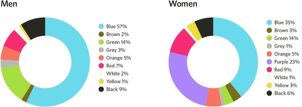
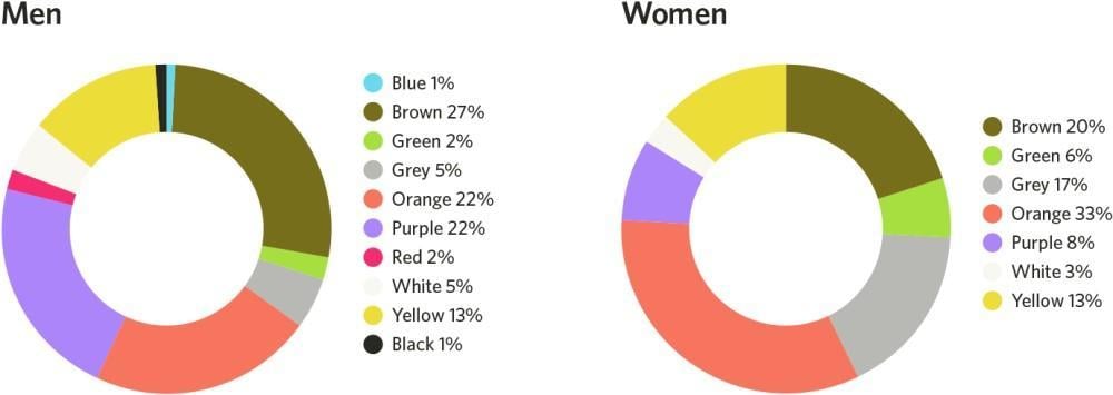
Men and women typically have different color preferences. A color that works for an audience of men might not be as effective for an audience of women. This is worth keeping in mind.
The chart below shows common color preferences for men and women:
And this chart shows color dislikes:
4. Not optimizing for user flow
What is user flow? Basically, it’s the series of steps a user takes to achieve a particular goal on a website.
Good web design and conversion optimization should not ignore user flow. Moz found that when users were asked to “schedule a demo,” users would have to stop what they are doing, check their calendar, and see if there is available time matching the company’s schedule. User flow was interrupted by this, and it affected conversions. By tweaking the CTA offer from “Schedule a Demo Today!” to “FREE 5 Min Demo Video,” Moz eliminated the need for having to check the calendar. This consequently improved user flow, and conversions increased by a massive 739%.
Web design and CRO success is about more than just getting users to click a button. It’s about getting visitors to become leads, and it’s about getting leads to become paying customers. This means your effort goes beyond just the landing page. The subscription and checkout page matter, too.
Any action that makes users stop, or even pause, in the process of achieving the goal you set for them on your website is a fundamental web design mistake because it interrupts their flow and costs you conversions. This could be how your site structure and elements are designed – there is no point in straying from user expectations on your website.
Various studies have demonstrated that every extra form field you add interrupts user flow and negatively affects conversions. So drop those extra form fields from your web design. Only request for the barest minimum information you need to get users to act now – you can gradually get other necessary information later.
5. Forgetting trust factors to boost your credibility
Often, when you go through CRO studies, you see a major brand implement a particular conversion hack with great results. But when you go ahead to incorporate the same thing into your web design, you got nothing. Or sometimes your conversions even suffer.
After all, based on how much Amazon (or your favorite big brand) spends on conversions, if it implements a particular conversion tweak it can’t be wrong, right? Not necessarily. Your not getting results doesn’t necessarily invalidate the experiment you read: perhaps you are studying that particular experiment in isolation when, in reality, there are other factors at play.
Let me be clearer: You could have the best offer, extraordinarily good copy, and follow all the tips in this article, but it wouldn’t move the needle for you if people do not trust you. In a world rife with scams and spams, people aren’t just careful about who they give their credit card details to – they are also careful about who they give their email address to.
If people do not trust you, conversion optimization hacks won’t make much of a difference. This is why one of the most common web design mistakes I see is failing to improve their trust factors.
Simple tweaks like using a trust seal can double your conversions – as many as 48% of people won’t trust a website that doesn’t use a trust mark.
Research also shows that simply enabling SSL can boost sales by up to 30%.
Take active measures to ensure that you communicate trust with visitors to your landing page:
- Use trust marks and secure seals to give assurance about users’ security on your website.
- Use SSL – let them see that green padlock!
- Use social proof when possible to reinforce the belief that they aren’t taking a leap of faith in dealing with you; they are joining others who have achieved great results.
- Make it easy to contact you on your website.
Remember: Your CRO results may vary
At the end of the day, it is important to realize that when it comes to conversion rate optimizations, there is no one-size-fits-all approach to things. You can’t always depend on hacks that work for other companies to work for you. But what you can do? Make sure to review your account and avoid these critical web design mistakes.
About the author
Robert Mening is a web designer and conversion optimization expert who runs WebsiteSetup.org, a project that has helped over 250,000 start their own websites.







![Search Advertising Benchmarks for Your Industry [Report]](https://www.wordstream.com/wp-content/uploads/2024/04/RecRead-Guide-Google-Benchmarks.webp)


