Your bids are competitive, your ads are laser targeted, and you’ve tested and tweaked your landing page to get the highest possible conversion rate. Ever.
You feel like Leonardo DiCaprio stand-spooning Kate Winslet on the Titanic, breathing in that fresh scent of saltwater greenbacks while your sales and leads keep pouring in. You’re a marketing genius (and you’ve earned the right to call yourself that).
But then you wake up.
Realizing that your 1997 GeoCities hosted landing page hasn’t seen an improvement since, well, 1997. And your potential profits are like a leaking ship. Slowly. Dripping. Away.
While you’re staying profitable (for now), your competitors are figuring out ways to improve, enhance, and build trust and relationships with clients that could have been yours. All because their first impression was more impressive than yours.
But don’t worry. There’s still time to improve your landing page conversion rates.
First, let’s clear the air and separate fact from fiction.
FACT: Your biggest conversion rate gains won’t come from the new ad you create, they’ll come from the landing page you test.
FICTION: Landing page testing is difficult and expensive, not to mention time-consuming.
The goal of this post is to give you proven ideas to test and try on your own site to increase your landing page conversion rates and lower your cost per acquisition.
Let’s get to work!
1. Test Your Headline & Value Proposition
Not only is the headline one of the first things a person sees when on your site, but did you know that on average, only 2 out of 10 people continue to read what’s after the headline?
Talk about do or die!
The goal of your headline should be for your visitor to feel compelled enough to read whatever’s next.
Here are some tips for landing page headline testing:
- Keep it simple and clear, as clarity almost always trumps persuasion, e.g. “We’ll Improve Your Conversion Rates, Guaranteed.”
- Promise to solve a unique problem your visitor is facing. Give them a solution.
- Does your headline match what your ad is saying? If not, test this out to see the power of consistency.
- Use “Title Case for Your Headlines” and “Subhead case for your subheads.”
- Start it off as a question. For example: Want More Conversions For Less Money?
- Try National Enquirer type headlines: “Godly New Fruit Melts Away Fat. American Moms Now In A Frenzy!” Just make sure you’re being truthful.
- Use words that sell, like Free, Discover, Secret, Results, Quick, Guaranteed, etc.
- Are you funny? Then try humor.
- Use the wording “How To…..”
These are just a few ideas to get you started. Your job is to get creative and test them out, as every type of headline will yield different results.
And whether you’re writing headlines for PPC landing pages or trying to SEO your blog post, make sure you’re compelling, honest, and leave the reader wanting more.
Here’s another little trick: The Emotional Marketing Value Headline Analyzer is a free tool that lets you test different variations of your headline, and then gives you a percentage score telling you whether your headline is more intellectual, empathetic, or spiritual and what emotional marketing value it has.
The higher the percentage, the more emotional marketing power there is in your headline.
For example, here are some of the headlines I tested with the EMVHA:
- 12 Landing Page Changes That Will Shock Your Conversion Rates (10%)
- Higher Conversion Rates With Lower Costs, The Fast Way (11.11%)
- Improve Your Conversion Rates With These Easy Tips (37.5%)
- 12 Quick & Fast Ways To Get More Sales, Leads, and Sign Ups (18.18%)
- 12 Easy Landing Page Tweaks That Will Shock Your Conversions, Starting Today (38.46%)
- Woah! 12 Ideas To Increase Your Conversion Rates (37.50%)
- Do Your Conversion Rates Need A Little Lift? (25%)
- These 12 Easy Tricks Will Increase Your Conversion Rates, Starting Today. (45.45%)
- WARNING: Increasing Your Conversion Rate Is Easier Than You Thought (30%)
(Of course, you’ll still want to run your own A/B tests, since “emotion” is subjective, and your audience might not enjoy being manipulated emotionally.)
Much like your headline, your value proposition is something that is unique to your business, like your USP, and it’s very similar to what you’d want to communicate in your headline.
If you know the pain points and fears your potential customer is facing, this should help you write a headline and value proposition specifically tailored to them.
2. Add Testimonials & Reviews
Positive endorsements give your visitors assurance that you’re legit – if they’re done right.
Word of mouth is the most powerful marketing there is, and client testimonials, reviews, and endorsements are your closest thing to social proof.
Many companies put up landing page testimonials that are way too generic and weak. They’re simply not believable. Stuff like:
“Great work!” – John A.
“Wow!” – Vicky H.
“We’re making so much more money now!” – Frank Q.
And my favorite…
“Thanks.” – Ricky B.
Not only are these testimonials insanely short, but they come off as fake.
Who is Vicky? And who the hell is Ricky?
You want to use testimonials that describe how your client has benefited from something you’ve helped with. The more detail there is, the more “human” they are. And the more human, the more believable.
Here’s a better example (not real):
“Not only did WordStream help me overcome my fear of marketing, but they showed me exactly where my advertising dollars were being wasted and which areas were more profitable than others. My business now has a 72% better ROI than before.” – James Van Der Beek, CEO of DawsonsCreekDVDs.com
Note that the full name and business are included, as well details about what kind of results they got with the product/service. Not only is this testimonial more convincing, but it can be used as a reference if your potential customer is still not convinced about doing business with you.
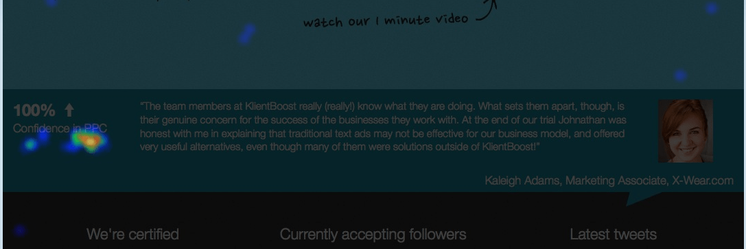
If you don’t think testimonials are important, take a look at our CrazyEgg heat map from a testimonial on the KlientBoost site:
We have a slider for our testimonials, and it’s obvious that the clicks are red hot. People do care about this stuff!
Do you have well-known clients that are higher up the brand food chain? Use them instead of your average mom n’ pop store. Those people are the people your new customers are aspiring to be!
But be careful. The easy, quick, and wrong way to do this is to write the testimonials yourself, or go on Fiverr and hire someone to do it. I’ve spotted a couple of companies with testimonials from the same person because of their picture. Ouch!
If you can, ask your clients for their LinkedIn picture, as they already have that online. That way they’re more likely to go with it and let you use their picture.
3. Optimize Your Lead Capture Form
Your lead gen/capture form may be the quickest and easiest area for conversion rate improvement on your landing page.
Many studies have been conducted about landing page forms, and it’s a general consensus that the more information you ask for, the lower your conversion rate will be.
See, even if the visitor doesn’t actually start to fill out the form, they’ll still see it and may decide whether or not they want to start filling it out based on the number of fields. A high number of required fields will either scare them away, or they’ll abandon it half way through.
Do you ask for both first and last name? Why? Why not just “Name”?
Are you asking for their company name too? Why?! You can get that later!
What about different home phone, cell phone, work phone fields?
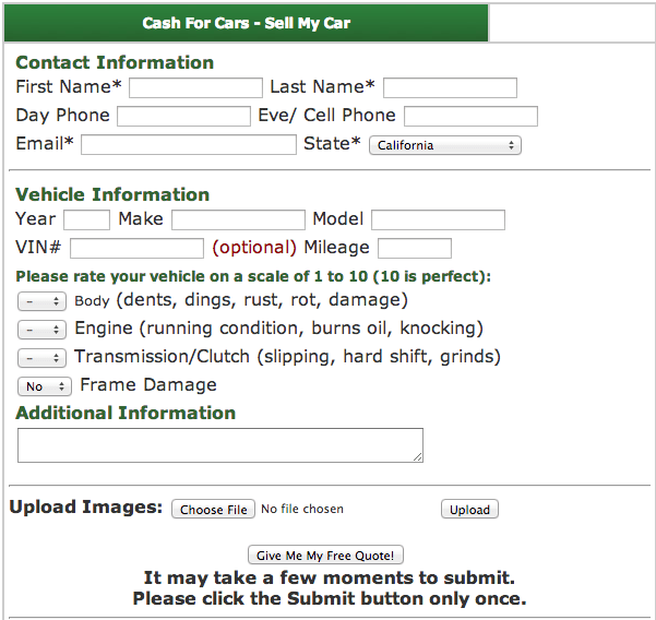
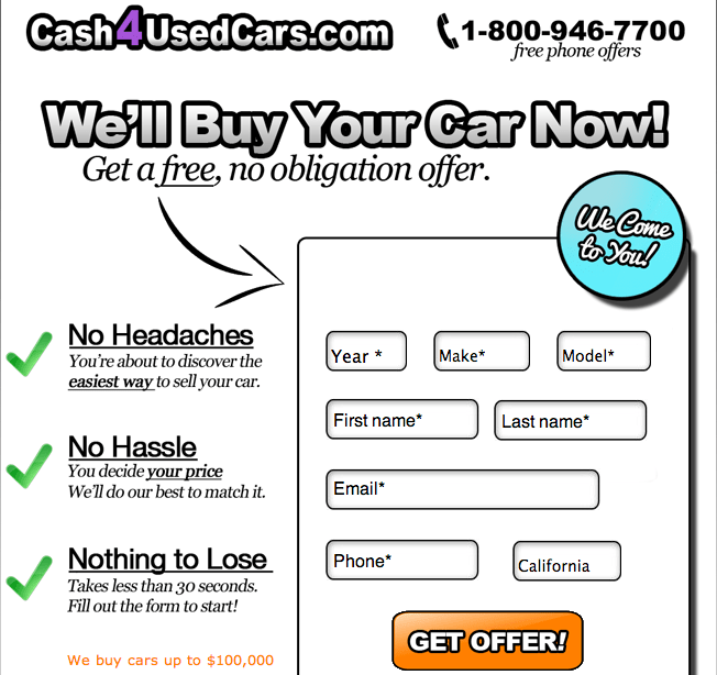
Here’s a test we ran for Cash4UsedCars.com, an online car selling service.
Their old form looked like this:
Here’s the new form (note that they wanted to keep the first and last name fields):
The result? A 77% increase in conversion rates and a decrease of 42% cost per lead.
While this was more of a radical redesign, we are still testing all the elements of the page to continually improve the conversion rates.
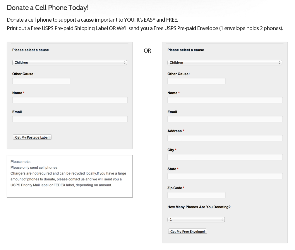
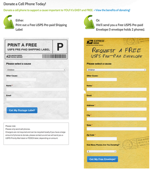
Here’s another example from one of our clients, Second Wave Recycling, an online cell phone donation charity. This one’s a bit more creative. Their old form:
And the new form:
The result of this landing page test was a 53% increase in donations. That’s with no change in advertising budget, no change in the ads, and no change in the bids.
We made it visually simpler and easier to distinguish between the two options. Either print a free pre-paid USPS label, or request a pre-paid envelope. We also made the copy easier to read, added some directional cues, and changed the color of the buttons.
But what if your form has a ton of required information and you’re not able to reduce the amount of fields?
Let me introduce you to the power of the progress bar.
The progress bar is a simple solution to break up your form into multiple steps so people aren’t overwhelmed with a form that’s as long as the dead sea scrolls. You can see a simple educational one in action right here.
4. Put Landing Page Visitors in the Isolation Tank
One common theme you see with strong PPC landing pages is isolation.
The Cash4UsedCars landing page I showed you earlier is a great example of an isolated landing page that only has one purpose and no other links, besides some hidden away in the footer.
No header links and nothing else you can click on that might distract you from filling out the form.
This method of isolating the visitor is a great combatant of something called the Zeigarnik Effect. The Zeigarnik Effect occurs when your brain feels dissonance from uncompleted tasks. You’ll remember these unfinished tasks better than the ones you finished.
So with only one task on the site, it’s easier for visitors to focus on that and complete the conversion. Keep that in mind when you create your landing pages.
5. Test Button Color, Shape, and Size
There’s a science behind Amazon’s, Apple’s, and Target’s rounded corner buttons. The color, shape, and size of the button is a huge part of conversion psychology.
The button on your site is the #1 most important item that you want clicked. So it’s vital to make sure it’s performing at peak condition, like Michael Phelps was during the 2008 Olympics (and not how he performed afterwards).
Here are some things to consider:
COLOR: Your button’s color should contrast from the rest of the site so it sticks out. Don’t make it the same colors as other elements on your site.
Take LegalZoom for example.
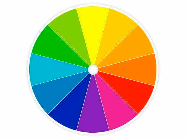
Orange is the opposite of blue, red the opposite of green, and purple the opposite of yellow. Use this color wheel to find your complementary and contrasting color for your button test.
What’s the best practice? It’s widely accepted that orange is a great “click color” because it creates the feeling of buying or selling, it’s energetic. Both Unbounce and SiteTuners use it on their sites – and they’re conversion rate optimization companies, so they should know!
Red, on the other hand, creates a sense of urgency and could work just as well, or even better than an orange button. Don’t make assumptions – your tests will determine which button color works best for you.
You’ll never find one color that makes everyone happy. But you’ll find one that makes the majority happy, and that’s the one that’s best for your landing page conversion rates.
SHAPE: Sometimes, buttons with sharp corners don’t convert as well as ones with rounded corners. Here’s why:
- Rounded corners are easier for the eyes and brain to process.
- We’ve been conditioned to be wary of sharp corners, as they can pose a threat. That also applies to buttons (crazy, right?).
- Sharp corners also tend to act as arrows, directing attention away from the button and not toward what’s inside, the call to action.
Consider, instead of a regular rectangle, square, oval, or round shape, using a combination of shapes. Amazon uses a combination of a circle and a rectangle:
The only way to figure out which one works best for you is, again, to test it out.
SIZE: Finally, your button size is also worthy of some easy testing. Increase or decrease its size to determine what gives you the highest conversion rates. (Hint: Bigger is usually better!)
6. Test Button Call-To-Action
Sometimes the call to action (CTA) on your button is more important than what the button looks like, and it’s also easier to test.
Take this test from Michael Aagaard at ContentVerve.com, for example.
By adding relevancy and value to the button’s CTA and also changing the form title, the landing page conversion rate increased by 31.54%.
The best approach is to focus on what the value and relevance is for the visitor. The vagueness of “Submit” doesn’t do much to tell the visitor what they’ll be getting.
Here’s an interesting video with some of Aagaard’s button call-to-action findings:
His suggestions for testing your button CTA include:
- Test the font color.
- Test using “My” instead of “Your.”
- Don’t focus on what a visitor has to do, focus on what they’ll get.
- Change verbs to “Get” where it makes sense. (“Get To Cart” doesn’t.)
- Test a right-pointing arrow on your button’s left side.
- Add value and relevancy to the button.
- Test a headline CTA and a subhead CTA.
- Test a hover effect that changes the color of the button.
7. Try a Chat Tool for Your Landing Page
For potential customers, calling someone at your company could feel extremely threatening.
Right there on the other side of the phone is a salesman waiting like a cat about to attack.
He’s got his hair slicked, script ready, his objection blockers rehearsed, and he just finished his third 5-Hour Energy shot while taking a look at his ankle tattoo saying “A.B.C.” (Always. Be. Closing).
He’s gonna get you.
But it’s not just the salesman on the other end of the line that’s a problem. What about the expectation of the dreaded call answering machine? “Sorry, zero is an invalid function, please try again.”
So how do you calm a visitor who knows that by calling, you have their phone number, and by emailing, you have their email address?
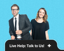
Meet Olark. Olark is by far my favorite solution when it comes to website chat. It looks great and has some unique features that allow for in-depth data and customization:
- See what city your visitors are from within the chat.
- See what page they’re currently on.
- See how long they’ve been on your site.
- Add any attention-grabbing image (like me juggling).
- Round robin operator system.
- Easy split-testing of greeter texts.
But most importantly, it’s an easy way for your prospective clients to get answers without having to pick up the phone, and it’s a lot faster than email.
We don’t require your name, email, phone number, or social security before the chat starts. We let our visitors hit the ground running with no lead capture.
I can’t even begin to tell you how many of our new clients have started their relationship with us via Olark. (We call it Cupid!)
8. Look Here! (Add Directional Cues)
Directional cues are like finger pointers. They try to move your attention to wherever they’re pointing.
There are two types of directional cues: explicit and implicit.
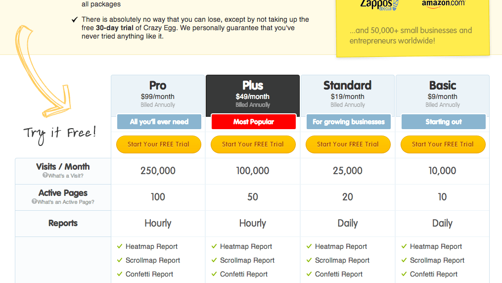
Explicit directional cues are like arrows that are obviously trying to move your attention to the form or the button the site wants you to click on.
Here’s one from CrazyEgg’s pricing page:
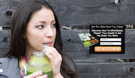
Implicit directional cues are more subtle. They’re like that woman-drinking-a-green-juice-out-of-a-mason-jar-because-all-the-other-glasses-were-dirty type of look.
See how she’s looking in the direction of the form? (Even though it looks like she’s actually by-passing the form and eyeballing that ice cream truck in the distance?)
And here’s everyone’s favorite gecko.
(The red arrows are only there to show you the subtle directional cues. They weren’t there in the live image.)
And to prove how powerful directional cues can be, take a look at these eye tracking examples and see the difference based on directional cues or lack thereof. Red indicates laser-focused eyes.
vs.
The difference is clear.
9. Create Explainer Videos & Sliders
You know those white board animated videos you see on websites that are around 1 to 3 minutes long? Those are explainer videos.
Explainer videos are, well, videos that explain what your business does. And if done right, these little animated masterpieces could increase your conversion rates by 30% (or more).
Why are they so effective? The answer has to do with our attention spans.
Our online attention spans have been steadily declining because of the speed of information we’re able to retrieve.
We don’t want to read books that have too many pages. We don’t even want to read a newspaper!
Explainer videos are easy to consume and understand because they’re visual and can arouse more emotions than reading.
But don’t just go all Steven Spielberg on me here. Explainer videos can be a bit tricky, so here are some tips:
- Explainer videos can be very expensive and hard to A/B split test since you’ll have to create uniquely different videos to do so. Plan things carefully.
- You might think the idea is all in the animation, but really it’s in the script. Spend some time creating a killer script.
- Think about voiceovers too. You want someone who meshes with your business identity. Do you sell saddles? Talk like a Texan. Do you rent out bouncey dragons? Talk like a kid. Do you want to sound super-smart and impress Americans? Talk like a Brit. (J/K. Sort of.)
- Include your best features/benefits and direct viewers with a call to action at the end of the video.
- Keep it as short as possible. Anything after a minute and a half will be hard to watch.
Want to see some examples? Here’s a look at WordStream’s own explainer video they use for their PPC landing pages:
Even though creating an explainer video isn’t easy, it’s well worth the effort if done right. And if you’ve ever thought about it before, make sure you do your research and inquire about pricing, because some providers aren’t the cheapest.
An alternative to explainer videos would be image sliders that have proven to sometimes work better than explainer videos.
Visual Website Optimizer created a case study in which the image slider had a 35% higher conversion rate lift than the explainer video. (However, in this case, the explainer video was almost 5 minutes long and very technical.)
Either way, an image slider or explainer video (or both!) is a great test if you have the resources.
10. Employ Trust Badges & Guarantees
Trust badges are pretty commonplace these days. Like product listing ads, it’s a must-test if you’re running an e-commerce store.
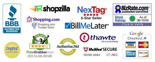
Badges like these have been known to help increase landing page conversion rates
It’s obvious that people care about your level of trustworthiness when shopping with you. But did you know that people will actually click on the badges, look at your https:// connection, and investigate your reviews to make sure you’re legit before even considering doing business with you?
A fellow Dane by the name of Karsten Lund ran a 6-month long A/B test in which he added just one badge in the header for an e-commerce store. The result? 32% conversion rate increase.
Here are some quick ideas for badge and seal tests:
- Move your seal or badge closer to the desired action (like the “Place Order” button).
- Add the seal or badge to your header.
- Make it clickable so that it’s not just an image, taking people to the third-party verification of your site.
- Don’t overdo your badges. We’re not looking to start any fashion trends here.
Do you have any corporate rewards or big media mentions? Include those on your site as well. And if possible, add the images as links going straight to the mentions. Make sure they open up in new tabs and don’t take the visitor away from your site.
Now when it comes to guarantees, KISSmetrics made some interesting findings.
Here are some different guarantees you can test out:
- 100% Money Back Guarantee
- 100% Risk Free Guarantee
- 100% Satisfaction Guarantee
- The Lifetime Guarantee
- Lowest Price Guarantee
- The Free Trial
- The Extreme Guarantee (Zappo’s 365 day return policy)
All poised to disrupt your conversion rates in some way. How much? That’s for you to find out.
11. Stop Hoarding & Remove Your Clutter
You might think it’s necessary to provide a visitor with all the benefits and everything you can offer on your landing page.
It’s not.
Sometimes removing unnecessary paragraphs can improve the experience for the visitor and make it easier to understand, thereby increasing conversion rates.
Remember, attention spans have never been lower than they are today.
So take a look at your site, and say goodbye to that prized paragraph you’re so proud of.
It’s time to clean up.
12. Fancy it Up & Be Ridiculous
As a wise person once said, “Don’t take yourself so seriously, no one else does.”
We’re living in an age of visual eye candy. Social sites like Pinterest and Instagram are not popular because people loved pinboards before they were digital or photography before there were filters. People love these sites because they can express themselves and be unique.
Don’t try to fit in. Try to stand out.
When people like something because “it’s different,” they tell their friends and their friends will tell their friends.
Before you know it, you’re not just a company, but a source of inspiration.
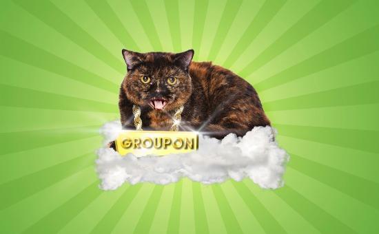
One great example is Groupon’s cat:
It has nothing to do with business, but it’s fun.
Here’s a fun Mad Libs style twist on the regular lead generation form that actually increased conversions by 40%.
Bonus Landing Page Conversion Rate Tips
Here are a few final things to consider before I let you go:
- When you do make changes to your site, make sure you test one major thing at a time, i.e. redesign, layout, headline etc. (If you change too many things at once, some of the changes might have improved conversion rate while others didn’t, and you won’t know what worked and what didn’t.)
- You want to reach statistical significance with at least a 95% confidence level. (To be on the safe side, make sure your increase in conversions is actually from the change you made, not some external reason you can’t control, like seasonal variance.) You can use this easy calculator to test if your results are significant.
- No testing is foolproof. Making your button bigger or having more testimonials does not guarantee an increase in conversion rate; it could actually make it worse! Be smart and don’t make assumptions.
- Never. Stop. Testing.
- Sometimes it can take weeks, even months before you reach a significant result. Use this calculator to determine how long you should run your A/B tests for.
- Remember that getting the sale doesn’t end on the landing page. Look at your approach in terms of how you talk and communicate, and mystery shop your competition and your own employees. Even if you have a 42% lead gen conversion rate on your landing page, your real conversion rate could be much lower when it comes to actually sealing the deal.
Want To Learn More About Conversion Rate Optimization?
Check out our list of seven favorite landing page tools.
Happy converting!










![Search Advertising Benchmarks for Your Industry [Report]](https://www.wordstream.com/wp-content/uploads/2024/04/RecRead-Guide-Google-Benchmarks.webp)

