A/B testing stands for “Always Be Testing,” right? It should!
Once you start testing various elements of your marketing campaigns – from PPC text ads to landing pages to email subject lines – you realize “A/B testing best practices” are only a rough guideline. You never know what’s going to work with your audience until you A/B test it.
We were shocked – SHOCKED!
When I hear about an A/B test with surprising results, it always makes me want to run out and test everything. So I asked 24 marketing experts to answer one question:
What is the single most surprising or exciting result you’ve ever achieved in an A/B test?
You can read their answers below. I hope you find these tests as fun and inspiring as I do! Here are the players:
- Aaron Levy – Test Where Your Form is On The Landing Page
- AJ Kohn – Small A/B Tests Can Have A Profound Impact
- Brad Geddes – Your A/B Tests Don’t Have To Be Perfect
- Brad Shorr – Tests Show That Small Wording Changes Matter
- Chris Kostecki – More Steps (Not Less) Yield Stronger Conversion Rates
- Crystal O’Neill – Don’t Underestimate the Value of Great Press!
- Francis Shovlin – Testing a New Call-to-Action Button
- Greg Meyers – Long Conversion Form Beats Short Conversion Form
- Jeff Allen – Desktop Landing Page Outperforms Mobile-Specific Landing Page
- Joe Kerschbaum – Resist the Urge To Follow Best Practices
- John Doherty – A/B Tests Can Reveal Visitor Sentiment
- John Lee – Outdated Mess Of A Landing Page Wins Against “Perfect” Page
- Ken Lyons – Testing Offers Above vs. Below the Fold
- Larry Kim – A/B Split-Test All Aspects of Your Business!
- Matthew Umbro – Split Testing Buttons By Color
- Megan Leap – Challenge Conventional Marketing Wisdom
- Michelle Morgan – A/B Testing Made-Up Words!
- Oli Gardner – A/B Testing Email Vs. Tweets
- Perry Marshall – The Dumbest Tests Are The Most Surprising
- Ryan Healy – Adding Salutations To Your Ad Copy
- Sean Quadlin – AB Testing For Conversion Rate Optimization
- Shawn Livengood – AB Testing Landing Page Button Sizes
- Todd Mintz – Testing Branded Dynamic Keyword Insertion Ads
- Tom Demers – A/B Testing Small Changes For Big Wins
Read on to discover what you should be testing and the kinds of crazy results you can expect to see when you do….
And if you have a surprising A/B testing result of your own to share, please tell us about it in the comments!
A/B Test Where Your Form Is On The Landing Page
Many of the best AB test results that I’ve run in my digital marketing career have come from testing things that don’t necessarily fit into best practices. The most exciting result I saw from an A/B test came from simply moving the form on a landing page from the standard right side, to the center of the LP.
(Before on the left, after on the right. Images/colors removed to protect client.)
The existing landing page was already pretty tightly optimized and had a conversion rate of about 11%. By making a simple change and moving the form to the center, we were able to increase conversion rate by nearly 50% to just a hair under 16%. Not bad for going against the grain!
Aaron Levy has been in digital marketing since 2007, spending his days (& many nights) as a PPC account manager at SEER Interactive, a Philadelphia-based Search agency. He moonlights as a wannabe brewer/cyclist/hockey star and tweets about all.
Small A/B Tests Can Have Profound Impacts
What’s the most surprising result I achieved using A/B testing? Back in 2007 I tested URL initial capitalization in Google Ads (formerly known as Google AdWords) ads and achieved a 53% lift in click-through rate.
The test was simple. I created two exact ads except for the URL. In one, I used the standard www.sitename.com while the other used initial capitalization and looked like www.SiteName.com. I repeated this test numerous times and always saw a positive lift.
Sadly, Google eliminated this type of URL display. However, at the time, it reconfirmed that small changes could have a profound impact and got me interested in how users “looked” at search results.
AJ Kohn is Owner of Blind Five Year Old, a San Francisco Internet Marketing firm specializing in search. An experienced marketing executive with a successful track record spanning 20 years, AJ combines a deep understanding of search marketing with a passion for product strategy and iterative product development, fusing design and user experience with quantitative analysis. Follow him on Twitter at @ajkohn.
Your A/B Tests Don’t Have To Be Perfect
I was working with a client who had a terrible landing page. It wasn’t well designed and you had to click on a button to go to a terrible form page to convert. I begged them to create a new page and at least put a clean form on the landing page. They came back with a page that still wasn’t pretty and had their terrible form just embedded on the page.
The new version increased the website’s profit 76%.
That’s when my perfectionist brain realized: You don’t have to be perfect. To achieve greater results, all you need to do is better than you currently are.
Brad Geddes is the founder of Certified Knowledge, a PPC training and toolset platform. He is the author of Advanced Google AdWords, and an official Google AdWords Seminar Leader. You can follow @bgTheory on Twitter to stay up to date with industry news.
A/B Tests Show That Small Wording Changes Matter
For PPC ads, we never cease to be amazed by how slight changes in emphasis can produce enormous improvement in click-throughs. Here’s a case in point from last week. We were AB testing these calls to action:
A. Get $10 off the first purchase. Book online now!
B. Get an additional $10 off. Book online now.
The CTR doubled with option … B. (Just for the record, my money was on A.)
Brad Shorr is Director of Content & Social Media for Straight North, a full service Internet marketing agency based in Chicago. He writes frequently about SEO, copywriting, and content marketing. Follow him on Twitter: @bradshorr.
A/B Test Reveals Having More Steps (Not Less) Yielded Stronger Conversion Rates
The most surprising insight I’ve gained from an A/B test, was when I tested 2 landing pages. The control presented the product and add to cart options versus a page that positioned the product, but was one click away from the actual product. Despite the extra step and more language to get through, it substantially out-performed the more direct path. It had a stronger conversion rate (+18% with 95% stat significance reached) and a higher AOV. It helped us recognize where we were engaging traffic within the buying process and as a result we were able to use the findings to better position other products prior to the sale.
Chris Kostecki has been working in Search since 2006, and in marketing since 1997. He created a PPC product for small businesses to supplement a Yellow Page directory product, and worked as a PPC manager in an agency serving eCommerce clients before his current role as in-house Search Analyst at Keurig Inc.Follow Chris on Twitter to keep up with the latest trends in Search Marketing especially every Tuesday from 12-1 p.m. EST during #PPCChat. All views he expresses are his own and do not necessarily represent the views of any entities he is associated with.
Don’t Underestimate The Value of Great Press!
One of the most surprising results I’ve seen in A/B testing was in ad testing. We had a client featured on Good Morning America (‘GMA’), so naturally we wanted to leverage the credibility and press from a show like GMA. We decided to first A/B test an ad in our Branded Campaigns with a tagline touting ‘Featured on Good Morning America’ vs. our regular ad with an ‘Official Site’ tagline. Ads with the GMA tagline won by a landslide for CTR and Conversion Rate. This isn’t the surprising part – we expected these results given the credibility and recognition of GMA.
Based on this initial A/B test, we rolled similar A/B ad tests out to our Non-Branded campaigns. In nearly all tests the ‘Featured on GMA’ ads won again. Again, not too terribly surprising.
Here is the surprising part. The GMA segment aired nearly 3 years ago now, and after rounds and rounds and rounds (you get the point) of A/B testing, ad variations that contain ‘Featured on GMA’ continue to be top performing ads. Here’s an example of recent ad results:
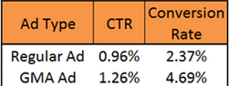
Moral of this A/B test story is don’t underestimate the value or longevity of great press!
Crystal (Anderson) O’Neill is the PPC Division Lead at SEER Interactive, a Philadelphia-based Digital Agency. She began her PPC career in early 2006 and has managed international PPC accounts across multiple platform and industries, with monthly budgets from four to six figures. You can follow her on Twitter at @CrystalA.
Test A New Call-to-Action Button
One of the more surprising results I’ve ever achieved through A/B testing was being able to lift conversions by simply testing a new call-to-action button. For this client, we did not have the resources to create and test all new pages. We decided to try splitting traffic between two different button designs.

We ran the AB test for just over seven weeks, and in the end, were able to increase our form conversion rates by 11%.

My advice: never count out testing the smallest elements. You can easily increase your conversions and revenue even with limited resources.
Francis Shovlin has been in search for almost 5 years, with the last 2 as a PPC Account Manager with the SEER Interactive team. The self-proclaimed “master of 70 characters” also enjoys good beer and music. You can follow his random thoughts on life and the paid search industry on Twitter: @fmshovlin.
Long Conversion Form Beats Short Conversion Form
I have seen many interesting results from A/B testing over the years including a few that would contradict many of the obvious optimization techniques that have traditionally worked wonders. However, there was one instance where “excessive content” won over “usability & conversion focus.” I approached one of my PPC marketing clients about creating a new landing page that would encompass a “hybrid model” consisting of the most important aspects of the product they were selling. It was a surprisingly hard-sell to the client who told me that even though he understood the strategy, his audience would rather read dozens of pages, than having it all in an compact, easy to read, above the fold, monetization-friendly format.
End Result: The new landing page had a higher bounce rate and lower conversions as compared to the existing one. This experience has taught me one lesson. Keep AB testing and listen to your clients!!!!
Greg Meyers is the founder of Afterclicks Interactive and the author of SemGeek.com.
Desktop Landing Page Outperforms Mobile-Specific Landing Page
As a big fan of mobile PPC, and co-presenter of an upcoming Hanapin/WordStream webinar on mobile, the most surprising results from an A/B test was that a desktop version of a landing page drastically outperformed the mobile-specific landing page in a month-long A/B test. The desktop version converted traffic into leads at about 15% while the mobile specific page came in at around 11%. It just goes to prove that you have to test everything and that extends to implementing best practices.
Jeff Allen has worked in Internet marketing since May of 2000. He has led the development of a proprietary email marketing platform, managed over 12 million leads, been part of two mergers, and his work has led to the multi-million dollar sale of an agency. He now works at Hanapin Marketing as the Account Director and is the leading contributor to their blog, PPCHero.com.
Resist The Urge To Follow Best Practices
Over time I’ve learned that A/B testing is filled with surprises. You can create a hypothesis based on years of experience and hundreds of successful tests, but outcomes are impossible to predict – especially when people (website visitors) are involved. We were working with an e-commerce client who developed a new landing page. This new page was gorgeous and we were 100% sure it would increase conversion rates exponentially. However, the old page won the A-B test. This old page had bad graphics, confusing layout, small and poorly written copy – and these are just a few shortcomings of the page.
Our initial inclination was to just switch over to the new page. This is how confident we were in the new page. We were glad that we didn’t because we wouldn’t have such a great (and frustrating) learning experience.
Joseph Kerschbaum is Vice President and Managing Partner for search and social advertising agency Clix Marketing. Joseph is a regular speaker at search and advertising conferences such as SES and SMX. His writing on the SEM industry appears in his regular Search Engine Watch column, and in his columns in Website Magazine and Visibility Magazine. Joseph is co-author of the Wiley/Sybex book, “Pay-Per-Click SEM: One Hour a Day.”
A/B Tests Can Reveal Visitor Sentiment
The most surprising results I ever got from an A/B test was while testing the conversion funnel on a site. We had the thought that allowing users to click out of the funnel was causing a lot of dropoff, so we wanted to see if removing the navigation would help people convert.
What happened, actually, was that users felt trapped and our bounce rate shot through the roof! So actually, by allowing people to have the freedom to navigate away from the funnel, we had a higher conversion rate than when we constrained them! Counter-intuitive, right?
John Doherty is the office lead and senior SEO consultant at Distilled New York City. With a background in technical writing and web development, he loves all things technical and geeky, but is also a writer and enjoys blogging on different industry sites such as Distilled, SEOmoz, and his own SEO site. In his spare time he rides his bicycle around Brooklyn, rock climbs, takes photos, and is constantly in search of new microbrews. Find him on Twitter at @dohertyjf.
Awful, Outdated Mess Of A Landing Page Wins A/B Test Against Perfect Page
There is a client of ours who has engaged with one of the more reputable landing page optimization agencies over the past few years. For one of the projects, the landing page that needed updating was really quite bad. We’re talking outdated, poor calls-to-action and a real mess. The optimization agency came back with a beautiful landing page that hit all the right notes in terms of conversion-oriented design. We pit the two pages against each other in an A/B test. Awful page vs. Perfect page. David vs. Goliath. Which page won the A/B test? The awful, outdated mess of a landing page. A few months later we tried the test again with the same results.
The moral of the story? Everyone’s gut instinct in this situation was to simply push all of our ads over to the new landing page without A-B testing. Glad we didn’t! While we never exactly understood why the undesirable landing page was a winner, it opened my eyes to the fact that you ALWAYS have to test – just to be sure.
John Lee is the Director of Client Services for Clix Marketing, an SEM agency, and is a frequent blogger and speaker on all things PPC, display and social media advertising.
A/B Testing Offers At the End of Sales Copy vs Offer Above the Fold
One of the most surprisingly successful yet head-smackingly simple results I’ve ever seen with AB testing happened a few years ago where we took the same exact offer/CTA that lived at the end of the sales copy on an SEO landing page and repeated it again above the fold, just below the intro paragraph. The AB test yielded more than a 400% increase in conversion rates. The logic behind the experiment was that we’d immediately interrupt a user’s flow as they read the landing page copy–which was long given the page was structured as an organic traffic asset–and give them the option of converting sooner vs later. Before making the change, I had no idea it would be as successful as it was since it went against what I thought I believed about creating a quality organic landing page experience. Interrupting flow, even before making a solid case for benefits and the USP, and repeating offers seemed somewhat counter-intuitive and heavy-handed at the time. But then, that’s why we A/B test, right? We were able to replicate the results on other pages on the site as well, which only reinforced the practice. Moral of the story: if users are ready to convert, don’t make them wait b/c you may lose them. Instead, try giving them more than one option to convert on a page.
Ken Lyons is Co-Founder of MeasuredSEM.
A/B Split Test All Aspects of Your Business!
Oooh. My favorite A/B tests. Where to begin. There are too many to just pick one, so I’m going to have to share 3! (Can I share 3?) These are all examples of the kinds of A/B tests were you say, huh?! what?-that-can’t-be-right,-run-the-test-longer!! – that kind of A/B test. OK here they are in no particular order:
- EXTRA STRENGTH SEO CONTENT A/B TEST: Being an SEO-type, I often try to jam-in a lot of stuff useful information into our web pages. Why say in 1 sentence, what you could say in 3 paragraphs, right! Like take a look at my free AdWords Grader application, and scroll down the page – you’ll see there’s a ton of content beneath the sign-up form. Now, some marketers here at WordStream, who have a really keen eye for design aesthetics, user experience, etc. found my content strategy to be flat-out bizarre-looking. So, we tested removing all the extraneous FAQ content that appears below the fold, to see how that impacted sign-up conversion rates. The variant that contained the 2000-word FAQ below the fold won. We were ABSOLUTELY FLOORED.
- EXTRA SECURE LOGIN AB TEST: Speaking of the AdWords Grader, the way that tool works is you just log into your Google Ads account and we analyze the performance of your Google Ads account and provide you with a helpful report card that shows areas of strength, as well as areas where you can improve. We recently upgraded the account login mechanism to leverage a newly released OAUTH extra-super-secure Google Ads account authentication mechanism, thinking that we would grade more Google Ads accounts. But the A/B test fell flat. The new super-secure OAUTH-based Google Ads authentication did pretty poorly (possibly because it added steps to the sign-up process) so, we ended up reverting back to the regular secure Google Ads login.
- PRODUCT TRIAL LENGTH AB TEST: My company sells PPC management software. You can sign up for a free 7-day trial. We got some complaints that 7 days wasn’t long enough to test it out. So we extended the trials to different time lengths, like 14 days, 30 days, etc. We measured prospect connect rates – the percentage of qualified customer prospects our sales organization is able to book a demo with – and we found that the connect rates actually fell. So, we reverted back to the 7-day trial model. Maybe they found the longer trial overwhelming?
Please keep in mind that I’m not saying that you should adopt any of the above AB test findings for your business. What worked for us is most likely not the same as what works for your organization. The key here is to be open minded and let the data tell you what to do, as opposed to listening to some self-proclaimed faux-guru (or in some cases, even your customer prospects) who says something has to be done a certain way!
Larry Kim is the Founder and CTO of WordStream, Inc., provider of the 20 Minute PPC Work Week and WordStream Advisor, an award-winning PPC management platform. You can follow him on Google+ and Twitter.
Split Testing Buttons By Color
We created a remarketing campaign targeting lost sales (those who abandoned the shopping cart). We designed two different sets of ads that were primarily the same. Everything including the font, offer, and imagery we’re all identical. The only difference was the color of the “Shop Now” button. One set of ads used a gray button while the other set used bright green. We rotated the ads evenly for two weeks and were very excited by the results. The set of ads with the green button converted at three times the rate of the ads with the grey button. Additionally, the green button ad click-thru-rates were considerably better than those of the gray button ads. The green allowed the ads to stand out much more, thus allowing more lost sales to see our great offer. The notion of standing out on the Display Network was absolutely confirmed in this test.
Matthew Umbro is the Director of Paid Search at Exclusive Concepts. He has been in the PPC industry since 2007, working with over 100 clients across multiple industries to attain profitable ROIs and improved lead generation. Matthew is also the founder of PPC Chat, a weekly Twitter chat where industry specialists discuss, analyze and debate various PPC topics using the hashtag #ppcchat.
Challenge Conventional Marketing Wisdom
One of the most surprising A/B test results I’ve seen is when a landing page with benefit-driven copy lost to a landing page with product-focused copy. In the tests I’ve run, benefits almost always outperform features. And as we all know, a benefit-focused message is a critical element of successful marketing. Yet, in this one campaign, visitors actually wanted to know the features of the product we were selling. So depending on your target audience, the stream of traffic, the message of your ad, your product etc., it might actually make sense for you to focus on features instead of benefits. But you won’t know that until you test. (In case you’re wondering, our next test was features vs. combined benefits/features, and the new test won. A/B testing FTW!)
Megan Leap heads up marketing and content for the Online Marketing Institute, the most trusted source for digital marketing education and training. She is a recognized expert in social media and content marketing, and her work has been featured in The New York Times, Entrepreneur Magazine, SmartBrief, and more. Previously, she was Online Marketing Manager at MarketingProfs, where she led their social media and conversion optimization initiatives, and Ion Interactive, where she built their social media presence from the ground up. She’s also consulted with leading brands on social media strategy and campaign management. Follow her on Twitter @meganleap
A/B Test Made-Up Words!
My most surprising AB test did not originate from a highly creative strategy. It came mostly out of frustration and stubbornness. A change in marketing laws for one of my lead gen clients made it illegal for us to use the word “Apply” in ad copy because the customers weren’t technically applying at that stage. After struggling for a month or so to find a synonym for “Apply” that performed nearly as well, and wanting to sneakily work “Apply” back in, I decided to make up a word. “PreApply” was born. And yes, I used that capitalization. Amazingly enough, CTR and conversion rate increased by 27% and 11% respectively, and CPA decreased by 8%. I’m not sure whether customers felt they were taking a smaller first step, or if there was some other appealing factor, but it worked. In the end, a change in advertisement law actually led to increased performance and a happy client.
Michelle Morgan is a PPC Specialist at Clix Marketing. Follow her on Twitter at @michellemsem.
A/B Testing Email vs Tweets
One of the most fun and surprising A/B tests we ran was to offer up an ebook in exchange for either an email address or a tweet (on a 50/50 traffic split). It was a dual purpose test: by splitting it up this way, we got leads from one page and continued viral exposure on the other (the tweets send people back to the landing page where they could get the ebook and repeat the cycle).
The email version converted at 22% vs. 18% for the pay with a tweet version. While asking people via an inline survey which mechanism they’d prefer, 45% said email, leaving me slightly confused by email winning the AB test.
But that’s not the exciting part.
We decided to run a 3rd test, where we had a single page with the same 2 two options, so that we could see how the numbers correlated when people really had a choice. Despite the close results in both the survey and initial A-B test, the results from the final test were shocking.
Result: In the new test 85% of people opted to give their email address.
After further analysis, we also noticed that people would tweet, and then immediately delete it from their stream. This is likely because it’s a personal a/c and they don’t want to share business related links.
Lesson learned: Never assume that even your initial test results are correct. Keep trying new hypotheses until you learn the truth.
Oli Gardner is Co-Founder & Creative Director at Unbounce, the DIY Landing Page Platform. He is an opinionated writer, primarily on the subjects of landing pages and conversion rate optimization. You should follow him on Twitter: @OliGardner.
The Dumbest Tests Are The Most Surprising
The most surprising thing about A/B split testing for me was finding out I could easily get 10X results by doing “stupid” things. For example:
The only difference is reversing Line 2 and Line 3, that’s it.
One may never know the precise reason why, but my theory is, the 2nd ad puts the benefit first, before it tells you the form you receive the benefit in. That makes a lot of sense to me.
Here’s another example:
How to Write a Book, Fast
14 Days from Start to Finish
Unique, Step By Step Program
Write-A-Book-Faster.com
4.40% CTR
How to Write a Book Fast
14 Days from Start to Finish
Unique, Step By Step Program
Write-A-Book-Faster.com
4.12% CTR
Can you tell the difference between the two ads? This pair of Google ads show how even the commas between the words make a tangible difference to your bottom line. The difference is effectively about 8%, which in this particular example was probably about $500 per year.
This stuff matters. Why guess when you can test?
Perry Marshall’s Chicago company, Perry S. Marshall & Associates, consults both online and brick-and-mortar companies on generating sales leads, web traffic, and maximizing advertising results. He’s one of the world’s most sought-after marketing consultants, and his work is referenced in dozens of influential marketing books. He’s published thousands of articles on sales, marketing and technology, as well as books including The Ultimate Guide to Google AdWords (Entrepreneur Press, 3rd Edition 2012), the world’s most popular book on Google advertising, and The Ultimate Guide to Facebook Advertising (Entrepreneur Press, 2011). Read our interview with Perry Marshall here.
Adding Salutations To Your Ad Copy
I’d always heard that the salutation of a sales message can make a big impact on conversions, so I decided to A/B test it for myself on one of my own sales pages. The A B test was very simple: one version included the salutation “Dear Friend,” while the other version did not.
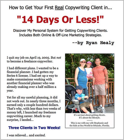
I expected a slight difference between the two versions, but I didn’t expect as big of a result as I got. The version without “Dear Friend” converted 28.2% better than the original version that included the salutation.
Ryan Healy is a direct response copywriter. Since 2002, he has worked with scores of clients, including Alex Mandossian, Terry Dean, and Pulte Homes. He writes a popular blog about copywriting, business growth, and product creation.
A/B Testing For Conversion Rate Optimization
The most surprising result I’ve ever encountered in an A/B test was when I was performing conversion rate optimization. It was also one of the least exciting results at the same time. We created a number of different PPC-specific landing pages that had different layouts: new images, embedded video content, new headlines, different font colors, you name it. The control won every experiment. We’d create new and exciting content, and it would get edged out every time by a basic page that we were trying so desperately to test out of existence. It’s a situation that can be described by any number of folksy sayings (“It it ain’t broke, don’t fix it” comes immediately to mind, but I’m sure there are others that are just as applicable). The page is so un-exciting but reliable, like white bread. One of these days I’ll be able to find a different winner and I’ll have to update this post, telling you all about my exciting asiago-focaccia-style landing page.
Sean Quadlin is an Account Manager at Hanapin Marketing and an author at PPCHero.com. He currently manages a six-digit monthly spend mainly focused on lead generation for consumer-facing businesses. You can find him on Twitter @SeanQuadlin or spending his non-business hours in the company of his beloved TiVo.
A/B Testing Landing Page Button Sizes
The most surprising result I’ve ever seen on an A/B test involved a landing page test I did for a marketplace site that measured new member sign-ups as their conversion event. The PPC landing pages were all hand-coded, and basically served as an entrance page to the sign-up process, serving up some basic bullet points on the benefits of the service, some relevant photos, and a “Get Started” button that linked to the sign-up page. We did a lot of tests on the text content and images, and nothing really moved the dial. Then, we made the button bigger and saw a huge lift. So then we made the button bigger still. Another success! We joked that if we kept this up, then our landing page would end up as a giant sign-up button with nothing else on the page.
The most surprising thing about this AB test was the effect of page layout on conversion. We AB tested a lot of different offers, wording, and layout colors with no result. And then we made it super-obvious what the next step was to complete the conversion. That’s a lesson I’ve applied to future landing page testing I’ve done. Always make sure your user knows what the next step is in your conversion process. Make it way more clear than you think it should be, and you’ll see some nice results.
Shawn Livengood is the Online Marketing Manager for BuildASign.com, and the author of the PPC blog PPC Without Pity. In his role as Online Marketing Manager, Shawn is responsible for developing the overall online marketing strategy for BuildASign.com’s multiple brands and microsites, managing its PPC, SEO, social media, email and affiliate marketing channels, as well maintaining and improving all web analytics platforms.
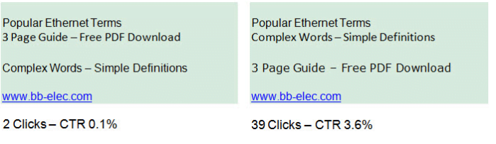
Testing Branded Dynamic Keyword Insertion Ads
In a particular PPC account, I had one campaign focused on targeting hundreds of brands in the merchant’s vertical (for a site where the conversion metric was a lead generation signup).
The ad headline said something along the lines of:
50% Off Widgets.
I wasn’t allowed to use the brand names anywhere in the ad text.
The yield on the campaign was so low that it was almost totally off my radar.
We decided to A B test using brand names in the headline.
Because there were so many brands in the campaign, I though the quickest way to test proof of concept was to change the headline for the many hundreds of ad groups to:
50% Off {KeyWord:Brand}.
At the time, the budget for this campaign was basically uncapped so long as I met certain CPA Metrics.
Overnight, this campaign generated so many conversions that I thought something broke in Google Ads. It went from nearly zero to the highest performing campaign in the account by about 4-5x.
Ultimately, I didn’t need to spend any time customizing the ad headlines…it wasn’t necessary 🙂
Todd Mintz, who has been with PPC Associates since March 2011, has over 10 years of experience in search marketing and has used Google Ads since it began. He also is very visible in the SEM social media space and is a curator/contributor at MarketingLand. He was one of the founding members of SEMpdx (Portland’s Search Engine Marketing Group), is a current board member, and writes regularly on their blog.
A/B Testing Small Changes For Big Wins
Most of the time I see larger, structural changes on a page lead to the biggest wins, so when a relatively small tweak gives a big lift in conversion I always find that really surprising and interesting, particularly when it beats a more dramatic variation.
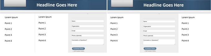
Below are some rough wireframes of an AB test we ran. First we saw the initial control page that a client had set up, and we learned that in addition to the trust icons (as seen in logs, associations, etc.) below the form, there were several others that we actually thought would convey even more trust and authority. The client had a relatively new/unknown offering so we thought really loading up on trust symbols as soon as the visitor reached the page would help with conversion and wanted to integrate the additional symbols into the page.

First we created Variation A which leveraged the extra trust symbols above the fold in conjunction with the benefit statement, and removed the “hero shot” that had been in its place (which didn’t seem to be conveying much to the visitor).
Variation A lost by a few percentage points to the existing landing page.
We still thought the additional trust icons could provide a lift if implemented properly, so we created Variation B, which kept the hero shot above the fold, and instead incorporated the new trust icons into an expanded trust section just below the form. We also reorganized the trust icons to feature the new, more weighty icons more prominently within that section.
Variation B, where we were simply incorporating a few new icons into a section of the page that already featured some, won by 367%! We were surprised by the result, but also by the degree to which a small tweak impacted conversion while a pretty substantive change to the page had not only lost, but also lost by a pretty small margin.
Tom Demers is co-founder and managing partner at Measured SEM search engine marketing consulting, a boutique search marketing agency. Get in touch with Tom directly via email at tom at measuredsem.com or by following him on Twitter.
Your Turn: What’s your most surprising A/B test?
What do you think about the above A/B tests? Which was the most surprising to you? Share your best A/B testing story in the comments below!
Are you wasting money in Google Ads?

Meet The Author
Elisa Gabbert
Elisa Gabbert is WordStream’s Director of Content and SEO. Likes include wine, karaoke, poker, ping-pong, perfume, and poetry.
![Search Advertising Benchmarks for Your Industry [Report]](https://www.wordstream.com/wp-content/uploads/2024/04/RecRead-Guide-Google-Benchmarks.webp)