Landing page design is all about communicating your offer to visitors in a clear and direct way. Part of that communication process is making sure that you influence people to notice what you want them to. Using white space to declutter the page and adding a contrasting CTA button are just a few ways to accomplish this.
In the end, though, landing page design is not just about how elements look, but what message they convey to visitors.
Visual appeal is just one facet of landing page design – how page elements interact with each other and flow together determines whether your page will successfully engage visitors.
This is where visual hierarchy comes into play.
What is visual hierarchy?
Visual hierarchy determines which page elements engage the visitor first and which elements they interact with (and in what order) while on the page. By establishing a visual hierarchy, you ensure that communication between the visitor and landing page is seamless.
Visual hierarchy can be achieved using the following techniques:
- Scale: Different sized elements will guide user’s attention — larger elements draw more attention compared to smaller elements.
- Color: People are drawn toward bold, contrasting colors.
- Contrast: Shifts in color can be used to grab attention. Contrasting the color of one element against another draws focus.
- Alignment: Columns and grids can create alignment between elements and make the visitor take notice.
- Proximity: This helps separate and group certain landing page elements together (or apart) to help distinguish between them.
- Page scanning patterns: Eye tracking studies show where visitors focus their gaze once they arrive on a web page and where they proceed throughout the page.
All of the above design elements are important, but this post will focus on the page scanning patterns that eye-tracking studies have shown to be relevant to reading content on the web – in particular, the F and Z patterns.
The F Pattern
In 2006, the Nielsen Norman Group conducted what is considered to be one of the most useful and most cited eye-tracking studies today. During the study, they observed how 232 users viewed thousands of different web pages. The findings showed that users’ main reading behavior was relatively consistent across the various sites and tasks.
More specifically, users read in an F-pattern.
The F-pattern dictates that visitors first read the page in a horizontal direction, mostly along the upper part of the content area, then move down the page and read across a second horizontal line. Finally, visitors scan the left side of the content in a vertical movement.
This is what the movement typically looks like:
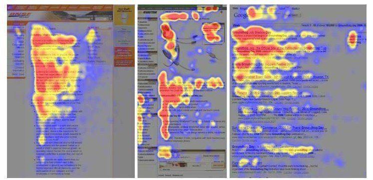
The three heat maps pictured above are derived from user eye-tracking studies of three different websites. It is also worth mentioning that the F-pattern does not have to follow a strict two-stem horizontal pattern (see heat map on the right above).
The color key is as followed:
- Red = most viewed and most fixated area
- Yellow = some views, but less fixation
- Blue = least viewed and very few fixations
- Grey = very few views and no fixations
The key thing to remember here is that the user’s eye movement starts in the top left and moves across the page before scanning down the page to search for an element they find engaging. For elements you want visitors to notice on a text-heavy page (like an image), placing them in the F pattern ensures the elements are seen.
Hootsuite uses an F-pattern on their landing page to highlight the most important elements (above the fold):
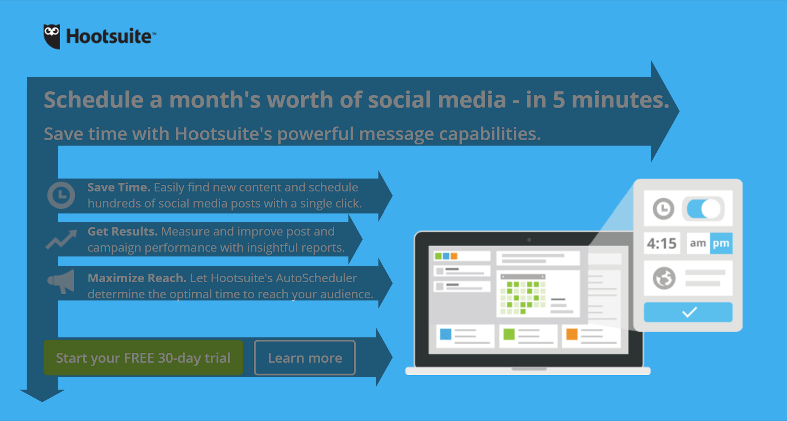
- First, the visitor’s eye first goes to the headline and subhead.
- Next, they will scan the bullet-point benefits (iconography).
- After that, visitors see both CTA buttons.
BigCommerce also uses the F-pattern on their landing page (above the fold):
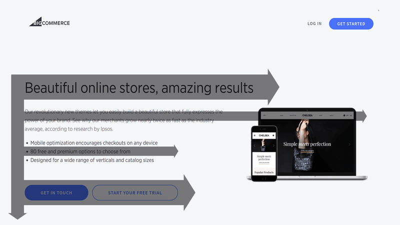
- The headline is the largest font on the page so that is likely seen first.
- Then the subhead across to the image.
- Next is the copy in the bullet points.
- Finally, the user scans left to right viewing both CTA buttons.
Arranging your landing page elements so they fall into this particular visual order ensures that visitors go through your page and click the CTA button.
The F-pattern usually works for pages that are content heavy, but can certainly be applied to pages with less content.
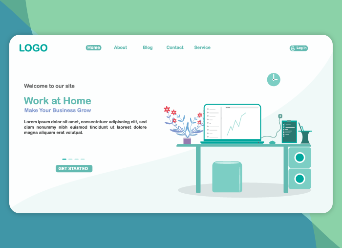
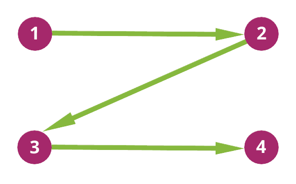
The Z Pattern
The Z-pattern layout is typically used on pages that are not content heavy. Its design mimics the route the human eye travels when it reads — left to right, zigzagging top to bottom:
- Visitors first scan from the top-left to the top-right, forming an imaginary horizontal line
- Next, they scan down and to the left, creating an imaginary diagonal line
- Lastly, they look back across to the right again, which forms a second horizontal line
This is the viewing pattern that emerges from these eye movements:
Just like F-patterns, the Z-pattern layout does not have to be an exact Z-pattern. The horizontal lines do not have to be exactly horizontal — they can be angled as well. Furthermore, there can be multiple Z’s throughout the page. Just make sure that:
- The top horizontal line includes the main components you want visitors to focus on first.
- The diagonal line should feature any piece of information that lead to your CTA button.
- The bottom horizontal line should highlight the CTA at any point along this line.
The Lyft landing page features a good example of the Z-pattern:
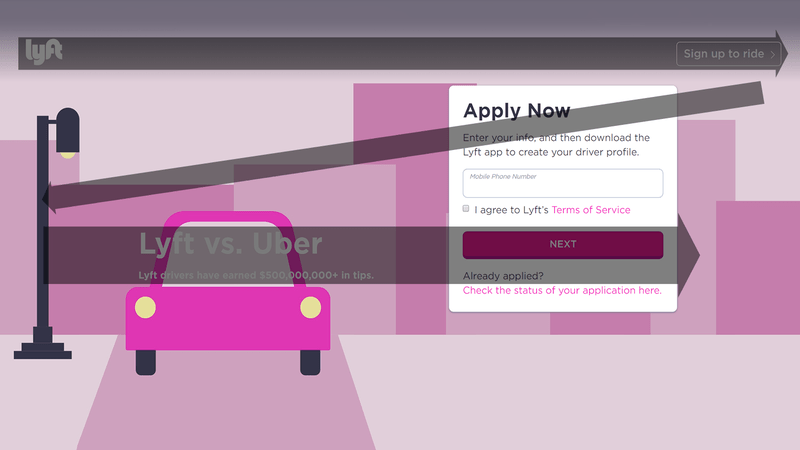
- The visitor first looks at the logo and “Sign up to ride” CTA button on the top horizontal line.
- Next, they proceed down the diagonal line and scan the form’s headline.
- Lastly, they look at the bottom horizontal line, which has the Lyft vs. Uber headline and subhead leading to the CTA button.
Our last example features LinkedIn using the Z-pattern:
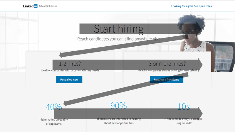
- The first horizontal line includes the “Start hiring” headline and the woman’s face
- Scanning downward-left, visitors then see the copy above the two blue CTA buttons
- In the second diagonal, the eyes moves to the 40% statistic and move left to right across the page to see the other two statistics
In the end, you can use the Z-pattern to get visitors to focus on elements that persuade them to move closer to the conversion goal.
Using the F and Z patterns to create engaging landing page experiences
Placing the most important landing page elements along visitors’ natural eye paths, whether in an F or Z pattern, ensures you create an engaging landing page experience.
Use the power of visual hierarchy on your landing pages to make sure visitors absorb your message and take the actions you want them to take.
About the Author
Tyson Quick is the Founder and CEO of Instapage, the leader in post-click optimization. He founded Instapage in 2012 after seeing how performance and growth marketers were losing money in underperforming advertising campaigns. Since then his vision has been to create a suite of post-click optimization products that maximize returns through advertising personalization.

Meet The Author
Guest Author
WordStream’s guest authors are experts, entrepreneurs, and passionate writers in the online marketing community who bring diverse perspectives to our blog on a wide range of topics.