With 11% of Internet users now blocking display ads, and many others just tuning them out, you have to work extra hard to make sure people click when they do see them. And great display ads are all about the visuals.
Don’t underestimate the power of design. 50% of companies say that design plays a massive role in how they achieve success. After all, design influences first impressions and the way consumers perceive your brand.
Of course, not every marketer or small business owner that wants to run display campaigns is a design expert. So, let’s take a look at how you can up your design game by applying five key principles of visual design to create high-performing display ads.
P.S looking to measure the impact of your display ads beyond just direct analytics? Check out this post.
1. Structure
The foundation of a good display ad is structure. And there are best practices you should follow when mapping out your ad. The Interactive Advertising Bureau says that display ads need to be “distinguishable from normal web page content and the ad unit must have clearly defined borders and not confused with normal web content.”
They also say that ad sizing should be flexible as people may view your ad on different-sized screens.
Google offers various ad sizes from half page ads to leaderboard to large mobile banners. The top three ad sizes in terms of performance are 300×250 (medium rectangle), 336×280 (large rectangle), and 728×90 (leaderboard).

So, you need to make sure you have a strong yet flexible structure to fit each format, paying special attention to the top performing sizes.
To do this, think about the fundamental elements of a display ad. Every ad should contain four main components:
1. Your logo or company name
2. A value proposition
3. An image or visual representation of your service
4. A CTA button

What’s the best way to arrange these elements?
Naturally, your value proposition and CTA are most important. One company found that optimizing its landing page CTA led to a whopping 245% increase in leads. This goes to show just how critical your CTA is.
Thus, your value proposition and CTA should be the most visually distinct elements. You should place your logo on the sidelines, at one of the edges of your ad. Plus, you have to make sure your image doesn’t obscure any of the copy.
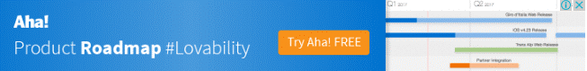
You should end up with something like this:

As you can see, the value proposition and CTA are front and center. The SoundCloud logo is out of the way, and the image makes up the background.
This is just one way to arrange the key elements of a display ad. The exact structure is up to you, as long as the CTA and value proposition are most prominent. And the elements can be rearranged in a comparable way to suit different ad sizes. (Note: with responsive display ads, Google will do the work of making sure your creative fits into the different size requirements.)
2. Color
In design thinking, color is vital as it’s used to grab people’s attention and evoke emotion. People also associate your color scheme with your brand. When you think about Coca-Cola, you’re always going to think red, for instance.
The psychology behind color is fascinating and something you need to pay attention to when designing ads. For example, men and women have different color preferences. One study showed that the most popular colors among men are blue (57%) and green (14%); while women are into blue (35%) and purple (23%).
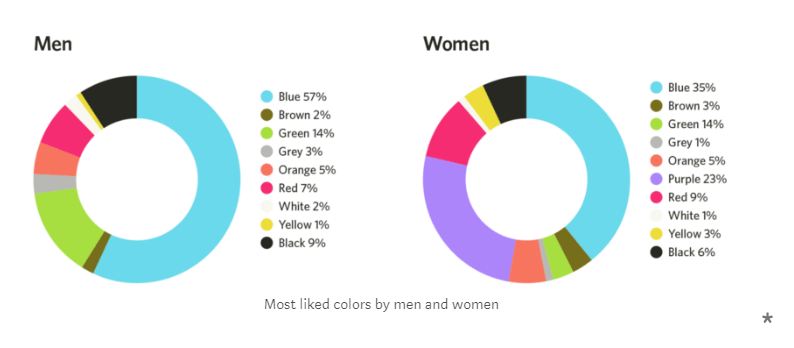
Hence, you may decide to use a slightly different color palette depending on who your campaign is aimed at.
Particular industries also tend to favor particular colors. This study from Visual Capitalist shows the colors used by the top 20 brands for their logos, sorted by industry:
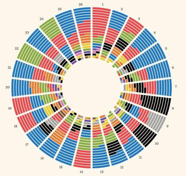
Author Jeff Desjardins concludes,
“We can see that many industries lean towards favoring particular colors, leveraging the psychological triggers these colors carry, both attracting us as a consumer and representing the industry.”
In the communications industry, for example, blue and black are the most popular colors. Using these colors in display ads for this industry will thus instill trust in your brand.
Clearly, there’s a lot to think about when it comes to picking a color palette for your display ad. The most important questions to ask yourself are:
- Who is my campaign aimed at and which colors will appeal to them?
- What do people expect from my brand and industry?
As a general rule, your color palette should be minimal. You should pick two or three main colors to use in ads. If you use a rainbow of colors, the viewer won’t be able to focus on what’s important. A couple of contrasting colors make the important parts stand out, like in this ad:
The green font stands out clearly against the light background. It’s a simple palette that’s totally on brand for the company.
What it all boils down to is choosing your colors wisely. Your choice isn’t arbitrary, and you need to think about the impact color will have on the audience.
3. Typography
Typography is another design element which draws your eye to the most critical information, like the speech bubbles in a comic book. Unbounce designer Ainara Sáinz says,
“The most important thing to have is a clear and legible typographic hierarchy. It doesn’t matter if you have amazing visuals — if your audience can’t read or understand your message, they won’t click on your ad.”
Take this example from Zendesk:

The potential customer’s pain point is emphasized using bold copy. Your eye is immediately drawn to the statement, “Good relationships take work.” The key takeaway here is to direct the viewer to the information you want to see via the order and scale of your typography.
The typeface is also influential. There’s a limitless number of fonts out there that you can use. But that doesn’t mean you should be using a bunch of different fonts in your display ads. Like with color, if you do this, then the viewer won’t be able to focus.
You may be wondering where you even begin choosing a font. This guide to font combinations will show you which typefaces complement each other nicely. Take a look at this landing page, for instance:

The font used for the headline is Playfair Display, a classic serif typeface. It’s mighty stylistic, which hints at the brand’s artistic prowess as a web design company. The information underneath is in Museo Sans, a sans-serif typeface. The combination of typefaces works as the sans-serif font balances out the stylistic font above.
Again, a hierarchy is formed using different, complementary typefaces. Use a more unusual font for the vital info you want to convey. A more traditional font can be used to add information.
You may wish to use a style or a bold typeface, or both, to make certain parts of the copy stand out.
4. Simplicity
Ever heard of the KISS principle? No, it’s got nothing to do with the 70’s rock band. KISS stands for Keep It Simple, Stupid. The phrase originates in product design but can be applied to design in any context.
Display ads are obviously compact. You’re not going to fit your entire brand story in a 300×250 ad. So, you have to keep it simple (stupid). You have to get your message across clearly and quickly.
Here’s another acronym for you… Google Marketing recommends the three C’s for creating display ads. They should be compelling, concise, and clear. This is so you don’t overwhelm the viewer.
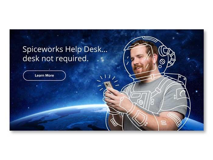
Look at how simple, yet brilliant this display ad from join.me is:

The value proposition and CTA are unmistakable. And that’s what you want. The three C’s mean you need a design that grabs people’s attention, a brief message, and a clear call to action.
For B2C ads, you’ll also want to display your product. You can do this and still keep it minimal. The trick is to use a high res image that doesn’t overwhelm your message or CTA.
Shaving brand Harry’s does this particularly well:
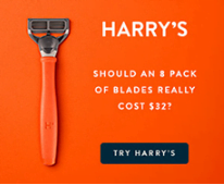
They feature the product in an understated way through the use of color.
Another way to feature simple design in your display ads is to make the design of the entire campaign seamless. For instance, if you click on a display ad and it takes you to a landing page with a different image, color, and/or typeface, it’s going to leave you a little confused.
Take this ad:

It leads you to this page.
The message is different, and the imagery is different. The overall experience is overwhelming.
By comparison, take a look at this banner ad example:
You can clearly see that the message and design of the display ad match that of the landing page. The overall experience is seamless.
Why is this even a thing? Seamless design creates a better user experience. And a better user experience leads to more conversions. Improving user experience can lead to an increase in conversion rates of up to 400%.
5. Custom Images & Graphics
You should never use images to simply fill up space. Or because you think that you’re supposed to have images in your display ad. You know that images are essential in marketing. You’ve probably already heard that you’re more likely to remember information if you see it as opposed to hearing it.
Why is this the case? Images communicate valuable information. That speaks to why they’re so important in marketing. And why you shouldn’t just use images for the sake of it. They should serve a purpose.
Perhaps the purpose of your image is to display your product in all of its glory…

Or perhaps you’re using an image or graphic to make your ad more eye-catching…
Using custom imagery in this way is likely to spark the interest of the viewer. As a rule of thumb, you should avoid stock images. Design is all about creativity after all.
Wistia, for instance, uses playful and unique imagery in their display ads:
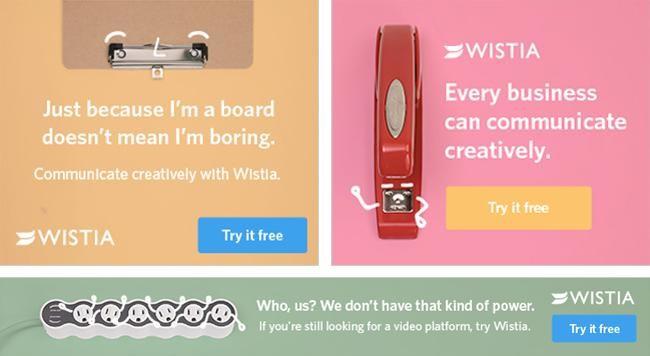
The images capture attention but don’t take away from the message of the ad – remember KISS? The effect that the images in these ads have is that they make you curious to learn more about the product. Wistia does this purposefully – they have simple display ads that pique your interest which then take you to landing pages with lots more information:
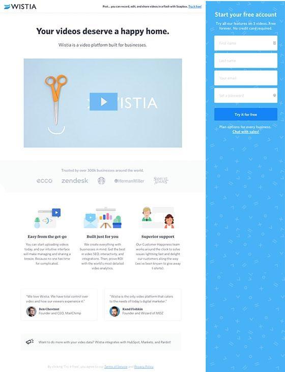
It apparently works as their landing page converts at 13%.
To emulate their success, show off your products or lure people in with interesting and unique images. But don’t forget to make sure your CTA and value proposition are at the forefront – because you want clicks, of course.
In closing
Good design (along with smart targeting) can help you cure widespread banner blindness. So, ensure you follow key design principles to create the best ads you possibly can:
- The best way to structure a display ad is to make your value proposition and CTA most prominent.
- Choose a simple color palette that’s conducive to your branding and marketing goals.
- When it comes to typography, construct a hierarchy to make sure the most important information stands out.
- Keep the overall design of your display ads simple.
- And finally, opt for unique images to grab the attention of fickle viewers.
Go ahead and look at your existing display ads. Do they adhere to these design principles? Do you need a redesign to get a better CTR?


Meet The Author
Brad Smith
Brad Smith is the founder of Codeless, long-form content creators for SaaS companies. Their work has been featured in The New York Times, Business Insider, TheNextWeb, Shopify, Moz, Unbounce, HubSpot, Search Engine Journal, and more.
Recommended for you


