Over the past couple of years, Google has been shifting away from text ads on the Google Display Network for a more visual ad unit: Responsive Ads.
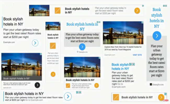
These units contain both a text and image component and serve almost as a bridge between the text and banner ad types. If you haven’t seen responsive text ads before, here are a few examples of what they can look like.
Text Ads used to find a large amount of inventory, but they were easy for users to overlook since there was no visual component drawing their eye. Many text ads blended seamlessly into the background of websites. Google’s shift to Responsive Ads has helped increase click through rates (CTRs) for Google Display Network ads, an improvement arguably good for advertisers and Google alike.
NOTE: As of November 2019, legacy display ads are being replaced by responsive display ads. Learn more about the announcement here.
How Do Responsive Display Ads Perform?
Here is a small example of the performance I’m seeing for each ad unit in my accounts.
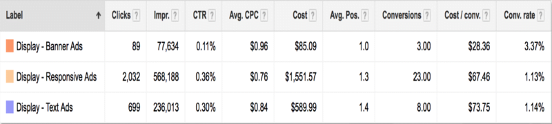
Impressions are higher as Google is increasingly preferring to use Responsive Ads to fill inventory, but on top of that, CTR for these Responsive Ads is higher than both other ad units.
Responsive Ads have also made the Google Display Network more accessible to a greater amount of advertisers. Standard banner ads have been a part of the Google Display Network for quite a while, but not all advertisers are able to take advantage of these ad slots.
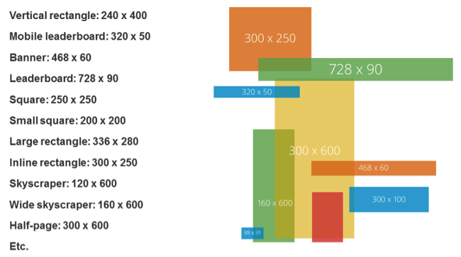
There are nearly 20 standard sizes for banner ad units on the GDN, each requiring a design team to tweak, resize, and customize the visuals to make sure they look right.
Many teams simply don’t have the bandwidth to create a full suite of banner ads, not to mention regularly creating multiple sets for proper ongoing message and creative testing.
More often than not, advertisers will opt to focus on the top 5 banner sizes, causing lots of inventory to go unused on the GDN.
Enter Responsive Ads.
These ad units allow advertisers to fill every space on the Google Display Network. This includes Native, Text, and Banner ad spaces. They do this by (surprise!) being responsive to the space and showing one of many text and visual combinations available. What this means for us advertisers is that there are many things Google is doing in real time that will affect the way our ads appear:
- Images will be scaled to fit into each ad unit.
- Text combinations will be chosen based on available space.
- Some text will be truncated in limited areas.
So knowing these things, it’s important we set ourselves up for success with any of the choices Google makes. Below are some best practices to keep in mind with images, text, and message choices while constructing Responsive Ads.
1.) Optimize for Image Scaling
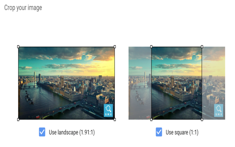
Responsive Ads allow advertisers to upload a couple images with ads in a square and landscape format. This can be really great if you have images that aren’t easily cropped.
The big caveat: Although the image upload process shows the images relatively large on the screen, not all resulting ad units will have large images. Meaning, the images you upload can get scaled down to fit into the appropriate space.
We’re running ads for a luxury travel agency that plans amazing trips all across the globe. One of their more popular trips are safaris, so we’ve been running Responsive Ads to generate more interest.
When choosing our images, we leaned on their expertise and found that zebras are a customer favorite, so we decided to use zebras in the ads. We reviewed a number of images and came up with a couple that showed two different versions of zebras:
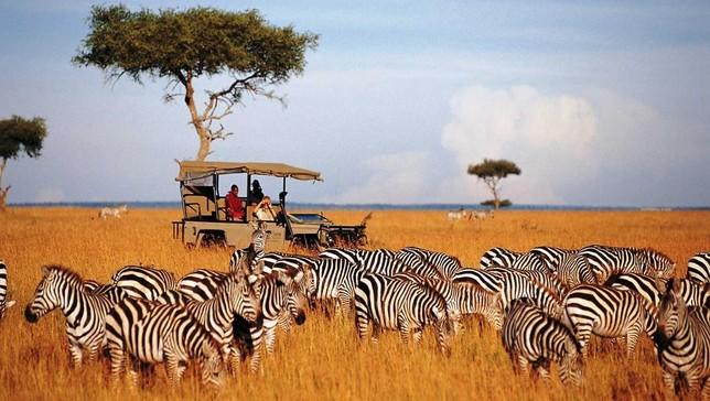

The first shows a group of zebras with a safari van in the background. Couldn’t be more spot on for what we’re advertising. The second image only shows a couple of zebras up close.
Which image do you think we used?
If you said image 2, you’re correct!
When both of these images are large, the first has a much better representation of what we’re selling, but the image of only zebras can also be eye-catching enough to those interested in zebras, even if the image isn’t perfectly on the nose for safaris.
When we scale these images down, the first becomes much harder to understand what’s going on. There are black and white stripes, and maybe a car and a tree, the ground is orange for some reason, but it’s really hard to tell what’s going on in a quick glance. In the scaled down version, the image on the right is the clear winner since it’s still clear that we’re looking at zebras.

When choosing images, think about how they look at full scale, but also how they would look if scaled down. If the images get too muddy when scaled down, you may be losing out on the impact an accompanying image can have.
2.) No Size Is Optional
Some creative sections will say they’re optional, but treat them as required. This will ensure all resulting ad variants will have the best possible representation in any space they fill.
If all else fails, use the same image, but utilize the crop tool that allows you to make a landscape image square, or vice versa.
3.) Be Flexible with Your Logo Where You Can
Brands love their logos. They’re sacred. I get that.
But for recognition on the GDN, the benefit of making small adjustments to ensure a logo is recognized can be worth the sacrifice.
The logo image uploads are the same as the image components: square and landscape. The problem is that some logos are designed to always be landscape or square and scaling can be your worst enemy here.
If you have a logo that is only square or landscape, consider adjusting to make it fit a bit better in the space, or do away with part of it to make it work better. Don’t be afraid to use only the icon portion of your logo if you need to for the square portion or shift alignment to make things fit better.
Let’s look at an example of Spotify. They have a logo that is designed for landscape with the icon on the left and the word “Spotify” to the right.
But this doesn’t fit well in the square image section of the logo for Responsive Ads. If you try and use this image in that space, it simply doesn’t fit.
At this point, you might reach out to your designer to get a square version of your logo. More often than not, the first answer a designer will give is to simply add whitespace to the top and bottom of the image to make it a square.
While this might look OK in the editor, don’t forget about the scaling effect we talked about earlier. This will likely look fine on larger ad formats, but on smaller ones it will be difficult to read.
At this point, it’s best to try and make other adjustments to get your logo in the ad in the best way possible.
For Spotify, they already have a version of their logo where they’ve adjusted to put the word “Spotify” under the icon what will work just fine for the square version.
Or they could go with just the icon by itself.
Because when the logos are scaled down to the same size, it’s easier to see and read the two we adjusted.
Although your brand managers might not like it, if you’re planning to run Responsive Ads, it’s worth it to spend some time adjusting your logo to fit both the square and landscape space without losing the feel of your brand.
4.) Be Aware of Text Combinations
In the Responsive Ads format, we’re given a number of text fields to work with.
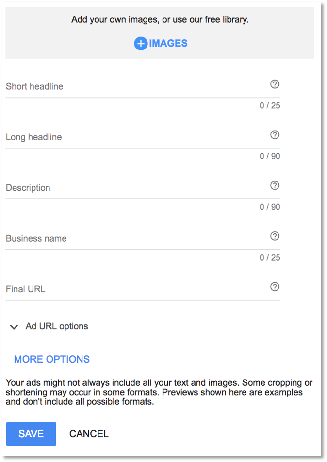
- Short Headline: 25 Characters
- Long Headline: 90 Characters
- Description: 90 Characters
- Business Name: 25 Characters
This is much more text space than we’ve been given in the past, but it’s important to know that not all text will show up together. Furthermore, it’s important to know which text fields can and will be shown together so we can make the most of the ad impression we’re given.
Headlines will never be shown together.
This means headlines can simply be different versions of the same message. They’ll never be shown together so we don’t have to worry about repeating ourselves in the headlines.
Descriptions can be shown with either Short or Long Headlines.
This indicates descriptions can always be a further explanation of the headline. The description will never be shown without a headline, so we’ll never miss out on context. It also can be shown with either short or long headlines, so make sure you’re not repeating copy from the headlines in the description.
Sometimes headlines will show without the descriptions.
Given this fact, it can be beneficial to craft headlines that an all-encompassing of a message or are enticing enough to get a user to click through to learn more without the aid of the description. For me, this means that I’ll try to include a call to action in my long headlines if possible.
Both Long Headline and Description can end in ellipses if they don’t fit the space.
Since these text fields can be truncated, it’s important to front-load messaging. Make sure users will get all information at the front of the text so nothing is missed if the end is cut off.
Once we know the text field combinations, it’s much easier to craft copy that’s informative, consistent, and non-repetitive.
5.) Check & Share Previews
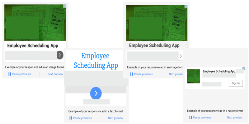
Although Responsive Ads are created in real time and there are nearly 1 billion combinations of a single ad that could be created, we do get a small glimpse into what these ads might look like with previews.
During the build process, there are a series of sections that will show us what our ads might look like in the wild. But these are mostly limited to square versions and one mobile-friendly view.
The best place to view the potential final products is actually after the ad has been created. When in the Google Ads interface, you can click on the ad itself, and it will bring up a Preview box. Within that box, there’s a link. This is where the real magic happens.
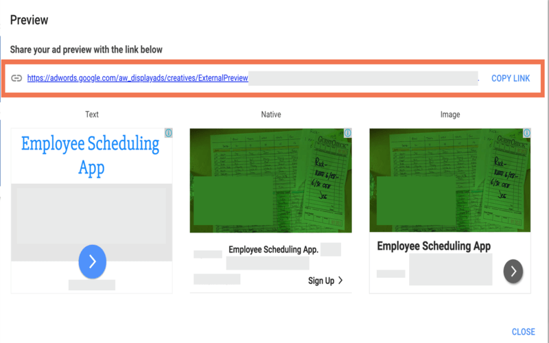
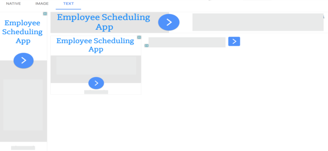
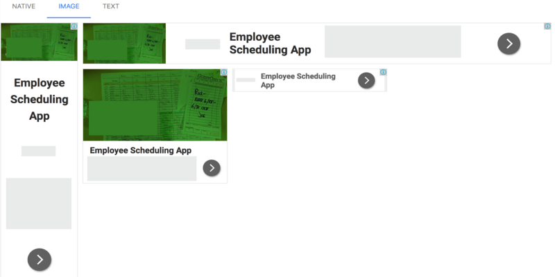
This link opens up a whole new window with many more previews of the potential ad combinations for Native, Image, and Text placement.
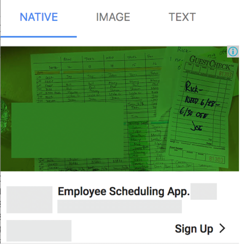
Granted, this isn’t nearly a comprehensive list of the combinations that can be created, but this is much better than what we’ve been given to this point. Better yet, this link is sharable so other members of the team (designers, client contacts, bosses, brand managers, etc.) can see the potential ad units and give any feedback.
6.) Be Cautious of Brand Safety and Regulations
After all of this, Responsive Ads simply aren’t right for all companies. And that’s OK.
From a brand safety perspective, it’s sometimes unacceptable for a company to not know what all combinations of images and text are going to show up. They would rather control all aspects of the ads from start to finish, which means banner ads are going to be the best way forward for them on the Google Display Network.
Another common issue with Responsive Ads deals with regulations. Some industries require advertisers to disclose legal information directly in their ads, which for Responsive Ads would mean they would likely have to use nearly all text and image space to cover those legal requirements without getting to the actual advertisement itself.
Keep these regulations in mind when looking through the combinations of text fields and images. If you’re able to cover your bases, then you’re all set. If not, this might not be the ad unit for you.
Closing thoughts
And there you have it! Responsive Ads on the GDN don’t require a physics degree, but there are certainly some steps you can take to step up your game without too much effort. Choose images and text wisely, understand how they’ll play together, and make sure you’ve covered your regulatory bases before jumping in.
Have you been running Responsive Ads on the GDN? What has been your experience? Have you had any issues with the best practices mentioned above?

Meet The Author
Michelle Morgan
Michelle is the Co-Founder of Paid Media Pros. She has twelve years of experience in all aspects of PPC and brings a wealth of experience developing and executing campaigns across search, social, and display platforms in both agency and in-house settings. Her experience gives her an especially well-rounded and holistic view of the paid search landscape—one she shares regularly as an influencer, author, and industry speaker at events like SMX, HeroConf, and Pubcon, as well as the Paid Media Pros YouTube channel.
Recommended for you