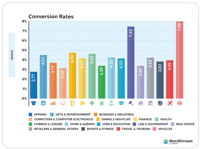
As you can see below, conversion rates vary by industry—apparel sees 2.77% while vehicles sees 7.98%. But one thing that’s true no matter which one you’re in is that a good landing page is a must if you want to meet or exceed your industry’s average.
In this post, I’ve collected 11 of the best landing page examples from a variety of industries. We’re going to go over what makes them work, what I might change, and how you can apply the ideas to your own pages.
Table of contents
- Product landing page examples
- Service landing page examples
- Ecommerce landing page examples
- Event landing page examples
Takeaways from these landing page examples
You can catch our landing page best practices here, but these are some of the key themes you’ll see woven throughout this post:
- Build trust: Include logos of your biggest clients, awards, review and testimonials (ideally with a headshot of the customer).
- Organize your information: Use not just font sizes, but colors, backgrounds, font weights, and the layout to give the reader a hierarchy.
- Keep the layout clean: You’ll see that these pages all have visuals, alternating background colors, F and Z patterns, with plenty of white space.
- Repeat the CTA in long pages: Long landing pages are effective, but make sure you have the CTA prominent at the beginning, middle, and end.
Product landing page examples
Even if you don’t offer a product, you can still get plenty of landing page ideas from these examples.
1. LinkedIn Jobs – sticky but nondisruptive CTA
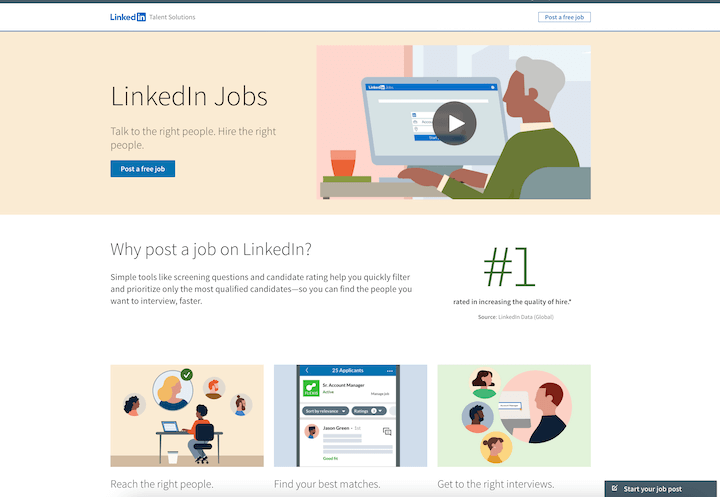
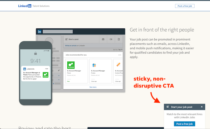
LinkedIn’s landing page below, for LinkedIn Jobs, takes advantage of the bottom right pop-out box common on social media platforms to include a non-disruptive CTA.
View the full landing page here | Go to actual landing page
What makes it great
- Simple, clean branding: Not just the visuals, but the simple tagline at the top: Talk to the right people. Hire the right people.
- Data-backed trust signals: #1 rated in increasing quality of hire, 3x more qualified applicants, being preferred over a top competitor by SMBs.
- Testimonial with photo: Putting a face next to a testimonial makes it more real and trustworthy.
- CTA: There is a sticky “Start your job post” pop-out tab at the bottom of the page.
2. Next Bee – superb organization
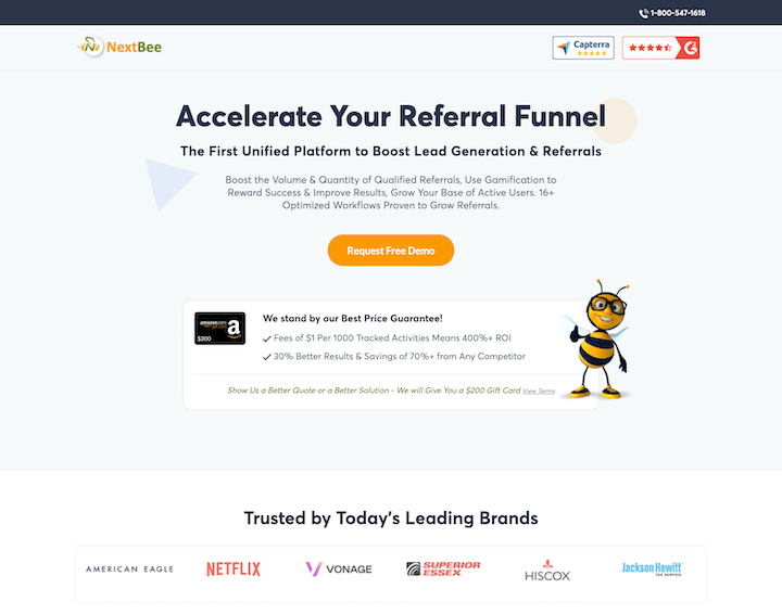
This landing page example is a great one to model after if you have a lot of information to convey on your page.
View the full landing page here. | Go to actual landing page
What makes it great:
- Benefit-focused headline: Now this is a high-converting landing page headline. Accelerate Your Referral Funnel is much more appealing than Try Our Referral Platform.
- Confidence: Show us a better solution – we will give you a $200 gift card
- Information and action hierarchy: We start with the ultimate benefit and most important CTA, then the guarantee and trust signals, followed by benefits and testimonials, and ending with more details on its features and then four more CTAs
- Page organization: Next Bee manages to pack 14 different descriptions of its platform features onto one clean page, using tabs and cards.
- CTA: Friendly orange (and nicely contrasting with the green) CTA to request a demo smack dab in the middle of the first paint of the page, repeated again in the benefits section, and then once more amid three others at the bottom of the page (request a free POC, get ROI analysis, get strategic advice).
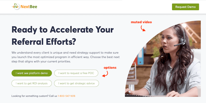
One thing I might change: Title case for everything interferes with the readability of the copy, especially the packed description below the headline. My brain sees them all as headlines rather than flowing information.
3. Adobe – active words
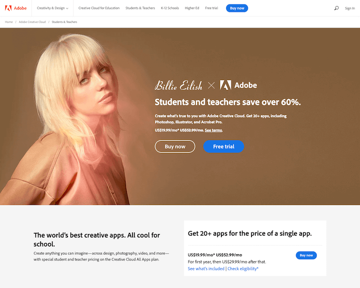
Adobe’s landing page example below is for Creative Cloud (and Billie Eilish?). The word choice on this page is the thing to pay attention to.
View the full landing page screenshot here | Go to actual landing page
What makes it great
- Headline: The 60% discount for students and teachers is the most prominent piece of information on the first page, and also matches the headline of the ad that preceded it.
- Price slash: Showing the original, higher price enhances the perceived value of the product and makes the discount that much more appealing (one of our marketing psychology tactics).
- FAQ section: The accordion-style FAQs at the bottom are the perfect way to add more information to the page without cluttering it up. This is the information that someone with the highest intent will seek out. This also works well if your landing page is indexed and you want it to rank.
- Active, interesting verbs: No need for exclamation points when your words are lively. Words in this landing page: create whenever, make it then PDF it, share, make, paint, get inspired, stroke and be stoked, boost your skills, make the leap, take the stage, watch and learn.
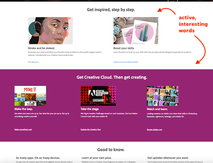
One thing I might change: The exasperated-looking Billy Eilish hero image. I feel like something a little more upbeat would help speak to the 60% discount mentioned right next to it.
4. Unbounce – short and simple
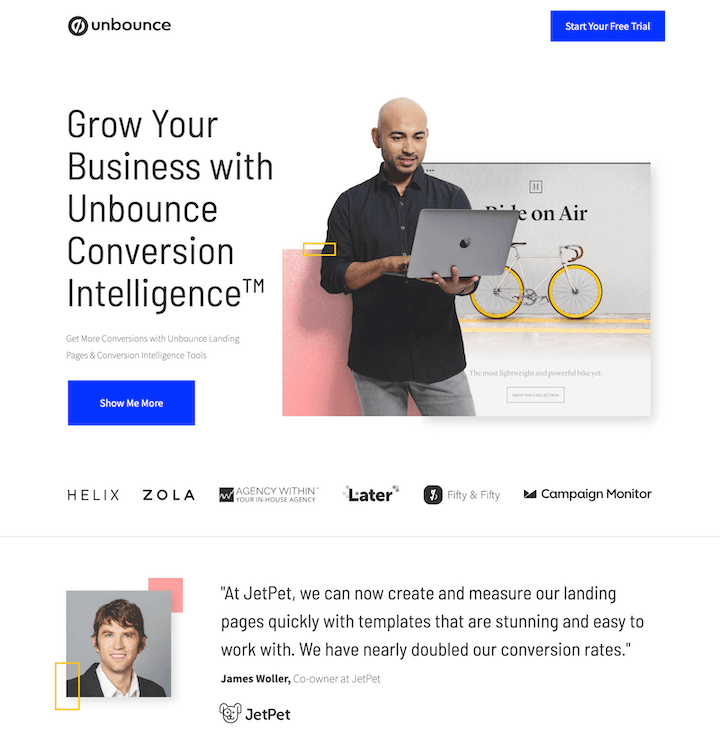
This landing page example for Unbounce’s Conversion Intelligence tools gives us some nice design inspiration.
View the full landing page screenshot here | Go to actual landing page
What makes it great
- Trending design: mixing real photos in with illustrations and graphics is one of the popular landing page trends of this year.
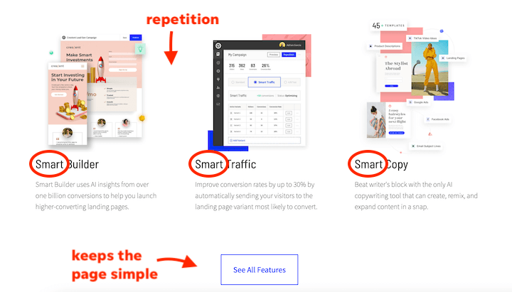
- Simplicity: Not every landing page has to be long. This entire page can almost be captured in one screenshot. The strategy here is to link to a separate page with all of the features, allowing visitors to focus on the testimonial, three core benefits provided, and the demo CTA.
- Repetition: This simple copywriting technique can improve memorability and strengthen your messaging.
One thing I might change: Just kidding. No way am I going to make a suggestion for a landing page company. Plus, I don’t have anything!
Service business landing page examples
These examples show us that there are so many ways to create effective landing pages—no matter your industry or budget.
5. BairesDev – trust signals
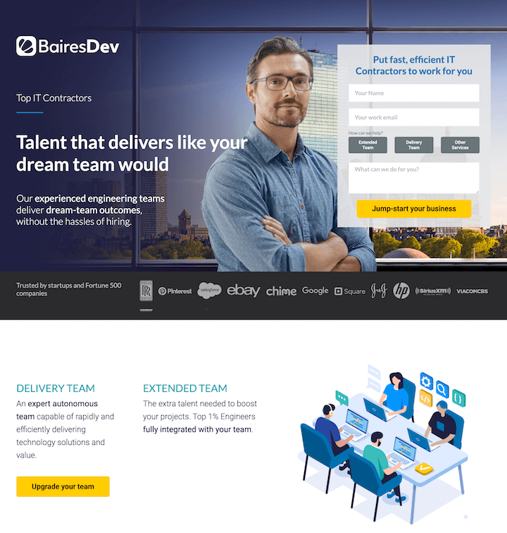
This landing page example for BairesDev, an IT contracting agency, leaves us with some awesome landing page tips.
View the full landing page screenshot here | Go to actual landing page
What makes it great
- The communication: The three most prominent pieces of information on the page are represented in three different ways—large “Talent that delivers” text, a confident-looking picture of a man, and a contrasting yellow “jump-start your business” button—the perfect way to convey your messaging without overwhelming the user.
- The copy: The “dream-team outcomes without the hassles of hiring” flows perfectly and shows us that rhyming and alliteration don’t have to serve cute or playful purposes.
- Quantifiable trust signals: Super important in the IT industry. 10+ years experience, only the top 1% of tech talent, 91.2% customer satisfaction, 70.3 NPS, etc.
- Testimonials galore: Not only is the page packed with big-name logos (Google, Salesforce, Pinterest, Rolls Royce, etc.) but there’s a carousel of cards at the bottom with reviews from people in these companies. A great example of testimonial advertising.
- The form: Not only is it a simple, three-field form, but if prospects don’t know what they need, they have three options to choose from. Hovering over each option gives you a little more information. Also, the specific form title and benefit-focused submit button.
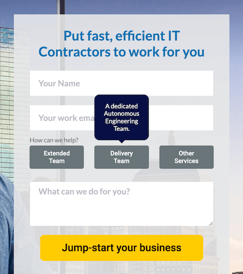
One thing I might change: The delivery team/extended team blurbs beneath the hero image aren’t fully clear to me. Perhaps a verb in front of each or a repositioning of the CTA to cover both.
6. Elite Martial Arts – emotional appeal
This landing page isn’t as fancy as the others on this list, but it goes to show that you can still create an effective landing page without an in-house designer.
View the full landing page here.
What makes it great
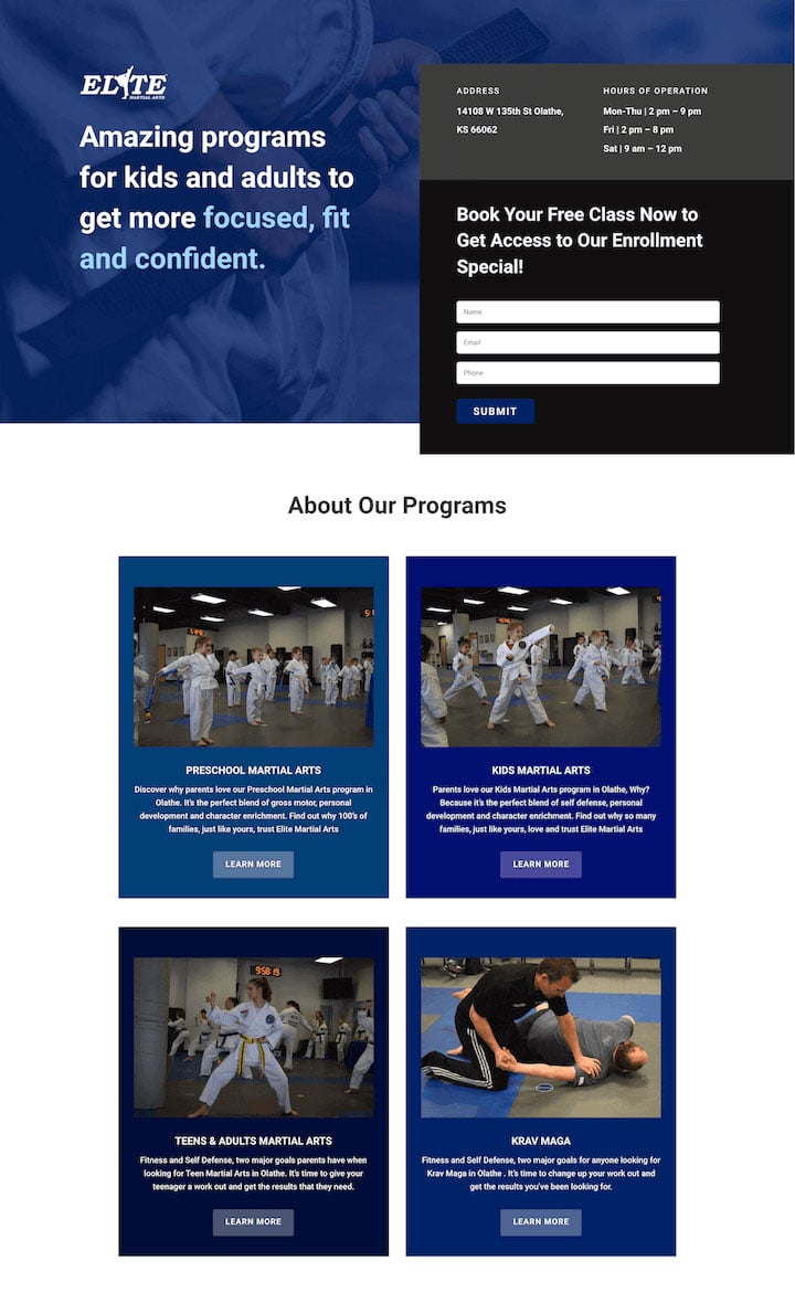
- Emotion! The key word in this landing page headline is confident, supported by the confident belt-tightening image in the background. Marketing with emotion can be subtle while making a big impact.
- Quantified trust signals: 100,000 plus active students, more than 1 million students trained since 1969, certifications based on 40 years of tradition and research development.
- The first paint: As a local business, the intent of visitors to this page (assuming the ad used location targeting) will be pretty high. Elite is smart to include its address and hours right at the top so people can get a feel right away for whether this establishment will work with their schedule.
7. Powell & Sons – local optimization
Here’s another small business website landing page that’s clean, professional, and covers all the bases
View full page screenshot | Go to actual page
What makes it great
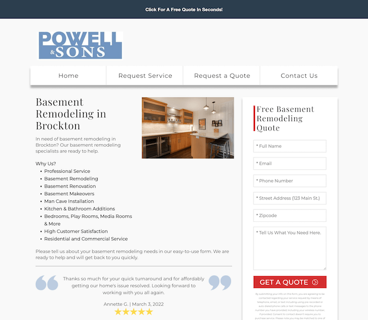
- Local SEO: This landing page also happens to be the website’s homepage, and in this scenario it works. The page has done its local SEO homework with local keywords in the headings, body copy, and meta data and a map embedded on the page.
- The real photos: Rather than stock images, the photo of the kitchen at the top and the owner himself halfway down the page on the page are real and more trustworthy.
- Reviews WITH dates: This reassures me that the business is active with happy customers NOW. Not eight years ago.
- Skimmability: This page provides the immediate information visitors to this page are looking for without having to comb through paragraphs or blocks of text. Plus the form is prominent, making the desired action clear and easy to take.
Ecommerce landing page examples
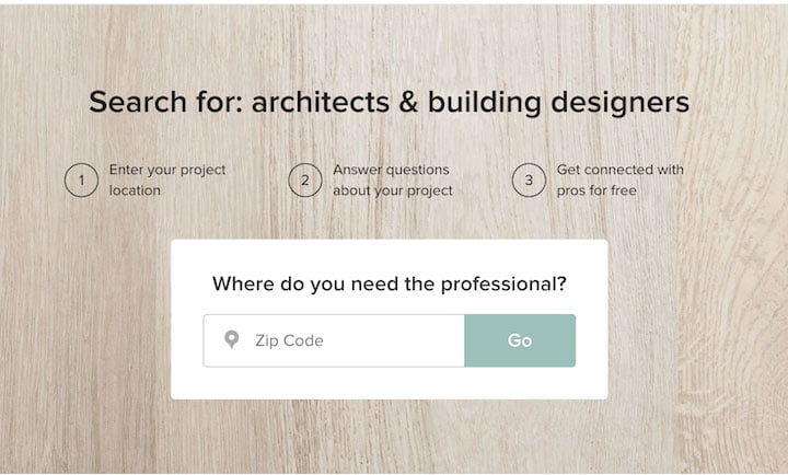
8. Houzz – eye candy
This v. attractive landing page for a Google ad that appeared when I typed in “architecture agency near me.”
View the full landing page screenshot here | Go to actual landing page
What makes it great
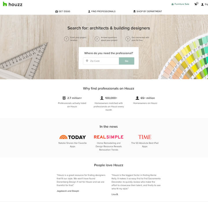
- The color: The paint samples, contrasting with the pink/red logos, on top of the natural wood background is eye candy.
- The concision: This landing page has an explanation on how to use the service, quantifiable features, big-name trust signals, and reviews all in one clean layout with minimal words. The numbers and quotes speak for themselves.
- The clarity: Of course, finding an architect or building designer is not as simple as 1 2 3. But by giving the user a clear picture of what to expect when they enter their zip code, Houzz improves chances of them taking this action.
9. Freshly – conversational style
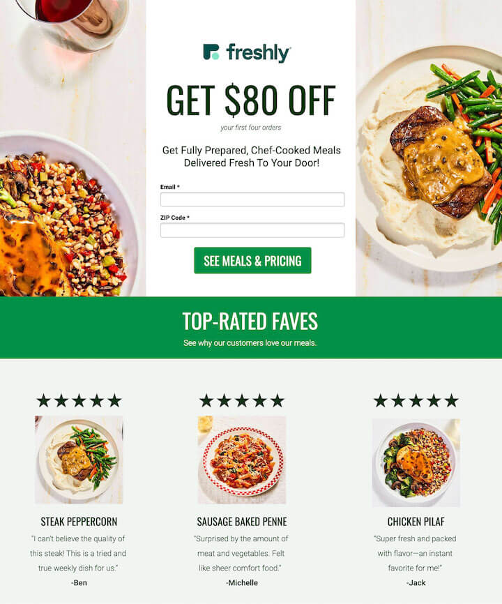
Freshly is a meal prep service with (clearly) an excellent food photographer.
See full landing page screenshot | Go to actual page
What makes it great
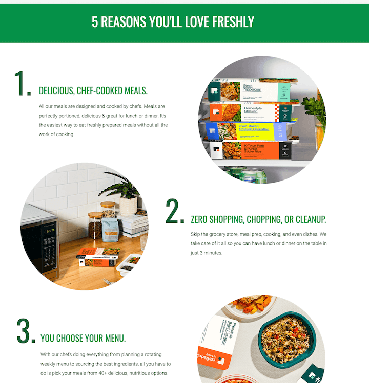
- The imagery: Vibrantly colored, mouth-watering images throughout the page make it look great while marketing the service at the same time.
- Conversational tone: “Top-rated faves” changes my perception, from that of a business marketing to me to a person telling me about the business. Plus the reviews stick with this tone.
- The CTA game: The page starts and ends with a loud and clear $80 offer with specific CTA button copy (“See meals & pricing” and “Get $80 off.”)
- The “5 reasons you’ll love Freshly”: Not only does this also show the user how the service works, but the colorful imagery and Z-pattern make it easy and enjoyable to read.
Event landing page examples
If you ask me, events provide opportunities to create some pretty cool landing pages.
10. Borrell Miami – active design
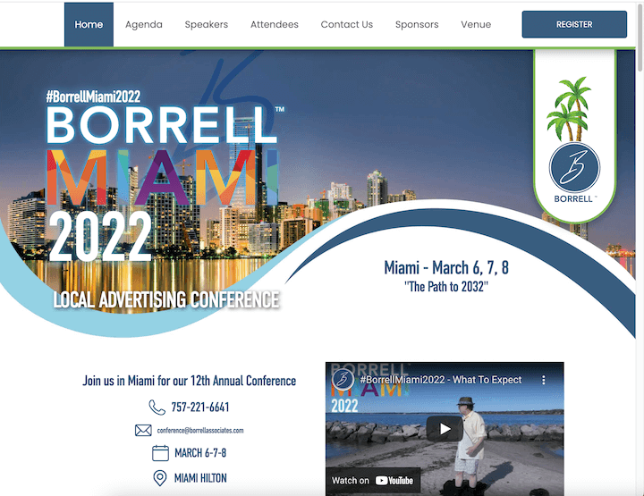
Borrell Miami is an annual local advertising conference that attracts 500 marketing executives each year—but you don’t have to be running a national campaign to use the ideas from this event landing page.
View full-size screenshot | Go to actual page
What makes it great
- The design: The colors and curves on this page give it life and movement.
- Information hierarchy: All of the immediate details about the event are available above the fold, including the event hashtag and theme. Then the FAQs are next.
- Video from last year’s event: This is the best way to show potential registrants what to expect and highlight the most attractive aspects of your event.
11. Miro – skimmability
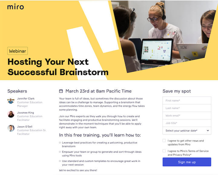
Miro is a free online whiteboard—which is pretty cool if you ask me!
View the full page screenshot here | Go to actual landing page
What makes it great
- The layout: Although there’s a lot of information here, the layout of the page makes it easy for me to take it in. Plus the large hero image puts the second half of text below the fold.
- The skimmability: The topic, date, and speakers are made clear right off the bat. If I don’t feel like reading the intro paragraphs, there’s a three-bullet list on what I will learn. Nice landing page copywriting.
- The form: Four fields, “Sign me up” CTA (rather than boring old “Submit), and perfectly contrasting purple to the yellow.
Add these landing page examples to your swipe file
- LinkedIn Jobs
- Next Bee
- Adobe
- Unbounce
- Houzz
- BairesDev
- Freshly
- Elite Martial Arts
- Powell & Sons
- Borrell Miami
- Miro

