Different business websites have different goals depending on their core offering, business model, and industry. But website visitors, well we apparently have one goal—to judge them, and mercilessly.
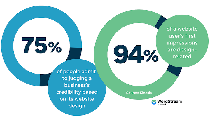
75% of people admit to judging a business’s credibility based on its website design. Emphasis on the admit because in my opinion, that 25% just isn’t admitting to it. And that’s just the first impression. If you’ve gotten visitors to stay on your site, now it’s up to the user experience and website copy to keep them there and get them to take the actions that support your business goals.
So, what makes a great website? Let’s take a look at 17 website examples from a variety of industries to find out—from copy to creative and everything in between.
Table of contents
💈 Small business website examples
🤝 Service business website examples
In the past, websites were mainly for big businesses with big budgets. But with today’s technology and tools, they’re feasible for businesses of any size. These small business website examples are from the IT, health, and real estate industries.
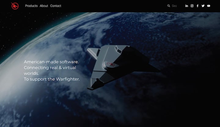
IT website example: Beast Code
Beast Code is a small-to-medium-sized technology company that develops software solutions. Now as a tech company and with a business name like that, I had high hopes for this site, and it did not disappoint—and not just with the spaceship homepage and warfighter tagline.
What makes it great
- First impression: Though there isn’t a prominent CTA button above the fold, it’s not because of other distracting elements. The simplicity of this first paint (a subtly animated, futuristic spaceship background) makes its own impression on your perception of this company’s tech abilities.
- Color contrast: The red CTA buttons pop out against the black background.
- Video elements: In the Z-pattern, instead of static images, the visual blocks are videos. Non-disruptive, silent videos that give the page life.
- The copywriting: The conversational tone and ability to put its complex processes into layman’s terms reflects intelligence, professionalism, and humor.
☎️ Need help crafting a compelling call to action for your website? Free guide download >> The 42 Best Call to Action Phrases Ever (& Why They Work)
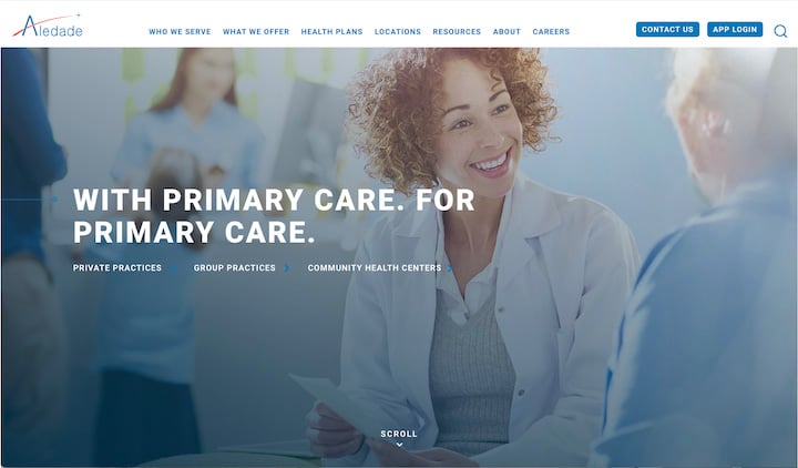
Healthcare business website example: Aledade
We start off with Aledade, a primary care physician partner that has a mix of offerings—practice management support, partnership programs, an app, and more—for private practices, group practices, and community health centers. But despite having a complex offering and audience, the website does a great job of guiding visitors.
What makes it great
- Overall feel: The smiling face and soft images, paired with all caps bold font give you a gentle but authoritative feel.
- Organization: Intuitive, organized header, plus a smaller menu below the headline designed to help the different segments of its audience find their way.
- Movement: Elements appear upon scroll, giving the site some added movement and life.
- Resources: While the homepage features a whopping eight resources, the card-style reel with image thumbnails makes it clean and organized.
We have plenty more healthcare website designs for you to browse here!
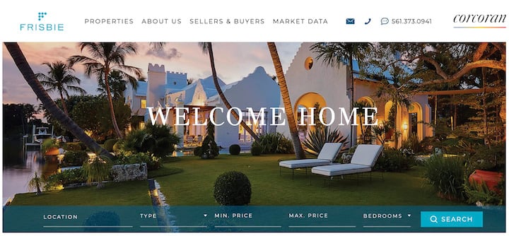
Real estate website example: Frisbie Realty
With this website example, we have yet another excellent visual first impression, but this time back on earth. What you’re looking at below is the homepage for Frisbie, a small real estate company in Palm Beach.
What makes it great
- Visual messaging: The image lets you know right away that this is a high-end realtor, and yet the warm lighting and “welcome home” title give off an inviting feel.
- Functionality: The property search function right there below the image with a nice contrasting blue button.
- Movement: A common theme among these examples (and a website trend), the elements appear and move slightly upon scroll.
- Content: There are neighborhood guides featured right on the homepage, a great example of content marketing.
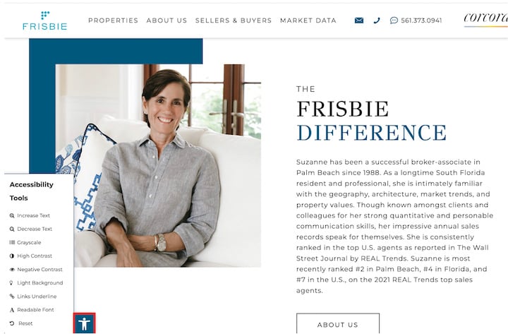
- Accessibility: The website accessibility options on the bottom left, such as to increase or decrease text size, adjust contrast, underline links, and more.
We have lots more real estate website examples to inspire you here.
👀 Looking for more ways to drive people to your site? Free guide >> 25 Ways to Increase Traffic to Your Website
Ecommerce websites are sort of their own animal, especially if you have a lot of products to offer. Here are a few examples from a range of verticals.
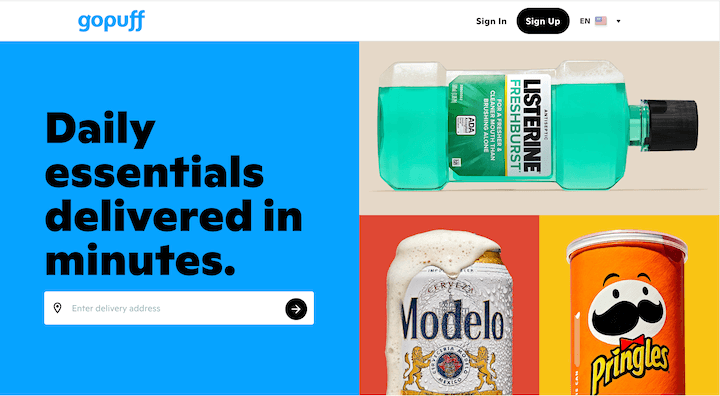
Grocery ecommerce website example: Gopuff
Gopuff is not your typical grocery delivery site. In the same way that Tend (above) does dentistry differently, Gopuff creates a unique online grocery/convenience store shopping experience.
What makes it great
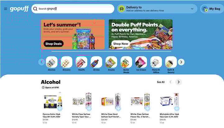
- Layout: While most ecommerce sites have complex mega menus, GoPuff has a simpler layout with a carousel format, which carries through into its subcategory pages.
- Relatability: Between the products featured (Pringles, Beer, mouthwash) and the copy used (“We don’t surge or hike prices. Yes, you read that right.”), you can tell that GoPuff knows its target audience well.
- Consistency: Gopuff is not meant for your weekly grocery shopping. It’s there for you when you’re in a bind and need something last minute. The concise, non-flowery copy on the site, the simplicity of the design, and even the absence of 90 degree angles on the site all contributes to this feeling of convenience and ease.
Rental ecommerce website example: Zumper
Zumper says that “today’s rental experience is broken. It’s outdated, exhausting, and slow” and is on a mission to “change the way you rent, forever.” I think they’re off to a great start.
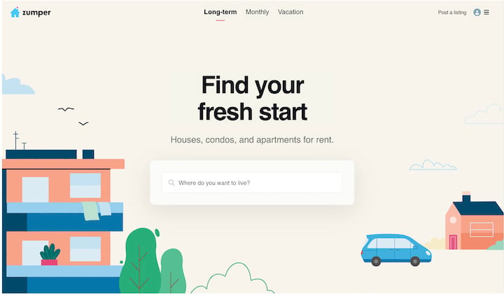
What makes it great
- The little details: Instead of “enter a location” the search box message reads, “Where do you want to live?” In the apartment illustration on the homepage, there are towels draped over the balcony railing. These little touches give the site character.
- Values on homepage: Scroll to the bottom and you see Zumper’s three core values—inclusive, safe, and respectiful—with a link to read more. As we’ve already seen in some of the examples above, this is becoming a bigger priority for businesses across industries.
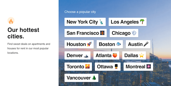
- Graphics: Hand-drawn illustrations and flat design are both website and landing page trends we’re seeing this year, and Zumper nails both. Plus, look at the “hottest cities” section and you’ll see excellent use of emojis.
🛑 Get the guide >> How to Make Great Landing Pages (with Crazy High Conversions)
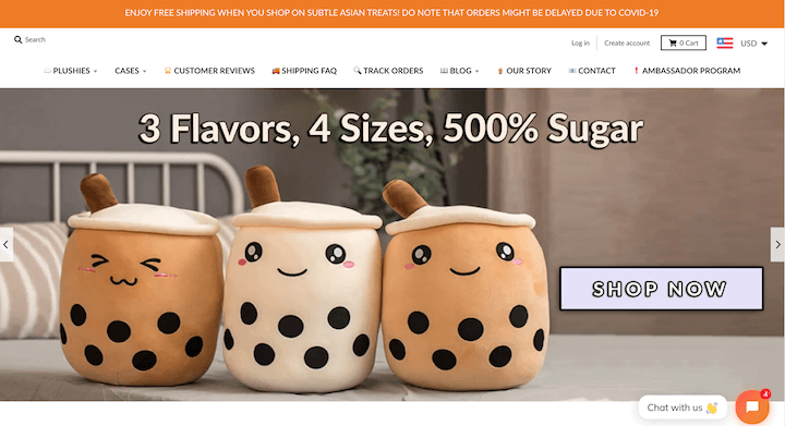
Retail ecommerce website example: Subtle Asian Treats
Subtle Asian Treats—a play on words from the popular Facebook group—is a great example of a super small ecommerce business website.
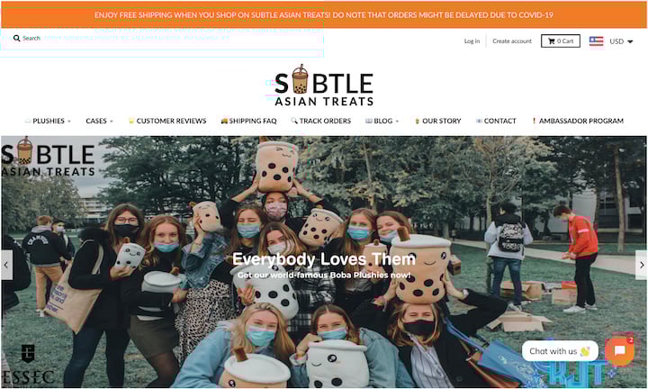
What makes it great
- Animated logo: How cute is that little bubble tea icon?
- Top nanobar: This is common for ecommerce sites since you can use it for important announcements, including sales promotions.
- Emojis: We’re seeing more and more emojis on websites these days. Adding them to the navigation menu here helps separate each one—and looks cute too!
- Centered logo: Most sites have a clickable (to homepage) logo on the top left. This one (as well as Chinelle’s) is in the center, below some of the other navigation elements—just different enough to be unique but still intuitive enough for a smooth user experience.
- Not so subtle. 500% sugar. Case in point
🚨 Get an instant website audit—for SEO and more—with our free Website Grader!
Lead gen or service-based business websites have different goals from ecommerce sites. Here are some examples from businesses big and small.
Design agency website example: Born & Bred
For most businesses, it’s best to stick with the traditional layout and design of other sites in your industry. But as a design company, you can get away with going against the grain. After all, you want to show off what you can do. Now a screenshot here doesn’t really do Born & Bred’s site justice because it’s the scroll experience that really makes it cool, so be sure to check it out.
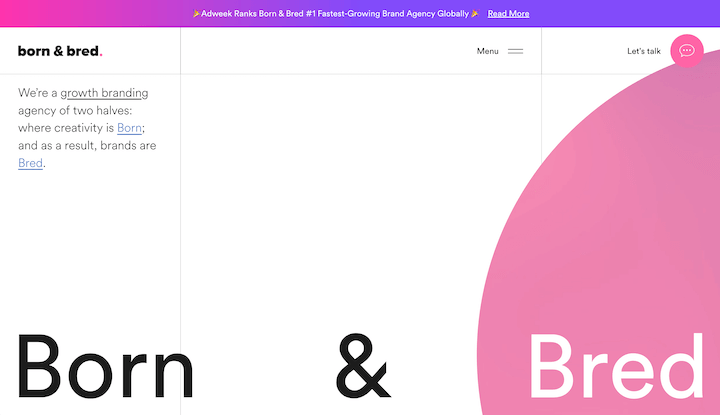
What makes it great
- The tour theme: The site is designed to take you through a tour experience as you scroll. In addition, the video reel playing at the top captures candid moments in the office.
- Values: Core values right on the homepage. My kind of site.
- The copy: Just like Beast Code, these guys have a lot of fun. For example: “And to your right…more case studies. Please keep your eyes and cursor inside the browser window at all times.”
- Nanobar: The bar across the top links to an article about a recent accolade and adds a nice eye-catching gradient background.
Get ideas from more B2B website design examples here.
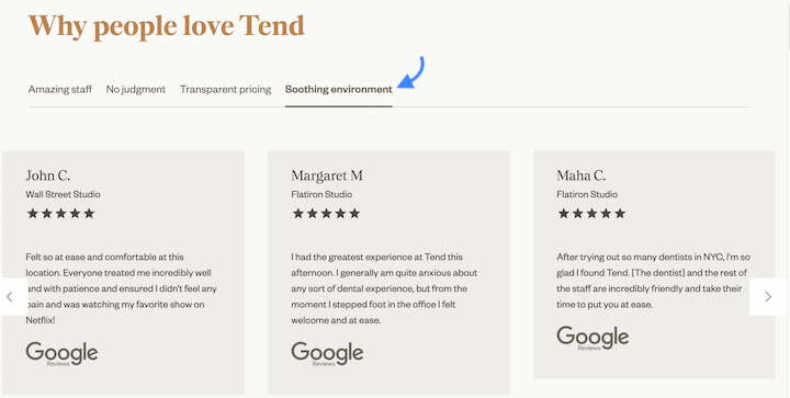
Dentist website example: Tend
Moving on from design, we’ve got a dentist website example next—and a really cool one. Tend’s tagline is “Dental done differently” and we can see that right away on the homepage. Let’s take a look.
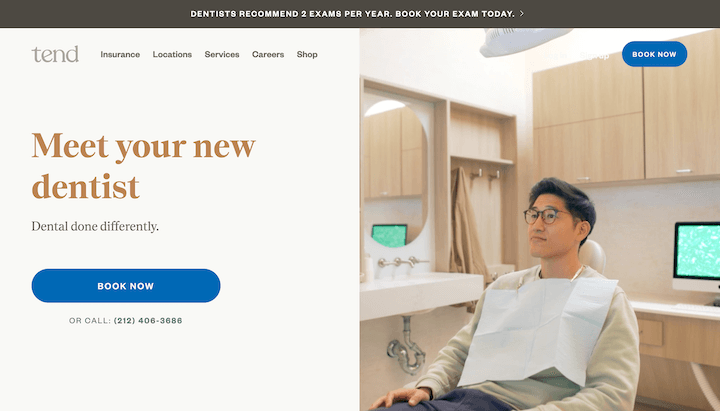
What makes it great
- The video: In about 10 seconds, the split-screen silent video on the homepage shows clips from a patient visit, showing you exactly how Tend does dental differently. Not your traditional explainer video, but very effective.
- Clean design: No pun intended there, but the simple layout makes this site appealing.
- Social proof: Not only is there an attractive testimonial carousel, but the four tabs used to organize the testimonials also serve as features of the business. Very clever dental marketing!
Advertising website example: Eleven
Just like with a design agency, the website of an advertising agency needs to be top-notch, and Eleven does not disappoint. Again, screenshot does not do the homepage justice, but you can still get a taste of this captivating site’s flare.
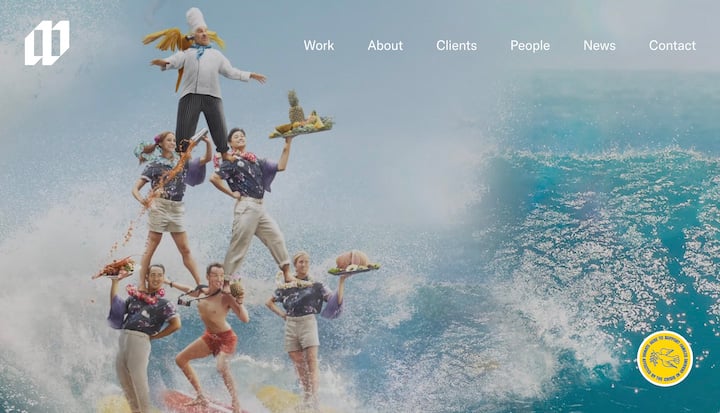
What makes it great
- Video background: The full-width background video on the homepage is a highlight reel with tons of awesome visuals that grab your attention (exhibit A above).
- Clean design: There isn’t a prominent CTA button in the first paint, and tastefully so. The simple white elements overlayed on the video background keep the video the center of attention, which is the call to action.
- People-centric: Not only does Eleven have a clear diversity, equity, and inclusion section on its about us page, but it also dedicates an entirely separate page to headshots/portraits of all of its employees (plus their dogs).

SaaS website example: Chartbeat
SaaS websites can be tricky because you want to demonstrate what your platform can do but without overwhelming visitors. Chartbeat does a great job with this through its illustrations and concise copy.
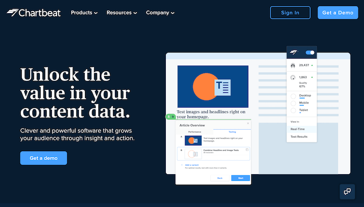
- The title: Nice value proposition in the title with “Unlock the value in your content data.”
- Animation: The dashboard image on the homepage is animated at just the right speed to show you different aspects of the tool without it being too much.
- Unique navigation menu: Chartbeat minimizes the space its nav menu takes up by listing out the items in the drop-down horizontally—a different but nice form of organization.
- Not a lot of talking: The homepage has very little marketing copy. The illustrations and customer testimonials do the talking while the marketing copy stays concise and weaves it all together.
Portfolio websites are used by students and professionals to showcase their work and provide an extension of their resume. Designers, developers, photographers, event planners, and models are just a few of the many trades that use portfolio-style websites.
Photographer portfolio website example
Chinelle Rojas is a self-portrait photographer, logo designer, and entrepreneur with a very cool portfolio website. Enter in and you feel like you’ve stepped into her world.
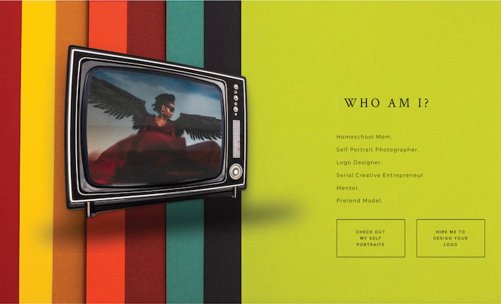
What makes it great
- Music: On the homepage, you can pick from one of six songs to play as you browse the site.
- Vibrant colors: In addition to a collage as her hero image, the color scheme in the middle section is like music to the eyes (? just go along with it).
- Personalization: Everything has a hand-picked feel on this site, giving you the feeling that you’re kind of like, right there with Chinelle hanging out.
- Gallery design: Her “My Black Self” gallery folllows a simple grid format on the left with the larger view on the right—an easy and intuitive way to browse her work.
Web developer portfolio website example: Brittany Chiang
This is a resume-style portfolio website example by a web developer named Brittany Chiang.
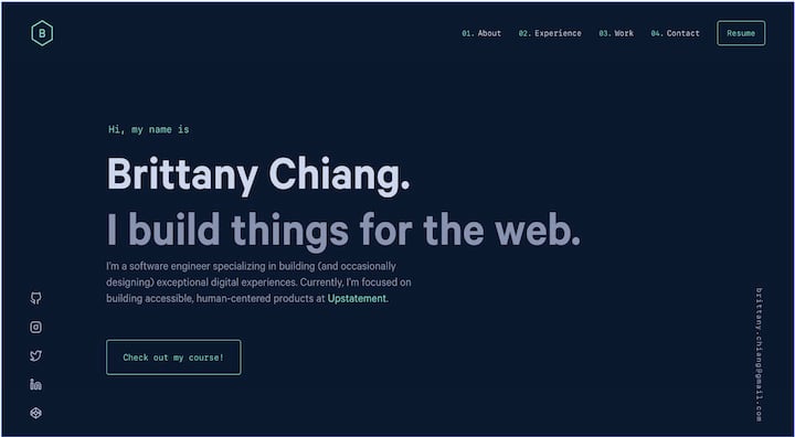
What makes it great
- Color scheme: The dark background and somewhat neutral colors make the green elements really stand out, drawing attention to her company name and her CTA button.
- Big title: The big title on the homepage sticks out here as well. For business websites, this is usually the business name or value proposition, but the simple statement here feels on-brand for this portfolio website.
- 3-D feel: The “Experience” page uses overlappig elements and transparent overlays to create the effect of multiple dimensions.
- Information presentation: Showcasing web development projects is not as easy as design or photography where you can have a gallery, but Brittany’s “Work” page is super organized and easy to look at, despite it being all text.
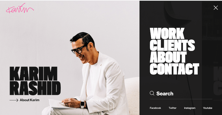
Interior designer portfolio website example: Karim Rashid
Our last portfolio website is from prolific designer Karim Rashid. It’s sort of a hybrid of a portfolio website and a business website.
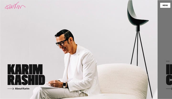
What makes it great
- Large font: The unique portrait, the black/white/gray theme, minimal copy, and images of Karim’s work have a quiet feel to them while the large font and bold colors that appear on hover are loud and clear—a unique juxtaposition that balances out nicely.
- Parallax: The mix of scrolling speeds gives the effect of the site having multiple dimensions/layers—another way to have fun with motion but without animation.
- The sneaky sidebar: That section on the right that looks like maybe you’re zoomed out too far or seeing some responsivity issues? That’s what gets you to engage. Curious, you hover over it and it expands just enough to show you an arrow with “see pr—” then it gets cut off. You click on that arrow and boom, you’re brought into a new view of one of his collections. Or maybe your eye is drawn to the white menu button that stands out on the dimmed background. Click on it and boom, massive menu elements just begging you to click.
Our last group of website examples are nonprofits. You’ll notice that even though they’re nonprofit, they’re still conversion-focused, where the conversion action is to donate.
Operation Underground Railroad
When you arrive at the Operation Underground Railroad website, you can immediately understand its loud and clear, zero-tolerance, go-to-any-lengths mindset.
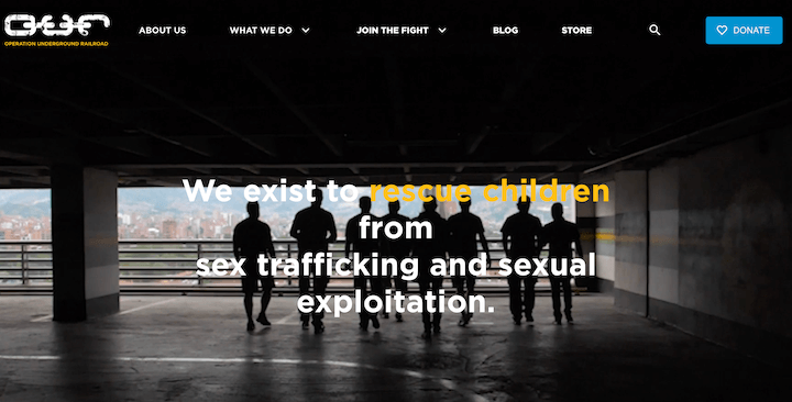
What makes it great
- Powerful video: The video background on the homepage takes you through a range of emotions. From kids dancing to police handcuffing to a horseback riding mission, you feel innocences, inspiration, and indignance all at once.
- Yellow accents: Not only do the yellow graphics stand out against the dark gray background, but because the images used on the site are very real and in the trenches, they’re not the highest quality. The yellow outlines in the images help to mask this and provide an added touch of action and emotion.
- Button-style menu: With such a busy background visual, the use of solid blocks as menu elements makes them easy to read and clickable.
International Women’s Media Fund
International Women’s Media Fund is another badass (in its own words) nonprofit website example with powerful imagery and no-nonsense copy.
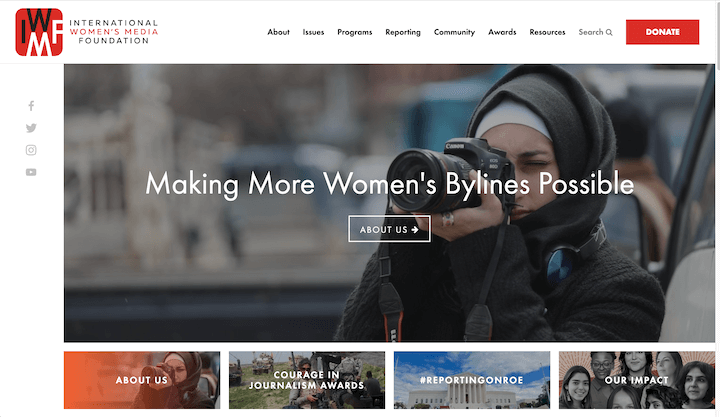
What makes it great
- Images as buttons: Below the large image carousel, there is a small thumbnail version of that image below with text over it, creating the effect of an image button.
- Prominent donate button: This is the CTA you’ll see across most nonprofit sites, and the bright red box in the upper right makes it easy to spot.
- Mission in the footer: Rather than the typical list of inks in the footer, we see social buttons, contact info, and its mission. This isn’t common but the idea of it appearing no matter which page of the site you’re on gives it an added layer of integrity.
- Power words: Throughout the site we see powerful word choices, like “We unleash the potential of women journalists as champions of press freedom” and “Meet the badass journos that we support.”
Use these website examples for ideas & inspo
Websites are works of art. While most industries have their own basic standard of how a website in that niche should look and function, you have the freedom to achieve that look and function in different ways. And you are free to adopt ideas from other industries as well. So use the website examples in this post to think about and test out the many ways to welcome visitors, show what you’re capable of, put your best foot forward, and meet your business goals.
Want to see more website examples? We’ve got you covered! Check out these:
Are you wasting money in Google Ads?

Meet The Author
Kristen McCormick
Kristen is the Head of Marketing at Hatch, a customer communication platform for service-based businesses. She was previously the Senior Managing Editor at WordStream. Her cat Arnold has double paws on every paw, and she finds life to be exponentially more delightful on a bicycle.
Recommended for you