Did you know that for many sites, the contact page gets more page views than any other section? It’s true, especially for agencies and contractors.
While many sites throw up a contact us page as a quick after-thought, you should be dedicating a lot more time and care to your contact page because, for many brands, it’s the beginning of your relationship with potential customers.
Today we’re providing some contact us page best practices and looking at examples of incredible contact us pages that show various styles based on different business audiences and intent.

To begin, let’s look at…
Some Obvious Contact Us Page Best Practices:
- Mind Your Ps and Qs: Even small grammatical errors can scream at visitors. You’ll want to go through your contact page with a fine-toothed comb.
- Keep it Simple: You don’t want to put too many barriers between the site visitors and the contact information they’re looking for. Keep your contact us page short, sweet, and to the point.
- Give the People What They Want: I hate contact forms – somehow I just get the feeling that when I fill one out, I’ll never hear back from them. It also feels like I’m somehow untrustworthy and don’t deserve a real email address. Of course, providing a real email address opens you up to potential spammers, so it’s really a bit of a toss up. However you choose to set up your contact page, make sure that it’s supremely easy for folks to get in touch with you. If you use a contact form, only ask for the essentials (name, email address, and their message). I’ve seen contact forms requiring mandatory mailing addresses and phone numbers. Form fields like those are a major turn-off.
- Look Gorgeous: When users visit your contact us page, they’re beginning a relationship with you. They want to know more about you, and your contact us page’s design and style will be part of their initial impression. Keep that in mind! Look sexy, make those readers just SO excited to contact you!
- Show off Your Personality: As I mentioned above, users who visit your contact us page are looking to learn more about you. Think about how you want your copy to reflect your brand persona. If your audience is the casual, fun-loving crowd, consider a light-hearted, even comical tone for your contact us page.
Contact Us Page Examples: The Great and Not-So-Great
Let’s check out some real-world examples. We’re scoring these contact us page examples on a scale of 1-10. 10 is a contact us page piece of perfection, 5 is all right, and 1 is “burn it to the ground.” Let me know if you agree with my scoring!
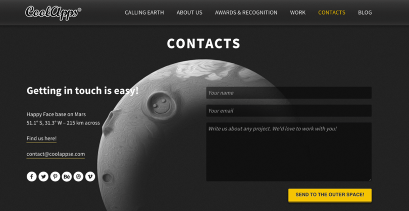
Our first example comes from CoolApps. Their contact us page provides a quick and simple contact form, an email address to use if you prefer, and various social media buttons in case you’d rather contact them through your social network of choice.
Of course what really sets this one apart is the style and adorable charm. It’s very fun!
Score: 8. Looks fantastic, has plenty of contact options, and shows personality.
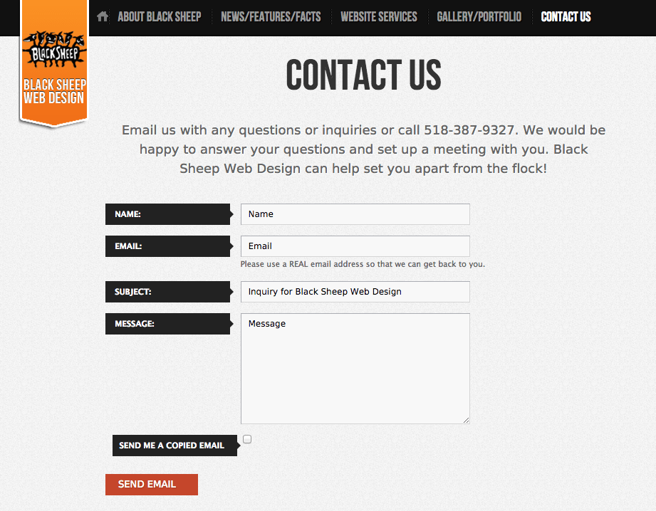
Our next example from Black Sheep shows a contact page that does a great job of using a style and design that matches the rest of the site. It’s clean, to-the-point, and looks good!
Score: 6. Simple, stylish, and fits with the theme.
Next up we have a contact us page from ViperChill, a site run by popular marketing maverick Glen. Before dishing out his e-mail address, Glen provides an FAQ page answering common questions that visitors have. This helps him save time and prevents him from getting overwhelmed by un-necessary emails.
While agencies and service companies may be hungry for emails, individuals who promote themselves as a personal brand are often working with a team of one. They can’t collect and hoard email contacts, and instead need to be much more deliberate with their time.
Score: 6. Smart use of information hierarchy to answer users’ questions before they send an email.

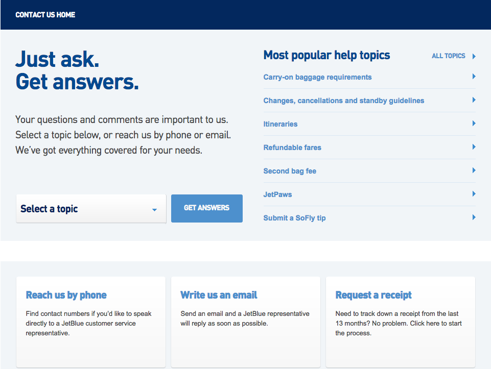
JetBlue offers another example of a well-crafted contact us page. Like the example above, JetBlue provides a direct link to popular help topics and answers. For those who don’t get their questions answered in the topics section, email and phone number contact options are provided below. This page also fits in well with the brand’s larger JetBlue design and color scheme.
Score: 7. JetBlue makes it very easy to grab info, whether from FAQs or with an email or telephone query, while maintaining a style that reassures visitors.
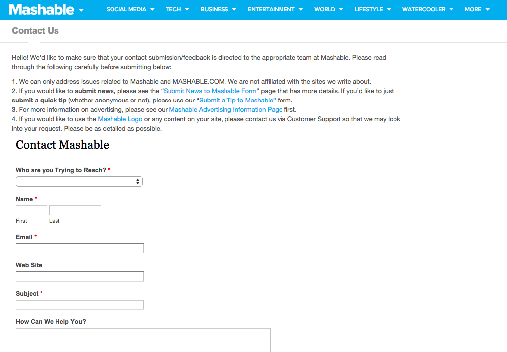
So functionality wise, Mashable’s contact us page isn’t the very worst. It provides all the info you need to get in contact with Mashable folks, with a contact form and more specific email addresses down below.
What’s shocking is how hideous this page looks. No style, no character, no personality at all. If you just saw this contact page, you’d never guess you were looking at one of the most popular sites on the web! Why so monstrous? Who knows? Maybe Mashable purposely maintains an ugly contact page so that their email inboxes won’t get as flooded.
Score: 2. Ugly, boring, and unfitting for Mashable.
This minimalist contact us page from Mostly Serious is a great example of a clean, crisp design. Even with such few pieces of copy, Mostly Serious still manages to add a touch of humor and personality.
Score: 7. Mostly Serious manages to pull off this ultra-minimalist design without neglecting the element of fun.

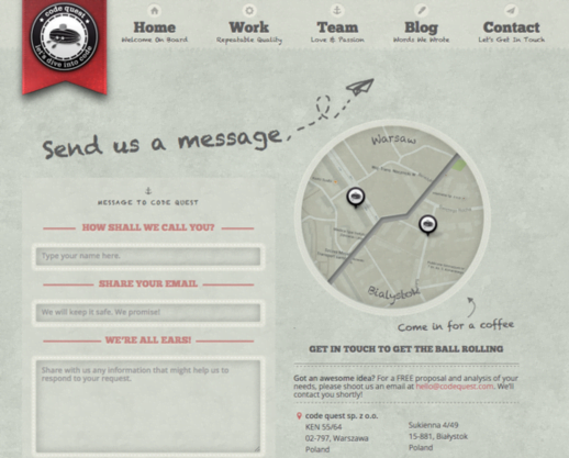
Code Quest offers another well-executed contact us page, with an eye-catching design, fun graphics, and a dose of personality. Code Quest also provides a map showing their locations, which is a great idea if your business is locally oriented.
Score: 8. Friendly, convenient, and concise, Code Quest gets it right.
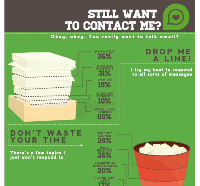
This contact us page from QuickSprout is especially unique, featuring a scrolling infographic explaining how much mail Neil Patel gets each day and how little time he has to read them all! You’ll only reach Neil’s contact form after scrolling through this infographic. Like the ViperChill example from earlier, Neil needs to be able to filter out any unrelated queries to save time.
Score: 8. Maybe folks will think twice before spamming people like Neil after checking out this infographic! This contact page is educational and functional.

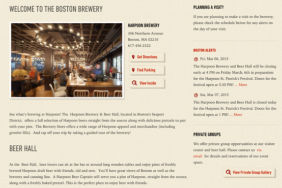
This contact us page from Harpoon Brewery has a lot of information packed in, but it does a nice job of setting up an information hierarchy. At the top you have the address and phone number, along with directions and parking instructions. This is probably the information most people will be seeking out on a brewery contact page.
Alongside this high-value info are alerts about special events or hour changes from the brewery, and below is more information on hours for the brewery hall.
Score: 6. Lots of information here that Harpoon Brewery visitors might require for their visit.
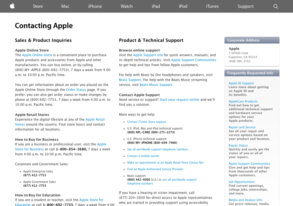
For a company that’s all about sleek, cutting-edge product design and style, Apple’s contact us page is unexpectedly plain. There’s nothing to indicate that we’re dealing with one of the most widely-renowned companies in the world! Come on Apple, we know you can do better. What gives?
Score: 3. Not the kind of design we would expect from the creators of the iPhone.
It really shouldn’t be a huge surprise that Ticketmaster would have a god-awful contact us page, but you’d still think that a website that deals almost exclusively with online orders and makes so much money could spare a little more attention on their contact page.
The giant, unattractive, ridiculously out of place looking banner image is just one more way Ticketmaster is doing you no favors.
Score: 2. Oddly unattractive, this one needs some work.

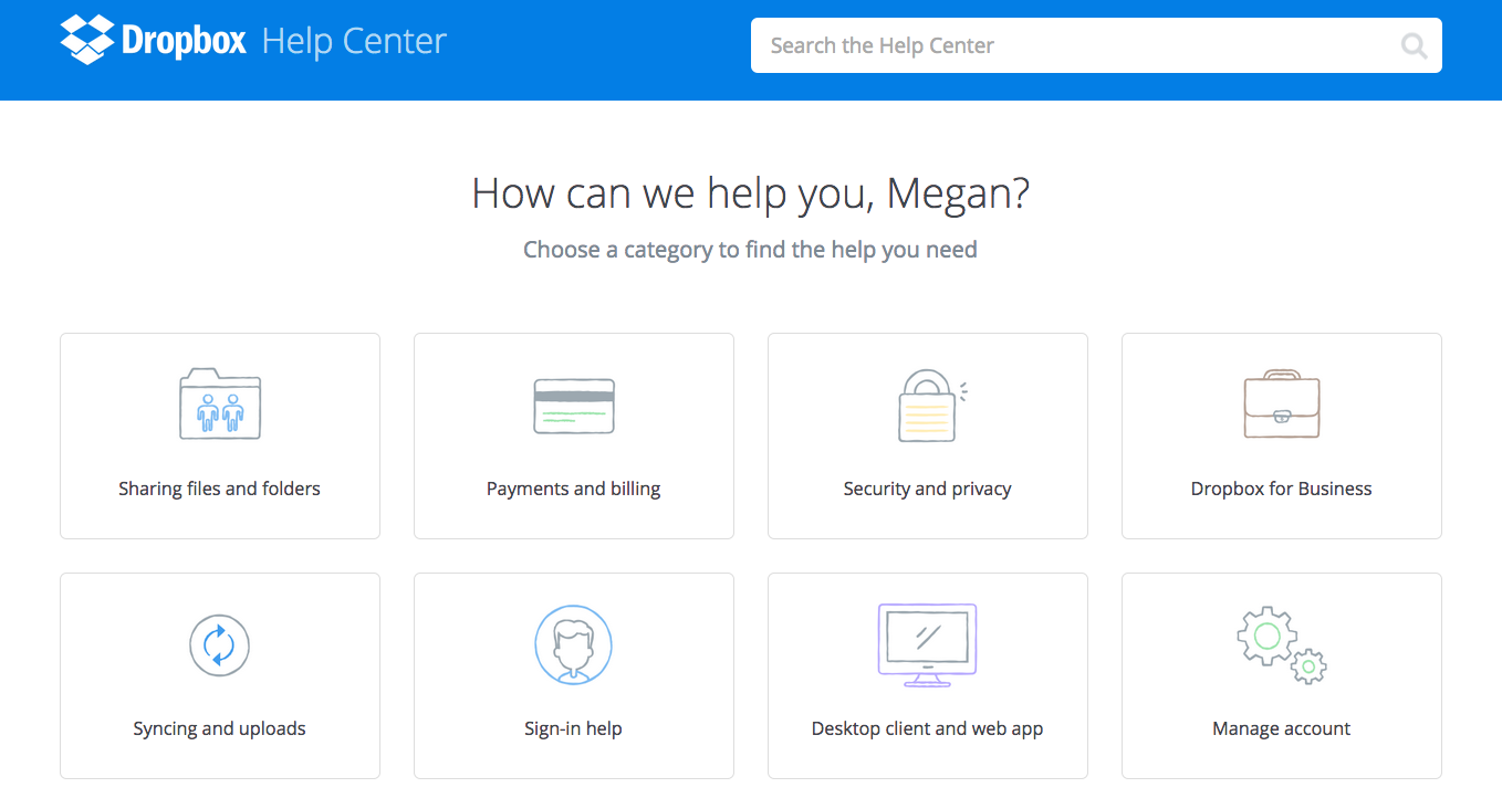
Dropbox provides another example of a truly quality contact page. The mini icons match perfectly with Dropbox’s large design, creating a cohesive user-experience. I also appreciate how Dropbox puts your name in the copy (assuming you are signed in) to add personalization. It makes you feel more like you’re having a conversation with Dropbox rather than an angry rant or a stressful answer search.
Score: 8. Reassuring and friendly-feeling, this contact us page is one worth storing away.
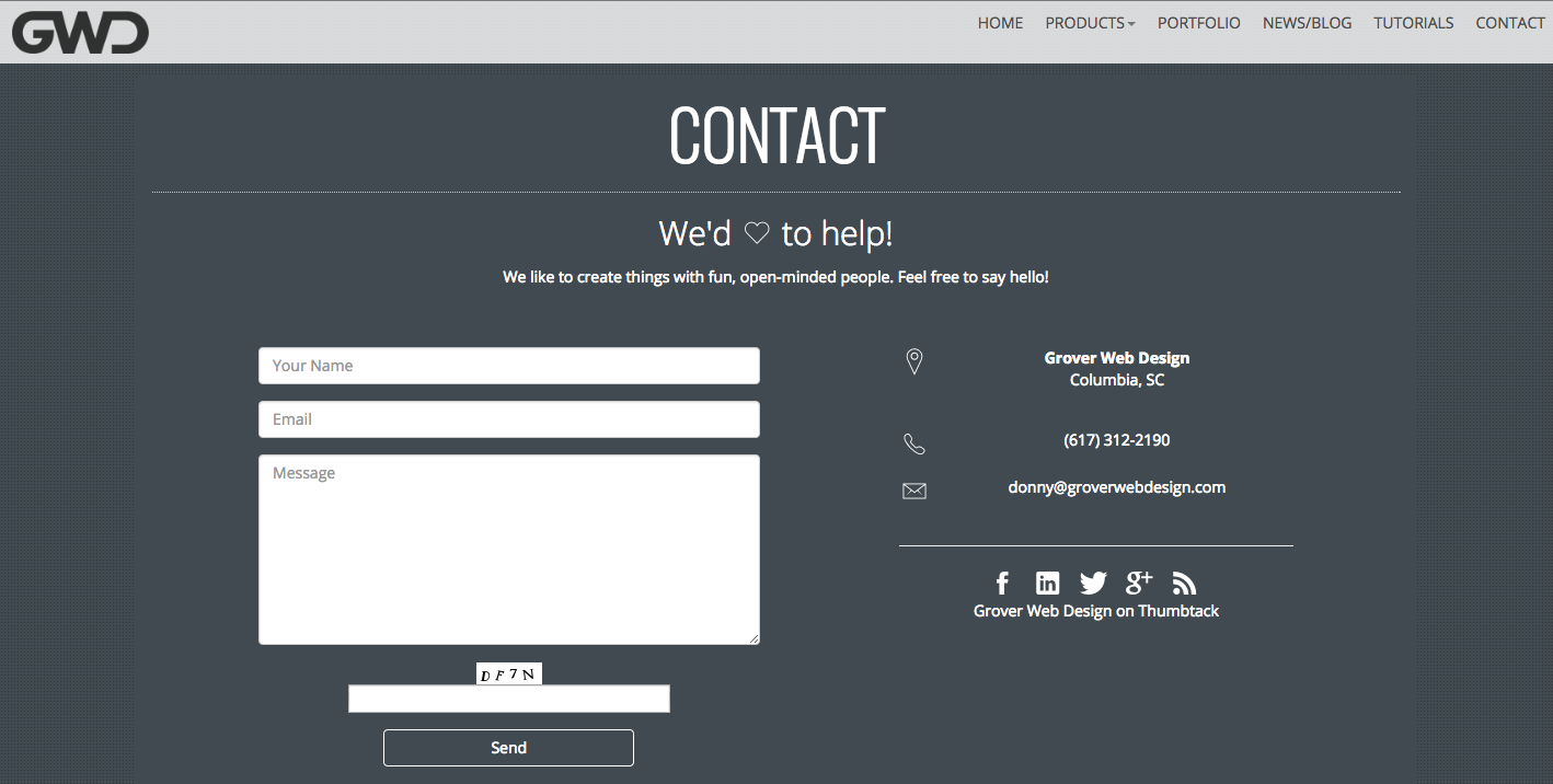
This contact page from Grover Web Design is friendly, inviting, and offers a variety of ways to contact the company whether through email, telephone, a contact form, social media, or even in-person.
Score: 7. Cute and quick, this page delivers what you need with a little smile.
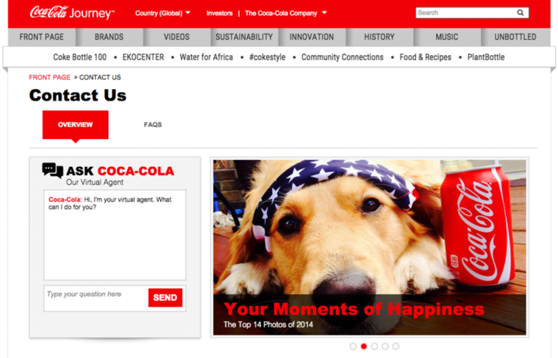
Coca-Cola does something pretty ingenious with their contact page – they put a virtual chat agent window right front and center.
In our online era, many users prefer chatting online with a help agent rather than calling in person. Coca-Cola knows their demographic and provides a quick and easy way to get help.
Right below the chat window is an FAQ and other means of contact, giving users their contact method of choice.
I’m not sure how I feel about the accompanying photo slideshow beside the chat window. It seems pretty pointless and out of place, but there could be a method to the madness, as seeing an adorable photo of a Golden Retriever would certainly reduce any immediate consumer fury I might be looking to dish out. Look at him…so cute!
Score: 8. With this creative approach, Coca-Cola shows they know their audience.
Princess Cruises provides us with another example of a not-so-excellent contact page. Similar to the Apple example from earlier, there just isn’t anything very interesting happening here. That’s not the only reason why this page is bad though – it also has a wonky information hierarchy happening.
The top-most section of contact information has to do with booking a cruise. Admittedly, I don’t know Princess Cruises’s audience, but I really doubt many people call cruises anymore to book trips, rather than booking online.
The next sections offer information to help you order a brochure (people still do this?), find out about tipping, and on-board alcohol policies (this YouTube video about resealing water bottles should help you out), and look at available employment. The very (very) last section finally provides an e-mail address for people who want to leave feedback or ask a question regarding their past cruise experience. I find it pretty bizarre that such vital information is buried beneath the fold, at the very bottom of the page. In my mind, I would expect that the customer assistance e-mail address is what a large portion of visitors are looking for on the contact page.
Score: 2. This information hierarchy on this one is all out of whack.

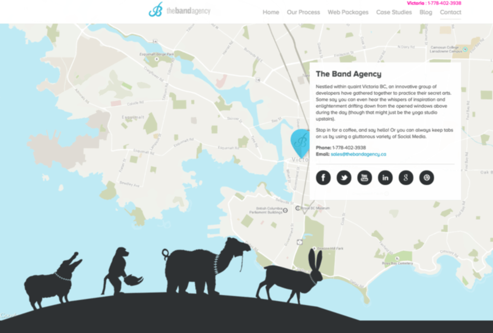
Many contact us pages are dull and boring, but The Band Agency shows that doesn’t have to be the case. This contact us page is my favorite of all the ones shown here. The vital info is readily available, placed cleverly layered over a map of their physical location. The parade of silhouetted animals adds a beautiful and endearing quality that sets this site apart from the rest!
Score: 10. Adorable, charming, and functional, this contact us page has it all!
Do you have any favorite contact pages you want to show off? Share your picks in the comments!


Meet The Author
Megan Marrs
Megan Marrs is a veteran content marketer who harbors a love for writing, watercolors, oxford commas, and dogs of all shapes and sizes. When she’s not typing out blog posts or crafting killer social media campaigns, you can find her lounging in a hammock with an epic fantasy novel.