The Excel bubble chart is often overlooked by PPC advertisers, because it can be tricky to set up. However, when used properly, a bubble chart lets you clearly present and compare categorical data (e.g. campaign, ad groups, device, etc.) – represented by the number of bubbles – as well as quantitative data (e.g. cost, conversions, CTR, etc.) – represented by the size of the bubble and its location on the XY axis.
In this article, I will show you step-by-step how to create the powerful Excel bubble chart for use with PPC data.
Why Bubble Charts Are Useful for PPC
As PPC managers, we understand our campaigns, but it can be difficult to quickly and effectively describe our campaigns to our clients or supervisors in order to set the proper context for further exploration. Which campaigns are important? Which contribute the most conversions? Which receives the most investment? Which perform the best? One way to add clarity at the beginning of our PPC conversation is to use a bubble chart to show our campaigns by CPA (ROI if you can) by conversion and by cost. This high-level introduction of our campaigns can set the stage for a deeper dive into our PPC program.
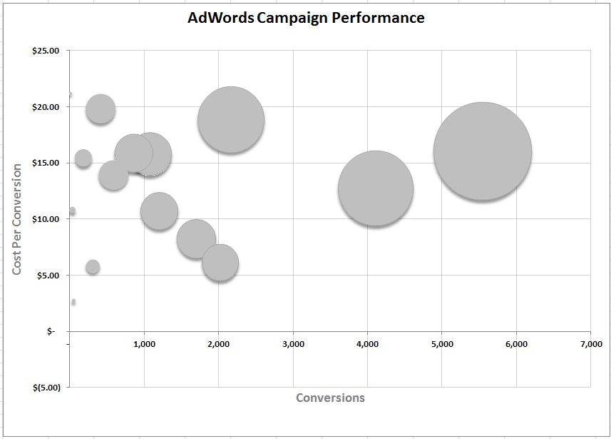
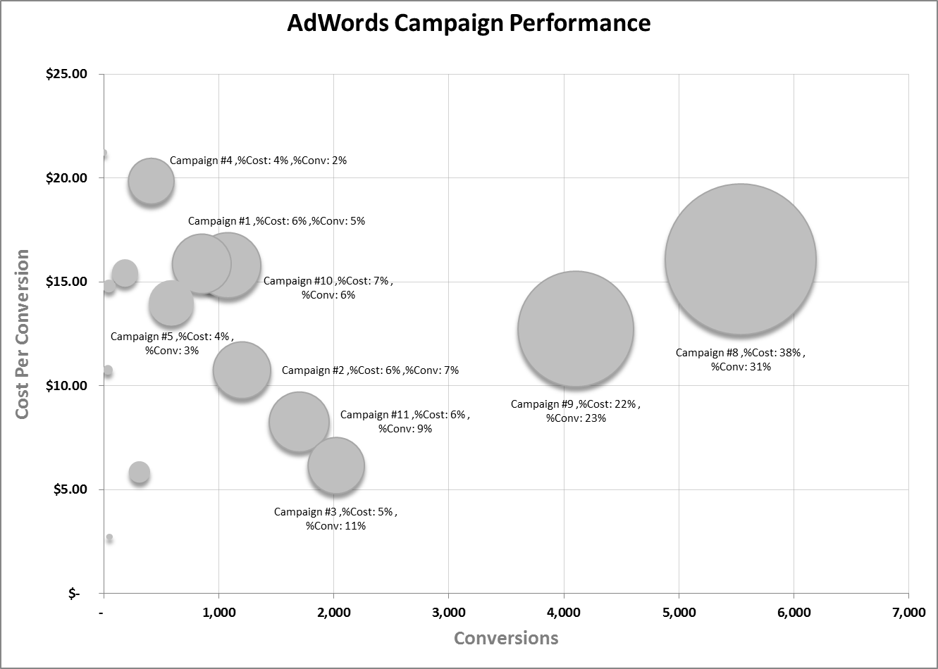
Here’s what the completed bubble chart looks like:
Checkout Campaign #3. It’s contributing 11% of the overall conversions at 3% of the overall cost. Maybe we should reallocate some budget from Campaign #8, which has 38% of the overall cost and only 31% of the overall conversions.
Let’s jump into the steps needed to create this chart. We will start with getting the data we need, then I’ll show you how to prepare your data for the chart, and finally I’ll walk you through the various steps used to create the chart.
Step 1: Get The Data
There’s more than one way to get at this data. I use Gazel, an Excel Add-in for AdWords (disclaimer: I’m the co-founder of Gazel) to pull the data directly into the Bubble Chart Excel Template with one click of the “Refresh” button. For those of you who don’t have this tool, you will need to take a few minutes to log into AdWords, run a Campaign Performance Report in AdWords, download the report, and open it up in Excel. We will only need three columns in the report: Campaign, Cost, and Conversions. The timeframe is up to you, but I recommend at least 30 days.
Step 2: Prepare Your Data
I did most of the work for you with the Bubble Chart Template, so this won’t be too hard. If you used Gazel, then you’re already finished and can enjoy the chart. If not, then you may have extra columns in your report, so delete all the columns you don’t need and make sure you are left with: Campaign, Cost, Conv. (1-per-click). Now copy your data and paste it into the template as show below.
Depending on how many campaigns you have, you may need to do a little more work. I’ve built the example template to handle up to 15 campaigns. Later in this post, I will show you what to do to add a more campaigns. Once you have you data prepared with the three needed columns, paste (values only) into the table as show above.
The bubble chart is linked to the blue transformation table located on the “chart_data” worksheet. I created this transformation table to add a little more context when you roll over a bubble in the chart. After pasting in your AdWords data you will need to copy the formulas in the transformation table down for as many rows as you need for your campaigns.
There are calculations for % of total cost and for % of total conversions. Then I created a surrogate campaign name with this information concatenated together using this formula:
=CONCATENATE(A15,” ,%Cost:”,TEXT([@[%Cost]],” ##%”),” ,%Conv:”,TEXT([@[%Conv.]],” ##%”))
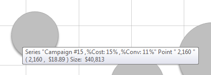
Now when you rollover a bubble you see this information:
Step 3: Building the Bubble Chart
In order to get your bubble chart to display your labels (surrogate campaign name) correctly you must start your chart from scratch and create a separate chart series for each row of data. So, in Excel:
1. Insert > Other Charts > Bubble (don’t have your cursor in the data tables). This will give you a blank Bubble Chart to work with. Now, click on the chart and:
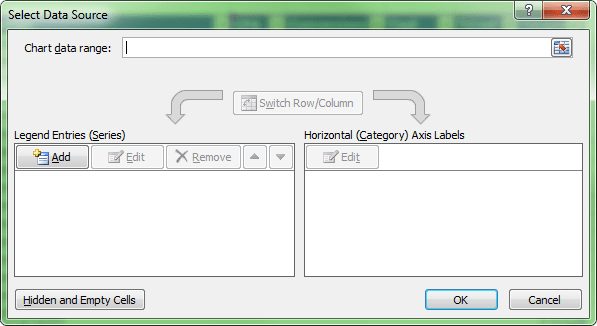
2. Select Data
3. Add a series
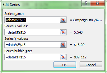
4. Using data from the blue table, use the surrogate name for the Series name, Conversions for the X values, CPA as the Y value, and Cost for the Size as shown below.
5. Repeat this process for each of your campaign rows of data. Like I mentioned earlier, I did this for 15 campaigns, but you can add as many more as you need.
You should now have a chart that looks something like this:
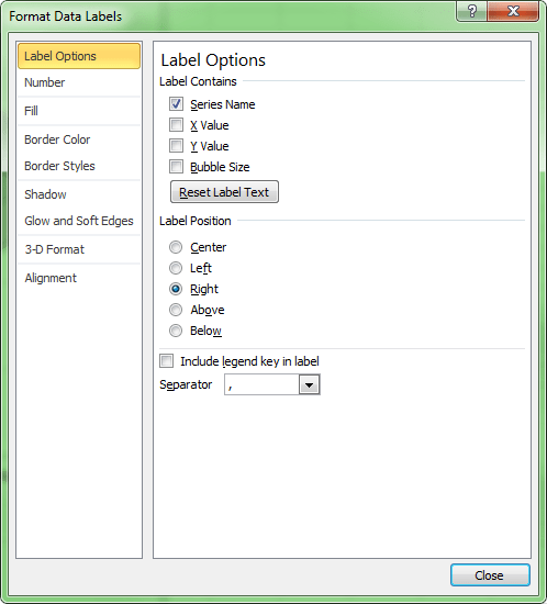
In order to get your surrogate name to show up as a label, simply add a data label to your series and format it so the series name is used for the label as shown below.
That’s it. Flawless Excel buble chart data labels. It may take a few minutes, but with this knowledge you can create awesome bubble charts for your PPC storytelling. Of course, you can customize this chart like any other Excel chart. One idea would be to make one of the bubbles a different color for emphasis. Another good use of the bubble chart would be to compare performance by device type, Search Network vs. Google Search, Geography, etc. Good luck!


