Pop quiz: What image comes to mind when you hear the words “display advertising”?
Image A: Infinite amounts of high-quality traffic, a ridiculous number of sales, and a big ol’ grin on your face when you peek at your bank account.
Image B: Piles of money being dumped into a bonfire.
If you’re like most people, then you probably thought of image B.
There’s no doubt display advertising has gotten a bad rep. Marketers shy away from it because it has a steeper learning curve and tends to be less forgiving than search advertising. And unfortunately, there is very little how-to information out there on how to run a successful display campaign.
However, here’s the truth: Display (commonly known as “banner advertising”) – when used correctly – is one of the quickest ways to build your business. And today you’ll find out the “secret” (which isn’t really that secret at all) to achieving profitability with display advertising.
What’s the secret? Simply, split-testing.
But not split-testing the way most people do it. The reason most people’s display campaigns fail is because they either don’t split test, OR they run the wrong split tests.
MORE: Top 5 Mobile A/B Tests to Try Right Now
Details vs. The Big Picture
The wrong split tests test things like button colors, calls-to-action, and small pieces of text. People love to split test these things because they’re easy. However, here’s what usually happens:
Joe split tests the color of his call-to-action button: a blue button vs. a green button. He sees the green button get a slight lift over the first couple of days. Joe gets really excited and declares green the winner. Joe is pumped from these results and runs 10 more of these tiny tests in a row.
Then, a month later, Joe looks at the results and realizes his conversion rate hasn’t actually changed at all.
Joe is dumbfounded since he’s A/B tested every single button color and call-to-action under the sun.
What happened? Joe called his A/B tests too early. He figured the initial lifts would hold over the long-term. Joe should have waited for enough data to accumulate. The tests hadn’t reached statistical significance yet.
But furthermore, IF Joe had waited, he would have noticed these small tests don’t normally lead to big lifts in conversion rates. So, what kind of tests do lead to higher conversion rates?
The Big Picture tests. Big Picture tests are when you A/B test large elements that have a significant impact on the overall design, look and feel, and positioning of the page.
Examples include the layout, the “hero” photo, the positioning of your product, or the entire concept of the landing page. Big changes like these tend to have the biggest impact on conversion rates once you have enough data. To put it simply: big changes lead to big insights.
Now, you might be saying, “Great. Got it. But there are a million different things I could test. Where do I even start?” Fear not. There’s a solution. And it doesn’t involve any brainstorming or mental bandwidth. You simply become a copycat. The best way to run come up with ideas for Big Picture split tests is to look at what top display advertisers are already split testing. You can use their split tests as inspiration for your own.
Because guess what? The best way to see results with display advertising is to follow the road someone has already paved.
In today’s post you’ll see five different advertisers running various split tests on these Big Picture items. You’ll see their ad creative and the landing pages they point to. You can use these as inspiration for your own split tests and start seeing better results with display advertising.
Split Test #1: Progressive.com
The saying “less is more” usually applies to landing pages. Fewer options, blocks of text, links, buttons, bells and whistles make the page less distracting. Your prospect is more likely to buy or move to the next step in your sales funnel when they’re given a clear path.
This is why many advertisers opt for minimalist landing page designs. Yet, there are cases where giving more information and making the page busier increases sales.
Here we have two banner ads for auto insurance advertiser Progressive.com.

These ads send traffic to two very different landing pages.
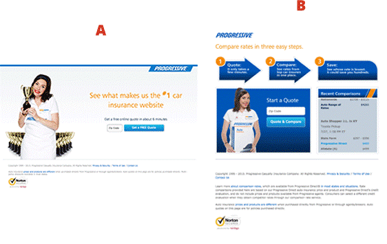
Page A is your typical minimalist landing page for lead generation. It has a simple headline, a zip code box and a call-to-action. Very simple, very easy to set up.
Page B includes many more elements. It includes a 3-step flow chart that explains how Progressive works.

These sort of elements can work well because it lets the prospect know what happens after they input their zip code. It tells them what benefit they’ll receive on the “other side.” Sometimes your prospects need a bit more reassurance and hand holding.
Another important element on Page B is the social proof box.
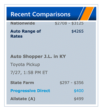
This box shows recent comparisons made by other users – demonstrating this comparison tool is being actively used. This can help put prospects at ease and make them less hesitant to put in their information. “Other folks are doing it, so I guess I can too!”
Social proof is VERY effective when it comes to getting cold traffic to convert. It should not just be on your landing page, but permeate through your entire marketing process.
These two pages, with very different layouts and look and feel, should give you a few ideas for “Big Picture” split tests.
Split Test #2: Veterans United
One of the tough parts about advertising to a diverse market is you tend to have multiple buckets of people with very different needs. As a result, there are many potential messages you could use. So how do you know which positioning works best with your potential audience?
You guessed it – with a split test.
Veteran’s United helps US military veterans get home loans.

These two very different ads send traffic to two very different pages.
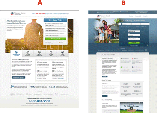
Take a look at the two pages above and pay close attention to the imagery. Page A shows of a picture of a family in civilian clothes.

How might this make someone feel? You wouldn’t even know at first glance that this is meant for former military. It looks like a stock photo that could be on the website of just about any insurance company. Is this how the prospect sees himself? This depicts a happy, nuclear family. Maybe the prospect has put their days of service behind them and now sees themselves not as a soldier, but as a family man.
This is much different than the imagery shown on Page B: a lone soldier walking off into the sunset.

This evokes a completely different feeling than the picture of the family. Perhaps this soldier has just returned home from a tour. He’s ready to start civilian life back up again. He may or may not have a spouse and kids. He might have different concerns, needs and questions.
The takeaway from this split test? Test very different types of imagery.
Most markets have multiple personas who identify themselves in very different ways. One of these personas might work much better than the other. You need to find which one works best through split testing.
Split Test #3: Harry’s
I’ve seen a lot of these ads popping up lately:
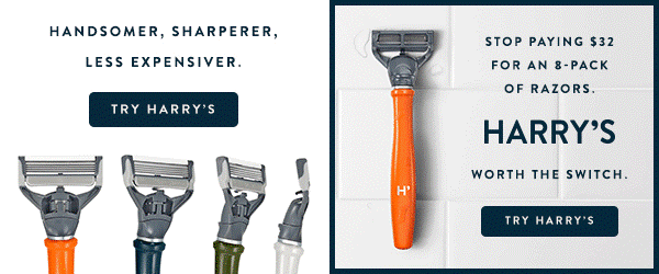
They come from Harry’s, a razor-blade e-commerce store. Harry’s is running an easy – albeit BIG picture – test you can set up in a matter of minutes.
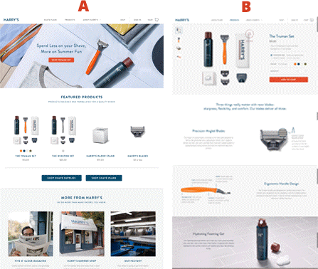
Page A is Harry’s homepage – a very traditional landing page. It’s got a “hero shot” (the big picture of the razor and accessories at the top), a large call-to-action, and a compelling headline.
Page B is a product page for their Truman shaving kit. It contains information about this specific product. It also gives you the option to buy right there. This page has little to no information on who/what Harry’s is, what their values are, what their brand stands for, or why you should buy from them.
Sometimes – especially with e-commerce – it’s best to give people what they want. Razor blades are pretty self-explanatory. All most people want are the highest quality blades for the lowest price.
Sending traffic to a specific product page might make more sense if people are already familiar with your brand (for example, when using display in a remarketing campaign). They already know who you are and what you’re about. All they need to know now is where to buy.
However, sometimes the prospect will need a bit more information about what you do before they feel comfortable enough to buy.
Split Test #4: US Concealed Carry Association
Average conversion rates for cold traffic are extremely low. Most prospects require a bit of grooming before they’re convinced your solution is for them. This is especially true for big ticket items.
One of the best ways to cultivate a relationship is through email. This is where a lead magnet comes in. A lead magnet is an ethical bribe – a whitepaper, e-book, report, or physical item – you give your prospects for free in exchange for their email address. You’ve probably seen them before and probably even opted-in to a few.
However, just having a lead magnet and sign-up box doesn’t mean you’ll see instant success. It all comes down to the way you position your lead magnet.
This next test comes from the United States Concealed Carry Association (USCCA) – a large advertiser for concealed carry insurance.

These two ads send traffic to a very interesting split test.

Both pages offer the same lead magnet – a guide to concealed carry laws. However, why they say you need it is positioned differently on each page.
Page A is based upon mistakes. It’s more of a warning.

“Don’t make these mistakes otherwise you could face the wrath of the law.” The angle used on this first page sounds like the guide is more informational. It sounds like more of a how-to guide.
Page B’s message is quite different.

This caters to a different mindset. It’s almost political. The assumption is many folks conceal carry because they don’t trust the current system in place. Therefore, they must be armed with the right information in order to protect themselves in what the USCCA calls a “life-saving report.”
The takeaway from this? First, test different positioning for your lead magnet.
But more importantly, test controversial vs. vanilla angles. Controversial often works better. Why?
People who feel passionate about a polemic topic are usually quite vocal about it. They prefer people who agree with them and tend to despise those who don’t. They also know the media tends to stay neutral on certain topics. This can come off as false, or wishy-washy.
Therefore, when someone isn’t afraid to state their opinion publically, they feel an instant connection. It shows you’re on their side and not afraid to tell the world about it.
On the other hand, sometimes the controversial stance is too much. It can turn people away. The best way to figure this out? SPLIT TEST!
Split Test #5: Intuit
Testing your headline is an easy big picture test.
Intuit is a SaaS company that offers personal finance products you might have used at some point in your life. TurboTax, Quickbooks, etc.

In this particular example they’ve been running a test on one of their pages for QuickBase software. Notice the change in language between the two headlines.

“Make Your Team Instantly Productive With Intuit QuickBase”
The first thing you’ll notice is this headline starts with a verb – make.Then it follows up with a direct benefit – “instantly more productive.” Words like “instantly” are what copywriters call power words. They evoke certain emotions. “Instantly” is a great word because people want results and they want them now. Instantly conveys that desire in one single word.
Page B – in my opinion – has the weaker headline.

It’s more of a description of the product itself. People don’t care what the manufacturer thinks about the product. They care what the product does for them. The end result you want isn’t a “better way to manage projects.” The end result you want is a more productive team.
Page B might have the weaker headline, but you’ll never know unless you test. You can take a page out of Intuit’s book and split test a more powerful headline vs. a more descriptive headline.
In Conclusion …
A lot of people get too focused on testing ad creative. Yet, what happens after the click at least as important. Split testing your landing pages really is the key to seeing success with display. When you find the right page, positioning, and messaging, you’ll soon discover that display advertising is one of the quickest ways to build your business.
About the Author
Bradley Nickel is the Head Copywriter & Content Marketing Manager of Adbeat, an advertising intelligence tool that will help you find your competitor’s advertising strategy at a glance on 100,000+ websites – view competitors’ winning ad copy, best website placements, and landing pages. Learn more about digital media strategy on the Adbeat blog.

Are you wasting money in Google Ads?

Meet The Author
Guest Author
WordStream’s guest authors are experts, entrepreneurs, and passionate writers in the online marketing community who bring diverse perspectives to our blog on a wide range of topics.
Recommended for you


![Search Advertising Benchmarks for Your Industry [Report]](https://www.wordstream.com/wp-content/uploads/2024/04/RecRead-Guide-Google-Benchmarks.webp)