When it comes to mobile A/B testing, many marketers make the common mistake of treating their mobile visitors the way they treat their desktop ones. Designing and building their landing pages with desktop in mind, they use out-of-the-box, template-based responsive design to condense that experience to a mobile one which does not address the unique behavior and needs of mobile web visitors.
As a result of providing mobile visitors with a desktop experience, there is a 270% gap between desktop and mobile conversions, simply because marketers disregard the fact that mobile visitors are in a very different state of mind than desktop visitors and require a different experience.
The key to converting more mobile visitors is understanding that we aren’t using mobile devices as a replacement for desktop—we are using these devices in a whole other way.
Since mobile visitors behave and think differently than desktop ones, it’s crucial for us as marketers to identify these behaviors and the mobile state of mind to create a better experience that’s dedicated to converting them.
Finding the Leaks in Your Mobile Funnel
The first step to creating a better experience for mobile visitors is locating the leak in your mobile funnel, by analyzing your current results and visitor behavior with Google Analytics and using heatmaps to better understand the unique behavior of mobile visitors.
Below are some the basic mobile metrics to get started with:
- Mobile audience & devices – Our goal is to understand our mobile visitors better by identifying who they are. Using this metric, discover which devices visitors are using and which browsers. Rather than taking on a complete overhaul of your mobile site, this data will determine what devices require immediate optimization to save you time and money.
- Mobile acquisition – Discover the strongest referral traffic sources on mobile and what channels deliver the highest or lowest ROI on mobile (these aren’t necessarily the same as on desktop).
- Mobile behavior metrics – The next step will be analyzing what mobile visitors do on your landing pages. First, which are your top landing pages, their bounce rate on mobile and for a much wider and more profound look, “exit pages” – once they make it through the first step of your landing page, what page do they exit on?
- Device behavior – This metric covers the technical side of things such as site speed. Site speed will tell you how long it takes your landing page to load on each browser/device. Once you know your top used devices and browsers and cross that data with site speed you will get a clearer picture of whether it’s not just a design optimization process that’s needed but also a technical one.
A quick at look at Google Analytics will give you a better understanding of your situation. Note how this site has the same amount of mobile traffic as desktop, yet in terms of e-commerce conversions and pure revenue there’s a 260% difference! They’re losing money, and a lot.

Once we’ve identified our mobile visitor behavior, we now need to take it a step further and come up with a testing hypothesis as to what could strategically optimize our landing pages and generate results that can be measured, understood and scaled. Testing a hypothesis rather than random elements on your mobile landing page will give you a window into your customer’s emotional state of mind and behavioral needs.
Below are some mobile testing ideas, best practices and examples of mobile A/B tests you can run. Running these types of AB tests over the past few years has helped increase not only signups and registrations for our clients and customers but has delivered more profound insights about their mobile visitor’s needs.
Mobile Test #1: Test strategic images to discover your unique selling proposition
People process visuals much faster than text, so they are one of the first elements visitors will see on your landing page. They have an even bigger effect since the mobile landing page real estate is scarce.
The most common tactic marketers use is a straightforward photo of their product. While this makes sense to most, an image of a product doesn’t give the landing page visitor a sense of why this product is better than the competitors or what’s in it for them.
Testing strategic visuals and images can produce vastly better results and give you a lot more insight into the mobile visitor’s state of mind. The more you utilize colors and strategic images you can trigger emotions in your visitors and get your USP through, converting them much faster.
Our go-to methodology when it comes to testing images, creating an impact and addressing our mobile visitors’ state of mind is by running a visual test portraying the current visitor’s state of mind vs. the desired state of mind.
For example, if a home insurance company were to try this, they might test a photo of someone worried as the current state. The dream state would be a happy and secure family. The images depict either how a family is feeling or how they will feel once they invest in the company’s insurance. Testing both images helps to see which emotional touchpoint is a stronger influence in the customer’s purchasing decision.
In the example below the original landing page designed by the client had an image of their product to promote their software:

Our variation focused on the peace of mind and sense of security customers experience once they’ve purchased the software:

Instead of focusing on the product, we focused on the desired state of mind of the mobile visitor. Our variation increased signups by 78% and purchases by 15%.
These test results highlighted what the target audience cares about and helped further guide us on what content to add when we started optimizing other elements on the landing page, such as testimonials, headlines and call to action buttons. Try brainstorming your own ideas with your team and speaking to customers to better understand the emotional value of your product or service and use those insights to run more meaningful A/B tests on the images you use on your mobile landing pages.
Mobile Test #2: Test strategic headlines
A/B testing your landing page headline is another simple way to test out different strategies and understand what visitors find more compelling: current state vs. desired state. Similar to testing images, avoid testing superficial elements of your current headline – rather, focus on testing different hypotheses of your value proposition.
For example, instead of saying “The #1 Dating Site in the World,” a dating site could test “Join Millions of Happy Couples.” This pivots the headline to be less about the company and more about the customer and gives you further insight to what customers care about. Used wisely, headlines can be used to portray your unique selling proposition and help you stand out from the crowd along with the right image.
In the example below, the company’s tagline on all landing pages was “The #1 Commission Software for Businesses.”

As part of our testing hypothesis we tested the headline “Lead Your Team to Success,” which generated a 97% increase in qualified leads.

The test results also helped us better understand what customers are searching for from a value perspective so we can run many more A/B tests on their value proposition.
Mobile Test #3: Break forms into sections
Between desktop and mobile, a form submission experience is exceedingly different. A form with multiple fields is easy to navigate and complete on a large screen, but on a small mobile device, that process is difficult and mostly frustrating. This usually causes visitors to abandon the landing page altogether.
To solve this, test breaking that form into sections. Determine which piece of information is most crucial to your business, and ask for that only. Once visitors have taken the first step, they’re more invested and are more likely to continue filling in the rest of the form. A great advantage to these kind of forms on mobile is that if a visitor doesn’t continue filling in the form, you still have that email or phone number you were seeking.
The example below is the continuation of our tests for the same B2B company. In this case we tested breaking their forms into 2 sections:
Step 1:

And Step 2:
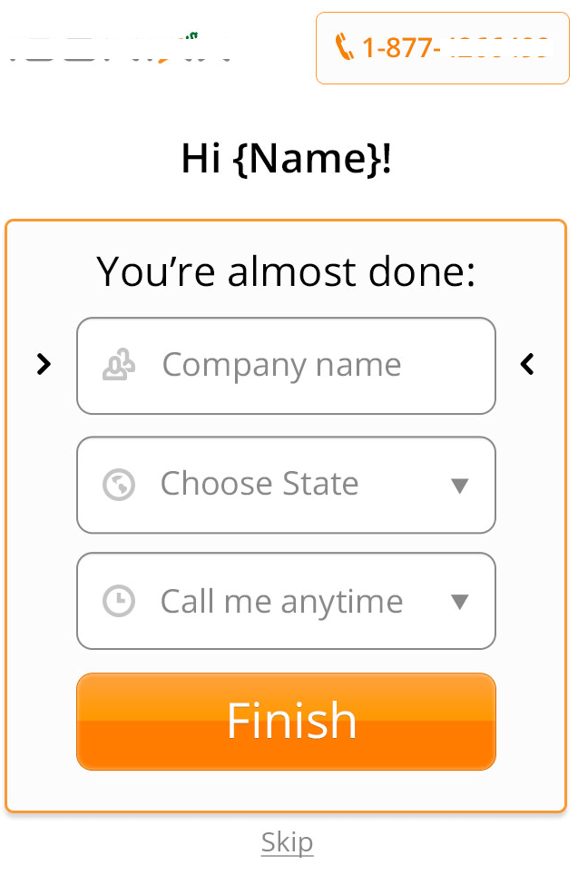
This test helped further increase leads by another 55% and we collected a lot more information about the customer for the sales team to use during calls.
Mobile Test #4: Test mobile overlays
Since most landing pages are built with desktop visitors in mind, many mobile visitors arrive on landing pages and have a hard time finding what they’re looking for. Having the same amount of content, visuals, calls-to-action and many other elements on such a small screen makes it hard on a mobile visitor to focus, and most times leads to page abandonment.
To help mobile visitors focus on one element and take the first step in converting, try testing overlays with a single call-to-action. A specific call-to-action overlay, such as a “Call Now” button, or “download the app” button, can help mobile visitors achieve their goals, reduce frustration and decrease page abandonment.
For example, our client Tekoia has an Android app, but haven’t launched their IOS one yet. As you can see below, their original landing page condenses all their content to a mobile screen automatically and displays all three call-to-action buttons and a wide variety of social share buttons above the fold.

Desktop version

Mobile version
There are now nine calls to action that confuse mobile visitors.
To ensure only the most relevant people are asked to download their app we used a simple overlay that detects which device the visitor is using in real time and serve them with the relevant offer (we used Banana Splash’s solution, a tool we have developed over the past 2 years). Android visitors now see a dedicated Google Play button while IOS visitors are asked to subscribe for updates about the soon to arrive app.
IOS Version:

Android Version:

This change and segmentation generated 110% more relevant downloads of the app and thousands of relevant subscribers waiting for the IOS launch.
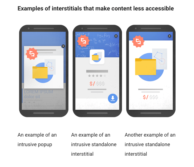
Google’s new policy regarding mobile interstitials and pop-ups is great news for mobile experiences everywhere. This new approach will ensure that only relevant pop-ups that assist a mobile visitor while on the site are displayed. Sites displaying pop-ups which block the original content, are hard to exit or offer irrelevant content will be punished.

Testing different forms of overlays saves a tremendous amount of time and resources because it doesn’t involve an entire landing page overhaul, but rather one simple change easily adjusted based on testing.
Mobile Test #5: Increase trust by testing a native look and feel
Mindsets change depending on the device a person is using. With this in mind, if you decide to design dedicated mobile landing pages for your campaigns, consider testing a different look and feel.
For example, iPhone users are accustomed to a certain interface just as Android users are more comfortable with an Android interface. By simply providing the experience a mobile visitor is used to, you can increase conversion rates dramatically. Take a look at your device report in GA and see if you can recognize a pattern and/or a certain device that is used more than others.
Your Next Steps for a Better Mobile Experience
The key to a successful mobile landing page is understanding that mobile visitors expect different things. Have your mobile visitor on your mind, get to know them better and start asking yourself how you can optimize your current responsive design or create a dedicated landing page for mobile visitors. Trying these five A/B test ideas will draw you away from using best practices and will hopefully help you run meaningful and valuable tests. From there you will gain the insight needed to tailor your site and your offerings to what mobile visitors expect and need.
About the Author
As founder at GetUplift, Talia helps businesses plan and execute meaningful conversion optimization programs. Using emotional targeting, consumer psychology and persuasive design, Talia creates customer journeys that generate more revenues, leads and sales. Talia is a keynote speaker, Harry Potter fan and was recently listed as one of the most influential experts in conversion optimization. Follow her on Twitter at @taliagw
Are you wasting money in Google Ads?

Meet The Author
Guest Author
WordStream’s guest authors are experts, entrepreneurs, and passionate writers in the online marketing community who bring diverse perspectives to our blog on a wide range of topics.
Recommended for you