Featured Article
Employee-Generated Content: Tips, Examples, & Benefits
Employee-generated content can help you build trust, amplify your company culture, and diversify your social media strategy.


Employee-Generated Content: Tips, Examples, & Benefits
Employee-generated content can help you build trust, amplify your company culture, and diversify your social media strategy.
![46 Must-Know YouTube Statistics [Infographic]](https://www.wordstream.com/wp-content/uploads/2026/03/youtube-stats-feature.jpg)
46 Must-Know YouTube Statistics [Infographic]
Looking to tap into video to enhance your business growth? Use these YouTube statistics for motivation, plus key takeaways and advice!

Google Ads for Sensitive Categories: What You Need to Know to Succeed
Some industries Google Ads considers as "sensitive categories" for advertising, which results in targeting restrictions, but there are ways you can still target efficiently without ad disapproval flags.

How Much Do Instagram Ads Cost in 2026? (+How to Make the Most of Your Budget)
Want to invest in Instagram ads? Read this guide to costs, benefits, and tips first.
Can You Trust What AI Tells You About SEO? We Tested It!
We asked five AI tools 50 SEO questions to see which ones get the most answers right or wrong, and you won't believe the results.

6 Reasons AI Ignores Your Content (+What to Do About It)
Is your content missing from AI search? You could make making one of these six mistakes...

57 Fresh April Marketing Ideas to Brighten Your Calendar
Express your brand's personality, attract customers, and celebrate diversity!

Keywords Still Matter in Google Ads, But Intent Matters More (Here’s Why)
Search is shifting from keywords to intent. Find out how to prepare your strategy.

The 25 Most Overused Marketing Phrases (+What to Use Instead)
Overused marketing phrases aren't just boring--they can harm your performance. Find out what to avoid, what to use instead, and how to edit your marketing copy for the best results.
![How to Run Watch-Worthy Facebook Video Ads [Complete Tutorial]](https://www.wordstream.com/wp-content/uploads/2026/03/facebook-video-ads-feature-image.jpg)
How to Run Watch-Worthy Facebook Video Ads [Complete Tutorial]
Get everything you need to know about creating Facebook video ads for your business, including reporting and creative best practices.

AI Is Making Your Content Lose Accuracy Faster. Here’s How to Fix It
AI search is making your content lose accuracy faster than ever. Find out how to discover, fix, and prevent AI content decay.
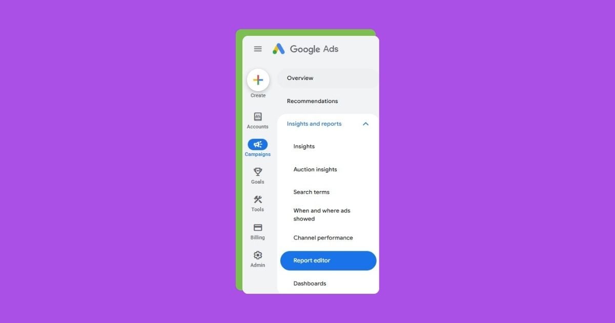
Want Better Google Ads Insights? Try These 6 Reports
See which Google Ads reports will matter most for your business in 2026 and beyond.

7 Customer Retention Strategies to Earn Loyalty (& Save Money)
Save on customer acquisition costs by focusing on retention instead with these seven strategies.

The 7-Step Guide to Better Healthcare SEO
SEO is a powerful marketing channel for healthcare providers. Use this guide to get found on search.
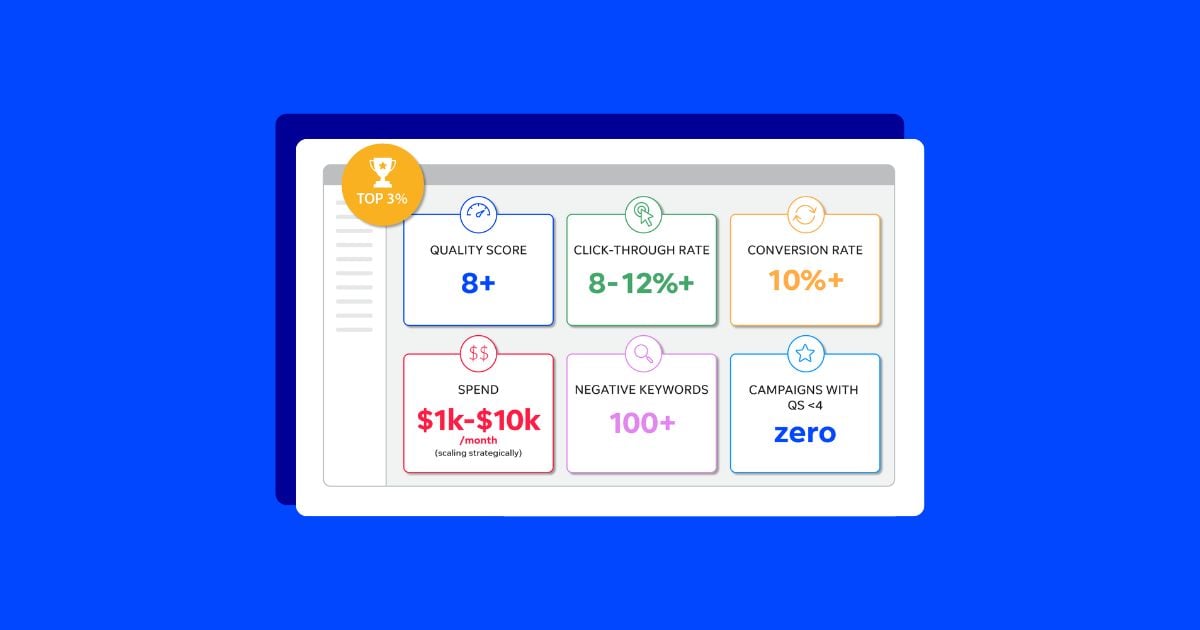
7 Surprising Findings From Our Study of 15K+ Google Ads Accounts
Check out the top seven findings from our review of over 15,000 Google Ads accounts.

How to Track, Analyze, & Optimize Performance Max
Google Ads Performance Max campaigns provide more insights and customization than you might think.

How the Pros Predict Marketing Will Change in 2026
What will change for marketers in 2026? 10 pros share their predictions

How to Write a Great About Us Page (+Template)
Crafting the best About Us page is both a science and an art. Get the formula for success with these tips and a template.

Google’s Still Rewarding Low-Quality Sites (What Gives?)
Google needs publishers to create great content, but are they rewarding those who do?

60+ Easy & Creative March Marketing Ideas (with Examples!)
In like a lion, out like a lamb, and chock full of opportunities to connect with your audience.

10 Plug & Play Headline Formulas to Get You Unstuck
Your blog post could be pure gold, but it might as well be invisible if your headline doesn't grab the reader’s attention. Use these tried-and-true formulas to help.
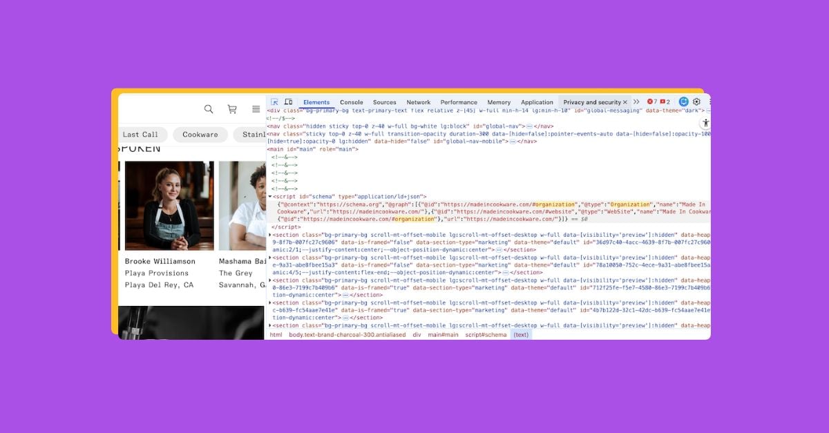
Schema Markup for AI: Types, Benefits, & How to Set It Up
Schema markup is not only great for SEO but also for GEO. Find out which types can drive AI discoverability.
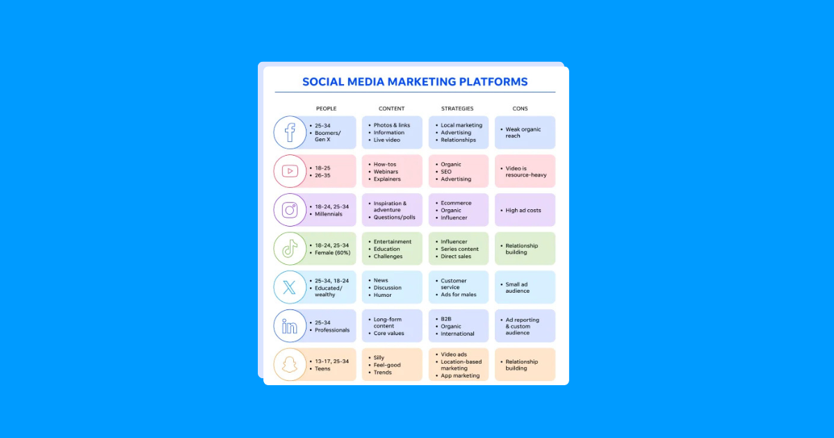
The Most Popular Social Media Platforms in 2026 (+How to Harness Them)
Which social media platform should you invest in? This guide has everything you need to make the best decision.

The Complete Email Deliverability Checklist for 2026 (+Tools & Tips)
This email deliverability checklist will help you get more messages to more inboxes.

How to Use Seasonality Adjustments in Google Ads for Better Year-Round Performance
Learn how to set up seasonality adjustments in Google Ads, when to use them (or when to avoid them), plus quick tips to help you get started!

The 6 Most Influential B2B Marketing Trends for 2026
B2B marketing is evolving fast. These trends will help you stay on course in 2026.