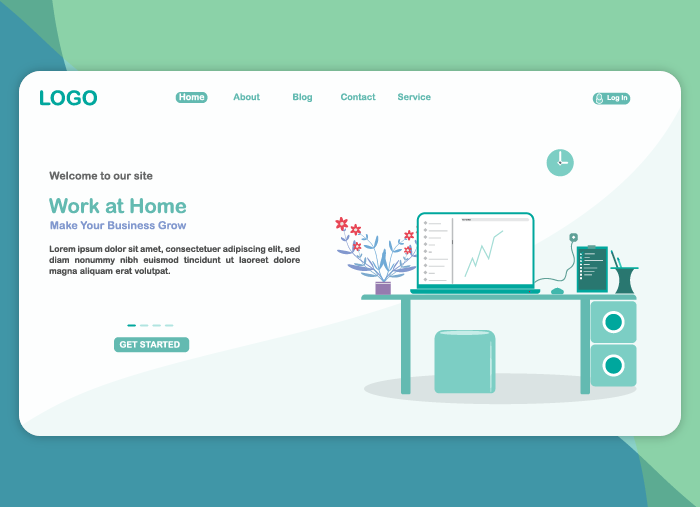
Have you ever done a search online or clicked on a Facebook ad to land on something way cooler than you expected? Perhaps as the page is loading you are starting to regret your impulsive click because your oven just beeped and your pizza is ready! But then something magical happens … You land on a page that is so gosh darn cool that your pizza starts to burn. Okay, maybe this isn’t a good hypothetical after all—who would ever let their pizza burn?
A sad, sad sight.
My point is this: The cruel truth is that coming across a truly cool landing page does not happen all that often. When it does, those moments for marketers should not be overlooked! In fact, the majority of the cool landing pages you see are inspired by other cool landing pages, which is why we put this cool post together—to inspire you! Haven’t you ever heard that imitation is the sincerest form of flattery?
But before we dive into some pretty cool landing page examples, let’s first consider…
What is a landing page?
When I first heard the term “landing page,” I figured every web page must be a landing page (as in a page that you land on), right? Wrong! To be considered a “landing page,” that page needs to be landed on through a marketing initiative. You may be running a special deal, allowing customers to sign up for your email list, or letting them in on a “coming soon” offer—froma a sponsored Google ad of some form (search, display, etc.), a paid social ad on Facebook, Instagram, etc., or an email campaign. To truly be considered a “landing page” in the marketing world, there needs to be a transaction that caused that individual to land on that page. Unbounce sums this up nicely: “In digital marketing, a landing page is a standalone web page, created specifically for the purposes of a marketing or advertising campaign.”
Now that we understand the definition of a landing page, it is important to remember that there are tons of uncool landing pages out there. In fact, only 22% of businesses are satisfied with their current landing page conversion rates. If your landing pages are not cool, then the conversion rates likely are not either. Here are 17 very COOL landing pages to get inspired and then work on improving your conversion rates.
17 cool landing pages I wish I made
Here is my roundup of super-cool landing pages. And you can find even more inspiration in our latest roundup of the best landing page examples.
1. Sandals Honeymoons
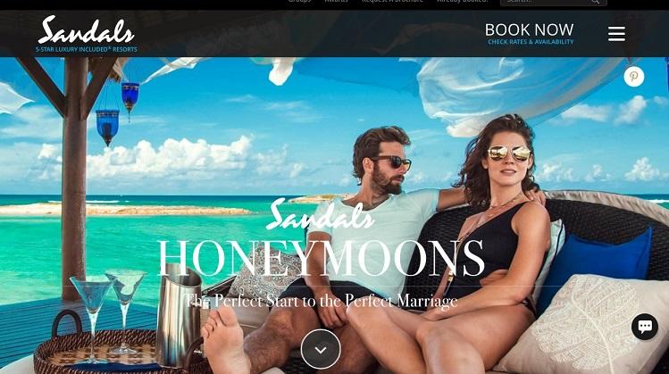
I am on the hunt for honeymoon ideas, and I came across this page when doing some research on Google. This page struck me as cool for so many reasons. First, look at the people, could they be any cooler?
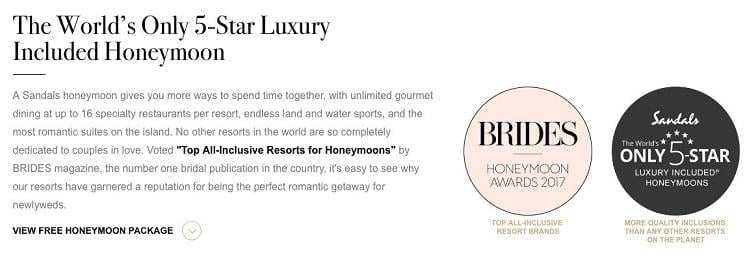
Seriously, though, this page is doing several things right: the seductive imagery, trust signals with well-known badges of honor given from outsides sources, and the clear but not overly obnoxious “Book Now” CTA.
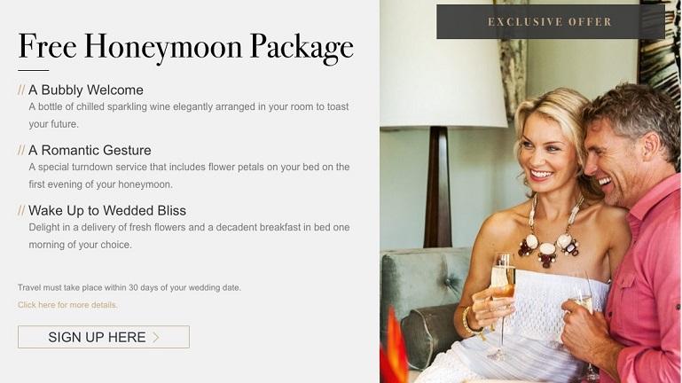
As I scrolled down the page, I was impressed by the coolness factor yet again. This landing page also includes extras in their honeymoon packages.
So how can you the steal the good things going on in this landing page and apply them to your own?
- Use “cool” and seductive imagery with people!
- Ensure your CTA is at the top of the page but not overly flashy.
- Provide top reviews from well-known sources to instill trust.
- Ensure you have a “free” offering on your page to tempt new leads.
RELATED: 11 Super-Actionable Landing Page to Trends to Jump On
2. Instacart
Who doesn’t get sick of going to the grocery store? Say you are in a pinch for groceries but rallying up your kiddos seems like far too much work so you turn to researching grocery delivery, and BOOM you land on this landing page, with this compelling pop-up that informs you that groceries can be delivered in as little as an hour. Who wouldn’t be sold?
There are many reasons this landing page works so well. First, it has a fun, relative, and graphic background; secondly, it immediately calls the viewer to take action with a CTA pop-up. Landing pages are often overwhelmed with multiple CTAs, buttons, or other locations to navigate to. However, this design is simple and easily to mimic. Just design a graphically nice and relevant background, and then use a pop-up CTA to get your viewers to do something before moving around your entire website.
3. GEM Plumbing and Heating
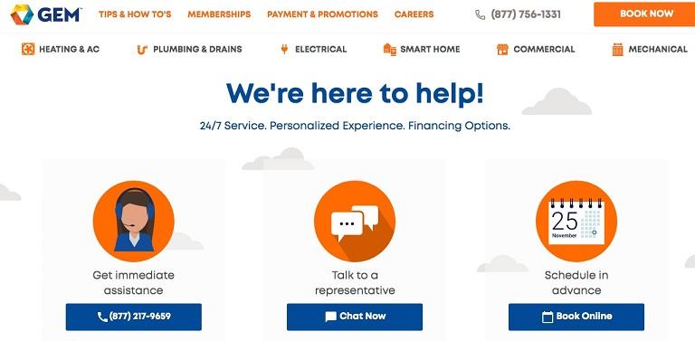
Say you are in need of some plumbing, heating, or other electrical assistance. In times like these, you are not looking to spend hours navigating a complicated landing page. This is why GEM’s landing page is so effective. While, yes, there is still a lot going on in terms of tabs and other places to navigate, the real coolness factor of this page comes from the fact that it is inviting and breaks down barriers of getting in touch in a time of need.
To make your landing pages similarly effective, use simple, welcoming, and clear language. Also, ensure that you think about your diverse audience. While you may have a target persona, you know that each and every person who visits your site is different and may have a preferred method of communication. Therefore, it’s important to provide options if your goal is for your visitors to reach out.
4. Solarwinds Help Desk Software
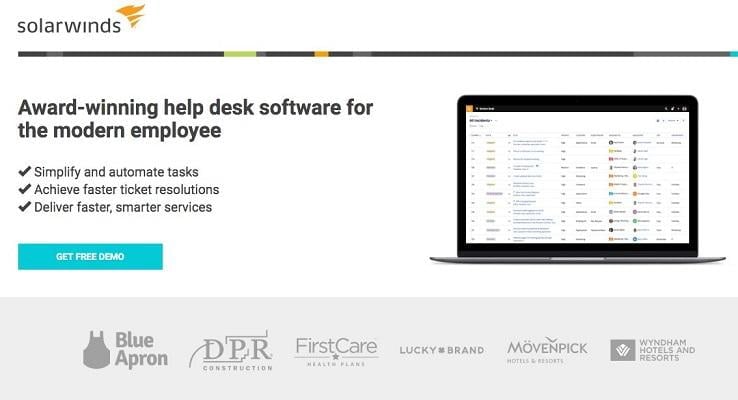
Let’s be honest, selling software is often not “cool.” We know this all too well at WordStream. That’s why making your landing pages as cool as possible is key! Solarwinds does an amazing job at this. Take a look at the landing page below.
Here are the reasons why it works so well:
- The text is short, sweet, and clear.
- The copy is organized into a list format making it easy to digest.
- There is one very clear call to action.
- This CTA is a free offer!
- The bottom of the page shows other cool and well-known brands that also use the software.
So how can you draw inspiration from this brand? Look up those bullet points above and do this on your own soon-to-be cool landing pages.
5. HelloFresh
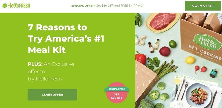
HelloFresh takes a great approach to the whole landing page thing with a unique offer. Rather than being overly aggressive and salesy, HelloFresh charms new users with content by linking them to a compelling blog post. The other great thing about this landing is the “special offer” temptation. Try this on your own landing pages, because special offers are definitely cool!
6. freshsales
“Contact management software—how cool is that!” said no one ever.
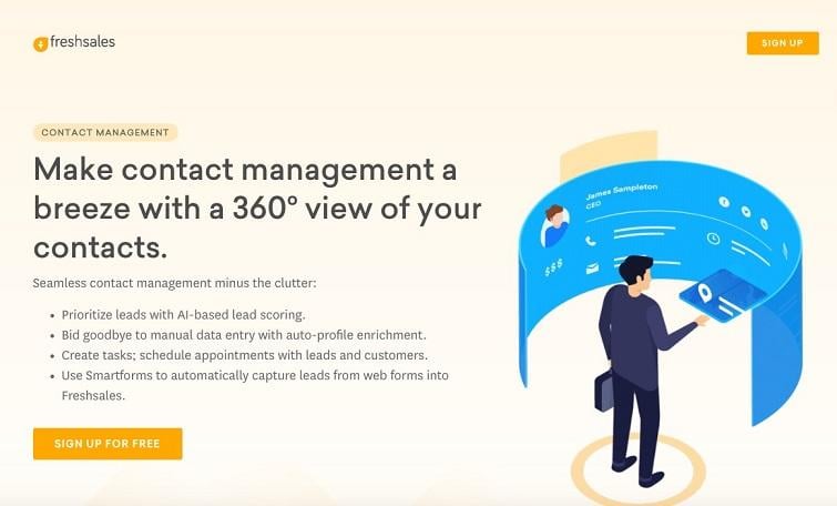
Luckily, freshsales knows how to make their visitors feel pretty cool with their fun 360-degree approach. The landing page below uses the strategy of keeping the text organized, compelling and clear, but it also incorporates a fun visual element. The other pretty cool thing about freshsales landing page is their FREE CTA—remember, free stuff is always cool.
7. Wistia
I might be biased because I used to work for the video platform company Wistia, but you’ve got to admit this landing page design is pretty cool! Check it out below. The main things that are cool about it include:
- The slick and simple design.
- The unique and pretty colors.
- The simple and clear text.
- The adorable piggy bank.
- The lack of a CTA at first (making it feel less pushy).
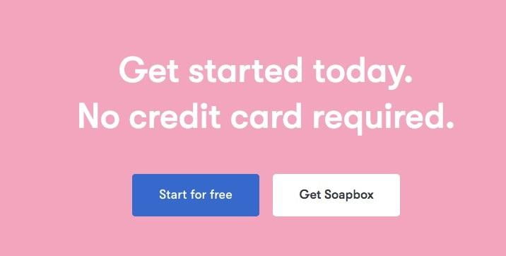
Then, as you scroll down the page, you get the clear call to action below, which states that a credit card is NOT needed to sign up. By this point you know how cool I think free stuff is, and this no-credit-card-required message makes me instantly love this offer.
To copy Wistia’s coolness, make sure to keep your design simple and visually appealing. Design and simplicity are key in building super cool landing pages, and (is this point sinking in yet?) free stuff never hurts.
8. Rent the Runway
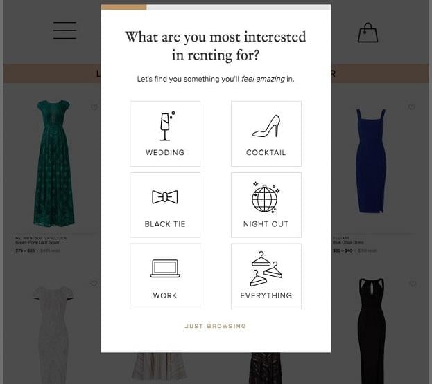
I am a big fan of this brand, so I was not the least bit surprised when I came across a very cool landing page. Rent the Runway uses the approach from examples above where a pop-up immediately grabs the attention of the visitor. I love this pop-up because it pulls the visitor in immediately and makes them feel like a part of the experience on Rent the Runways website. It is pretty cool to be able to visit a site and get exactly where you want to go that quickly.
So how can you be as cool as Rent the Runway?
- Experiment with pop-ups that make an easier experience for your visitors.
- Use simple and sleek icons that are relevant to the place your visitor will land.
- Combine text with visual elements to make a fun and easily digestible experience for visitors (See more landing page best practices here).
9. Row House
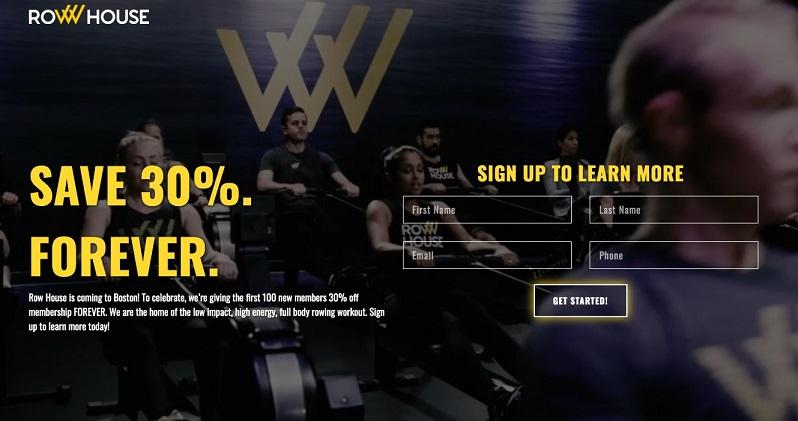
“Wow! What a cool landing page!” is exactly what I thought when I landed on this page for Row House, a brand I had not previously heard of but now am quite interested in. This landing page is super compelling because of the slick and simple design, but what I loved most about it is the autoplay video in the background. If your brand has a cool visual aspect to it, why not instantly capture visitors with a visual component like video on your landing pages?
Try out Row House’s strategy and put an autoplay video in the back of your landing page, and your visitors will be blown away by your coolness level.
10. Toro Loco
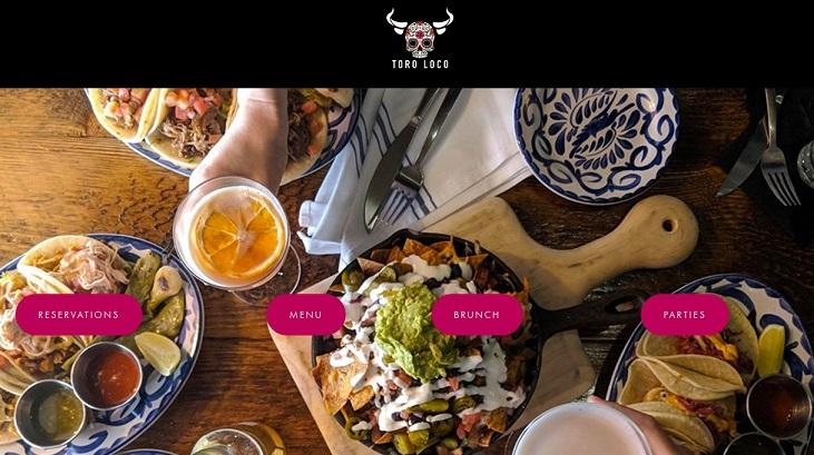
The restaurant industry is definitely one of my favorites because—like most people—I think food is awesome. And I won’t name names, but I’ve come across far too many uncool landing pages in this industry. Toro Loco is definitely not one of them. When I saw this landing page, I was greeted with gorgeous table of delicious food, as well as four relevant options of where to go next.
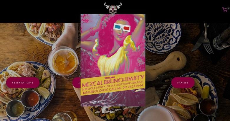
Then, a fun pop-up magically appeared. What a treat! Also, look at that pop-up below … “Mezcal Brunch Party.” What could be cooler than that?
Make your landing pages this cool by showing off your delicious offerings from a fun angle.
11. Airbnb
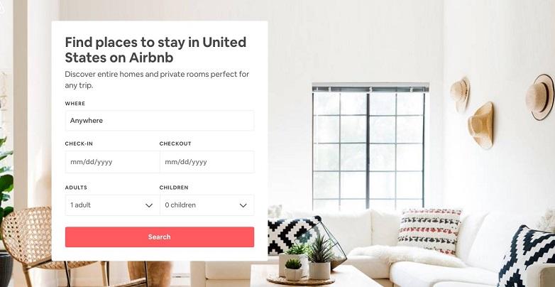
You probably know Airbnb, and I would suspect this has a lot do with the company’s amazing website experience. Airbnb’s main landing page that visitors will find when searching for hotels for travel has a clean, clear, and helpful feel. It also definitely feels cool … I mean just look at that stylish, sunny, bright room with the hipster hats decorating the wall. You really can’t go wrong when gaining landing page inspiration for Airbnb.
Stick to the principles we have been discussing to make your landing pages this cool:
- A simple, straightforward design
- Enticing but not overwhelming imagery
- A very clear and non-pushy CTA
12. Chase
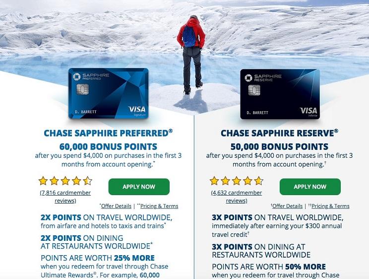
Who doesn’t want to become a “member of the Chase family”? Choosing which credit card provider is hard enough, but then there is the fact that most companies have multiple cards to choose from. That’s why I love this page from Chase. Not only does it break down the differences of both cards, but it does so in a very cool and digestible way.
If you have two comparable products that your visitors may feel conflicted on, make it easy on them by copying this strategy from Chase. To imitate the strategy, find a compelling and relevant image to use for your background, compose a brief and visual list of the differences, provide reviews if possible, and have a separate CTA for each option.
13. Wayfair
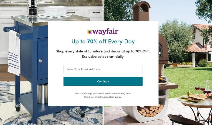
This might look like a pop-up, but it’s not! Wayfair does a wonderful job at having shoppers land on a beautifully simple and relevant landing page. There are no gimmicks and multiple tabs getting in the way. Rather, shoppers are met with a pretty fantastic discount offer to get them shopping ASAP. All you have to do to mimic this style is keep things super simple and offer up a discount.
14. HomeLight
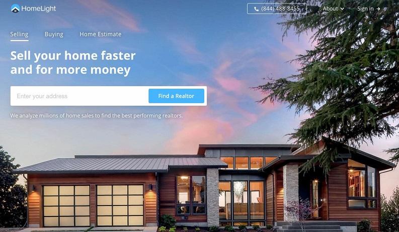
HomeLight nailed it with this super cool landing page. Not only is it simple and easy to navigate, but it also shows a beautiful home with a gorgeous sky. What could be cooler?
15. Teddy Bear Club
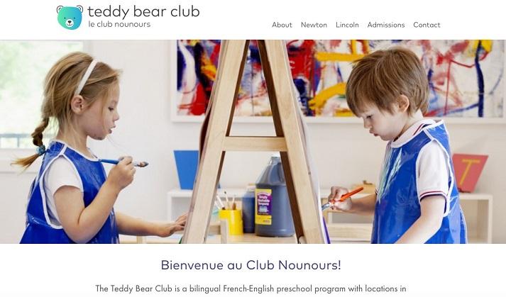
Doesn’t a “teddy bear club” sounds like something you want to be a part of? It’s actually a bilingual French/English preschool in Newton and Lincoln, MA, but I stumbled upon it when doing research for this post and was super impressed by their very cool landing page. First of all, the brand name is too cute. And, I mean, kids are cool, and adorable bilingual artists are even cooler.
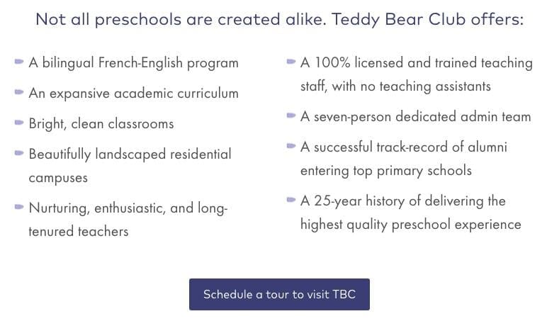
As you scroll down the page, you are met with a very simple CTA.
I love how parents can read some comforting and informative information before the getting to the CTA and, hopefully, committing to a tour to visit. This is definitely a cool strategy to mimic.
16. Wix
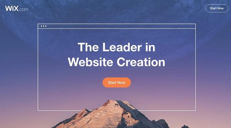
This Wix landing page is so cool that I feel like I do not even need to explain why. Just look at the gorgeous and sort of mind-blowing image of the mountain and the sky. The message is clear, focused, and the CTA is right there for you to go forth and “Start Now”!
17. Uber
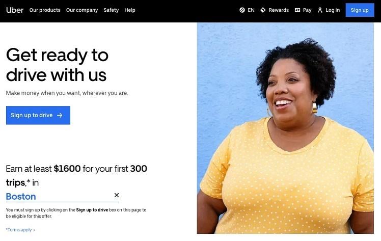
Last, but certainly not least this Uber landing page to recruit new drivers is very cool for many reasons. The messaging is clear, the CTA is focused, but the main reason I find this page to be so cool is the charming, happy lady pictured. The photograph on this page feels real, human, and relatable, which is very cool if you ask me.
Start creating your own cool landing pages
I cannot wait to see all of the cool landing pages you create with this list of coolness for inspiration. Share your super cool landing page links below in the comments!

