Even after so many years, email is still going strong as one of the best ways to market your business, and its versatility is unmatched. You can use it to build trust, get important feedback, announce new features, keep customers coming back, prevent churn, and so much more.
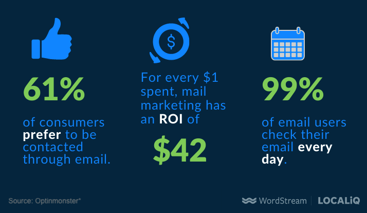
But with billions of emails going out every day, you’ve got to put in every effort to stand out to your readers, keep their interest, and meet your marketing goals.
That’s why in this post, we’re going to provide you with 13 email marketing tips to drive the best possible results from your campaigns.
We’ll start with the fundamentals and then work our way up from there!
13 email marketing tips for better performing campaigns
Email marketing best practices are pretty evergreen, but the best ways to implement them evolve along with the rest of the world. The below list offers tried-and-true email marketing tips based on recent studies, 2021 digital marketing trends, and more advanced tools we have at our disposal. These tips can work for both B2C and B2B email marketing.
1. Segment your subscriber database
Email can be used for any number of marketing campaigns: to welcome new customers, guide them through your funnel, announce feature releases, share special promotions, and more. But you can only make use of these strategies by segmenting your list.
There are many ways to segment, but here are a few of the main ones:
- Demographics: Use your CRM to pull a list of emails according to a specific location.
- Engagement: You might want to re-send or send out a second, slightly different email to subscribers who didn’t open your first one.
- Stage of the customer journey: Cater your offers for new customers vs, long-time customers.
- Source: Which form on your website they filled out to give you their contact info.
You’ll need to set up rules and conditions in an automated email platform to make this happen.
2. Personalize your messages
According to research by Janrain and Blue Research, 96% of consumers report that they have received mistargeted information or promotions, such as:
- Offers that show they don’t know the customer.
- Mistakes about basic information about the customer.
- Communicating inconsistent messages on different platforms.
And according to the same research, 68% of customers automatically delete emails that contain these types of mistakes and 54% unsubscribe.
In contrast, personalization can bring about the following benefits:
- Personalized subject lines can generate up to 50% higher open rates.
- Personalized emails have a return on investment of 122%.
- Birthday emails can generate 342% more revenue per email than regular promotions.
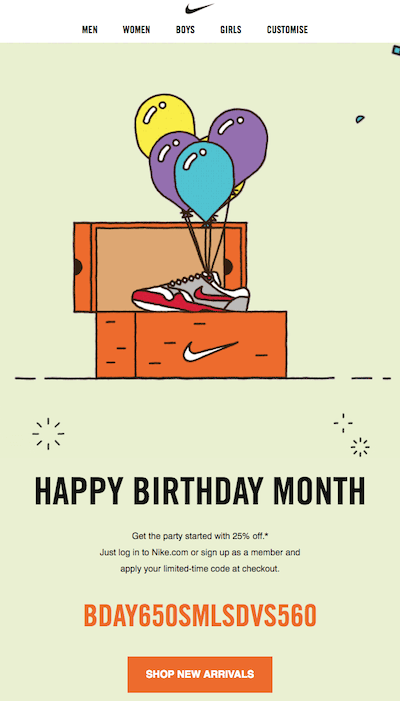
Thanks to digital marketing, you have tons of information about your potential customers you can use for personalization.
- Use your website and social media analytics to get an idea of the topics, products, services, or messages generate the most engagement.
- Use lead forms to collect email addresses with a few additional fields so they can provide the information you need to personalize.
- For a smaller subscriber database, you can use an email lookup tool to get basic information about your customer, like their name, company, server location, and social media profiles.
📫 Free email templates! >> 30 Free Small Business Email Examples & Templates
3. Optimize for mobile
A poor mobile experience makes 52% of users less likely to work with a company and 53% said that they would leave a site that doesn’t load within three seconds. Since 70% of emails are opened on a mobile device, and your CTAs all lead back to your site, mobile optimization is crucial.
Here’s what mobile-optimized looks like:
- All relevant text can be read from a single screen without having to pan over.
- The email and landing page load quickly.
- There are clear, tap-able buttons.
- Font type, size, and color are easy on the eyes.
On a related note, learn about Google’s 2021 mobile-first algorithm update here!
4. Re-engage inactive subscribers
While it’s important to be getting a steady stream of new customers, don’t forget about your existing ones! Oftentimes, you can reengage a dormant customer or reader with an enticing offer and the right email copy. Look back at your data to see what type of content they engaged with before, and send a new and improved version. Or just offer a discount!

And any inactive subscribers that don’t engage with your campaign? Remove them to declutter your email list.
5. Use A/B testing to identify the perfect email
Use A/B tests to learn even more about your subscribers. Test subject lines, body copy, layout, CTA language or button color, images, and more. As with any A/B test, only change one thing at a time so you can draw clear conclusions.
For example, if you’re promoting a free guide about driving traffic to your site, here are some subject line variations:
- 10 Ways to Drive More Traffic to Your Site
- Could You Be Missing Out on Website Traffic? 10 Easy Tips.
- 10 Ways to Drive More Traffic to Your Site [Free Guide]
This way you can see which words (like “download” or “guide”) resonate with your readers, or whether they engage more with a prevention-based or goal-based tone.

Note! With the iOS 15 update, A/B testing using open rates may not be the best way to go. Learn 13 post-iOS 15 email marketing strategies here.
6. Set up trigger emails to prevent missed opportunities
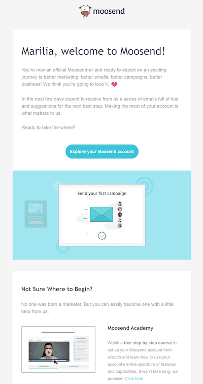
A triggered email is one that is sent out automatically after a customer takes a certain action. Triggered emails have a 70.5% higher open rate because you’re reaching your readers while they’re engaged. For example, you might send:
- A reminder email shortly after they abandon their cart.
- A feedback request after they complete an order.
- A review request shortly after they purchase.
- A welcome email after they jump onboard.
7. Nurture leads into customers
For B2C businesses and low-cost offerings, a new subscriber to your email list may very well become an immediate customer. But for big-ticket purchases and B2B marketing, the decision involves more research and careful thinking. With nurture emails, you send a series of emails that build trust and provide offers that gradually increase.
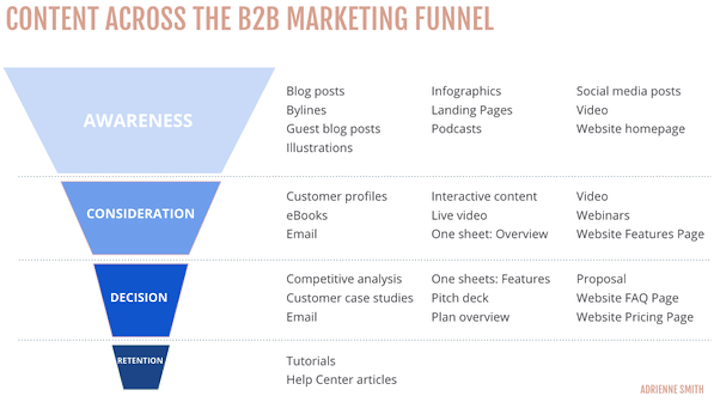
For example, your series might look like this:
A person subscribes to your list and gets a welcome email. Subsequent emails ask them to:
- Download a pocket guide
- Download an ebook
- Attend a webinar
- Read a case study
- Book a consultation
All of the content you’re providing is high-quality and useful and each “ask” is only a small increase from its precedent, so by the time you ask them to book a consultation, they’ll be likely to do it! Nurturing is a must-have for any lead generation process.
For help crafting your email series, these follow-up email templates might help.
8. Use emotion to connect
Every pain point and desire for customers traces back to an emotion. If you’re an accountant, your customers want to stop feeling fearful about not getting their taxes done on time. They want to feel peace of mind that they’ll get the highest return.
If you’re an analytics platform, your audience wants to stop stressing over their reporting. They want to feel confident when presenting to their boss.
So get more engagement from your emails with emotional marketing copy.
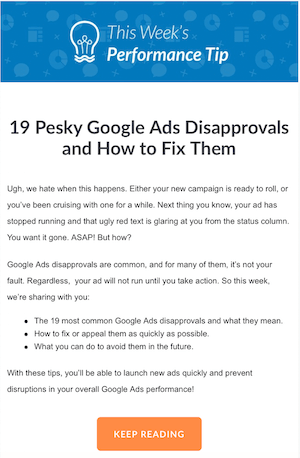
Email is a great avenue for marketing with emotion, especially since you can cater to very specific readers and experiment using A/B testing.
9. Showcase your values
Today’s customers expect much more from a company than they did years before. They want to give their dollars to companies that they support, whose missions align with their core values, and who look at them as more than just a means of revenue generation. They also covet more vulnerability and transparency.
You can showcase your values in different ways:
- Directly call them out: For example, “At Flockjay, no one will fly solo. This is one of our core values and that includes you. With our new service center, you’ll have human help at your fingertips 24/7…”
- Share milestones in your social responsibility initiatives, like how many trees your product saved this year or how much of your proceeds were donated to an organization you support.
- Close off with an inspiring quote in each send that speaks to your values.
10. Tell a story
Whether it’s three sentences or three hundred pages, stories are memorable and compelling. Here are some ways to use storytelling to improve your email marketing results:
- Tell a short story behind your newest product or service and how it came to be. Readers will be interested to see the end result, and they’ll also be reminded of why your offerings are top-quality.
- Share a brief version of a success story, and then link to the full story for more details.
- Even better, you could start with describing the customer’s problem in a way that resonates with your customers (think P-A-S formula), end with impressive (quantifiable) results, then finish off with “How did we do it?” and a “Find out here” CTA.
- Get creative and tell your own story as a primer for the rest of the email. Sleeknote provides a great example of this email marketing tactic (although we’d recommend removing all of the line breaks for better readability).

For more tips like these, check out our post on how to write emails like a human being.
11. Find the right email sending time
In general, the best time to send marketing emails is:
- During the day
- On a weekday
- Not Monday
- Midweek
However, these are general benchmarks and it may be different for your particular customers. Plus, with the uptick of remote working due to the pandemic, peoples’ schedules have changed so it’s a good idea to reassess. Run A/B tests and use your own data to find optimal times to send your customers marketing emails.
12. Use dynamic content
Dynamic email content is another way to personalize your marketing. With this strategy, the content of your email automatically changes to match based on reader criteria such as gender, geographic location, purchasing patterns, or behavior on your site.
Customers will receive the same template but see different images, offers, and calls to action.

Another example of dynamic content is including a countdown in your email or a live feed from your blog or social channels.
13. Try out plain text emails
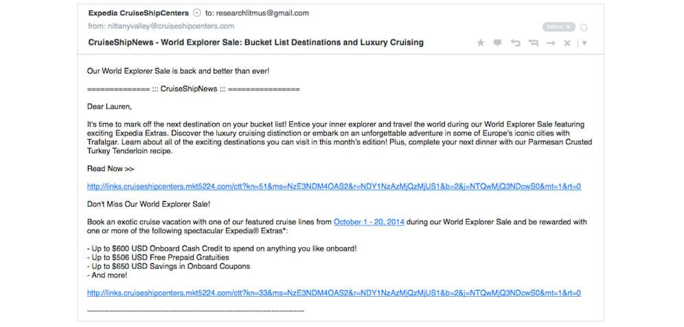
I know what you’re thinking: plain text!? But this is no typo. In the midst of animated graphics, sophisticated designs, and trendy aesthetics, there is a growing appreciation among consumers for more minimalistic content. Not only do plain text emails align with this trend, but they also appear better on smartphones, smartwatches, and voice-assisted devices; and travel smoothly through spam, security, and privacy filters.
Use these email marketing tips to hit your goals
Email marketing can be used in a variety of ways—to promote a new product or service, create a memorable customer experience, turn leads into customers, build your brand identity, and connect on a deeper level with your audience. So be sure to use these tips to maximize the results of your campaigns:
- Segment your subscriber database.
- Personalize your messaging.
- Optimize for mobile.
- Re-engage inactive subscribers.
- Use A/B testing to identify the perfect email.
- Set up trigger emails to prevent missed opportunities.
- Nurture subscribers into customers.
- Use emotion in your email copy.
- Showcase your values.
- Tell a story.
- Find the right sending time.
- Try out dynamic content.
- Give plain text emails a try.
*Source for stats in the intro: Optinmonster.

