We’re on a bit of a mobile kick lately – my last post was about mobile marketing basics, and today we’re diving head first into mobile websites.
We will be covering different approaches to mobile website design, mobile site best practices, and what you can do to easily make your site mobile-optimized! Get ready to touch, tap, and swipe your way into the world of mobile web design!
Mobile Website Statistics: Why You Need a Mobile Friendly Website
If you aren’t quite sure about whether or not it’s worth your time to learn about mobile site design, these mobile website statistics will convince you!
- Global mobile traffic now accounts for 15% of all Internet traffic
- No one screen size has more than 20% of the market share
- 61% of people have a better opinion of brands when they offer a good mobile experience
- 60% of mobile shoppers use their smartphones while in a store, and another 50% while on their way to a store
- Tablet users spend 50% more than PC users
- Mobile-based searches make up one quarter of all searches
- Every 100ms increase in load time decreases sales by 1%
Mobile Website Design’s Biggest Rule: Keep it Simple
Your mobile website doesn’t need to have the same kind of pizazz and showmanship as your regular, full-size site. On a tiny screen, big, flashy graphics take up too much space and can result in snail-paced load times, which mobile users simply won’t accept.
Mobile sites should be more basic and bare bones, with a simplified design. Remember that most mobile users are visiting mobile sites for hard info, not for curiosity or general interest. The goal is to provide mobile users with the information they want and nothing extra. This means streamline navigation and layout, keeping things as easy and simple as possible.
That being said, this doesn’t lock you into having an ugly site – aesthetes rejoice! You can still create beautiful mobile websites. CSS3 lets mobile website designers create some pretty attractive graphics with features like gradients and drop-shadows, letting you have a polished mobile website without the clunky weight of large graphic files.
With this overarching concept of mobile simplicity in mind, we can start to think about how to actually go about our mobile website design plan. There are generally two approaches.
The Two Approaches to Creating Mobile Websites:
1. Build a unique mobile website
2. Design existing website to adjust itself for various mobile devices (what is called “responsive design”
We’ll be discussing these two different methods in detail. There’s no right or wrong answer, but your business’s priorities might make one option better suited for you.
Approach #1: A Domain of Their Own – Creating a .Mobi Website
.Mobi websites are sites that have been specifically designed to be viewed and navigated on mobile devices. Technically any domain can be viewed on a mobile device, but .mobi sites claim superior usability.
From a user perspective, .mobi is preferable since all .mobi sites MUST be optimized for viewing on a mobile device. From a business perspective, there is a solid assortment of both pros and cons in taking the .mobi design route.
PROS of Building a .Mobi Website:
- Specifically designed to work well on small mobile screens
- Minimum amounts of bandwidth is used, letting sites load faster
- Simple, light, and streamlined
- More likely to appear than .com sites on mobile searches
- Since you’re building a separate website, you can adjust content to rank for specific mobile search queries, which often vary from classic desktop searches
CONS of Building a .Mobi Website:
- You now have two separate websites to maintain (your regular .com domain and .mobi mobile domain)
- You must start SEO work for your .mobi from scratch
- Having two domains means the increased possibility of duplicate content, which could mean getting penalized by the Googs
Approach #2: Go With the Flow – Responsive Web Design
Responsive web design enables a pre-existing website to resize and re-adjust automatically for various mobile devices. Technologies like CSS3 and HTML5 make it easy to design your site to adapt to any device it’s being viewed on, converting the website to a mobile layout for better viewing.
Responsive web design is a great option, and growing more popular by the day as the variety of devices that access the web grows. Mashable noted that last year they were accessed on over 2,000 different mobile devices! Responsive design aims to make your site look gorgeous on all of them. Naturally there are some pros and cons.
PROS of Responsive Design:
- One single website adapting to different devices, rather than managing separate sites for different devices
- There are many responsive web design themes from WordPress for under $100
- Responsive web design is the Google-recommended method of mobile website design
CONS of Responsive Design:
- Sites implementing responsive mobile web design can be slower to load than .mobi sites
- Website ads often break when being adjusted with responsive web design
- Information architecture and functionality can get screwy
Choosing Between .Mobi vs. Responsive Design
The .mobi vs. responsive web design battle is as great a rivalry as Coke vs. Pepsi, Energizer vs. Duracell, Mac vs. PC! Well, OK, it may not be quite that intense, but many web experts really do have some pretty strong feelings about which is the preferred method of mobile site design.
So which method is right for you?
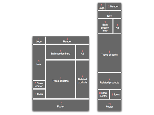
Image from Google Mobile Ads Blog
There really is no right or wrong answer. Responsive design is easier to maintain, since you are dealing with one single website. However, creating sites customized specifically for mobile devices means you’ll have the chance to experiment with mobile-specific features like GPS and cameras.
Usually such functionality is resigned to apps, but implementing this kind of experience into mobile sites can result in extremely engaging and exciting sites. As Bryson Meunnier of Search Engine Land notes, this kind of app-like behavior on sites should be more common, especially considering how some brands like Answers.com have found great success with this technique.
Some experts recommend that businesses with a smaller number of mobile visitors should go with responsive web design, while those with a large number of mobile users should create a mobile-specific site. Ultimately, it’s your call.
BTW: You can create a mobile specific site without creating a .mobi domain. You can just as easily set up a sub-domain like “http://m.domain.com” to put your mobile site on.
Mobile Websites vs. Apps: We Didn’t Forget Them!
I know, you’re probably thinking “Umm, hey, what about apps? Apps are great! There’s an app for that!” Apple did a pretty phenomenal marketing job getting us all excited about the idea of mobile apps. And while mobile apps are great, they really aren’t suited to every business.
Apps are software applications that need to be written in the native language of a selected platform like the Apple iPhone or the Google Android. There are some nifty advantages of creating a mobile app, but for most small to medium-sized businesses, it isn’t worth the effort.
PROS of Building an App:
- Since your code is specifically built for one platform, it’s more likely to perform well
- Getting an app distributed in app stores could increase attention and notice
- Apps can use a mobile device’s functionality, like a built-in camera or accelerometer
CONS of Building an App:
- Expensive to develop and maintain
- User must take more actions before being engaged (they must download the platform-specific app marketplace, download the app, update the app, etc.)
- Individual app must be made for each platform
- Fees are involved with promoting the app on app stores
The truth is, you probably don’t really need (or heck, even want) an app for your business. Mobile websites earn a larger reach compared to apps, and consumers tend to prefer using the mobile web interface for searching, surfing, and shopping. According to the Pew Research Center, 60% of tablet users prefer reading news on the mobile web to reading on an app.
What businesses will benefit from apps? As noted on Adaptistration, the businesses who will benefit most from apps are those who have specific content delivery needs, like wanting to stream HD video for subscribers of a specific membership program (Netflix, HBO GO, Hulu Plus etc.). Apps are also great for specific tools, such as an app to help users find the nearest gluten-free restaurant.
Don’t hop on the app bandwagon just because it sounds cool. If you want to put in the time and money to build an app, it should have a real purpose.
Mobile Website Examples: Learn From the Top Mobile Sites
Here’s a look at some of the best mobile websites brands have come up with.
Abercrombie & Fitch
What They’re Doing Right: Collapsible navigation and a clean, simple design.
Caribou Coffee
What They’re Doing Right: Collapsible navigation, aimed for local intent with Location Finder and Offers, key information with nothing extraneous
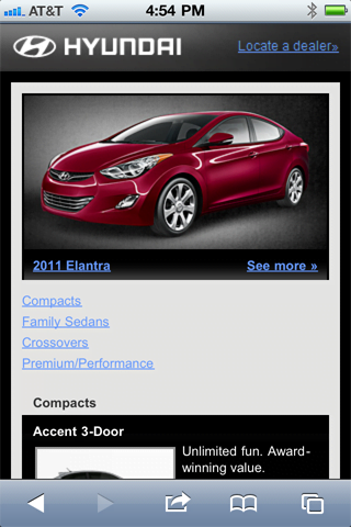
Hyundai
What They’re Doing Right: Simple and easy to understand
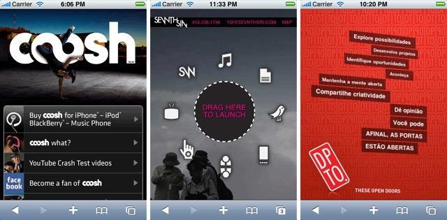
The sites above manage to be fun, creative, and engaging while still maintaining a simplicity that works well for mobile.
Examples of Responsive Mobile Design
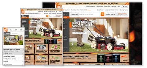
Home Depot
Home Depot does a couple things really well with their mobile responsive web design:
- They’ve optimized the mobile experience for local, putting the “Store Locator” option at the top of the navigation menu
- Consistent and easy to navigate across screens
- Mobile device navigation is vertical and collapsible, keeping things simple for users.
Starbucks
- Like Home Depot, Starbucks prioritizes the “Store Locator” option
- Main image is consistent across devices, but sized appropriately for each screen
- Easy to navigate
Mobile Website Ads: Break It and No One Buys It
Mobile website ads can be somewhat problematic when functioning with responsive web design. The ads, which are shown across a wide variety of different-sized devices, end up being unintentionally warped or distorted. Stretch Armstrong rocks, stretchy pants are comfy as heck, but stretchy ads are just no good.
Thankfully, Google has been crafting a workaround. Google has updated the AdSense ad code policy so that code can be modified by advertisers to display ads properly across different devices. Originally, AdSense ads were shown in fixed slots. The new policy lets AdSense users format their ads to fit any device with a small change in the javascript code. Pretty neat!
Want to see how your mobile PPC ads are performing? Our free AdWords Grader tool can help you out.
Mobile Website Design Tips & Best Practices
- Stick with Single Column – Single column designs are more manageable on smaller screens and convert from horizontal to vertical better.
- Think About How Your Content Will be Stacked – Define how your content will stack and reorder itself going from desktop to mobile.
- Go With a Collapsible Navigation – Collapsible navigation keeps your mobile design simple and clean. With collapsible navigation, menu items can be tapped to expand more options.
- Consider the Translation from Mouse Clicks to Finger Taps – Desktop computers allow users to easily handle designs where precise clicking is required, but since mobile devices use finger and thumb tapping, users need larger buttons that are less exact. Same goes for hover items – navigation menus that normally appear after a hover action need to instead expand with a tap.
- Don’t Forget Visual Indicators – While many desktop browsers have built-in progress indicators like loading symbols, these aren’t as common on mobile browsers. It’s best if you provide your own visual feedback as part of your mobile design. When a user taps a button, have the button change its appearance to show that a tap has happened. Try spinning icons for loading indicators, etc.
- Test Across Lots of Devices – Test, test, and test again! There’s a bunch of testing tools and device emulators to help you see how your site looks across different mobile devices (we’ve got some recommendations below!)
- Stay Practical – Most mobile users aren’t looking to dilly-dally. They are looking for information and they want it fast! Keep things simple, crisp, and to the point.
- Keep It Consistent – While you’ll absolutely want to change your design layout and maybe even add or adjust content for mobile, your core identity and message should be consistent across devices. Your mobile design shouldn’t look like a totally different animal than your classic site.
- Know Your Audience – Really take some time to consider your core audience and what they are looking to get out of your mobile site. Their intent on mobile is likely to be different than intent on desktops.
- Keep Text Input Minimal – While great progress is being made to make text input easier on mobile devices, it’s still a nuisance. Only make users input text when it’s essential.
How to Test Your Mobile Site
We’ve collected a bunch of free mobile site design testing tools to help you make sure your site looks great no matter who is using it. To be the best, you gotta test!
- MobiReady: a testing tool that evaluates the how well optimized your site is for mobile devices, taking into account mobile best practices and industry standards. You’ll get a score from 1-5 and a full site analysis.
- The Responsinator: A free tool for testing your mobile responsive design across popular mobile devices.
- GoMoMeer: This tool from Google shows how your site looks on a smartphone and offers a free report with personalized recommendations on how to be better optimized for mobile.
- Screenfly: Screenfly lets you view your website on variety of devices. Just pop in your URL.
- Mobile Phone Emulator: A popular mobile phone emulator, this tool allows you to test your site across a large number of mobile devices.
- iPad Peek: As its name implies, this tool lets you see how your site appears on the iPad or iPhone.
And there you have it – the complete guide to mobile websites and mobile design. Go forth and go mobile friends!
Remember, you can always check your site’s mobile friendliness and SEO with the free LOCALiQ website grader.


