More doesn’t always equal more – the infamous Jam Study first taught us this lesson over a decade ago.
Via Sandglaz
Choice invariably leads to more choice, decisions to indecision. Overthinking leads to worse productivity, less creativity, and exhausted willpower. And when it comes to ad campaigns and landing pages, an exhausted customer is the last thing you want.
Sometimes, the key to maximizing your landing page conversions is streamlining: less is more. Other times, a simple change to your CTA or a more personalized targeting strategy is what’s required.
Looking to squeeze more conversions out of your landing pages? Let’s take a look at six landing page tests you can try to get better results.
1. Set the right expectations with your button copy
“You can have a very beautiful thing to say, but say it in the wrong words and it’s gone,” says public speaking champion Mohammed Qahtani. Here’s how applying this knowledge to a landing page can impact a campaign:
Culligan, a water filtration company, wanted to find out which phrase would perform better in a landing page: “Get A Quote” or “Get Pricing.” What could possibly be the difference? Well, three weeks of testing declared “Get A Quote” the clear winner, with a whopping 104% increase in form submissions.
Here’s the rationale:
While both CTAs ultimately mean the same thing – obtain pricing details – the words “quote” and “pricing” make people expect different things.
Anyone who’s ever been on a first date knows expectations can be a tricky deal. The “Get A Quote” CTA sets the right expectations early. People knew what they were getting into before clicking—that they were going to fill out a form, speak to a sales rep, and obtain a personalized pricing list.
The people who clicked the “Get Pricing” button, on the other hand, expected to be redirected to a pricing page, period. These people didn’t realize there was a lot more work involved. And “more work” isn’t exactly at the top of anyone’s priority list.
Are you sure your CTA button text sets prospect expectations? If you’re not sure, test!
2. Cater to timely, local interests
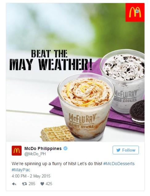
Boxing fans know that May 2, 2015 was the day Manny Pacquiao of the Philippines got into the ring with American boxer Floyd Mayweather. The “Beat the May weather!” campaign from McDonald’s was a hit in Pacquiao’s home country. It even won advertising awards for brand awareness.
Here’s a look at one of the ads:
If you’re not aware of the climate pattern in the Philippines, you might scratch your head and think the guys at McDonald’s messed up Floyd’s surname. But the months of April and May are the height of summer in the Philippines, when the temperature can go as high as 43 degrees Celsius (about 109 Fahrenheit). McDonald’s piggybacked on the Pacquiao-Mayweather narrative to build better brand awareness for its McFlurry product.
Clever, right?
Trying out a new market? The next time you write copy for your landing page or your CTA buttons, think of the impact your word choice will have on your target consumer. Test creative that might resonate with that particular audience.
3. Switch out your slider for a static page
Sean Bestor has a funny depiction of how sliders work. Initially, he says, it’s like seeing the bat signal calling on Batman. But before you have a chance to register what you’ve seen, the beacon turns into the Superman logo, spews out instructions on where to go, changes into something else before you finish reading, then turns into the bat signal once again.
Slider carousels are just as confusing. They’re like merry-go-rounds—round and round they go, until every adult who got sucked into riding with their kids has motion sickness. The only difference is that people who ride merry-go-rounds actually pay for the experience. People browsing websites don’t have a choice. Sure, sliders can be pretty to look at, but they’re notoriously bad for conversions. And SEO. And speed. And usability.
In an A/B test by international shoe retailer Clarks, a static banner with basic navigation-focused links saw a 17.5% increase in conversionsand a 16% decline in bounce rate next to a test variant that used a slider with five images. The test also showed that while the slider page contained fewer links below the fold, site users made a beeline for those links—a direct effect of what the Nielsen Norman Group calls “a switch from cognitive ease to cognitive strain.”
This means that when people exert more effort to find information or use a website feature, their tendency is to look for other options. In the case of the slider page, the below-the-fold links.
If sliders are out, what’s your best bet? Simple static pages. With just one point of focus—instead of, say, 10—and with no sliding movement to distract your already perennially distracted site users, static pages hand back control to your visitors.
If you have slider pages live on your site, try a test to see if a static page outperforms.
4. Build targeted landing pages for different industries
You can’t be everything to everyone. You may wear a lot of hats and juggle a lot of roles, but you’re primarily the supervisor to your staff; the guy with a noisy motorcycle to your grouchy neighbor; the parent to your child; the sibling to your brother or sister. If you’re a software company serving multiple industries, you’re the financial software provider to an insurer; or the talent management tool vendor to a recruiter.
That means you need to speak a different language to different audiences.
Software provider SAP put this concept to the test on their German homepage and landing page. They asked themselves:
- Should we use generic messaging that caters to several industries?
- Or should we provide a dynamically changing homepage with images and copy based on the visitor’s industry?
Not surprisingly, the dynamically changing page with targeted messaging prevailed:
You don’t optimize landing pages for page views. You optimize for conversions, with messaging that matches the intent of the advertisement your target audience clicked.
The easiest way to do this? Help people self-select. Get them to tell you exactly who they are.
You can do this on your pricing page, like John Doherty does on Credo. John segments plans by company size, so he knows who’s dealing with what problems and how much each can pay.
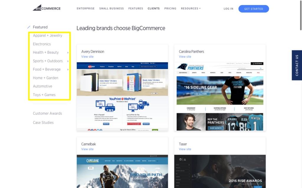
You can also do this on service pages. Say someone is shopping for a new eCommerce store, views BigCommerce’s examples, then drills down into a specific vertical to see a preview of what their site could look like:
Gotcha!
Now you know which visitors hit each page on your site. If they don’t convert on the first visit, you can retarget them based on their on-site behavior, knowing the exact customer segment into which they fall.
5. Test long-form vs. short-form (because you never know)
Nobody will buy from you unless you’re credible. However, there is such a thing as too much credibility. Visual Website Optimizer, for instance, once used long-form copy to communicate the many benefits of their website optimizer tool. The copy was divided into several sections, including a customer testimonial category.
So this thing was long. Real long.
To change things up, they decided to defy best practices by radically redesigning the page to only focus on the signup form.
The result was a 16.34% increase in signups.
Tests like this can be tricky, though. They lead you to think, “Oh, WordStream says testimonials sink conversions.” But that’s not what’s happening here. In this case, it was likely just too much visual clutter. Too much information to process.
One 2012 Google study found that visually complex pages, as well as those not conforming to website prototypicality, ranked low in the “aesthetically pleasing” scale. Simply stated: Complex pages confuse us. We don’t know where to look or what to click.
Remember: Easy = True. Things that are easier to pronounce or understand can perform better. Minimalism isn’t just a design trend. It focuses attention on what’s most important. Which may just happen to coincide with how you eventually make money.
But! Don’t assume a shorter, simpler page is going to be your winner. WordStream did a similar test for their AdWords Grader landing page and found the opposite to be true – the long-form version won! So always test to statistical significance.
6. Remove the “conversion friction” derailing your visitors
MarketingExperiments.com found that simplifying both the length and complexity of a conversion or checkout process can increase results across the board. Removing complexity reduces “conversion friction”—the questions and issues that pop up which prevent us from sealing the deal.
“Difficulty-oriented friction” applies broadly to the number of decisions to make on a page, like multiple equally weighted CTAs. And “length-oriented friction” applies to both the number and layout of form fields, and to the number of steps in an entire checkout process.
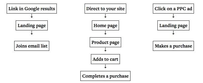
Then there are “user flows,” which dictate how someone gets from one page to another—these are about the transitions that can derail a visitor’s intended action. An eCommerce site will have a checkout flow, beginning from an ad or email, that ends with money in your pocket. Apps follow a similar structure to activate and then onboard new visitors.
Lead gen sites have something similar. There’s the initial visit, the opt-in, the confirmation page, and the follow-up email or phone call. But each website often has several different user flows, too. TOFU (top of funnel) visitors, for instance, might go from organic search, to a blog post, to an eBook landing page; while BOFU (bottom of funnel) visitors might go from a branded search, to a services page, to a thank you page.
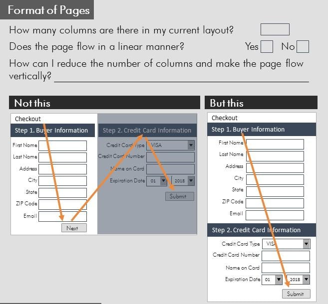
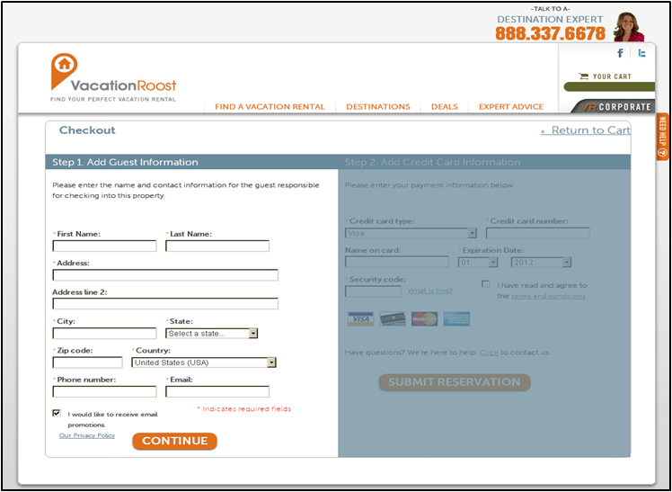
In another landing page test, MarketingExperiments.com redesigned a vacation rental checkout process, focusing on minimizing friction (i.e. distractions, form fields). They wanted to see how changes to the steps in each process or flow affected the bottom line.
Here’s the control version:
And here’s the test:
This version eliminated the step where users had to click a first button to fill in their payment info, before clicking the second button.
The results? A not-too-shabby 36.1% improvement.
They didn’t necessarily make huge modifications to what information was being requested. They didn’t mess with how people paid them. They just simplified the steps to remove any extra decisions or effort. In short, they didn’t make people think.
Marketing is both art and science. But ultimately, it always comes back to people. Catering to user intent (and psychology) often trumps fancy tactics. Try these landing page test ideas out and see if they can work for you!


