This blog post has been updated for 2019.
If desktop landing pages are the equivalent of a job interview, mobile landing pages are like elevator pitches on steroids – you have mere seconds for your page to load, grab your users’ attention and persuade them to act. Building the perfect mobile landing page is no easy task, and unless you have a strong mobile strategy in place before you start, you could be missing out on invaluable opportunities for greater conversions.
MORE: 9 Tips for Killer E-Commerce Product Pages
The importance of mobile landing pages
Even if you’re fully aware that you shouldn’t—and by shouldn’t, I mean can’t—ignore the prominence of mobile, it’s more than likely that you’ll encounter skeptics. You may work with folks who simply refuse to prioritize mobile optimization—folks who claim that the calls to do so are baseless and empty.
Well, here at WordStream, we’re firm believers in the power of cold, hard numbers. Here are 10 statistics you can share to change the skeptics’ minds:
- The majority of all internet traffic comes from mobile devices.
- People spend 69% of their total media time on their smartphones.
- The percentage of US adults that own a smartphone has grown rapidly this decade.
- 89% of consumers say they’ll recommend a brand after a positive mobile experience.
- 57% of mobile device users say they won’t recommend your business if your mobile website experience is bad.
- Consumers are 62% less likely to buy your product or service after a negative mobile experience.
- 71% of global traffic to retail websites comes from smartphones and tablets.
- Ecommerce conversion rates on both smartphones and tablets grew between Q3 of 2017 and Q3 of 2018.
- Nearly half of all online shopping orders are done via mobile.
- Tablet users add products to their carts on ecommerce websites at an outstanding rate of 8.58%.
How to design mobile landing pages
Just because your desktop landing pages can be viewed on a mobile device doesn’t mean you shouldn’t design specialized pages solely for mobile. Serving desktop versions of your landing pages on mobile devices is a big mistake, as people interact with sites very differently on mobile devices than they do on their laptop or desktop. Below are some mobile landing page best practices to keep in mind.
Headlines for mobile landing pages
Headlines should be short – brutally short (forget about those irresistible Upworthy-style clickbait headlines). Four words or less is ideal. Once you think you’re done writing your landing page copy, go back and edit it down. Then do it again. Cut out every single word that doesn’t need to be there – yes, even those sexy new product descriptions. You could take this one step further by asking if you even need copy on your mobile landing page. (Some businesses are having success with landing pages that primarily image-driven.)
Mobile landing page organization
Make sure that everything your customers need to perform an action can be seen instantly on the page. Think about your mobile landing pages from your customers’ perspective. Would you spend several minutes pinching or scrolling around a screen to learn more about a product? Neither will your customers.
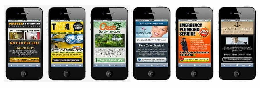
When building a landing page, resist the urge to fill every pixel of white space on your pages with imagery, text or other distractions. Take the mobile landing page examples above, for instance. Yes, the calls to action are instantly visible, but there’s so much going on with the rest of the page that the entire experience could turn off potential customers – plus, these examples are needlessly image-heavy, which will likely result in longer load times. If you choose to use mobile landing pages templates to help you during the design phase, bear this in mind. When designing mobile landing pages, think minimal. Remember – white space is your friend.
Mobile landing page CTAs
Calls to action must be strong, clear and immediate. Ideally, your call to action should be one of the first page elements a user sees. However, just because it’s visible doesn’t necessarily mean it’s optimal. If your mobile landing page’s primary purpose is lead generation, for example, you won’t want to ask prospective customers to complete a lengthy web form. Keep forms as short as possible – think one field for their name and another for an email address.
Clickable phone numbers
If you want customers to call you, include a phone icon or make your company’s phone number a clickable element. If you want them to come to your store (a crucial component of local search), add a link to a Google Map of your business so visitors can use the GPS functionality of their phone to get directions.
If you’ve ever misclicked on a button, and then had to wait 10 seconds for the wrong page to load, you know how frustrating this can be. To avoid missing out on potential conversions, ensure that clickable elements on your mobile landing page have sufficient padding around them.
The importance of mobile landing page speed
When it comes to mobile landing pages, speed is everything. The longer your customers have to wait for a page to load, the more likely they are to give up and go elsewhere. Every second counts.
Don’t use technologies like Flash and other plugins that can take forever to load or may be incompatible with your customers’ devices. Instead, ensure that images are in .jpg format whenever possible, and avoid PNG-24 images at all costs. You may also want to consider coding the page using technologies like HTML5 and jQuery to improve page load times.
Optimize your mobile landing pages to keep the number of HTTP requests to a minimum (by eliminating unnecessary scripts, for example), and use CSS image sprites wherever possible to further reduce the time it takes for your page to load. Although the ideal page size varies depending on content, aim to keep your mobile landing pages around 20 kilobytes.
Bear in mind that not all of your visitors will be accessing your page using the same kind of connection. Some will be using Wi-Fi, others might have 4G LTE access, and some may be on 3G connections. A mobile landing page that loads in less than five seconds on a strong 4G LTE connection may not load as quickly on a 3G connection. If you optimize your mobile landing pages to load quickly on terrible connections, they’ll be even faster on high-speed connections.
Always A/B test your mobile landing pages
You already know that A/B testing landing pages is always a good idea, and it can be even more useful when evaluating the impact of mobile landing pages.
Image credit: Google
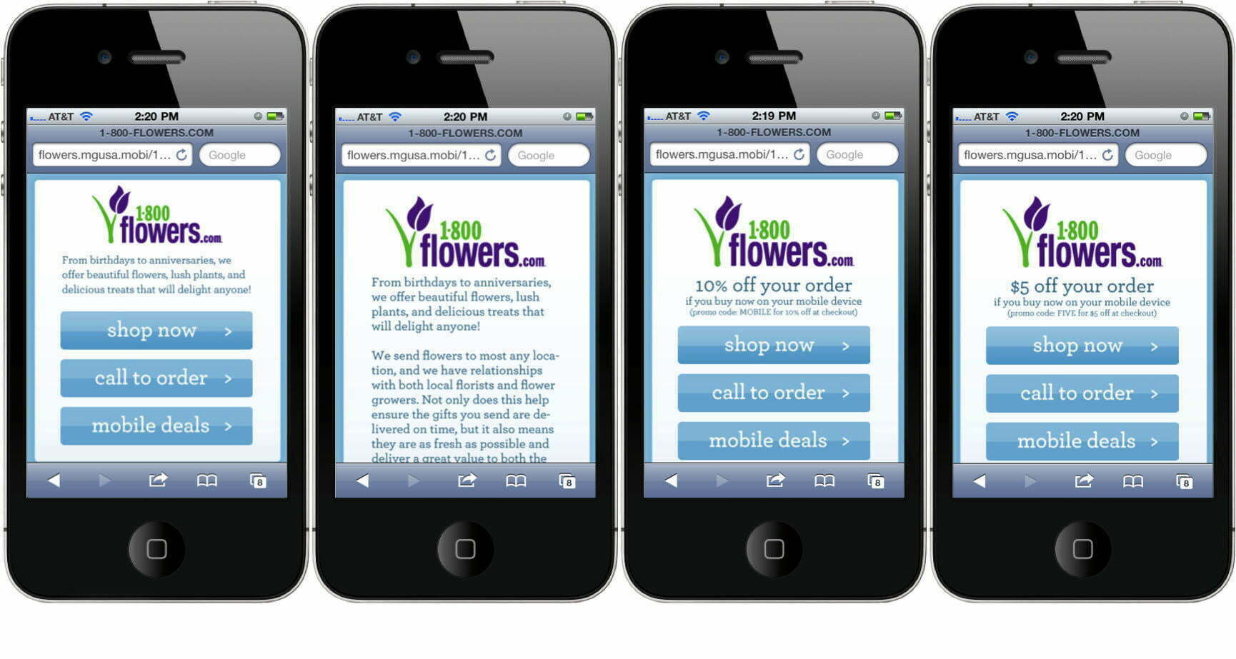
Which of the mobile landing pages above do you think would result in the highest conversions? It’s definitely not going to be the second example, which features far too much text and no clear call to action. The first page is better, but could still benefit from less copy. The third and fourth pages are ideal, as they both feature several clear calls to action, and an added incentive for visitors – either 10% or $5 off their order. Now would probably be a good time to order a bouquet of flowers as a peace offering for accidentally deleting the season finale of “The Bachelorette” from your significant other’s DVR, right?
Use A/B testing extensively when creating mobile landing pages. Start with major variations before refining your changes at increasingly granular levels. Don’t limit yourself to just A/B testing mobile landing page layouts – experiment with the phrasing of your calls to action and customer incentives, too. Try to write copy in the voice of the customer. Even small changes can have a big impact on conversion rates.
3 examples of great mobile landing pages
To wrap up this guide to mobile landing pages, let’s look at three examples of companies who are delivering awesome, helpful site experiences to their mobile visitors.
Geico
Talk about minimal! The main reason I love this mobile landing page from Geico is the fact that there’s so little going on. Everything on the page is necessary, and there’s absolutely nothing I would consider a distraction. Thanks to the minimalist design, the value of becoming a Geico customer is communicated clearly and immediately: you’ll save money.
Plus, they couldn’t make it any easier for mobile visitors to convert. The only information you need to enter to get a quote is your ZIP code, and the call button enables you to connect with a representative with a single click.
Plated
Although this mobile landing page from Plated is a bit busier than the Geico example, I’m still a fan of it. The best feature, by far, is the discount offer. With a prominent “Save $80!” CTA button at the heart of the page, Plated makes it super enticing for their mobile visitors to convert.
The information bar at the bottom of the screen is great, too. No matter what kind of information you’re looking for, Plated enables you to access it with just a single click. Plain and simple, that’s great user experience.
Zoho
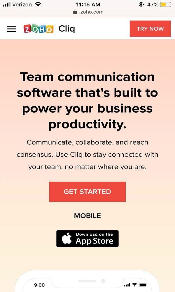
The last mobile landing page example we’ll look at is this one from Zoho. First things first—that’s a killer headline at the top of the page. It tells you exactly what you need to know and nothing more: “We sell team communication software. It makes you more productive.”
Additionally, giving mobile visitors the opportunity to immediately download the app is smart user experience design; Zoho doesn’t make you change devices to get started with the software. Remember what those stats from the beginning of the post told us: offering a good mobile experience is essential to winning new business.


