For even the babiest of websites, the list of things that work together to make it tick is long and complicatedly specific…

$1 off $8 Benadryl brand tab form bought on a Wednesday only if sunny
…like, say, a CVS receipt. But unlike said receipt where you can take the extra bucks and leave the rest, everything in a website audit checklist is important (if you want traffic and customers).
Where do you even start? To keep you from going insane, I’ve organized a complete website audit into one epic checklist with six clear-cut phases in this free Google Sheet template 🙌 .
This is the last website audit checklist you’ll ever need (at least for a while). Let’s take a look at how it’s organized.
Contents
- Master website audit checklist
- Website audit tools
- The light website audit
- The SEO content audit
- The technical SEO audit
- The design/UX audit
- The accessibility audit
- The conversion rate optimization audit
Here’s your master website audit checklist
This website audit checklist spreadsheet supports each of the steps I cover in this guide.
Don’t worry, it’s separated into sanity-saving tabs in the sheet.
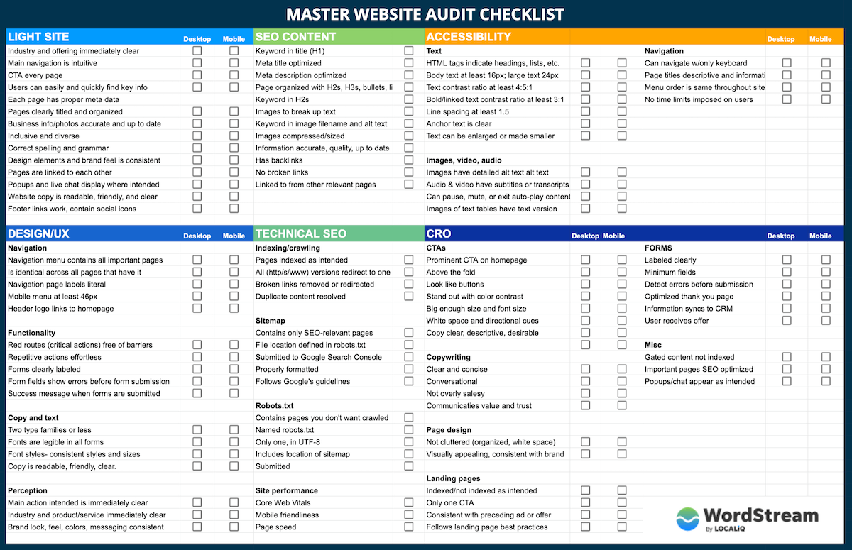
See full-size image | Go to sheet
Here are your website audit tools
So this question is erroneous. No one tool can do it all, and at the end of the day, you’re going to need a mix of tools. This mix will depend on the size of your website and overall audit goals, but here’s a general list:
- Your CMS: You’ll of course need access to the backend of your website (WordPress, Squarespace, etc.) so you can check and adjust metadata, HTML tags, links, and the content itself.
- A mobile device: You’ll need to do some manual testing in this audit.
- Google Analytics: This will help you identify which pages to audit, based on traffic and goal performance. It will also be necessary for gathering any SEO metrics you want to use, prioritizing action items, and measuring improvements. (Google shows you how to connect your site to GA here. But if you’re only just getting connected now, off on the SEO portion of the audit for about a month so you can give Google time to collect data.)
- Google Search Console: GSC is essential for both the content and technical SEO audit. You’ll also need it for requesting pages for reindexing after you’ve fixed them, submitting sitemaps, and more.
- Page speed calculators: Google’s PageSpeed Insights and GTMetrix are great.
- Image compressor: Tinypng.com is my go-to, but you might also need a gif compressor like ezgif.com
- SEO software: If you’re going to look at deeper SEO metrics like backlinks, competitive information, and keyword data, you’ll need a tool like Ahrefs, Moz Pro, Screaming Frog, SEMrush, etc. Some of these offer free trial versions or free services for the first 500 (or something) links. You can learn more about these in my round-up of the best keyword research tools.
- Accessibility audit tools: For the sake of this audit, something like WAVE or webaccessibility.com should do the trick.
- Website graders: Grader tools offer a little more guidance. With SEO software, you oftentimes need to know what you’re looking for and how to make sense of the [copious amounts of] data and information. That’s not a bad thing, but for non-SEOs, website graders can simplify things and tell you what the results mean.
For example, our free website grader helps you to make sense of each item in the report, with prioritized results and an expandable “why this matters” and “how to fix this” tab for each element.
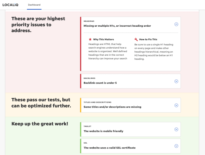
Head here to get a website audit with our free website grader tool.
How to do a website audit without going insane
You can do these in order, jump around, or mix and match.
- Light site audit
- SEO content
- Technical SEO
- Design/UX
- Accessibility
- Conversions
1. The light website audit
Let’s say your website is a house and a person jogging on your street needs to use the bathroom. Would they choose your house? Feel comfortable? Have any trouble finding or using the bathroom? These are the shoes to put on for your light website audit.
This audit has a little bit of everything from each of the subsequent phases and applies them to just the core pages of your site (home, about, products/services, pricing, contact, etc). It’s a nice warmup round, designed to catch any glaring errors or easy fixes you can get out of the way first (and prevent you from going insane).
- Points of focus: obvious errors, first impression, accuracy of company information, intuitiveness, brand feel.
- Pages to audit: main navigation and footer pages; a sample search results page, landing page, and blog post; your 404 page.
- Tools needed: your CMS, a mobile device.
Light website audit checklist
Remember to check these elements on both desktop and mobile, and if you see any issues, check to see if they’re present on other browsers as well.
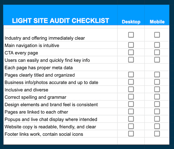
- It’s immediately clear what industry you’re in and what your business does.
- Main navigation is intuitive.
- Each page has a call to action.
- Users can easily and quickly find key information.
- Each page has a proper meta description and meta title.
- Pages are clearly titled and information is organized.
- Business information and photos are accurate and up to date.
- Photos and graphics of people are inclusive and diverse.
- Correct spelling and grammar.
- Design elements and brand feel are consistent.
- Pages are linked to each other.
- Popups and live chat display only where they should.
- Website copy is readable, friendly, and clear.
- Footer links work, contain social icons
Light website audit template
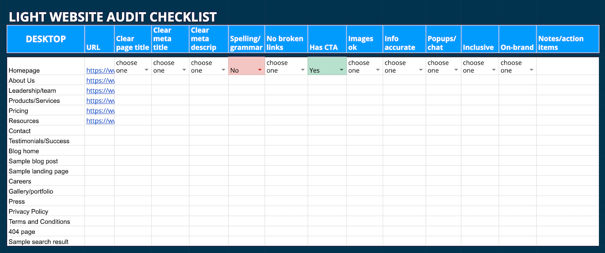
Here’s what the light site audit tab looks like in your template. You’ll see the same blue row repeat for the mobile version of the audit.
Go to the Google sheet (Note: this is the same link throughout the post, as every tab is in the same sheet.)
More resources to help with your light site audit
- 9 About Us Page Examples (+How to Create Your Own)
- Content Readability: 5 Mistakes Your Plugin Won’t Detect
- 7 Ways to Write More Engaging, Compelling Website Copy
2. SEO content audit
Alright, now step out of your random runner shows and into your appraiser shoes. An appraiser determines the value of a home based on its condition, quality, age, and more. From an SEO standpoint, both Google and users are your appraisers, so you’ll want to have a Google shoe on one foot (Converse?) and a user shoe on the other (Crocs?).
In literal speak: Google wants to provide only the most accurate and reliable search results for its users (expertise, authority, and trust, or EAT). Your SEO content audit here covers the quality and relevancy of your content as well as how well you convey both of those to Google.
- Primary focus: keyword targeting, content quality, links
- Pages to audit: highest-trafficked pages/blog posts; highest value pages/posts, pages with significant traffic drops.
- Tools needed: CMS, Google Analytics, SEO or keyword research tool, tinyPNG, Google Search Console (optional)
SEO content audit checklist
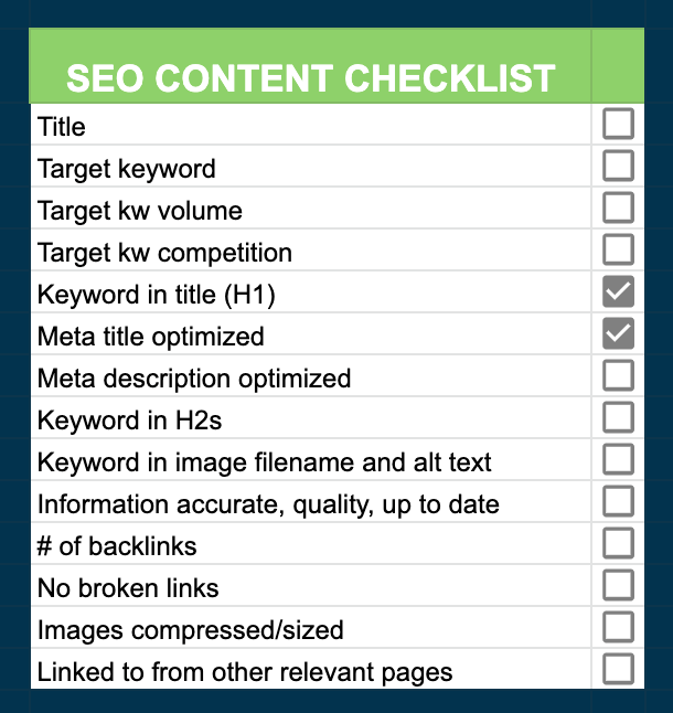
- Traffic: organic traffic (to prioritize pages or compare date ranges and check for significant drops/increases). See our SEO metrics guide.
- On-page keyword targeting: keywords in the meta title, meta description, H1, H2s, image file names, alt text, and [not stuffed into the] body content. We provide on-page SEO help here.
- Meta description and title: front-loaded with keywords, within character count limits, optimized for organic CTR (compelling and shows value). See our posts for help with meta descriptions and meta titles.
- Images: no broken images, file names contain keyword, alt text is descriptive and contains keyword, images are compressed and properly sized. Image SEO guide here.
- Quality: information is organized into clear sections, accurate, up to date, and thorough (not thin?). More on quality content here.
- Links: Links work, page is linked to from other relevant pages on your site. Link-building tips here.
- Backlink profile: Quantity/quality of backlinks (GSC can give you some information on this, but an SEO tool will give you deeper insights). Backlink tips here.
SEO content audit template
Here’s what the SEO content audit tab looks like in your template. Since SEO content optimizations are page-specific, the items to check are horizontal as you’ll have a list of pages to audit. And you might go insane if you had 14 lines for each page you have to audit.

Go to the Google sheet (Note: this is the same link throughout the post, as every tab is in the same sheet.)
More resources for your SEO content audit
- How to Do a Content Audit: The Definitive Guide (+6 Free Templates)
- The Easy 10-Step SEO Audit (+Free Tools)
- SEO Basics: The Complete Beginner’s Guide
- 9 SEO Copywriting Tips to Rank Sky-High
- A Guide to Creating SEO Content
- How to Rank for a Keyword in 10 Steps
3. Technical SEO website audit
Not only should your site have quality information and be trustworthy, but it also needs to provide that information quickly and securely and make it as easy as possible for crawlers to identify it as such. And to find your site in the first place. This is where the technical SEO audit comes in.
In our home analogy, this involves your contractor (is the house structured right?), plumbers and electricians (are wires and pipes connected to each other and to outside sources?), home inspector (is the home safe and secure?), and let’s throw the USPS in there too (can they even find your house?).
In other words, now it’s time to put both Google shoes on, but not Converse this time. Work boots.
- Points of focus: site structure, speed, security, and mobile-friendliness.
- Pages to audit: the whole dang site (then any problem pages that arise, and potentially also your highest trafficked pages).
- Tools needed: Google Search Console, PageSpeed Insights, GTmetrix, Copyscape/Siteliner, SEO tool
Technical SEO audit checklist
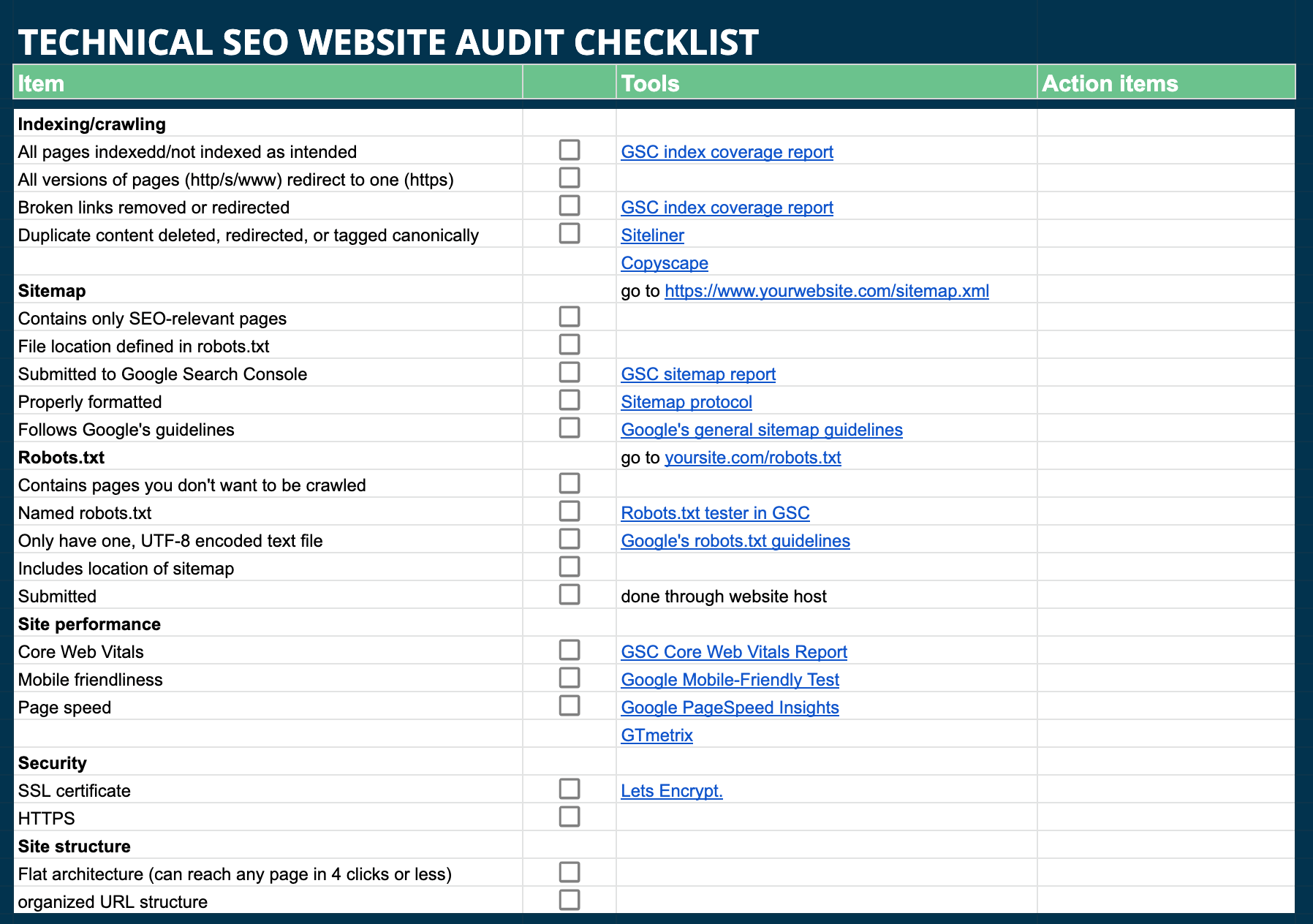
- Indexation: all (and only) intended pages are indexed without errors. Done through the GSC index coverage report. This will show you if you need to make any adjustments to your sitemap and robots.txt files
- Sitemap: (find this by going to yourwebsite.com/sitemap.xml); includes only the pages you want Google to crawl, is properly formatted according to Sitemap protocol, follows Google’s general sitemap guidelines, and its file location is defined in robots.txt. If you need to make changes, resubmit to Google through GSC sitemap report.
- Robots.txt: (find this by going to yourwebsite.com/robots.txt ); tells Google what pages not to crawl, is named “Robots.txt,” has only one version, follows Google’s robots.txt guidelines, and includes location of sitemap. If you make changes to this file, you’ll need to resubmit according to instructions from your website host.
- Core Web Vitals: An explicit ranking factor that encompasses user experience, page speed, and mobile friendliness. Audit your whole site through the GSC Core Web Vitals Report. Run problem pages through Google PageSpeed Insights and Google Mobile-Friendly Test to identify fixes needed. Once fixed, use GSC to validate fixes.
- Security: Also a ranking factor. Site HTTPS (vs HTTP)? You can get a free SSL certification from Lets Encrypt.
- Links: make sure any http/https and www variations of your website address all redirect to the https/www domain; redirect or remove broken links;
- Duplicate content: use Siteliner or Copyscape to identify and then delete, redirect, or resolve with canonical tags
- Site structure: flat architecture (users and crawlers can reach any page in four clicks or less); clean and organized URL and internal linking structure
Technical SEO audit template
Here’s what the technical SEO audit tab looks like in your sheet. You’ll notice it’s a vertical list as most of the steps are site-wide. Although you may want to create a column or separate tab for scores and results so you can benchmark and compare once you’ve made improvements.
Go to the Google sheet (Note: this is the same link throughout the post, as every tab is in the same sheet.)
Resources to help with your technical SEO audit
- How to Do a Technical SEO Audit in 6 Steps
- 5 Ways to Improve Your Core Web Vitals
- The Beginner’s Guide to Duplicate Content
- The Top 10 Google Ranking Factors
4. Design & user experience website audit
For the next three phases of your website audit, pack your bags because we’re going to evaluate our house as an Airbnb tenant. We’re not just looking and evaluating. We’re sleeping in the beds. Using the washer and dryer. Searching around for the spaghetti strainer.
In website audit speak, this part covers the functions and feels of the website for someone doing more than stopping in.
- Focus: visuals, navigation, functionality, perception.
- Pages to audit: all of ’em, with particular focus on main navigation pages, pages along your red routes (frequent and critical activities).
- Tools: CMS, eyes, a mobile device.
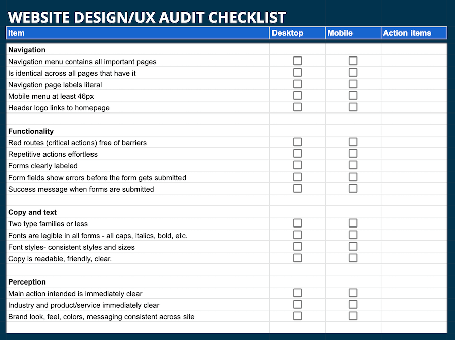
Design/UX website audit checklist
- Navigation: navigation menu is intuitive, consistent across pages, with literal labels; header logo links to homepage; mobile menu at least 46px.
- Functionality: red routes free of barriers; repetitive actions are effortless.
- Forms: clearly labeled, show errors in fields before submission; completion give a success message.
- Text: Two type families or less; fonts readable in all forms (all caps, italics, bold, etc.); font sizes and styles consistent across the site.
- Visual design: visual hierarchy clearly prioritizes the most important things for a visitor to know; elements other than color convey meaning, hierarchy, and function; whitespace around important elements to focus attention; clear contrast between foreground and background design elements; page layouts use existing design patterns; site has a favicon (so your logo shows in browser tabs).
- Perception: users can identify your industry and product/service immediately; can quickly intuit where to find key information; can perform key functions easily and quickly; buttons and links make it clear where clicking will take them; intended action on each page is clear; brand look and feel is consistent across the site.
Design/UX website audit template
Here’s what the design/UX audit tab looks like in your website audit template:
Go to the Google sheet (Note: this is the same link throughout the post, as every tab is in the same sheet.)
Resources
- 6 Tips to Choose a Stunning Website Color Scheme
- How to Use F & Z Patterns in Your Landing Page Design
- Use Design Thinking to Solve Your Next Marketing Problem
- How to Write a Content Style Guide in 6 Steps
- Website Maintenance Checklist
5. Website accessibility audit
Accessibility refers to making sure the information on your website can be consumed and understood by individuals with disabilities. For this website audit, we’re focusing on visual and hearing impairments, but a full accessibility audit should cover everything, including epilepsy, learning disabilities, cognitive impairments, and more.
- Focus: visual and auditory accessibility.
- Pages to audit: the whole shebang.
- Tools: accessibility audit tools like WAVE or webaccessibility.com, mobile device.
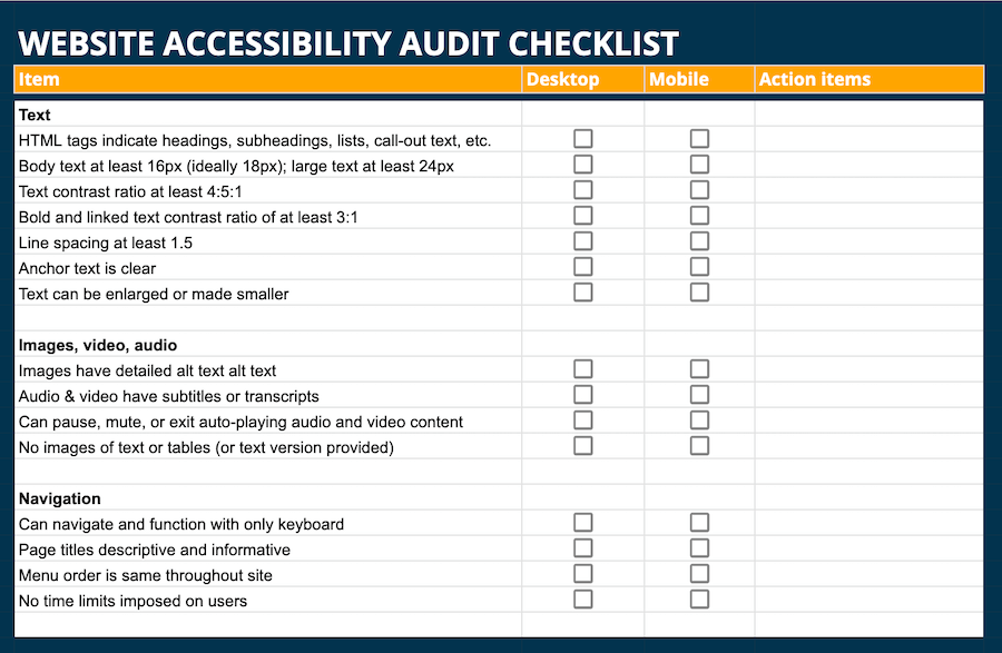
Website accessibility audit checklist
Note that W3.org and ADA.gov can provide a full list of accessibility tools and checklists. Here is our light list (for insanity prevention purposes).
-
- Text: HTML tags indicate titles, headings, subheadings, lists, call-out text, etc; body text at least 16px (ideally 18px) with contrast ratio of at least 4:5:1; large text at least 24px; bold and linked text has contrast ratio of at least 3:1; line spacing is at least 1.5; anchor text is clear and descriptive; text can be enlarged or made smaller
- Image, video, audio: Images have detailed alt text, audio and video have subtitles or transcripts; users can pause, mute, or exit auto-played content; images of tables or text are accompanied by the actual tables and text.
- Usability: Users can navigate and function on the site with only a keyboard; page titles are clear and descriptive; menu order is the same throughout the site; no time limits imposed.
Website accessibility template
Here’s what the website accessibility audit tab looks like in your template:
Go to the Google sheet (Note: this is the same link throughout the post, as every tab is in the same sheet.)
More resources to inform your accessibility audit
- How to Optimize Your Emails for Accessibility
- How to Implement Accessibility and Inclusivity in Advertising
6. Website CRO audit
Great news. You’ve made it to the final stage.
The BOTTOM of the CVS receipt. (The survey you’ll never fill out).
This, coincidentally has to do with the bottom of your funnel (well, all stages of it for that matter). Conversion rate optimization (CRO) is the set of practices designed to convert as many visitors to your website into customers and qualified leads. User experience, page speed, and information quality impact CRO, which is why it’s important to get the above audits taken care of first. But now it’s time to drill down even further into the details.
- Points of focus: ease of use, brand feel, trustworthiness, automation.
- Pages to audit: any page with a CTA (so…all of them), but prioritize navigation pages, red routes, top landing pages, top trafficked pages, high intent pages.
- Tools: CRM and automation tools, SEO software, mobile device.
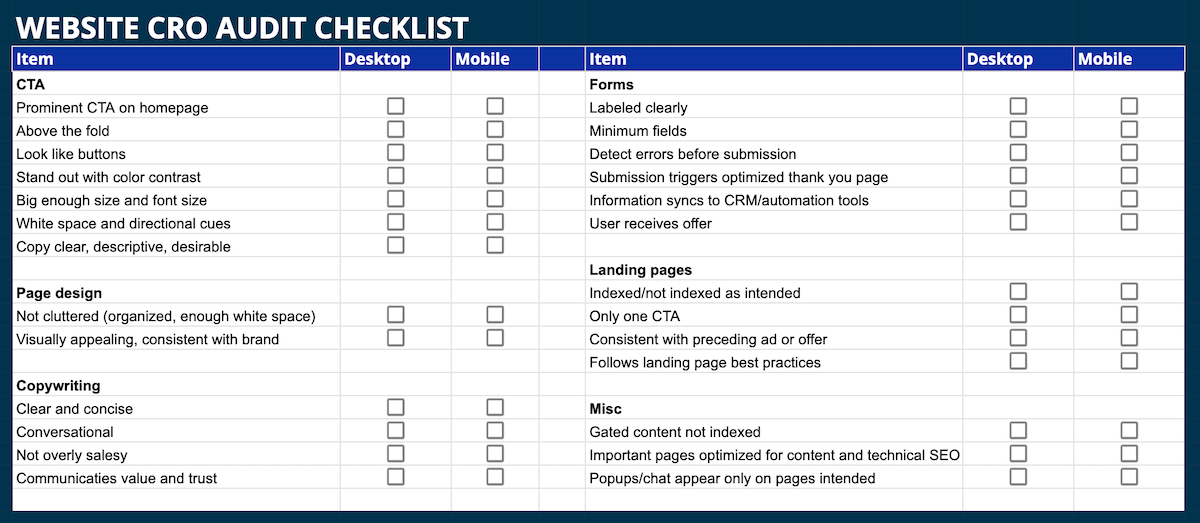
Website CRO audit checklist
There is MUCH more to consider for an ecommerce site, but (because insane), here are the core elements to hit:
- CTA: prominent CTA on homepage; CTA buttons look like buttons, stand out with color contrast, size, whitespace, and directional cues; are above the fold; (CTA best practices here).
- Copywriting: CTA copy is descriptive, and desirable; page copy is clear, concise, conversational, not too salesy, communicates value and trust (here’s how to write copy that sells).
- Page design: Not cluttered, well organized, enough whitespace, visually appealing.
- SEO: gated content is not indexed, important pages are optimized for content and technical SEO.
- Landing pages: indexed/not indexed as intended; only one CTA; consistent with preceding ad or offer (landing page best practices here).
- Forms: labeled clearly, organized, minimum fields, detect errors before user hits submit; submission sends thank you message or optimized thank you page, information syncs to CRM and other automation tools, user receives offer.
- Popups/chat: appear only on pages intended.
- Mobile: everything functions on mobile.
Website CRO audit template
Here’s what the CRO tab in your website audit template looks like.
Go to the Google sheet (Note: this is the same link throughout the post, as every tab is in the same sheet.)
Additional CRO audit resources
- 5 Critical Web Design Mistakes That Cost You Conversions
- 6 Powerful Ways UX Can Affect Your Conversion Rates
- Pop-ups vs Chatbots: Which Works Better for CRO?
- Ecommerce User Experience: 5 CRO Lessons from Amazon
Get started with a free website audit
So hopefully you didn’t end up going insane. With these lists and templates as well as what each item means and the resources and tips to take care of them, you are now well-equipped to do a website audit. As mentioned above, you can also get a free website audit with the LocaliQ Website Grader.
To go to our free website grader click here and get an instant audit on your SEO and online presence.

