Did you know that 44% of B2B clicks are directed to a home page, instead of a dedicated landing page?
That’s a big problem, because landing page relevance and performance is a key ingredient in your Quality Score (the single biggest factor in determining your results and costs).
Sending paid traffic to unoptimized landing pages is like scarfing down a Big Mac on your way to the gym. You’re undermining your own efforts, forcing yourself to work twice as hard (or spend twice as much) just to see a miniscule return.
But if you can fix these five common landing page mistakes, you can stop these problems dead in their tracks and start seeing the results you deserve.
Landing Page Mistake #1. Slow Page Speed
Headlines? Sure. CTA’s? Makes sense.
Buy why speed first?
Because believe it or not, speed has probably the single biggest impact on landing page performance.
Don’t believe me?
If a page fails to load within 5 seconds, 74% of people are bailing.
It gets worse for eCommerce sites. Only a little 3 second delay could lead half your traffic to bounce. That’s why some top brands load pages in less than a second!
Unfortunately, it doesn’t matter how valuable that landing page offer is if peeps don’t stick around long enough to see it. Especially on mobile (which has outpaced desktops for internet usage), and over multiple pages during one conversion event.
Here are a few quick tips to make landing pages blazing fast.
Test Your Page Speed
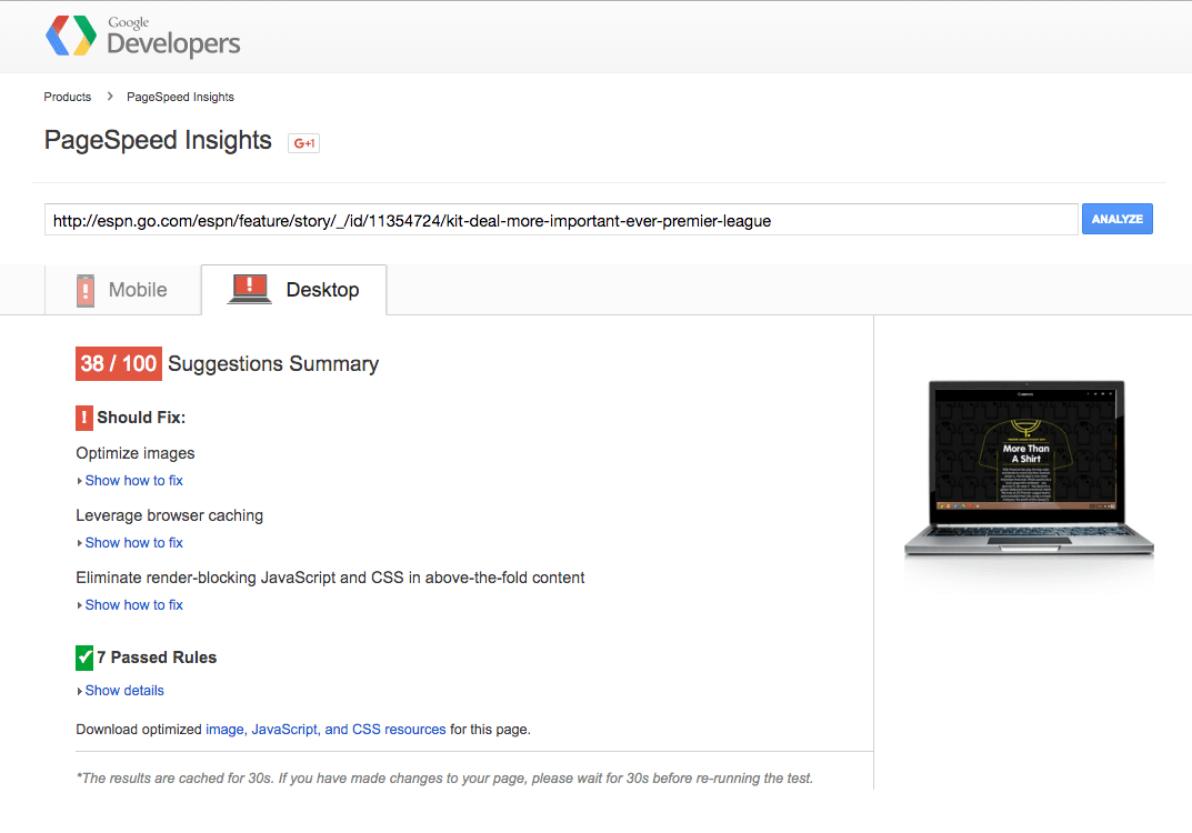
Fire up Pingdom or Google’s PageSpeed Insights tool to quickly get a sense for how quickly (or, not) your pages are loading on desktop and mobile. You’ll also get some recommendations for specific fixes, like which images need to be optimized.
Clean Up Your Code
The best landing pages are clutter-free and well-organized. We’ll get to this more in the next section. But for now, keep in mind that the same holds true for what’s under the hood too.
Clean code, free of extraneous junk, is the quickest way to achieve fast loading times (see what I did there?).
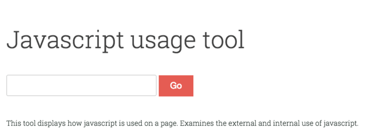
That means take it easy on excessive use of Javascript or Ajax, remove unneeded sections and tags, etc. If you must use Javascript, use Varvy’s Javascript Usage Tool to make sure you’re loading other content first (per Google’s recommendations).
Minimize Redirects Where Possible
Using 301 redirects IS the SEO-friendly way. ‘Cept when they get excessive, bogging down your server.
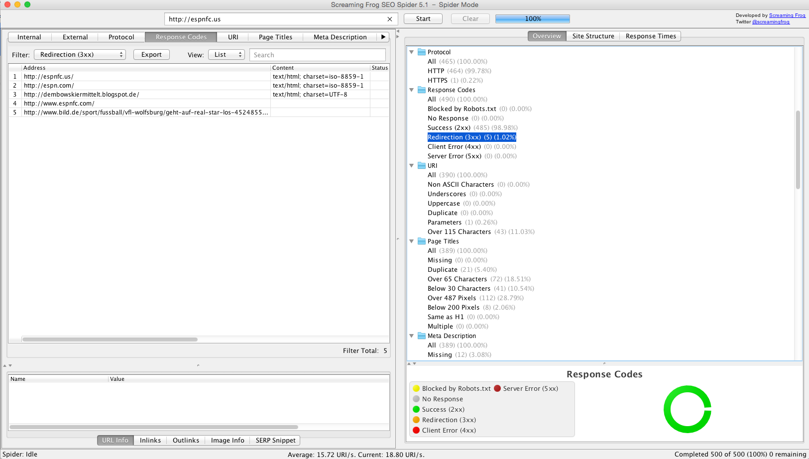
Download and open Screaming Frog, dump in your URL, and it’ll highlight your redirects pointing to redirects pointing to redirects (that commonly occur as sites evolve over a few redesigns).
Resize and Compress Images
Your use of visuals (both images and video) on a page can also substantially impact loading times.
If possible, always host larger files (especially videos) externally (assuming of course your main priority here is conversions and not SEO). With options like Wistia, why would you ever use another method?
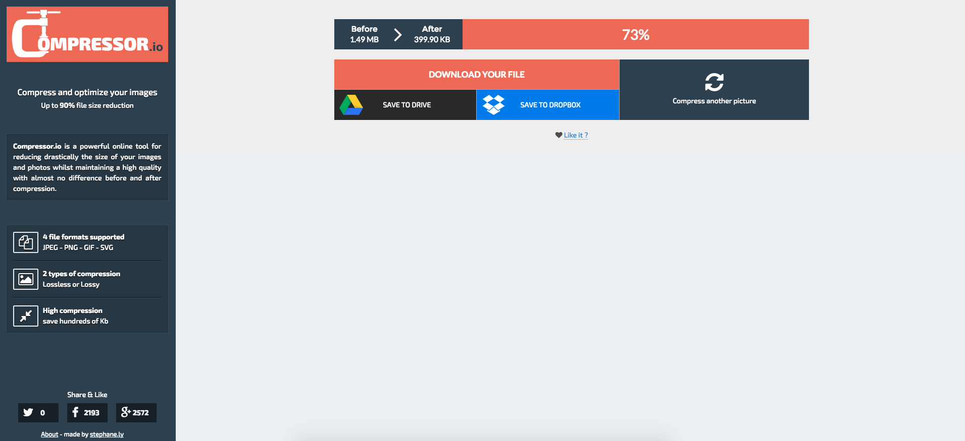
Otherwise, always resize images prior to upload (so you’re not forcing 3000+ px down to 600px every time the page is loaded), and use an image compressor like Compressor.io (get it?) if possible.
Upgrade Your Hosting
Nothing kills load times faster than shared hosting splitting up resources across multiple sites. Just say NO to cheap hosting.
If you’re using WordPress to deliver landing pages, upgrade to managed hosting with Kinsta, WP Engine, or Pagely and let them take care of the heavy lifting.
For more reading on Page Speed, check out Kinsta’s in-depth guide on the topic. Or just forward it to your technical help to take care of the rest. Those Mai Tai’s at Happy Hour today aren’t going to drink themselves!
Landing Page Mistake #2. Cluttered Design
Want to hear some depressing news?
48% of landing pages contain multiple offers.
Even worse?
Only 16% of landing pages are free of navigation bars.
Why is that bad? Because when landing pages are focused and have the navigation removed, companies can see a 100% improvement. One hundred percent!
Browse any list of the top resources on good landing page examples, like this one or this one and one thing quickly stands out: They’re all clean, well-organized, and clutter free. They’re laser-focused on one (only one!) action, making sure people know exactly what to do on each page.
One of the best books on usability is called Don’t Make Me Think. With a title like that, you can probably already guess what it’s about. Basically it says the best way to make websites easier to use (and more enjoyable) is to make things so simple and obvious that visitors don’t have to think.
Just like this HubSpot example:
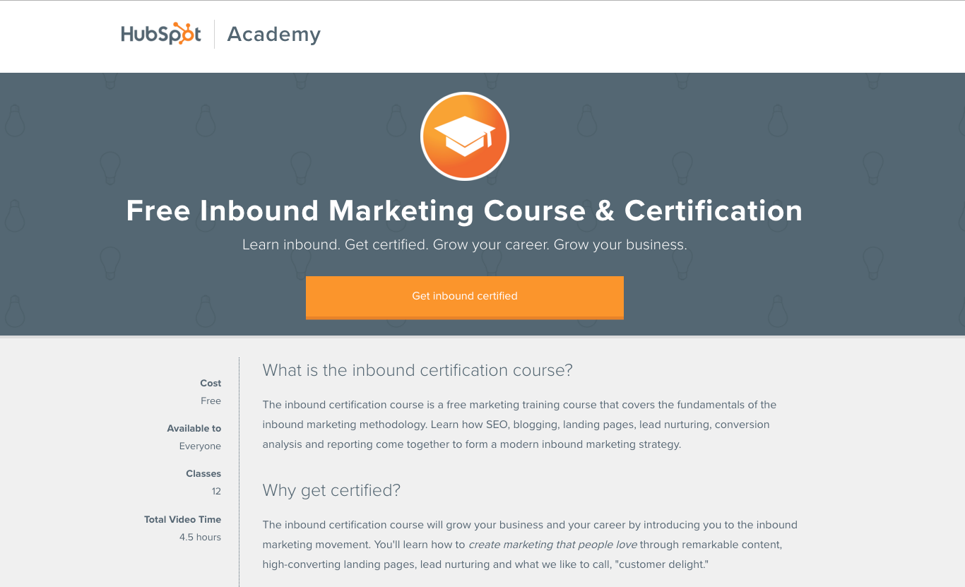
The primary headline is big and bold. The enormous orange button can’t be missed. There’s no navigation to distract users away from this page. And the copy is organized so it flows logically and is easily scannable (even though there’s a lot of it).
Or how about this homepage from MailChimp?

Admittedly they do have navigation. It’s a homepage after all. But the rest of the page is zen personified. Beautiful imagery centered on the page to draw your attention to where the page objective lies. Only one simple sentence of copy. A red button that stands out, letting you know what to do next.
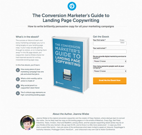
The best landing pages also follow a ‘template’ of sorts (neatly summarized in this Kissmetrics infographic). You have the primary headline, the hero image, the benefits, the social proof (boosting credibility of your claims) and the CTA. This Unbounce one is a textbook example.
Here’s where behavior tracking tools like CrazyEgg prove useful, helping you uncover what people are (or aren’t) consuming on a page.
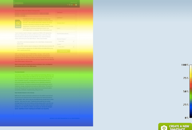
Historically, ‘brand aware’ traffic to a short, concise page is ideal. While cold traffic (from paid sources perhaps) needs a longer, more in-depth explanation. But you never know, until you test it yourself. The Scrollmap view (above) can give you an indication if people are dropping off, and how to adjust the page accordingly.
A simple, clean landing page that’s free of distraction is the antidote to help visitors avoid analyzing or hunting around, enabling them to grasp a page’s substance (and what they should do next) in only a few milliseconds.
Landing Page Mistake #3. Limp Headlines
Great headlines expertly summarize a complex value proposition in a few simple, jargon-free words. They’re the first impression people get when they see it scrolling through their News Feed or popping up in their email inbox.
Want better headlines for your landing pages? Here’s all you gotta do…
First, get your hands on a copy of Headline Hacks.
Second, pause to admire the exceptional headline employed on said page.
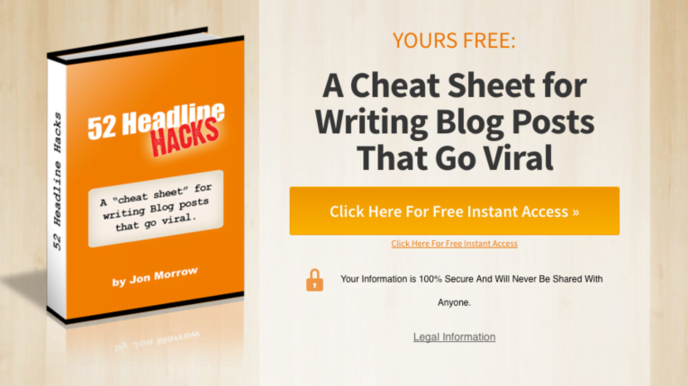
Third, read through it cover to cover to discover what differentiates the most effective headlines (hint: it has to do with age-old, primal motivations).
Fourth, start becoming mindful (what is this, a new-agey meditation article?!) of the templates all around you used by the best in the business.
Like BuzzFeed.
Yes, I just rolled my eyes too. Little did I know those words would leave my lips years ago when shelling out big bucks for an MBA. Their content might be crap, but the headlines are gold. Peep this one:

It would be easy to use a generic word like ‘rare’, but instead, BuzzFeed expertly uses specificity to their advantage by calling out the exact number (thereby boosting credibility and doubling down on intrigue).
Or how about this one:

In this case, they’re promising a simple solution to a difficult problem. ‘Cheat sheets’ implies a ‘hack’ or a simplified, step-by-step blueprint that people can follow (thereby promising simplicity for overworked people with busy lives).
Now notice how a similar template pops up on a HubSpot landing page.
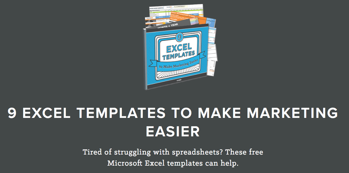
The headline formula goes a little something like:
- [#] of [Helpful Done-For-You Tool] to [Make Difficult Thing Easy]
The best headlines do one of two things:
- Deliver pleasure (you know, in a strictly G-rated way)
- Take away pain
The first references the goal of simplicity or zen touched on in previous examples. People are busy – overworked, overstressed and overcommitted. Giving them a simple, pain-free solution (that ideally does the work for them) is an effective way to pique their interest.
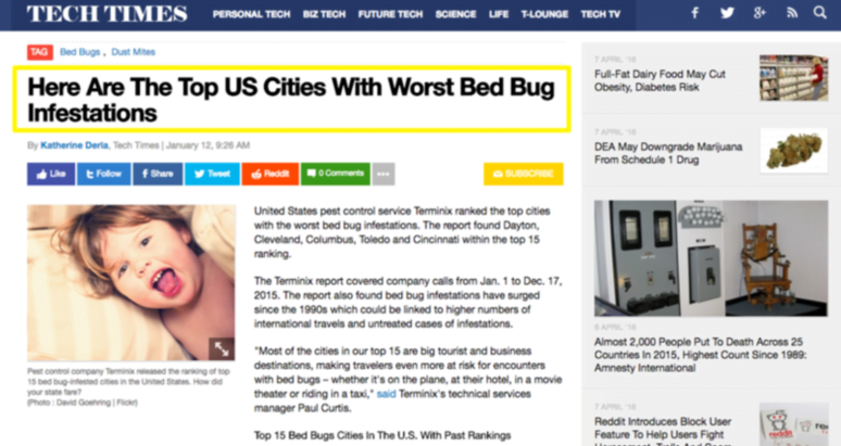
The second delves more into negative messaging, which can result in a 63% click through rate lift over more positive ones.
Negative headlines include those that help people protect themselves from external threats. Like bed bugs. Which are disgusting. And seemingly EVERYWHERE!
Negative messaging can also help people save themselves from… well, themselves (pointing out how to fix internal mistakes they’re already making). Example? This very article you’re reading.
For more headline examples, check out this great list from CrazyEgg that covers some additional copywriting classics used for decades like:
- What (Group or Celebrity) Can Teach You About (Industry)
- The Ultimate Guide to [Blank]
- X Little Known Factors That Could Affect Your [Blank]
Landing Page Mistake #4. Irrelevant Visuals
Stock photos are worst. Not just because they’re ridiculously overpriced. But because they don’t work.
Using people in real photos (instead of stock ones) can result in a 35% conversion increase.
For best results, the visuals on each page should:
- Show off your product or service in use (or in context)
- Give people an example of what they’re going to get
- Show the before and after transformation
- Highlight that ‘after’ end result so people can project themselves into it
Top athletic brands do this extremely well, like this example from lululemon:

They’re showing the product in context of use, which is excellent. The high quality, original photography also helps create a mood and set a tone that perfectly matches the words used in the headline and subhead. Together, it makes a powerful statement that resonates immediately.
If you think back, Nike has always been a trailblazer in showing their products in use like this, with all of their commercials incorporating a mix of product usage, humor, and storytelling.
That’s the ideal. The lofty goal. But even on a small scale, effective images should help people understand what they’re going to get. Especially when it’s intangible.
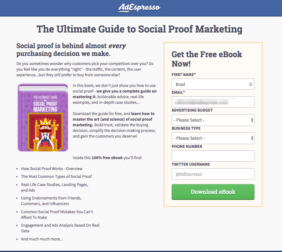
This eBook landing page from AdEspresso uses a simple illustration to show people what they’re going to receive after entering their information in the form on the right. That’s important because it gives the offer substance, increasing the perceived value by boosting credibility.
The next example you should emulate is on the RightSignature home page.
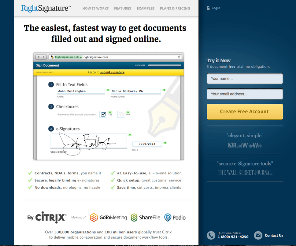
Sure, the image you’re looking at above nicely depicts how electronic signatures might work. But to truly appreciate this visual, you need to see it with your own two eyes. (Go ahead, take a look. I’ll wait).
What you get is a little visual demo, a live walk-through, showing viewers exactly how the service works. It’s the perfect way to remove ambiguity and doubt, alleviating fear of wasting your time in starting a trial.
Sidenote: This homepage also follows the landing page format outlined earlier. Study and follow: Bold headline. Great visual. Benefits with check marks. Social proof with logos and quotes. And an eye-popping call to action.
Which brings us to…
Landing Page Mistake #5. Generic Calls to Action
It all comes down to this.
The page was lightning fast, up in under a second. It was clutter-free and jaw-droppingly-beautiful. The headline neatly conveyed how unique your offering truly is. The visual instantly depicted how people can benefit.
Now, it’s time for the call to action to grab their details.
Only question is… where should you put the thing?
Your CTA positioning is a small but crucial detail to help it stand out from everything else on the page.
The previous RightSignature example above highlighted this perfectly, similar to how the most recent Basecamp one looks too.
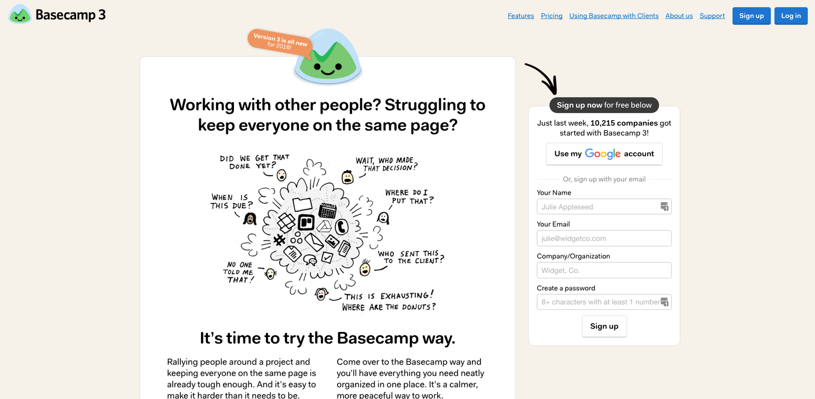
Both RightSignature and Basecamp locate the primary page CTA in the right sidebar, above the fold. RightSignature uses a different color background to help set it apart. While Basecamp uses different color shading as well, in addition to a helpful little arrow that brings your eye-line from the headline over to the CTA.
The other key to this positioning is through the liberal use of whitespace to help focus attention on the page element that truly matters.
For example, this landing page from HighRise uses whitespace around the copy-based elements to provide a nice ‘buffer’ around the primary action on the page – clicking that ‘Try Highrise’ button!
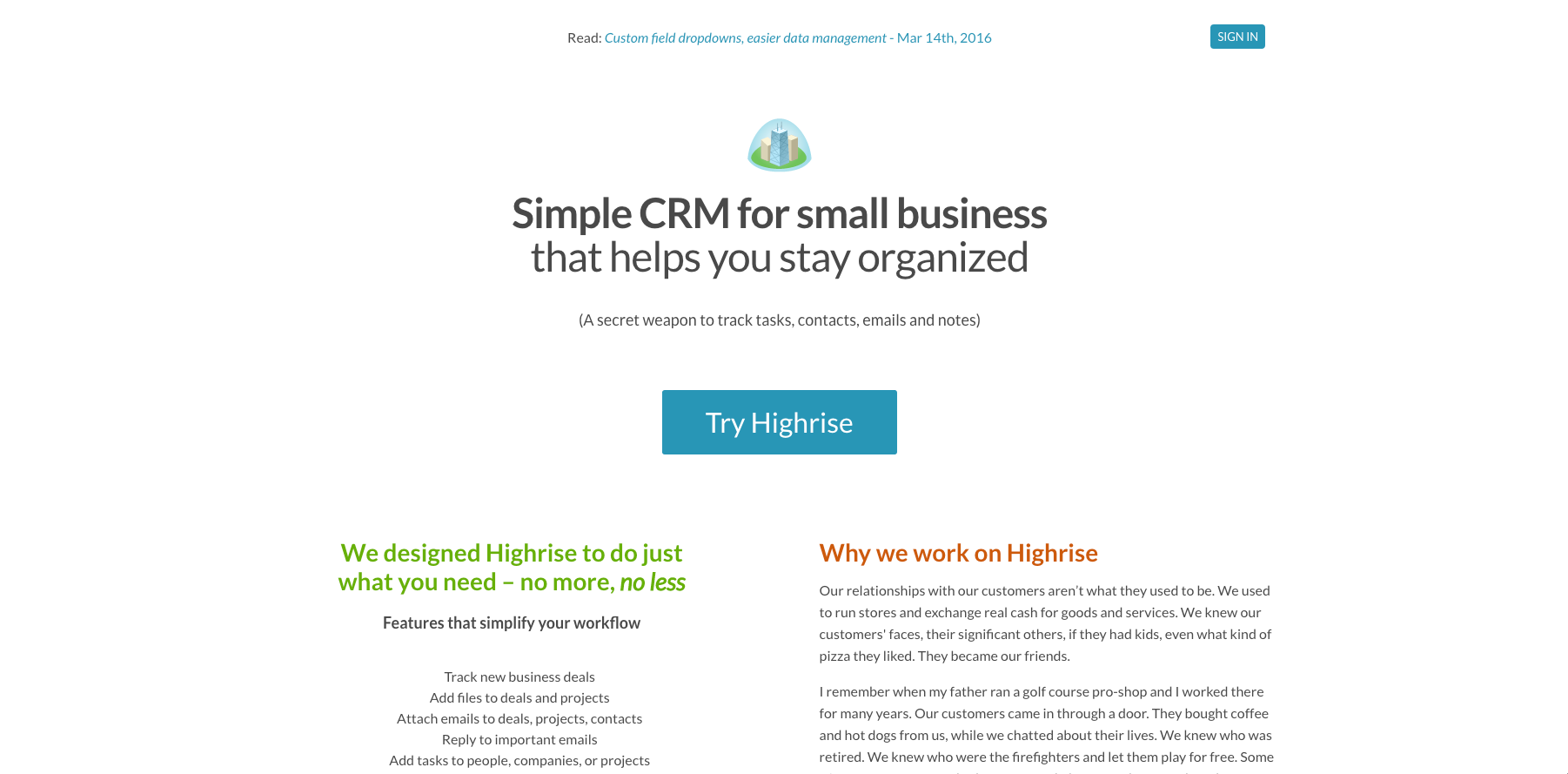
The word choice in the CTA matters too. The Highrise example is more relevant than a cliched alternative like “Sign Up.”
And as we’ve seen so far, relevancy and specificity lead to better results. In this case, a 213% increase.
You can take relevancy to the next level by aligning your headline and CTA verbiage, which CopyHackers saw resulted in a 123.9% click lift.
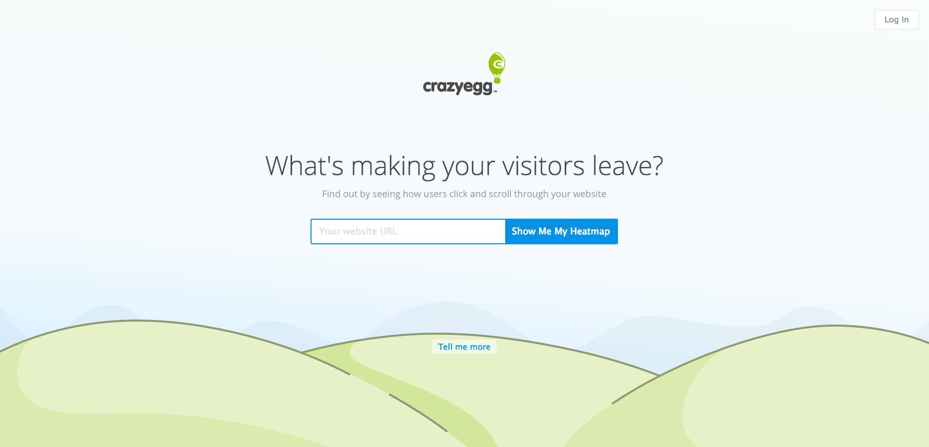
CrazyEgg does this by using the primary benefit or use case as the CTA copy, re-affirming what you’re going to get when dropping in your URL. And they make it BIG, with the CTA taking up nearly half the page.
Sidekick (below) incorporates all the elements discussed so far. They also match the action-oriented language used in the button to the promise delivered by the headline.
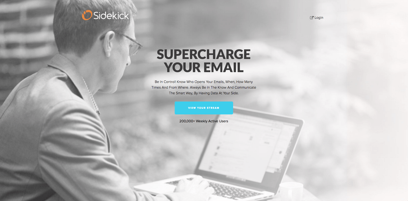
Another subtle trick used in this Sidekick example is the click trigger underneath the button. That’s the tiny line showing how many other users are happy customers, and it adds a final touch of social proof to alleviate concerns people might have when deciding whether to click it or pass.
TL;DR
The best offer in the world won’t convert if people don’t stick around long enough to check it out. Slow loading pages are conversion-kryptonite, turning away visitors in droves with each lagging second.
Cluttered designs with mixed messages can confuse visitors and distract them from the primary goal on the page.
Generic headlines don’t capture or convey why people should care about your offer in the first place.
Irrelevant images fail to inspire or motivate people to take that critical first step towards fighting inertia. And uninspiring calls to action leave visitors with doubts or insecurities right at the moment of truth.
Optimizing your PPC budget is a great start. But fixing these common landing page mistakes is the other side of the coin, heavily influencing your campaign’s performance and how much you’re spending (or wasting) in the process. So make sure you’re not guilty of these all too common mistakes!
Are you wasting money in Google Ads?

Meet The Author
Brad Smith
Brad Smith is the founder of Codeless, long-form content creators for SaaS companies. Their work has been featured in The New York Times, Business Insider, TheNextWeb, Shopify, Moz, Unbounce, HubSpot, Search Engine Journal, and more.
Recommended for you