Remember when you were a kid and bowling was fun? That’s because you had the bumper lanes. All you had to do was pitch the ball down the lane and watch. The ball was pretty much guaranteed to hit at least one pin; it was just a matter of which one and how many.
Fast forward to your adult days and the ball is going into the gutter left and right.
Switch over to your business and marketing without landing pages is like bowling without the bumper lanes—a pretty unpredictable and oftentimes frustrating experience (unless, of course, you’re a professional).
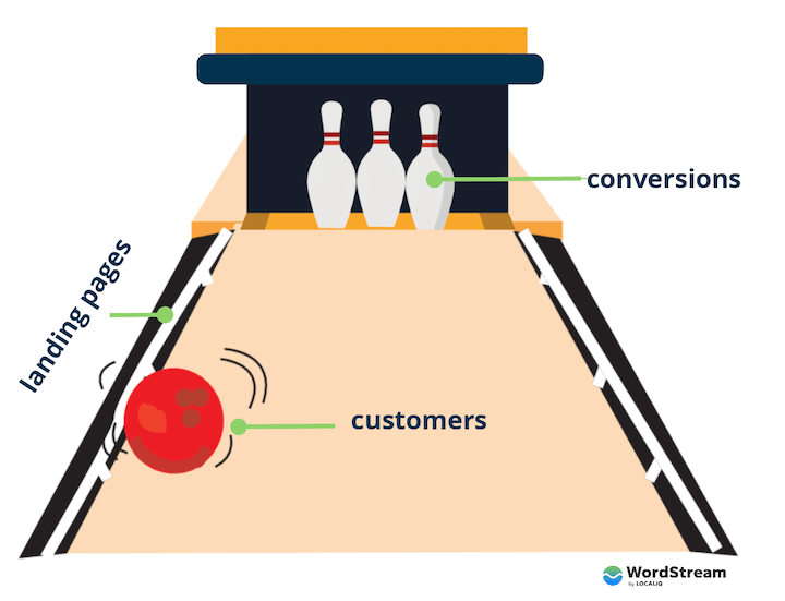
Landing pages serve as the guidance your customers need to stay on track with converting—with hitting those pins. You need them if you want to reach your marketing goals; if you want marketing to actually be fun. So in this guide, we’re going to cover everything you need to write great landing pages for your business and optimize them for conversion.
Table of contents
- What is a landing page?
- Why are landing pages important?
- Websites vs landing pages
- Types of landing pages
- Before you create a landing page
- How to write a great landing page
- Landing page optimization
- Landing page examples
What is a landing page?
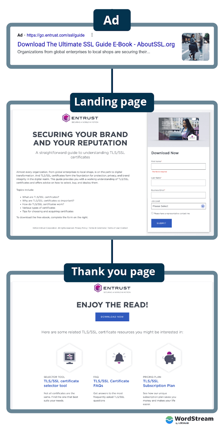
A landing page is a page that a visitor arrives (lands) on after clicking on a call to action (CTA) for an offer. The offer can be anything (a product, coupon, free guide, or a demo, for example) and the CTA can be anywhere (like a Google ad on the SERP or a newsletter signup button right on your homepage).
A landing page is specific to the offer and provides more details the person needs in order to make a confident decision.
Why are landing pages important?
Landing pages aren’t just important—they’re essential. They’re designed to improve conversion, which is ultimately one of your most important metrics. How so? Well, if someone clicks on an ad for your product and lands on your homepage, they’ll have too much information and too many choices for actions.
But if they are brought to an effective landing page describing the features and benefits of that product only, with a button or form to obtain that offer right there, think about how much more likely they are to convert. This means that landing pages lead to:
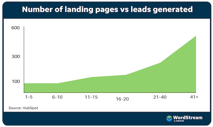
- More leads and sales: Higher conversion rates mean more purchases, sign-ups, free trials, you name it. In fact, businesses with more than 30 landing pages generate 7x more leads than those with fewer than five.
- Higher ROI: Whether you’re spending on ads, your website, email service, or something else, you’re getting more results for the same price— just by changing the URL the visitor goes to.
But it doesn’t just stop there. When you optimize your landing pages using the tips in this guide, you:
- Increase brand credibility: Whether it’s influencer endorsements, partnership badges, reviews, or stats, the trust signals you use on your landing pages build your credibility, regardless of whether the user actually converts.
- Create a memorable experience: Because landing pages are specific to an offer and even the user, the copy, imagery, and messaging are highly customized, making for a personalized and memorable experience.
In short, landing pages provide a quality experience for visitors and drive conversions using targeted messaging that matches each user’s needs.
Landing pages vs. websites
Understanding the difference between a landing page and a website can be confusing since there are different ways to create landing pages for your business. Some businesses create landing pages using their website builder (like SquareSpace) or content management system (like WordPress). In this case, the landing page is a page on your website; it lives on your website’s domain.
Other businesses use marketing automation (like Marketo, for example) to create landing pages. In this case, the landing page isn’t actually part of your website’s domain, but lives on a subdomain. So instead of the landing page being at website.com/ebooks/beginners-guide-to-saas, it might live at, say marketing.website.com/beginners-guide-to-saas.
While your website contains all of the information about your business, a landing page contains only the information specific to a particular offer.
Types of landing pages
There are as many types of landing pages as there are offers. There are event landing pages, webinar landing pages, product landing pages, newsletter signup landing pages, and more. But in general all landing pages fall into two categories: lead generation landing pages and click-through landing pages.
Lead generation landing pages
With lead generation landing pages, the offer is not your final product or service, but something higher up in the funnel, like gated content. By providing their contact information to obtain the offer, the visitor becomes a lead that you can now follow up with, via phone or email, to nurture through your funnel into customership.
Lead generation landing pages contain a form right on the page for the user to request the offer. Upon filling out the form, they are brought to a thank you page that confirms the next steps—such as that a person will reach out to you, that the guide has been sent to your inbox, or that you can click on a button to download the file.
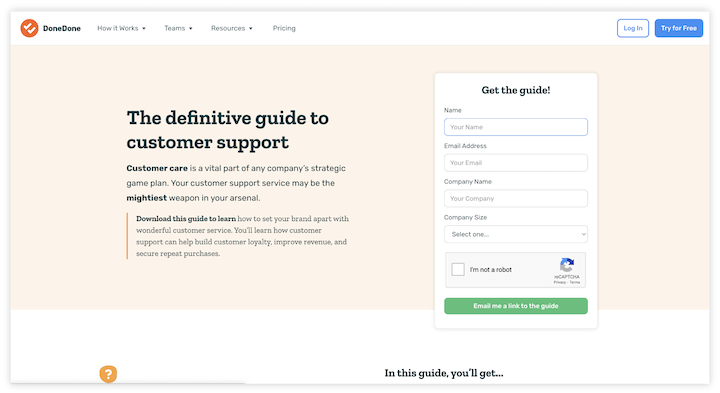
Lead generation landing pages are most commonly used by B2B businesses or those that have big-ticket items, as well as by ecommerce businesses looking to build their email list.
Click-through landing pages
With click-through landing pages, there is no form on the page. The page is dedicated to explaining the features and benefits of the offer, and when the user clicks on the CTA button, it leads them to a new page where the user obtains the offer. Click-through landing pages are typically used for bottom-funnel offers or sales, where the second step is the account creation portal, app store, or checkout window.

Click-through landing pages are commonly used by ecommerce and SaaS businesses, but anyone can use them.
Before you create a landing page
Now that know why you need landing pages, it’s time to start creating them. But before you start cranking out those 41+ landing pages to get those 600 leads, you have some homework to do. In order to make these pages purposeful, impactful, and specific, you need to ask yourself:
- What’s my goal? In an ideal world, what would visitors do upon reaching your landing page? Would they buy something? Fill out a form? Toss aside their keyboard, break out a harmonica, and play a sweet blues rift? The first step for any strategy is determining goals. You have to define conversions before you can track conversions.
- Who is my audience? Not just your general target market, but who is the target audience you’re reaching with this specific campaign? Loyal customers will require different messaging than newsletter subscribers or cold audiences. The better you understand your audience, the better your landing page copy can resonate with them.
- How are they getting to my landing page? A person arriving at your landing page from a Google ad will be in a different mindset than someone arriving from an email, or from social, or from a banner ad. Keep this in mind when coming up with the creative and messaging.
- Who am I competing against? Really, this is three questions: Who am I competing against, how are they succeeding, and how can I copy their success? Imitation is the sincerest form of flattery, so if your competitors are doing something that works, you should go ahead and do likewise. They’ll (probably) thank you for it.
How to write landing pages that convert
Once you’ve answered the fundamental pre-landing page questions, it’s time to write your awesome, persuasive landing pages. Landing pages should have a snappy headline, scannable body copy, a clear call to action, and a strategic thank-you page. Here’s how to write them:
1. Start with an appealing offer
Your product or service, of course, is your highest value offer. But you’re looking to capture leads, you need to make sure you have a lead magnet: something your audience feels is worth giving up their contact information for. This could be a high-quality guide, informative webinar, or even a discount on their first order.
2. Create a strong headline
A strong landing headline takes different forms, depending on the landing page, the offer, and the CTA that preceded it. In some cases, it’s the same as the ad headline so as to make the experience as seamless as possible and ensure message match. This is especially important for Quality Score in Google Ads.
In other cases, it’s something more creative or evocative to capture attention and express your brand voice. These emotional words and phrases can help you out with that.
Regardless, your headline needs to answer the one question your users have: What’s in it for me? When in doubt, a benefit-focused headline is a good first step. You can always A/B test and iterate.
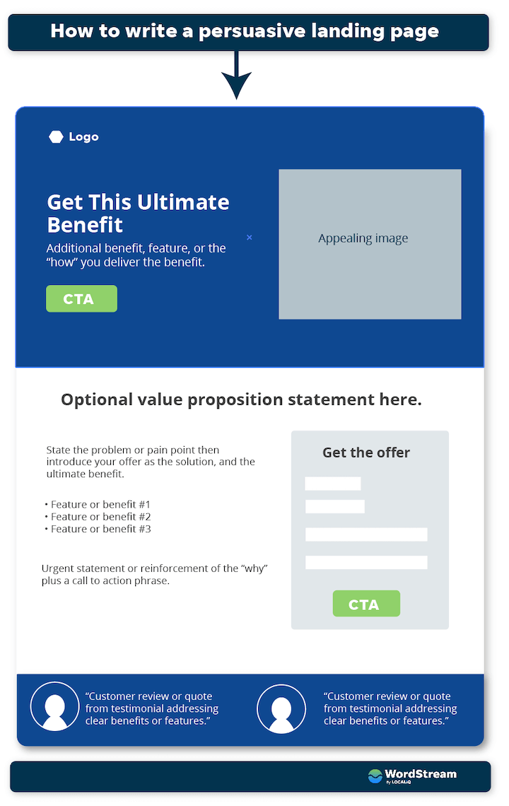
3. Write concise and engaging copy
Copy that sells is clear, concise, credible, and compelling.
- Clear copy means it uses plain, conversational language that your customers use. It should be easy to read and organized with a proper information hierarchy. You have about eight seconds to convince users to stay on your page, so it’s absolutely vital that visitors can capture the essence of your offer with a quick glance.
- Concise means it gets to the point quickly. It provides the essential information to inform and interest your audience and nothing more. You can always add more information at the bottom in the form of accordion-style FAQs.
- Credible copy uses facts rather than opinions and contains trust signals, which we’ll get to in a bit.
- Compelling copy means it has the right mix of features and benefits but also uses powerful words.
4. Add a form
If you’re creating a lead-generation landing page, you’ll need to add a lead capture form. Your form should capture enough information so that you can follow up in a customized manner, but not so much information that it takes extra time or thought to fill out. A good rule of thumb is to have seven fields or less. Name and email are a safe bet. Ask for a phone number only if it’s necessary. Then you may need to get additional details to qualify or score your leads.
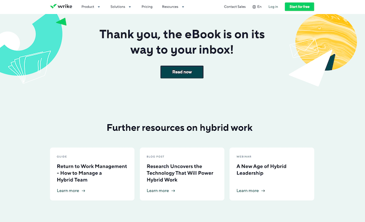
5. Follow up with a thank you page
The thank you page is essential. For one, it confirms for the visitor that they have completed all necessary steps. It also contains the instructions for obtaining the offer, such as checking your inbox or even clicking on a button right on that page to download the piece of media. And finally, you can use your thank you pages to introduce visitors to other resources or even a lower-funnel offer.
How to optimize your landing pages for conversion
Follow the above steps, and you’ll have a good landing page. Follow the above and below steps and you’ll have a great landing page that converts. Here’s how to optimize your landing pages for conversion:
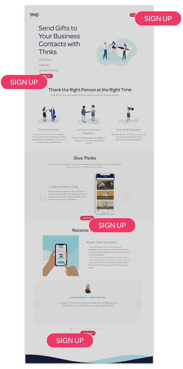
1. One goal, one CTA
Generally speaking, each landing page should have one goal and one CTA. Additional links on the page—like navigation links, footer links, or social share buttons—all serve as secondary CTAs that reduce the chances of the user taking the action you want them to take. Remove these or keep them to a minimum.
If your landing page is long, you can have multiple CTAs placed throughout that all point to the same form or destination, as with the example below. Also notice how the main navigation is removed from the page, giving the user just one option.
2. Keep it clean and organized
As mentioned above, the information on your landing page should be prioritized so that the most important elements are visible above the fold (or before the user has to scroll), like the CTA, key benefit(s), and value proposition. The rest of the information should be presented in an organized, skimmable manner, with plenty of visual elements to balance it out (F and Z patterns are your friend). If you’re optimizing for SEO, consider using tab, drop-down, or accordion-style functionality to include additional copy without cluttering up the page.
3. Use trust signals
These are crucial for landing page conversion, and there are lots of different types.
- Customer quotes: Pull quotes from testimonials and case studies, or include customer reviews.
- Influencer endorsements: If confidentiality is not an issue, include logos of well-known brands who use your product or service, or quotes from influencers.
- Data: There are lots of options here, like “over X five-star Google reviews,” “trusted by X customers,” or “over x leads generated/money saved.”
- Awards and recognition: Do you have any partnership or certification badges? Any form of recognition or award from a third party helps build trust, including just being featured in a publication or being a finalist, even if you didn’t win.
4. QA your landing pages
Before you make your landing page live, go through the process as if you’re a user. Read the page in full, fill out the form, and make sure the correct thank you page loads and the offer is delivered. If you have tracking set up, make sure the information makes its way into your CRM or database. Repeat this process on mobile devices.
5. Optimize for mobile
Speaking of which, make sure your landing pages look and function just as well on desktop as they do on mobile. You may need to make adjustments on the back end of the page so that things appear differently on mobile.
6. Run A/B tests
There are several components to a landing page that influence your users’ behaviors. The headline, the image used, the button colors, even the button copy all have an impact. Test your landing pages regularly to find out what works and what doesn’t.
Examples of great landing pages
Ready to see all of the tips above put into practice? We’ve got some of the best landing page examples to better illustrate what makes a successful landing page that drives conversions.
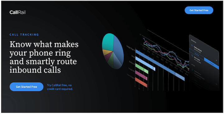
1. Free trial landing page example – CallRail
This landing page example from CallRail is what I landed on after clicking one of its LinkedIn ads. Here’s what makes it great:
- Clean design: There are only 26 words visible above the fold, six of which are the two CTA buttons (which are for the same offer). The colorful graph design is appealing to the eye and the blue buttons stand out against the black.
- Compelling headline: “Know what makes your phone ring and smartly route inbound calls” gives me a clear idea of what CallRail does and how it can benefit me.
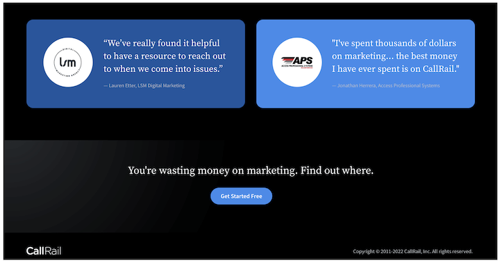
Scroll down and we see:
- Trust badges: Trusted by more than 180,000 businesses, with three badges. Plus testimonial quotes from real customers.
- Clear copy: CallRail uses cards to explain its features and benefits, in super short copy.
- Button at bottom: Since this page is long, the CTA is repeated at the bottom of the page, with a nice, fear-based CTA phrase: “You’re wasting money on marketing. Find out where.”
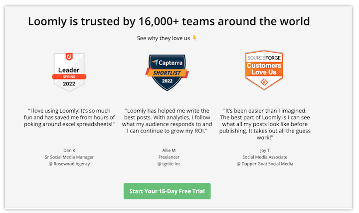
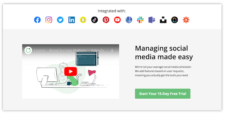
2. SaaS landing page example – Loomly
I ended up on Loomly’s click-through landing page after clicking on a Google Ad that appeared for “social media software.”
Here’s what makes it great:
- Targeted messaging: The headline may not be the most compelling, but it reads “Social Media Software,” a direct connection to the query that triggered the ad to appear. Note that Loomly refers to itself as a brand management platform, so this is a great example of tailoring its messaging.
- Clean design: Like CallRail, this landing page has just one action, to start a free trial, with multiple buttons that all lead to the free trial signup form.
- Video: An embedded explainer video on the page is used to outline the features and benefits. Studies have shown that adding video to landing pages can increase conversions by 86%.
- Trust badges: Testimonial quotes from customers, plus badges for awards from G2, Capterra, and Source Forge
3. Signup landing page example – Lyft
This landing page from Lyft is a great example of very minimalist, clean design.
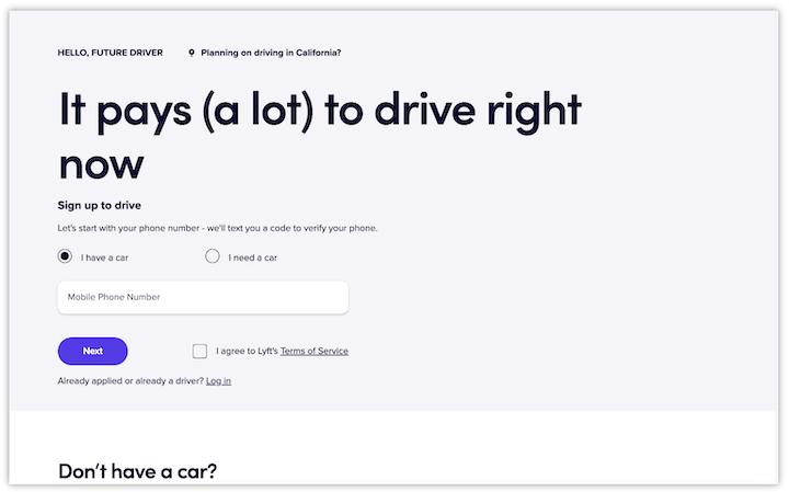
Here’s what makes it great:
- Prominent form: The form on this landing page is right at the top, and it only has one field, the user’s mobile number. There are more steps to the form, but this is a great way to reduce friction and barriers to entry.
- (Really) big headline: There is no image above the fold, but the headline serves as the focal point: “It pays (a lot) to drive right now.” Benefit focused, conversational, and compelling copy.
- Information hierarchy: “Don’t have a car?” is above the fold, likely strategically placed to prevent drop-off from visitors who exit thinking they can’t drive without a car. Later on, you learn how it works, the insurance protection, and then FAQs. This is all necessary information, but it is presented in a way that is not cluttering up the page.
- Scroll-triggered floating bar: There is a lot of content on this page, but rather than having multiple buttons placed on the page, there is a floating bar that appears after a certain point of scrolling.
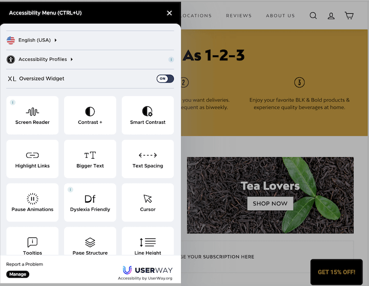
4. Ecommerce landing page example – Blk & Bold
This ecommerce landing page example is from Blk & Bold, a coffee subscription company.
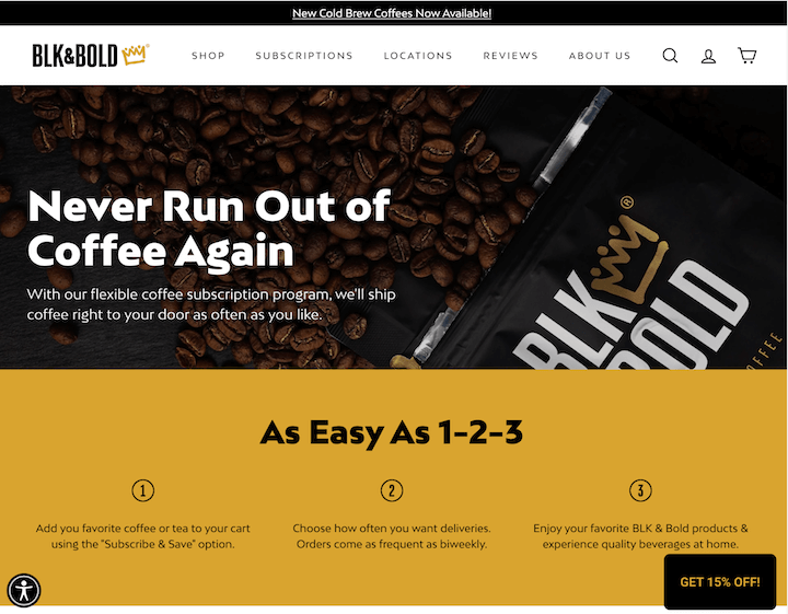
Here’s what makes it great:
- Strong headline: Never Run Out of Coffee Again addresses the pain point for all coffee lovers.
- Clear copy: Before you scroll, you immediately understand how it works in three steps, not to mention the power word “easy” in there.
- Accessibility: On the bottom left, there is a website accessibility icon that when you click it, gives you options for presenting the information depending on your needs.
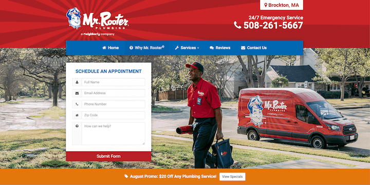
5. Appointment landing page example – Mr. Rooter
Our final landing page example is from Mr. Rooter, a multi-location plumbing company. Here’s what makes it great:
- Large, vibrant image: The full-width image of a smiling man (perhaps Mr. Rooter himself) heading into a job on a sunny day gives this brand a friendly, inviting feel.
- Information hierarchy: I landed on this page after clicking an ad for “plumber near Brockton, MA.” The location in the upper right-hand corner of the page reassures me immediately that I’m in the right place, and the contact number is extra large.
- Simple form: This form is five fields and visible above the fold, making it super easy to book an appointment.
Start writing effective landing pages now
Now you have everything you need to create landing pages that convert. Let’s finish off with a recap of the steps to write an awesome landing page and optimize it for conversion:
- Start with an appealing offer
- Create a strong, benefit-focused headline
- Use concise, compelling, credible copy
- Add a simple form
- Include a thank you page
- Have one goal and one CTA
- Maintain a proper information hierarchy
- Use trust signals
- QA your landing pages
- Optimize for mobile
- Regularly run A/B tests

Meet The Author
Kristen McCormick
Kristen is the Head of Marketing at Hatch, a customer communication platform for service-based businesses. She was previously the Senior Managing Editor at WordStream. Her cat Arnold has double paws on every paw, and she finds life to be exponentially more delightful on a bicycle.
Recommended for you