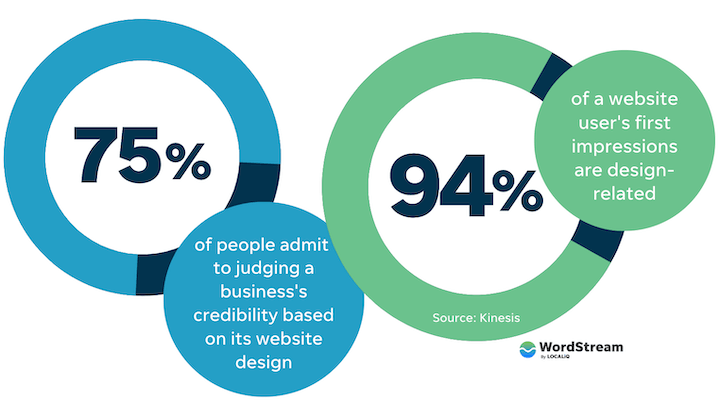
I’m overdue for a dentist appointment. Worse, I need to find a new dentist. Long story short: I’ve spent a lot of time looking through dentist websites over the last two weeks, and truth be told, I’d be lying if I denied being one of the 94% of people whose first impression is design-related.
While I’ve been Googling ranking lists and skimming websites, I’ve noticed some of the same elements making me want to learn more about a practice. So here are 11 dentist website examples that you can use as inspiration or models for your own.
You know the drill. (Too much?) Before we jump into the examples, let’s talk about why a website is quite possibly the most important tool for your dentist marketing strategy.
Why is your dentist website an important marketing tool?
Your website is an important dental marketing tool because it allows you to communicate your practice’s offerings, ethos, and unique value proposition—and it can even attract and convert potential new clients. According to a 2019 survey, most people choose a dentist office based on online reviews, proximity, and search engine rank.
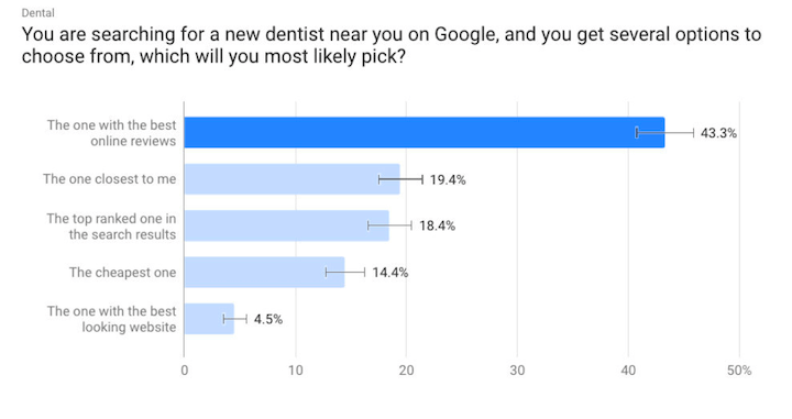
Even though it’s not the top deciding factor, the appearance of a dentist’s website is still a deciding factor for people seeking out a dentist. Even more importantly, your website also plays a big role in your search engine rankings, and your online presence contributes to the quality and quantity of your reviews.
Plus, when you filter the data by age, the percentage of respondents who select the best-looking website increases to 6.7% for 18 to 34-year-olds, and this increases even more when you narrow in further to 18-24 year-olds. For younger people, the quality of your website becomes increasingly influential in their decision to make an appointment or not.
The takeaway: Your website is an important tool for attracting new patients and converting word-of-mouth referrals to your dental practice—one worth investing some time in to make sure you’re getting the most out of it.
Dentist website examples
Now that we’re clear on why your website is important for growing your dental practice, let’s take a look at how you can improve it. Here are 11 awesome website examples from real dentists so you can get ideas and inspiration. Brace yourself (had to) and let’s go through them.
1. Tend
After I searched for dentist offices in Boston once or twice, I started getting targeted Instagram ads from Tend. The ads were trendy and engaging, so of course I visited the dentist’s website.
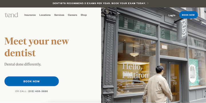
The navigation is straightforward to new and existing patients alike, which communicates to me that Tend meets its promise to streamline visits to the dentist from the outset.
Plus, the video on the homepage gives me a clear idea of what to expect with Tend. Finally, the Nantes font in muted tones, as well as the storefront pictured prominently in the hero section, are modern and inviting.
2. Dntl bar
Dntl Bar is another dentist office promising a newer, modern experience—this time in NYC, and with a different focus for its website.
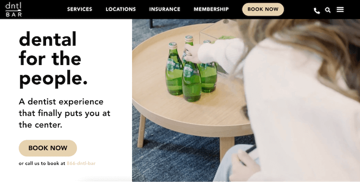
Dntl bar has a clean, lux website color scheme—cream, black, and a muted gold. The video in the hero section continues this color palette, including pops of green with the Perrier bottles and well-appointed office furnishings.
Now, the sparkling water might seem like it has little to do with a dentist office (besides the fact that it might lead to cavities). But the video captures a patient walking into the office for a visit and grabbing a drink while filling out paperwork on a tablet. This showcases the patient-centered Dntl Bar experience that the tagline promises.
3. The Smilist
It’s crucial to have compelling design, but that’s not the only thing you’ll need to impress your patients. Take a look at this dentist website example from The Smilist located in Smithtown, NY.
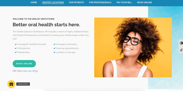
This hero section outlines the procedures and types of care that the office offers, which is an excellent choice: In 2019, over 64% of people reported that they tried to self-diagnose before making an appointment.
This suggests that plenty of your potential new patients are looking for specific services—not just a cleaning, but a filling for a cavity or a consultation for periodontics. Having your services clearly outlined on your website makes it clear to these searchers that you can help them. (Plus, clear copy is copy that sells).
Also noteworthy: Like Tend, The Smilist Smithtown gives the option to book online or via phone, making it easy for your potential client to get in touch with you however they prefer. This ease of booking should be standard in dentist websites.
4. Smilebar
Your potential clients want to know what your current patients are saying. In fact, 71% of people looking for a new dentist check online reviews to help them decide which practice to choose.
Smilebar knows this, so they feature customer testimonials on their website.
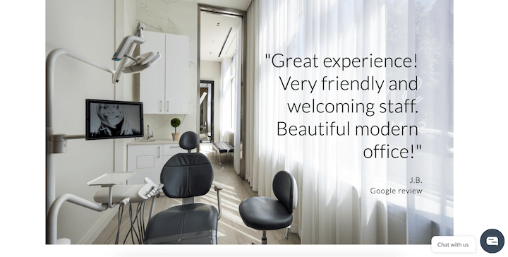
Putting the reviews front and center so that anyone considering your practice sees them is an excellent call, especially when they can highlight a unique selling point for your practice.
5. Maine Dentistry
When you’re highlighting your dentist office on your website, you want to feature your services, client reviews, and a quick, easy way to contact you. You also want to make your office inviting and trustworthy.
The best way to do this is to humanize your brand. Maine Dentistry makes it clear that there are people behind the practice by featuring the staff prominently on the homepage, just below the fold.
Take a look.
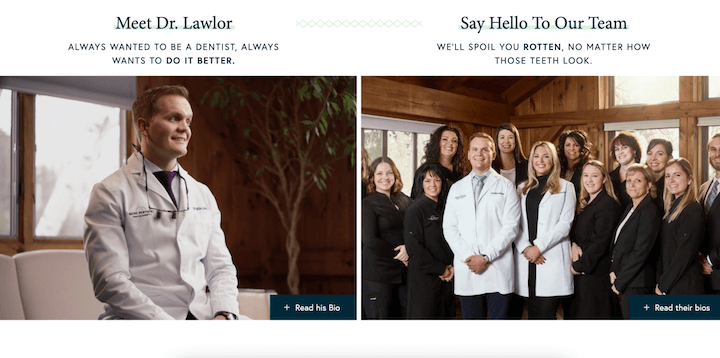
The photos of Dr. Lawlor and the entire team are great, and the copy that the mission and the entire office’s patient-first approach make this even better.
Also worth noting: A+ dentist pun with “We’ll spoil you rotten, no matter how those teeth look.”
6. Watertower Dental Care
Real photos of people are great. If you want to take humanizing your brand to the next level, you’ll need video. Watertower Dental Care, located in Chicago, has an awesome video that highlights its location, takes a patient through an appointment, and emphasizes the warm approach to patient care that would make anyone (read: me) feel good about booking an appointment.
The video shows Watertower Dental Care’s clean and professional practice, as well as its warm and inviting staff. Plus, using video is a proven way to boost your conversion rate—I bet this hero video helps attract new clients.
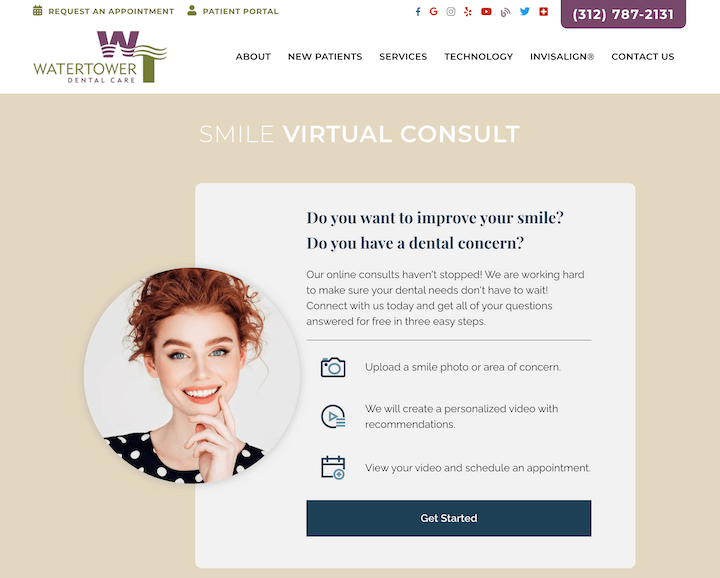
Plus, it takes online scheduling a step further by offering virtual consults.
7. Gentle Dental
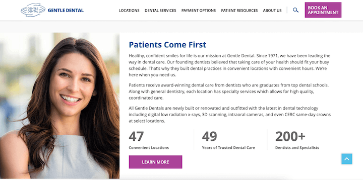
Another element that you’ll want to include on your dentist website is a trust signal—and you’ll want more than one. Trust signals let your potential client know that you’re real, you’re reliable, and you’re safe. These could be ratings, certifications, associated brands, customers, experience, or other details that would assure your website visitors that you can be trusted.
Gentle Dental, a national network of dentist offices, includes some compelling stats about its locations, years of care, and associated dentists. All of these make it a safer choice for patients and patients-to-be.
8. Inspire Dental Group
Scheduling a dentist appointment by phone is inefficient and annoying—especially when you’re looking for most convenient, not necessarily next available. Your dentist website should have a clear, simple way for your current patients and your prospective make appointments.
Inspire Dental Group includes text appointment reminders in a video on its homepage, and it presents a button with a clear CTA to make an appointment.
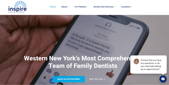
See that chatbot in the right corner, too? Inspire answers your questions and quashes your concerns before you even have to consider scheduling an appointment—making it clear you won’t have to play phone tag (or pick up the phone at all) to get your next cleaning.
9. Pearl Dental NYC
So far, the dentist website examples have included sleek branding, warm videos, compelling copy, and easy contact methods. Lots of admin and people, not a lot of dentistry. I’m not recommending including before and after pictures or anything like that. To be honest, teeth are kind of gross. Probably best to avoid photos on the homepage.
But you do still want to make your services clear. Pearl Dental NYC does a great job of using graphics to represent its expertise (without including any real mouths).
Take a look.
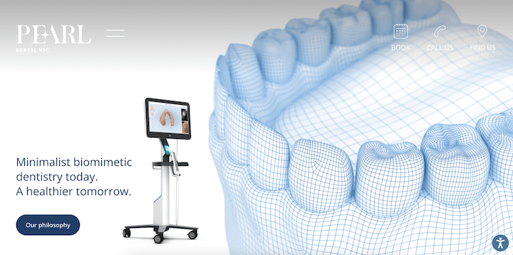
In addition to graphics like the mouth model above, Pearl uses context clues in its photos to emphasize its biomimetic focus. For instance, the typical light, the headpiece, and the perspective of the dentist in the photo below.
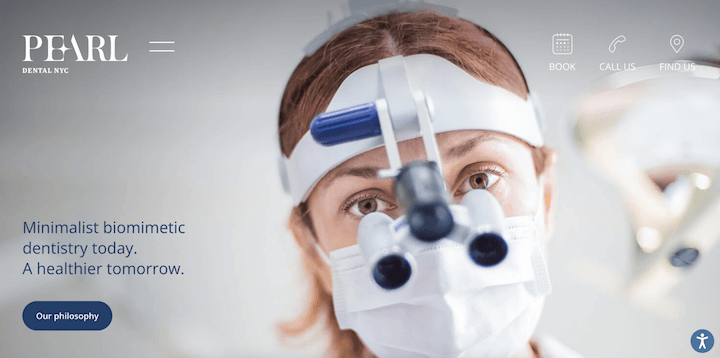
This is a great way to highlight your practice’s work and dental expertise without getting graphic.
10. Concord Dental Associates
Patient reviews are so important, but it’s essential that the reviews are trustworthy as well as compelling. That’s why it can be better to direct your website visitors to unsolicited, unbiased testimonials collected by an online review platform like Yelp or your Google Business Profile. There’s no denying that your patients are honest about their five-star experiences in that case.
But you don’t necessarily have to direct your potential patients away from your website. You can embed these reviews just like Concord Dental Associates does below.
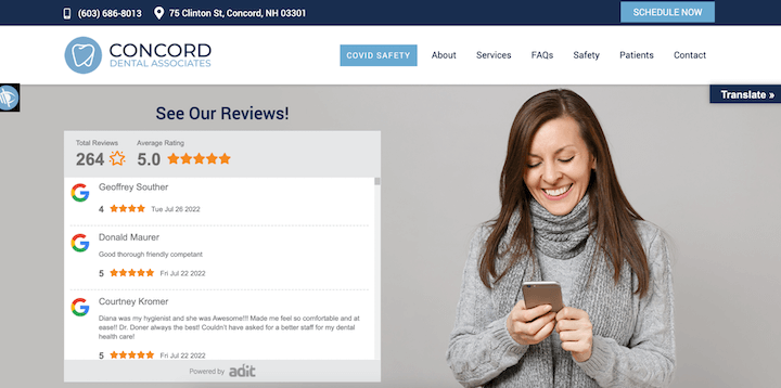
Two other things jump out at me here: A button to translate the page and the highlighted “COVID Safety.” The translation option not only means that this dentist website is accessible, but that Concord Dental Associates is, too. The fact that the COVID precautions are first in the nav bar and highlights tells me this practice knows its patients are conscientious. Both of these are encouraging for making an appointment.
11. Dental Care Seattle
We’ve gone through a lot of dentist website examples and identified the images, the designs, the buttons, and the reviews that work well. Something we haven’t talked too much about? Website copy.
For dentist marketing, you want to ensure that your copy is accurate, but this doesn’t mean it has to be boring or bland. One way to avoid that is using interesting power words like these.
Another way to avoid that is to stress the impact of your dental care or your practice’s approach, or the benefit instead of the feature.
Dental Care Seattle gets this right.
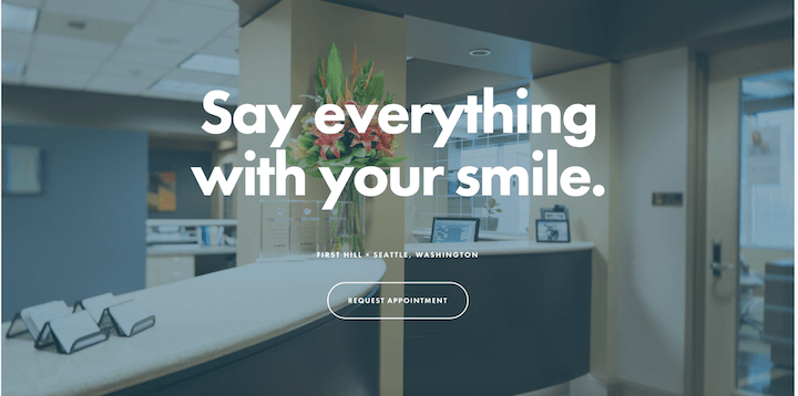
Having exceptional teeth is more than a semi-annual cleaning and cavity check—it’s confidence-boosting. Capturing these bigger-picture impacts on your dentist website will help you outshine your competition (last one, I promise).
Use these dentist website examples to improve your own
We went through a lot of dentist website examples to identify their best features. Here’s a quick overview of the tips we’ve gone through:
- Refresh your brand colors and your website design for contemporary appeal.
- Highlight your office’s unique selling proposition, whether it’s communication or specific services.
- Feature your patient reviews prominently.
- Include trust signals to establish your authority.
- Make it easy for potential clients to contact your office.
- Use pictures of real people to build trust and welcome new prospects.
- Add video to humanize your brand and give patients a clear picture of what to expect.
- Focus on the benefits of your services in your website copy.

