When it comes to your website, you need to give your customers a terrific experience to get them hooked on your brand.
Imagine you launch the perfect website for your business. Everything is flawless—the layout, the performance, the navigation, the copy. It all creates the dream experience for your users, and people rave over it.

Well, you’ll only be able to make that happen if you choose the right website color scheme, and I’ll show you exactly how to do that—even if you have no experience in design.
Color plays an integral role in how we perceive the world. Consequently, it can radically affect how we perceive a website. But when it comes to website design, color scheme often takes a backseat. In this article, I’m going to share six important tips you can use to create a stunning website color scheme:
- Get to know color psychology basics
- Acquaint yourself with color theory
- Think about mixing color combinations
- Keep it simple
- Contrast your colors
- Integrate your branding
Whether you have a working knowledge of color theory or aren’t quite sure of the difference between primary and secondary colors, these tips will help you select the ideal color scheme when building your website. Let’s get started!
1. Get to know color psychology basics
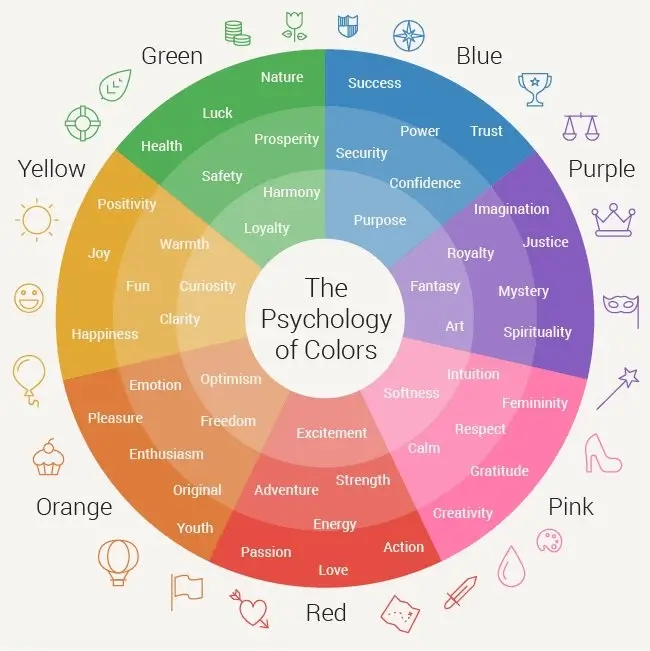
The role of color psychology in marketing is an important one. Going over all the details would take way too long, so here are the most important basics you need to know.
Color associations are powerful. We develop them when we’re infants, and they usually stay with us for life. These associations are instinctive and often subconscious.
Many of these associations are fairly universal. For example, everyone learns to associate green with leaves and nature and yellow with the sun.
However, some are cultural. One study found that Americans associate envy with black, green, and red, while Russians thought black, purple, and yellow were the envious colors.

These cultural associations are more important today than ever before since so many brands maintain a global presence. Depending on the colors you use, people from certain countries might associate something negative with your brand, which you definitely don’t want.
2. Acquaint yourself with color theory
In a nutshell, color theory is the science of how color works. The longer version isn’t as easy to explain—there are entire college courses for it! But there are a few simple concepts that you can pick up to enrich your understanding of color for your website design.
First, you need to understand primary, secondary, and tertiary colors.
Primary colors are colors that cannot be made by mixing any other two colors. There are three primary colors: red, yellow, and blue.
Secondary colors are created by mixing two primary colors. For instance, when you mix blue and yellow (two primary colors), you get green (a secondary color).
Tertiary colors are created by mixing a primary color and a secondary color that are next to each other on the color wheel. These create compound colors; for example, mixing blue (primary) and violet (secondary) creates blue-violet (tertiary).

Second, let’s talk about warm and cool colors.
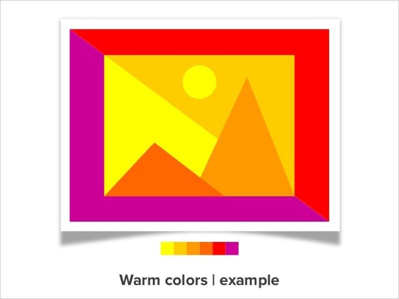
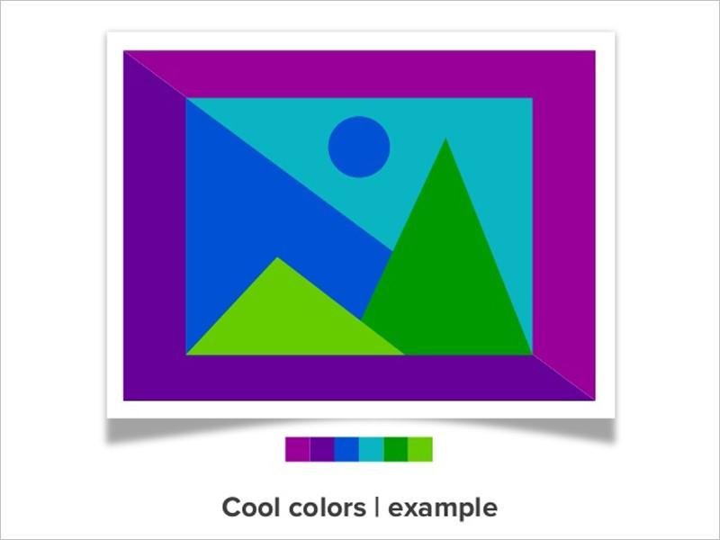
You probably already have an idea of what warm and cool colors are. Reds, oranges, and yellows are classified as warm, while blues, greens, and violets are cool.


Third, it’s important to understand color nuances.
Not every color you see is a pure color. Many of the colors you see online have been affected in one way or another.
You might be seeing a tint (a color with white added to it), a shade (a color with black added to it), or a tone (a color with grey added to it).
Or you could be seeing an oversaturated or desaturated color. The saturation of a color is how bright or dull the color is.
There’s a lot more to these color nuances, but those are the basic points you need to know to choose effective color combinations, which we’ll talk about next.
3. Think about mixing color combinations
Your goal is to select a color scheme for your website design. What does that mean? Well, you’re looking for a good combination of colors. Depending on how many colors you end up working with, your color scheme might involve multiple color combinations.
When thinking about color combinations for your website, understanding these color nuances is critical. You need to know why certain colors work together and how you can modify colors to better suit your scheme.
Color theory is great at telling us what colors work well together. So when it comes to selecting the colors for your palette, there are a few more advanced aspects of color theory that can help you decide which colors will be best for you.
Earlier, I mentioned how colors are combined to create new colors, but we also need to look at how to combine different colors.
There are five main color combinations: complementary, split complementary, triads and tetradic, analogous, and monochromatic.
- Complementary colors sit across from one another on the color wheel. A complementary color combination will be composed of one warm color and a cool color. Red and green is one popular complementary pair.
- Split complementary colors are made up of a base color and two colors that are adjacent to the complement of the base color.
- Triads and tetradic colors have similar relationships. Triads use colors that are evenly spaced on the color wheel (like red, blue, and yellow). Tetradic colors are four colors comprised of two pairs of complementary colors (like red, green, blue, and orange).
- Analogous colors sit next to each other on the color wheel. As a result, analogous colors are extremely similar, like green and yellow-green.
- Finally, monochromatic colors are simply variations of the same color. This is accomplished by using tints, shades, and tones.
Think of these color combinations as your tools. Since these combinations all work, you won’t have to worry that your colors don’t match.
Now that you know the exact combinations you can employ, you can think about how to use those together to create a powerful, engaging color scheme.
4. Keep it simple
This might seem like it could get complicated, but it shouldn’t. Instead, when choosing your color scheme, think about simplicity. A really complicated, busy color scheme often confuses the eye.
Keeping things simple has two big benefits.
Perhaps the biggest benefit is that simplicity can effortlessly tie together a color scheme. If you have just a few colors at work, everything will look unified. (Well, at least if you’ve used one of the color combinations mentioned above.)
Another benefit is that viewers don’t have to work hard to process what’s going on. That’s one of the hallmarks of a great website. If you go overboard on the color, your users will be more confused.
WordStream’s color scheme is a great example. The homepage uses just three colors: blue, orange, and a splash of green.

Blue and orange are the central colors here, with the page being dominated by different shades of blue. The orange is used for the call to action, and since orange is blue’s complement, the button stands out and draws the eye.
Going back to the color language we reviewed earlier, we can classify this as a monochromatic color combination combined with a complementary combination.
This color scheme is consistent throughout the site. Here’s what one of the blog posts looks like:

It’s a simple color scheme, but it’s incredibly effective because of that simplicity. It goes to show that flashier isn’t always better.
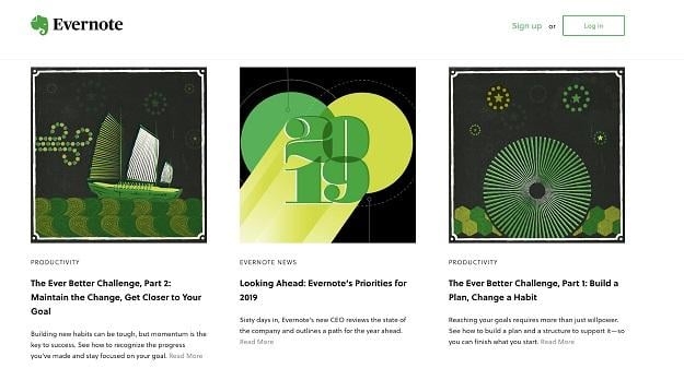
Evernote’s blog is another great example:

The blog design is built around the color green, which is Evernote’s main brand color. There are some fantastic touches here—the image, login button, and even hyperlinks are all green.
Yellow shows up a lot, making this color scheme analogous.

These simple designs have a huge impact—keep that in mind when selecting your website color scheme.
5. Contrast your colors
Next, think about contrast. It’s one of the most important elements of good design you can use when creating your website color scheme.
That’s because contrast creates impact. Specifically, contrast can draw attention to certain parts of the page.
Take another look at WordStream’s site:

The orange CTA on the blue background is an excellent example of contrast in action. In fact, complementary colors work together so well because they contrast each other. There’s a surprising amount of research on CTA color choice proving that buttons that stand out convert better.
So if you have something that you really want your users to notice, make it contrast from the rest of the page (or at least from the design elements that are closest to it).
6. Integrate your branding
Finally, consider how your branding will play into your color scheme. Chances are your brand already has certain colors associated with it. If that’s the case, you can use your existing color palette to help create your website color scheme.
However, you may need to tweak your brand colors. If one of the colors you’ve chosen has a negative meaning, you might want to choose a different color.
That’s the key here—think about the color associations that people have with the colors you’ve chosen. Are these associations consistent with the values that you’ve built your brand on?
It’s helpful to see what other brands have done, too. Here’s an example from Medium:

You’ll often see the same colors come up when you look at display advertising. (Blue tends to be popular.)
Now, start (color) scheming!
Now you’ve got all the tools you need to create an awesome, engaging color scheme for your website.
All that’s left is to go and do it.
It may take some trial and error, but that’s part of the process. Any good color scheme will go through its fair share of iterations.
One more thing—this knowledge will come in handy down the road. These design principles have many more applications than just website design. You can use them to optimize things like social media posts and infographics. But for now, start with your website. Take the information you’ve learned from this guide and go crush it! You’re ready to make your site the best it can be.
About the author
Payman Taei is the founder of Visme, an all-in-one visual communication platform empowering everyone to create and share beautiful interactive presentations, infographics, reports, and other forms of engaging content with no design skills.


