Websites vary in style, format, and quality. But one thing they all have in common? Headers—that strip at the top that makes for easy navigation.
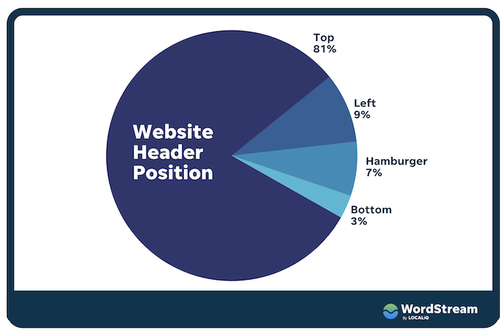
Despite taking up minimal real estate, headers are the most heavily engaged-with element on a website. Businesses looking to leave an impression will strive to strike a perfect balance—of providing an easy and intuitive yet unique and stimulating experience.
In this post we’ll be sharing 24 website header examples while breaking down:
- Exactly what a website header is
- What to include in your website header
- Best practices to optimize for conversion
This way, you can provide a solid user experience while also supporting your marketing goals.
What is a website header?
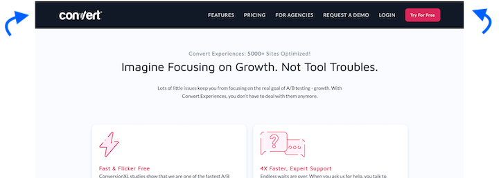
A website header is a visual typographic strip or menu that typically runs across the top of a website. It contains a number of clickable components, like a logo, navigational tags, login buttons, and more. Virtually all websites—even the most basic websites—feature a header on their homepage, and many have variations of the header on the rest of their pages.
Here’s a very basic, instantly-recognizable website header:
As alluded to above, website headers have a dual responsibility:
- Navigation. First and foremost, they need to be able to effectively guide site visitors to other pages on the website.
- Marketing. When designed right, a header can (and should) be a marketing asset and promotional vehicle for your business.
👀 Looking for ways to drive people to your site? Free guide >> 25 Ways to Increase Traffic to Your Website
What should a website header include?
Below you’ll find a number of elements that can appear in a website header. But it’s important to note that not every header will feature all of these. It all depends on your industry, business type, and website format. Furthermore, a header may change depending on which page you’re on within the same site. For example, the homepage header may feature 5-6 clickable elements, whereas on the resources page, the header might include fewer clickable icons.
Logo
With very few exceptions, all variations of a website’s headers will prominently feature the company logo which, when clicked on, brings the user back to the homepage. If they get lost, they can always count on it to direct them back to familiar territory.
Navigational links
This is also core to any website header. Typically you’ll want to keep your main navigation options to between 5-7 elements, but which pages you link to will vary depending on your niche. For some businesses, the navigation menu links to the about us page, product or services page, pricing page, resources page, and contact us page. For others, it’s to the careers page or first-time patients page. It all depends on the industry.
Most SaaS and tech website headers look something like this:
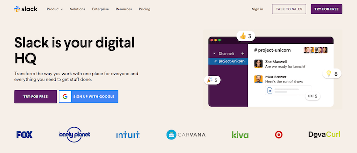
- Product gives visitors an in-depth view of the various features or product types.
- Solutions leads visitors to a page/hub where they can see how the company’s platform can be leveraged in different scenarios, or see different packages.
- Resources often contains the blog, case studies or testimonials, knowledge base, and/or whitepapers.
- Pricing will lead visitors to a comprehensive page in which the platform’s various subscription packages are displayed. It’s worth noting that some SaaS platforms shy away from making their pricing packages public. This is especially true in regards to enterprise solutions that are customized and lack a uniform pricing structure.
Search bar
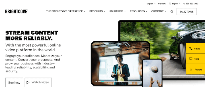
In the earlier days of the internet, search bars were far more pervasive and heavily used than they are today. You’ll know a search bar when you see it, with most sites using a magnifying glass icon to indicate the element’s function.
You’re more likely to find a search bar on a blog menu header than on the homepage header. Still, some sites feature it on their homepage header. Brightcove, a leading video hosting platform, interestingly enough features a search bar but doesn’t feature the more common pricing element.
Shopping cart
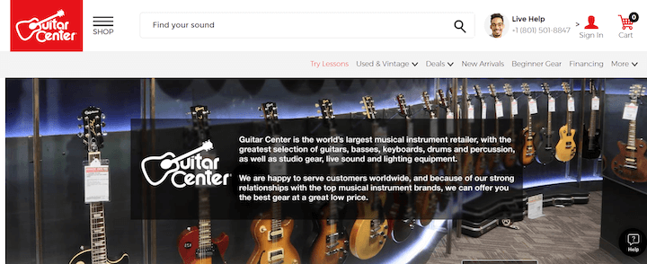
A staple of ecommerce websites, this CTA should be on the top right and either a shopping cart or shopping bag icon.
Social media buttons
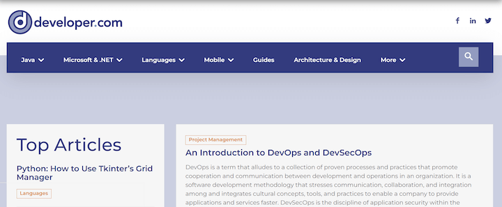
Though these are more commonly displayed in a website’s footer, some website headers include links to social channels. Here’s an example:
⚡️ Free guide download >> PPC 101: Complete Guide to Google Ads
Login field
Any website that has a login option should include the login field in its header as well. If you’re an active customer, you’ll have a user and password that you can punch in to gain access. Most major platforms offer you the option of gaining access via your Google account, as well.
CTA
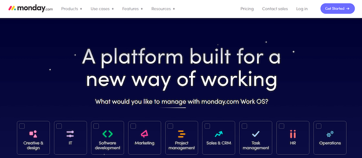
One thing you’ll notice in almost all of the examples in this post is that the header contains a call to action. As this is the most heavily used element on a website, you’ll want to take advantage of that to help support your business goals. This could be to use a free tool, sign up for something, contact the business, start a free trial, and more.
Website header examples & trends
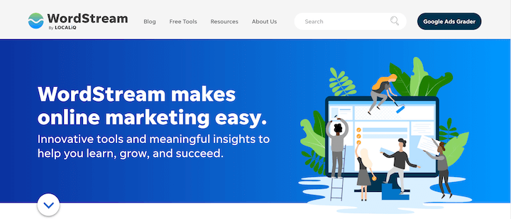
Though they have just a few components, there are a ton of ways to configure your website header. Let’s look at even more website examples to give you ideas and inspiration.
Single-line header with left-aligned logo
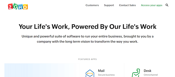
Basic but effective, Zoho has just four clickable navigation elements plus a search bar. Notice also how Zoho opted for right alignment. This accentuates the logo, giving it more room to draw visitors’ attention.
Single-line header with a notification bar
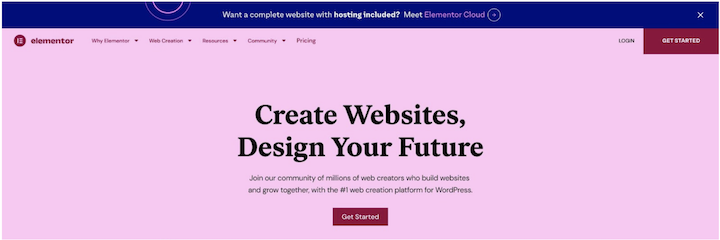
While the header itself is pretty ordinary, the banner on top is meant to draw attention to something new, important, and/or exciting. Elementor used this recently to announce that it now offers cloud hosting for WordPress.
SE Ranking is currently using its notification bar to promote support for Ukraine:
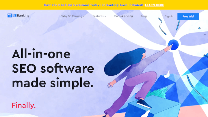
These banners will, of course, include a CTA. Once clicked on, visitors will be directed to a designated landing page detailing the offer in the banner.
Two-tiered header
A two-tiered header can help present more navigational options without overwhelming visitors with one continuous line of icons.
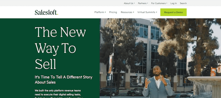
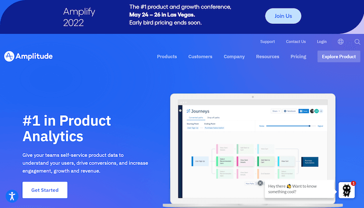
Two -tiered hHeader with notification bar
Amplitude added a notification bar above its double-tiered header to promote its upcoming conference. The notification bar is equal in length to the header, making it feel less cluttered and more like a separate section of the site.
Header with a utility bar (sticky bar)
Some sites affix the header so that it sticks with visitors as they scroll down the page. Their rationale is simple: Provide your visitors with the option of navigating to any part of your website at any time.
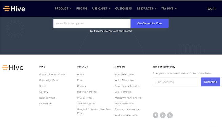
This header sticks with you all the way to the bottom of the site.
Floating header
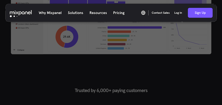
As seen on Mixpanel’s homepage, a floating header is similar to a sticky bar, the difference being that when you scroll down, you see the webpage below and above the header, thus creating a floating effect.
Header with mega menu
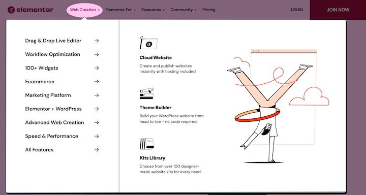
Some websites can’t afford to be scarce with the information they share in their headers. In those cases, using a mega menu can prove very useful.
Header with multi-site navigation
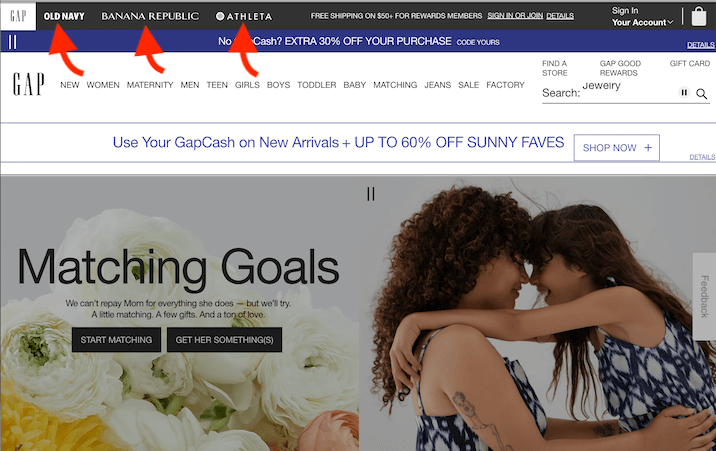
Usually seen on retail and ecommerce websites, multi-navigational headers allow for users to easily jump from one sister company’s site to another.
Left-aligned vertical header
The first of the non-traditional header examples, you’ll find many of the same navigation menu items hanging vertically to the left.
Right-aligned vertical header
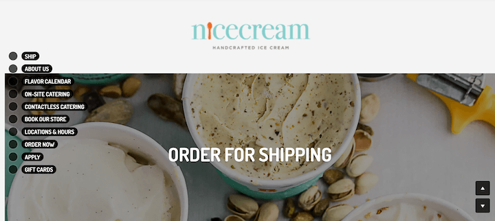
Same concept but this time aligned vertically on the right. These guys took it a step further by having each menu item hang vertically, as well.
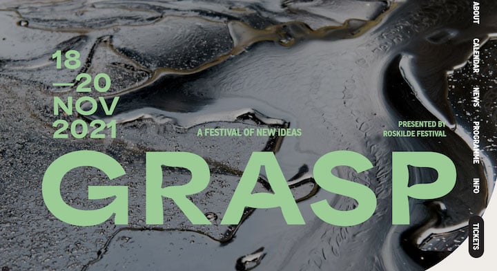
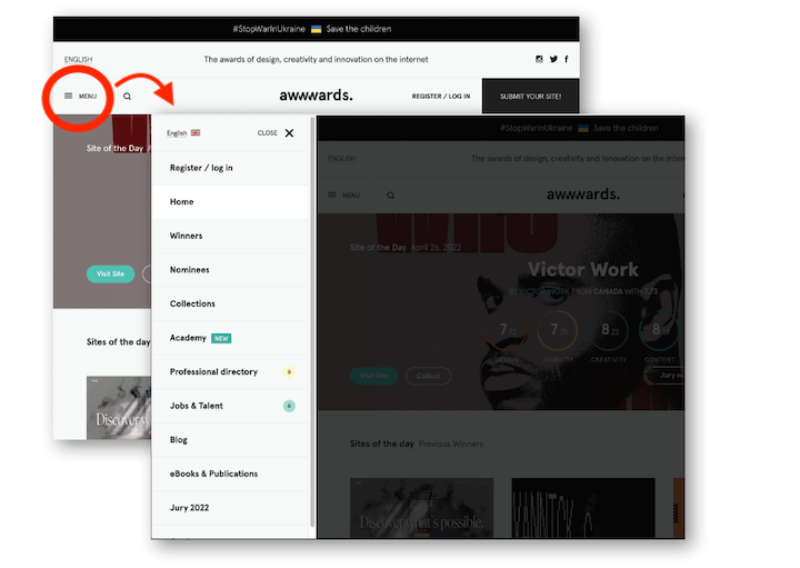
Hamburger slide-in
Less common but nonetheless engaging, hamburger menus are a nice demonstration of sleek web design. The background goes dark as the menu slides in, helping draw visitors’ attention to the clickable options.
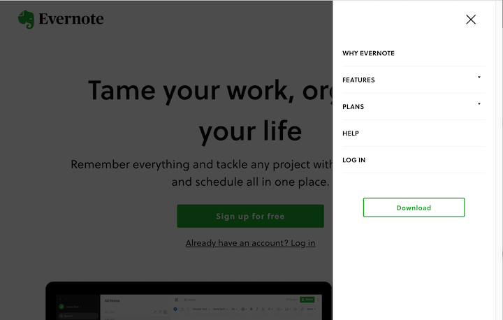
Here’s the same thing, just on the other side:
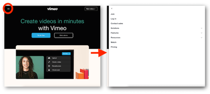
Full takeover slide-in
You can get really bold and have the menu extend over the entire screen, like Vimeo does:
Website header best practices
- Use color contrast. At bare minimum, there should be a ratio of 4.5:1 between your headers’ background color and your chosen font. This goes for the header along with any secondary information included around it. You may also want to darken the background of a page once the header menu is displayed to make it more focused.
- Include a CTA. We mentioned this above but it’s worth mentioning again. Whether it’s to contact your business, try a free tool, start a trial,
- Make it sticky. Some websites easily wow you with their design and dynamic scrollytelling, but ultimately, most websites have one clear objective: Conversions. You have about 15 seconds to offer visitors value before they bounce, so you need to make it as easy as possible for visitors to navigate to important pages, at all times. Not to mention see that all-important CTA at all times.
- Make it intuitive. Before selecting one for your own website, examine competitors and other sites in your niche to see what is most common. Website navigation is not an area where you should strive to be unique or “disruptive.”
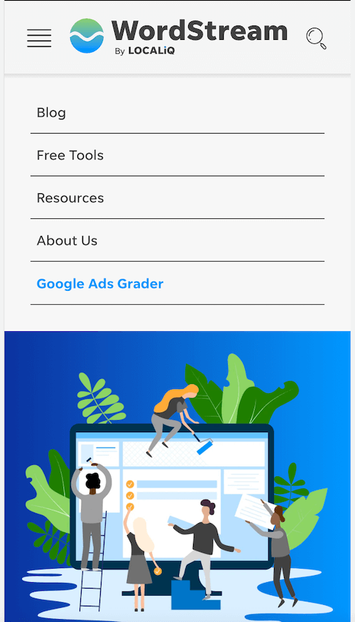
- Optimize for mobile. Unless you go with a font size only visible under microscope, a horizontal header is not an option on mobile. The most common approach is to configure a hamburger menu for mobile browsing.
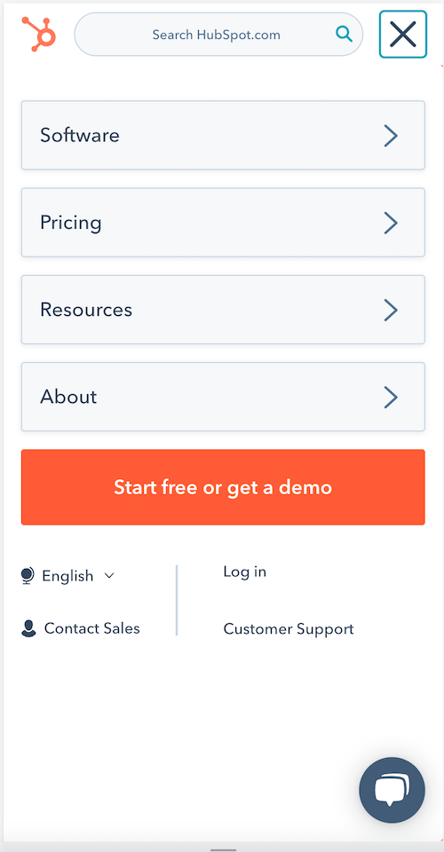
It’s worth noting that if you need it, you don’t have to lose the search bar or even the CTA button when optimizing for mobile. Here’s how HubSpot does it:
- Stick with simple fonts. Legibility is everything when it comes to UX (and as it turns out, copywriting psychology too), and it is doubly important when it comes to your site’s most foundational clickable element. Sans Serif font is common for website header text as it’s highly legible.
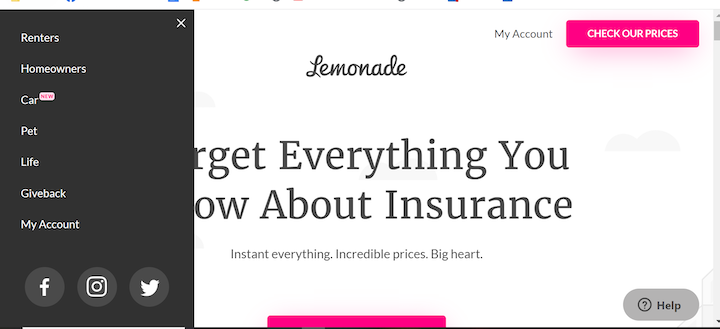
Good thing Lemonade did not use its logo font for its header font.
Website headers: A delicate artform
Coming in a variety of shapes and sizes, website headers are critical to your site’s success. Whether you choose to go for a more traditional design or something a bit more experimental, it’s important you adhere to universal best practices. It’s quite oblivious when a website has aced the header element. Visitors to your site will come away having been provided a succinct yet stimulating navigational experience. Very often, this is instrumental in leading them towards your ultimate business goal; be it landing on specific pages or actually converting into paying customers.
About the author
Yoni Yampolsky is a Marketing Manager for Elementor. With more than 10 million active users, Elementor empowers just about anyone to create stunning WordPress websites, code-free.

