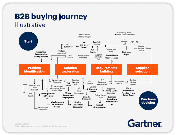
B2B website design requires a careful approach. A B2B buyer is nowhere as impulsive as a B2C buyer. They take their time to do extensive research before investing in any new product, and in some cases, multiple stakeholders are involved in the decision process. Just take Gartner’s illustration of the B2B buying journey:
The point? Your website needs to be meticulously designed to meet their unique expectations and careful calculations. Fortunately, you can achieve that by following the key B2B website design best practices. In this article, we’ll share 10 of those, along with excellent B2B website design examples to inspire you.
B2B website design: 10 tips and examples to inspire you
The key to a great B2B website is not in having all the bells and whistles, but in having all the fundamentals in place and then layering on your unique brand voice. let’s take a look at these great B2B website designs and what makes them work.
1. Miro: Have a clear CTA
The CTAs on your website have the greatest impact on your conversion rates. Having one main, clear CTA on your homepage is a critical B2B web design best practice.
Miro is an excellent example of a B2B website with a clear CTA.
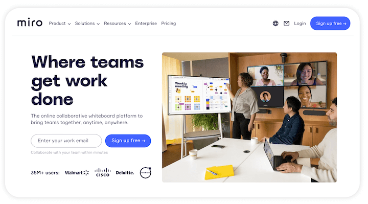
It has a purple button above the fold and in the website header, with plenty of white space to help the button stand out and super-clear language (“Sign up free”).
Takeaway tip: When creating CTAs for your website, use the fewest words possible while still communicating your message effectively. To ensure the best results, A/B test your call to action phrase, button colors, and placements.
2. Stryve: Employ a strategic and consistent brand style
Your brand is the story and identity you tell the world to differentiate your business from competitors. Using that branding style consistently across all your assets—especially your B2B website—helps to deliver a strong message to your audience and boost brand awareness, recognition, and recall.
Take Stryve’s B2B website, for example. It uses a dazzling website color palette on its homepage to show its quirky personality, as well as a custom font that conveys both a professional image but also that they’re easy to work with.
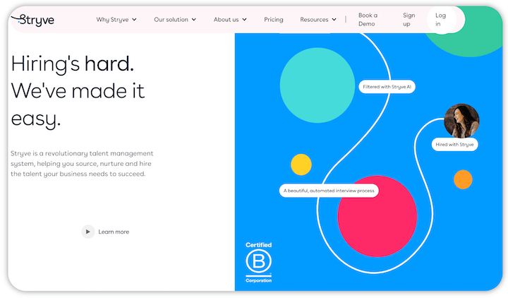
And you see it throughout the site, such as on its careers page:
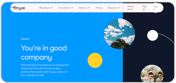
This brand consistency creates congruence. When website visitors move from one page to the other, they know they’re still in the Stryve site because the feel is the same across all of those pages.
Takeaway tip: Your website should ensure brand consistency across all its pages, which includes not only colors but also font and language. More on this in a bit.
3. DoneDone: Use visuals
A great B2B website design communicate swhat your business does—not just with compelling website copy but with visuals and illustrations, too.
These help users see the product in action, support the points made by the copy, and make the pages more engaging. DoneDone‘s B2B website design is a great example of this. It uses visuals and illustrations across its homepage, as well as a video at the top stating its value proposition.
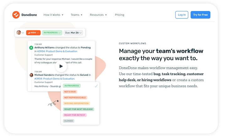
There’s also another video demonstrating some of the product’s features when you scroll a bit. Towards the bottom of the page, there are additional screenshots showing more features and benefits.
Takeaway tip: Don’t just talk about what your business does; show it with visuals, like screenshots, illustrations, videos, GIFS, and other forms of animation.
🤔 Could your website be improved at all?
Find out with the Free Website Grader.
4. IBM: Implement responsive web design
From 2017 to 2022, mobile phone traffic has grown from 39% to 59& of all web traffic. Plus, Google is now also using a mobile-first indexing. B2B websites (all website, for that matter) must, therefore, be responsive to rank higher, get more traffic, and deliver a great user experience.
Below are two images showing IBM’s responsive web design from a desktop and a mobile phone. The same information is displayed, but it has been adapted to the screen.
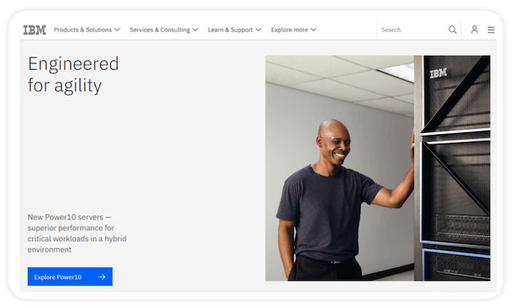

Takeaway tip: It’s not about being mobile-friendly anymore. You need to have a fully responsive website in your B2B marketing strategy. Here is how to create a responsive web design:
- Set appropriate responsive back points
- Start with a fluid grid
- Optimize for touchscreens
- Define typography
- Use a predesigned layout
5. Best Buy: Make navigation easy
The easier it is for your website visitors to find the information that interests them, the longer they’ll stay on your site and the more likely they are to make a purchase. Your web pages should be well arranged, linked, and labeled so the visitor can get to where they want to be within a few clicks from the homepage. This is also good for SEO.
This is especially important for B2B ecommerce sites. Best Buy’s website, for example, uses a visual hierarchy of text and design elements to prioritize and organize information. The most important copy and images have the biggest sizes.
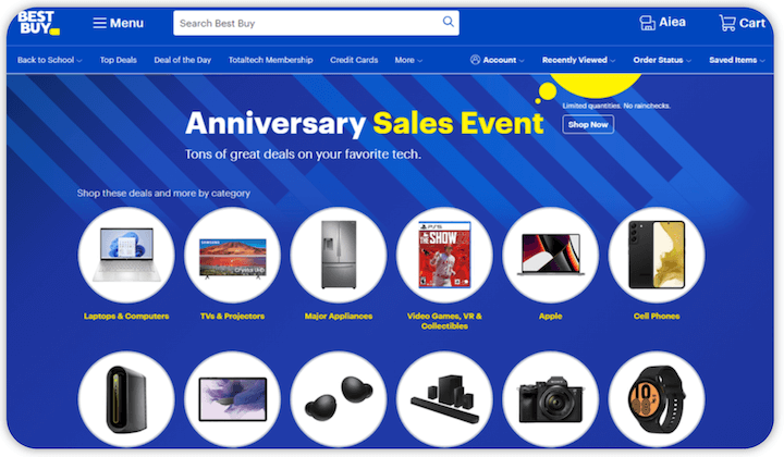
Takeaway tip: Create an organized site architecture and structure to prioritize information for users, using clear categories and avoiding long drop-down menus.
6. VineBox: Keep it simple with Minimalist design
When building a website, you might be tempted to hit the visitor with everything you’ve got. Don’t do that. A minimalist design—where you only show the user the essential information upfront— is often recommended for B2B websites.
This way, the information is filtered for them and they get a clear idea of what is being offered without getting confused. Plus, the fewer elements you use, the shorter your load time, the higher your engagement, and the better your basic SEO.
An excellent example of minimalistic B2B website design is VineBox, which just has a few words of copy and a big “Shop now” button.
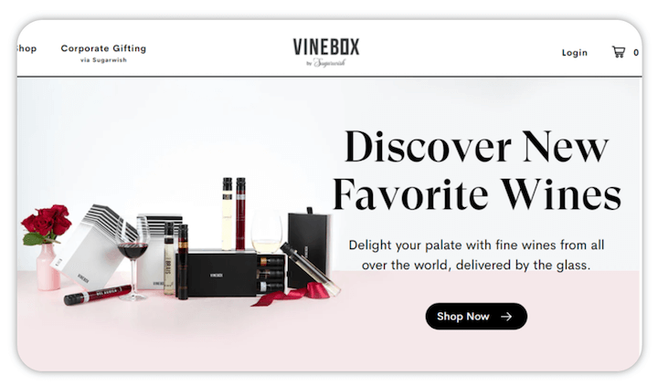
Takeaway tip: Don’t overload your visitors with information on your homepage. Try minimalist design by generously using white space, making sure every element serves a purpose, and using no more than three colors.
7. Voluum: Communicate your value proposition
As a B2B business, you need to communicate your value proposition right away, in simple language. In addition, your web copy should be customer-centric and well-curated. Take a look at this B2B website example from Voluum:
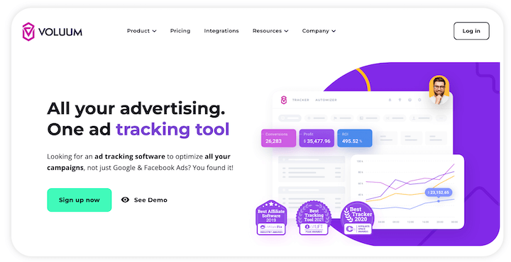
Ad tracking software has a lot of complexities, but a quick scroll through its homepage and you understand simply: it’s an ad tracking software for all campaigns—not just Facebook and Google.
Takeaway tip: After just scrolling your homepage, your website visitors should have a clear idea of not just what your business offers, but makes it unique from other providers of similar services/products.
8. Hunch: Bake testimonials into your copy
Testimonials show prospective customers that you’ve satisfied similar customers and increase your credibility.
In Hunch’s B2B website design, you can see it incorporates testimonials into each feature on its homepage—and each testimonial is authenticated with a name, photo, company name, and position.
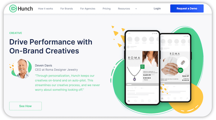
Also, notice that these are all testimonials from top-level positions—a CEO, a Global Manager, a Performance Specialist, and more. This is by design because these same people reflect the target audience Hunch is reaching out to.
Takeaway tip: If you already have customers benefiting from your services, it is high time you sourced their testimonials and used them to better your B2B web design—actual quotes with details from the customer to maintain top credibility.
9. Intellum: Have a case studies page
One of the most important elements of B2B website design is case studies—which show, in detail, how you helped a business and the results you delivered, demonstrating your competence and reliability.
Intellum’s dedicated case studies page is a great example of this. Notice that each study is titled specifically: “How G4S Doubled Their Completion Rate” and “How DISCO Reached 10,000+ Course Completions in One Month”
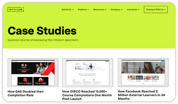
Takeaway tip: Case studies serve as social proof and help you address possible customer objections so don’t make the mistake of not including them in your B2B website design. Here are some things to consider to write compelling case studies:
- Tell the story of how you worked with them from start to finish.
- Present your case study in an easy-to-read/follow format.
- Provide real numbers you generated for the client.
- Detail the strategies you used.
10. Brandtailers: Make your B2B site accessible
When designing a B2B website, you have to keep in mind that your website visitors are all abled differently. To make your website accessible, you need to make sure:
- Web pages are screen reader compatible.
- Images, tables, and illustrations are alt-tagged.
- Automatic scripting is enabled.
- Forms are usable even without a mouse.
- The color scheme is inclusive.
- Keyboard-friendly browsing is enabled.
But there are also specific preferences that can be hard to accommodate in just one design. The Brandtailers website uses a tool called accessiBe which allows users to switch to a mode that caters to the blind, those who experience seizures, those with ADHD, and those with cognitive disabilities, among others.

Takeaway tip: You can enable your website visitors to curate how they want to experience your website with an accessibility tool. For example, if they are impaired or have a condition requiring special features, they can select a particular mode, and the website becomes more user-friendly for them. As you can imagine, this is super important for healthcare websites as well.
Is your B2B website design up to par?
Making a quality B2B site is not impossible, but it is also not that simple. You need to have an understanding both your business and target audience so you can communicate clearly to them and address all their needs.
Follow these tips to deliver a better user experience with your B2B website design:
- Clear CTAs
- Responsive design
- Consistent branding
- Easy navigation
- Minimalist design
- Visuals
- Benefit-focused language
- Testimonials
- Case studies
- Accessibility
About the author
Ian Loew is a web entrepreneur and inbound marketing expert, and the Owner & Head of Business Development of Lform Design. After four years of helping Fortune 500 companies with MGT Design, Ian embarked on his freelance career before establishing Lform Design in 2005. He leads a team of creative professionals to deliver inspired online experiences via modern, responsive websites that reflect his clients’ core values. When not at the helm, Ian can be found mountain biking with friends or spending time with his family.

Meet The Author
Guest Author
WordStream’s guest authors are experts, entrepreneurs, and passionate writers in the online marketing community who bring diverse perspectives to our blog on a wide range of topics.
Recommended for you